Category Archives: wonderful spaces.

the bridge house.

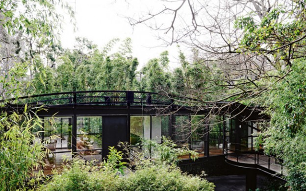
The Bridge House was another of the homes designed by modernist architect and writer Robin Boyd (see previous post, here), and it has just been extensively renovated. It is a little difficult to see what remains of the original home, designed in 1953, but the renovation is progressive and contemporary, rather than simply a pastiche. It is interesting to compare this home with the Walsh Street one, which remains unchanged since the ’50s.

The house’s unusual shape is a masterclass in designing according to context: two elliptical steel trusses straddle an old river bed, easement and dramatically sloping site. The resulting longitudinal window walls create a wedge-shaped plan and maximise internal views of the site’s established trees. A timber and steel bridge connect street level to the mid level entry point of the house.

boyd-bridge3_ohlboyd-bridge4_ohlboyd-bridge2_ohl.

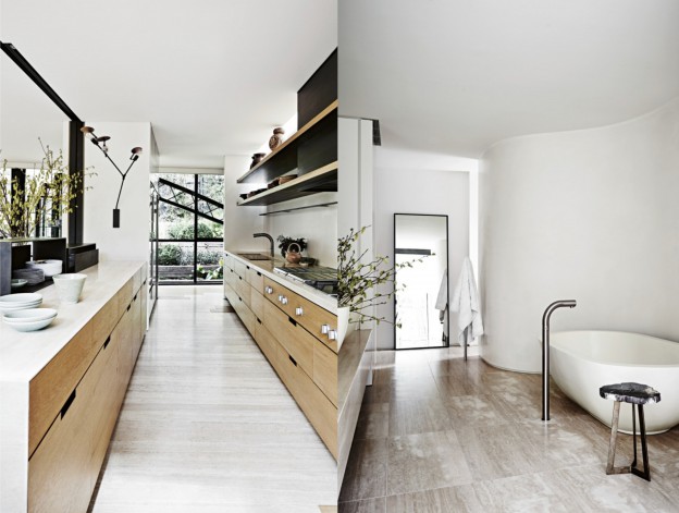
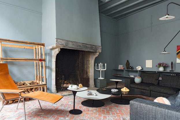
The interior is luxe and rich – floors are pale oak and travertine, a circular, ridged oak insertion holds a wine cellar. Walls are kept white, offsetting the black highlights and black metal windows that so beautifully frame the outdoor green.

Which do you prefer? I’d happily settle for either.

Bridge House, via. Photographs: Lisa Cohen

house of simple ambiguity.

The first thing that struck me about this building was the beautifully proportioned front facade (read my take on composition, here); next, the stratified brickwork – thin linear strips graduating to larger brick sections as the eye travels up the building.

Located in an historical centre but lacking any character of its own, this house also faces the challenge of its narrowness, a 6.5m width. To resolve the problem of getting light in, a series of outdoor spaces create a transition between the rooms, thus becoming rooms themselves. Privacy, solar gain, ventilation and light are all addressed and resolved in one fell swoop. The sequence of spaces also creates a lovely ambiguity about what is an interior and what is an exterior space.

Because the colour and rhythm of the exterior masonry is visible from within, the interior walls are painted white, with just the window reveals left raw. There are simple, pale wood floorboards and an exposed (but beautifully detailed) metal ceiling. Sometimes, the materials are reversed, and the ceiling or walls are lined with wood. The zig zag line of the stair soffit plays against the pattern of the metal ribbed ceiling as it rises up, as well as the rhythm of the wood planks.

house-1014-h-arquitectes_10_mg_00-78_79-ohl.image2-ohl.house-1014-h-arquitectes_08_mg_0054_55_tall-ohl.image1-ohl.house-1014-h-arquitectes_12_mg_0559_60_tall-ohl.

A kid’s room contains a single piece of furniture serving all necessary functions – sleeping, reading and storage.

Perfectly proportioned on the outside, simply and beautifully detailed within.

House 1014 by H Arquitectes, via Photographs: Adrià Goula

a danish shelter in black.

We all seem to respond to the idea of living more simply and in closer proximity to nature. Like the cabins I wrote about in the NZ wilderness (here), these shelters offer a pared-back environment, but very little, if anything, is compromised.

Vipp Shelter is a 55m2 cabin comprising living, bathing and eating areas, and sleeping for 4. They are prefabricated in Denmark and brought to site – anywhere in the world you happen to own a piece of wilderness – where they are erected in a few days. The facade is sheet metal, fully insulated and painted black. And everything is included. There is a complete kitchen, in matt black, with Vipp fittings and all cutlery, kitchen utensils and plates. A fully functioning bathroom, with towels. The sleeping loft has an integrated bed with bedding. All lighting is included. A functioning fireplace, floor heating.

The interior aesthetic is contemporary Danish; like a Vipp bin the vibe is modern – not minimal, but clean and industrial. But unlike a Vipp bin, there is no choice of colour. As Henry Ford said, you can have any colour so long as it’s black.

vipp-shelter-morten-bo-jensen-ohl3vipp-shelter-morten-bo-jensen-ohl.vipp-shelter-morten-bo-jensen-ohl2vipp-shelter-morten-bo-jensen-ohl3Which cabin would you own?

More about Vipp Shelter, here. Photographs, via

modern and serene in antwerp.

Beautiful, serene interiors that belie the bustle of everyday life. Shown are three separate projects from the same design studio.

The kitchen below is minimally detailed, with a wall of white, streamlined cabinets with concealed handles and hinges and matt white marble countertops. Timber floorboards and furniture and brass taps add warmth to the palette. The soaring ceiling is simply adorned and brought back down to human scale with the elegantly minimal Tube Chandelier.

The monochromatic bathroom is kept clean and minimal with a linear marble countertop stretching end to end, with simple, rectangular mirrors and black Vola taps. The effect is softened by the diaphanous curtain to one end.

344_ohl.345_ohl.images_ohl.

I could move right in. What about you?

All by Antwerp based Rollies + Dubois.

antwerp house in blue/grey.

veerle_wenes_en_amberes_307556_1200x800

veerle_wenes_en_amberes_202974908_1200x800 veerle_wenes_en_amberes_575021604_1200x800 veerle_wenes-ohlveerle_wenes2-ohlLike Ampersand house (I write about it here and here), this home in Antwerp doubles as a gallery space. The first thing that one notices is the wall colour: an intense, muted grey/green. The second thing is the cobblestone floor and exposed brick. Originally built as a workshop in the 19th century, it translates beautifully into the 21st, with contemporary materials – resin floors and polished concrete elements – adding to the simple fixturing that allow the gallery’s pieces to be shown to best effect.

Much of the furniture is by Muller Van Severen, who describe their pieces as ‘sitting somewhere between art and design’. I love their simple, industrial but elegant aesthetic.

Gallery house in Antwerp via AD. Photographs: Ricardo Labougle

home of the year 2014.

An eyrie is defined as ‘the nest of an eagle or other bird of prey, built in a high inaccessible place’. A perfect moniker, then, for these two cabins, built on an inlet on the New Zealand coast, and awarded 2014 Home of the Year by Home magazine.

Barely larger than their four sheets of plywood, the cabins are off-grid and autonomous, their outsides burnt black. I love the description of the architects’ vision, a ‘poetic of small boats bobbing in a sea of grass’. There are no doors. One climbs up boulders and in through a window instead. Each comprises a tiny bathroom (both have showers that are outdoors), a kitchen, a sitting area and a sleeping loft. Each has two large windows and wooden hatches that allow ventilation of the bathroom and sleeping areas. A window in the ceiling allows a view of the night sky. The interior of one of the cabins is covered in honey-coloured ply; the other is inky black. A perfect owl’s house.

eyrie16eyrie09HE0414_H_KAIPARA_011-1024x1536

HE0414_H_KAIPARA_005-1024x682eyrie07

Photography, Jeremy Toth (feature image, images 2, 3, 6) and Darryl Ward (images 4, 5)

Eyrie by Cheshire Architects, via. More cabins for living in, here and here

a parisian in barcelona.

Caught in its original condition with just the addition of a rich, chevron patterned oak floor, this apartment contains an enviable collection of modernist delights and objet trouve. Looking very much like a Parisian apartment of the Haussmann era (more Parisians here, and here), the striking furniture is all postwar, French, too: Jean Prouvé, Charlotte Perriand, and an inventory of the wonderful, organic light fittings of Serge Mouille.

piso_de_anticuario_en_barcelona_329126761_1200x901

piso_de_anticuario_en_barcelona_176509230_1200x784piso_de_anticuario_en_barcelona_208971356_1200x784images_ohlpiso_de_anticuario_en_barcelona_368220607_901x1200

It is a very strong aesthetic; each piece of furniture a statement in itself, and each in strong, saturated primary colour. There are lovely details too – the little shelves above the radiators, for example.

Apartment in Barcelona, AD Espana. Photos by Pablo Zamora

sorrento simplicity.

Sorrento is a beautiful coastal town on Victoria’s Mornington peninsula, and I have very fond memories of seemingly endless summer days spent on the beach there. This summer house captures the vibe perfectly in its simplicity and feels just about right on these gorgeous, late September days.

Share-Design-Inspiration-Blog-Sorrento-Beach-House-by-Shareen-Joel-Design-06 Share-Design-Inspiration-Blog-Sorrento-Beach-House-by-Shareen-Joel-Design-04 sorrento-simplicity2_ohl sorrento-simplicity_ohl.
Natural materials reflect the surrounding landscape with timber floorboards, in this case Fir with a white oil finish, and the woody exterior, stained black. Clean white walls reflect the coastal light, with texture provided by the timber lined ceilings, again kept white. The living spaces are open plan with the clever insertion of a log-burning stove and bank of cupboards on one side, and kitchen units on the other. The joinery is kept consistent throughout – white cabinetry and palest grey glass mosaic tiles adding texture and tone wherever a waterproof surface is required. Built-in shelves and a low ledge behind the bed are always a good idea. A second bathroom is kept simple with panels of ply and a reclaimed metal trough.

Scandinavian classics are plentiful with low-slung leather armchairs, Louis Poulsen’s PH5 light, and lots of pieces by Hay and Iittala.

House in Sorrento by Shareen Joel Design. Photographs, Brooke Holm. Via

moroccan modern.

The villa is built from locally sourced Ouriko stone, its reddish color associated with nearby Marrakech, the ‘Ochre City’. Internally it is the rawness of the materials that create a wonderful, earthy quality. Raw, but utterly refined. The restraint continues in the palette of finishes. Each of the materials is kept in isolation, so that a bathroom is executed solely in black cement render, another in pale render, yet another in slabs of white marble – pure simplicity. And the detailing is exquisite – nothing is superfluous. A window frame fills the entire wall, its fine frame doing nothing to detract from the view beyond. The overall effect is of absolute calmness and serenity. I could move in tomorrow, what about you?

Studio-K-Villa-E-Marrakech-20-600x803Studio-K-Villa-E-Marrakech-8-600x470Studio-K-Villa-E-Marrakech-12-600x854Studio-K-Villa-E-Marrakech-10-600x485Studio-K-Villa-E-Marrakech-11-600x860Studio-K-Villa-E-Marrakech-23-600x758

Beautifully shot images by Daniel Glasser and Philippe Garcia

Villa E, Studio KO, Morocco via

stockholm modern.

Within such an elegantly ornate interior, the bold mix of contemporary art and Scandinavian design classics creates a tension that feels utterly harmonious in this Stockholm apartment.

In the wood-panelled office, pale, angular furniture with simple, masculine forms counter balance the intensely decorative interior. Textures contrast wildly, too: rich, honey-coloured woodwork and an emerald green marble fireplace neither over-power nor dominate with a contemporary shaggy rug to soften the effect.

Classic furniture pieces feature throughout, including 1930s Artek chairs and a coffee table by Poul Kjaerholm. Other iconic Alvar Aalto pieces can be found in the children’s room; the Artek Chair 66, and Table 90A. I love this room with its collection of snow globes (one of my personal favourite collectibles), and colourful Russian dolls, all vivid reds against the light wood and neutral walls. And there is nothing retiring about the lighting, with 1950s Orrefors chandeliers hanging all about, and the Flos Taccia lamp adding drama to a sideboard vignette.

Share-Design-Home-of-Ben-Gorham-03Share-Design-Home-of-Ben-Gorham-04Share-Design-Home-of-Ben-Gorham-05

 More, here and here

Office photograph, Felix Odell. All others, Idha Lindhag