
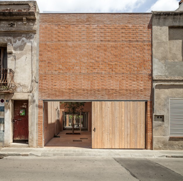
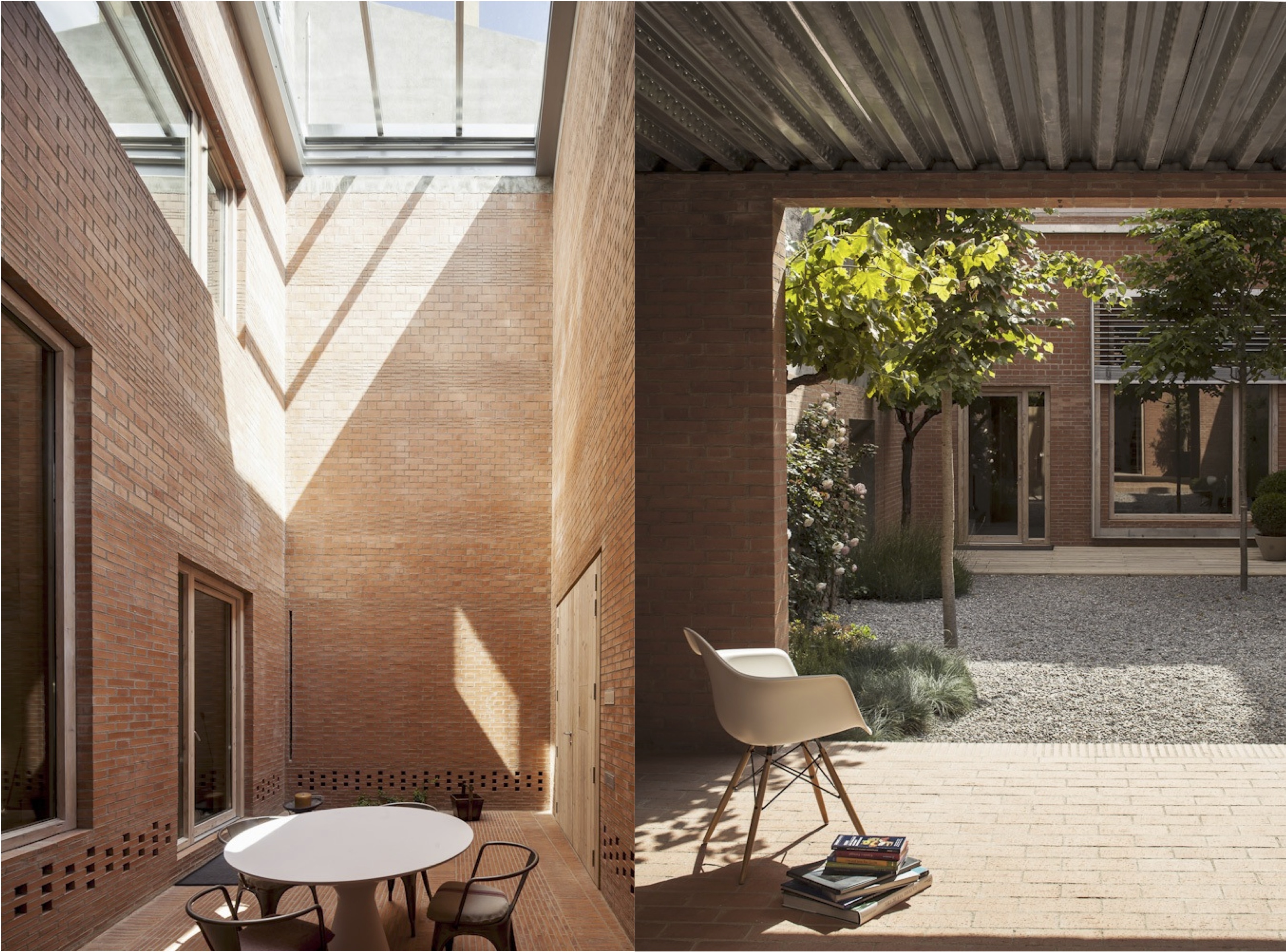
The first thing that struck me about this building was the beautifully proportioned front facade (read my take on composition, here); next, the stratified brickwork – thin linear strips graduating to larger brick sections as the eye travels up the building.
Located in an historical centre but lacking any character of its own, this house also faces the challenge of its narrowness, a 6.5m width. To resolve the problem of getting light in, a series of outdoor spaces create a transition between the rooms, thus becoming rooms themselves. Privacy, solar gain, ventilation and light are all addressed and resolved in one fell swoop. The sequence of spaces also creates a lovely ambiguity about what is an interior and what is an exterior space.
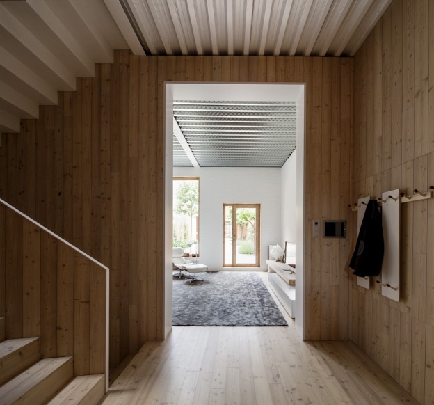
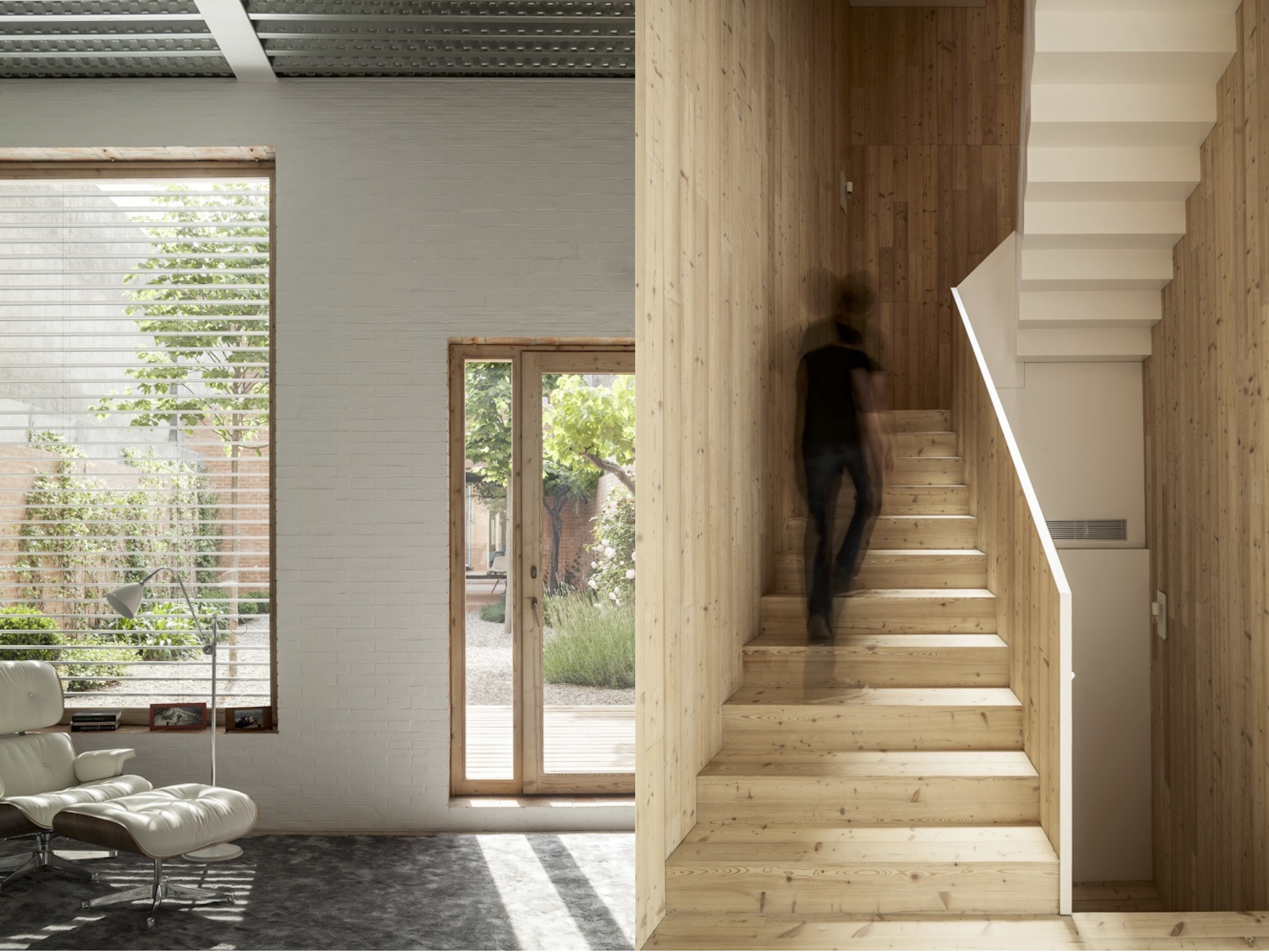
Because the colour and rhythm of the exterior masonry is visible from within, the interior walls are painted white, with just the window reveals left raw. There are simple, pale wood floorboards and an exposed (but beautifully detailed) metal ceiling. Sometimes, the materials are reversed, and the ceiling or walls are lined with wood. The zig zag line of the stair soffit plays against the pattern of the metal ribbed ceiling as it rises up, as well as the rhythm of the wood planks.

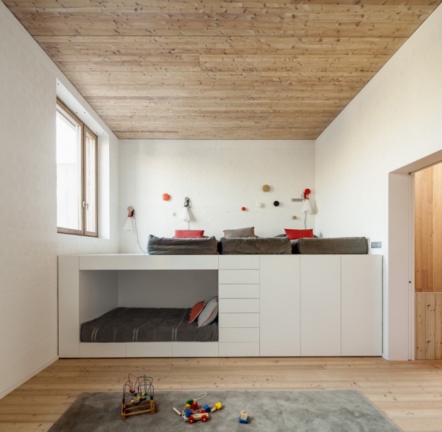
A kid’s room contains a single piece of furniture serving all necessary functions – sleeping, reading and storage.
Perfectly proportioned on the outside, simply and beautifully detailed within.
House 1014 by H Arquitectes, via Photographs: Adrià Goula

Such a beautiful home Jane. I love that the rooms are built with different textured ceilings. Really adds another dimension to the spaces. xD
hi Doris, the ceilings really do add another dimension. i love that each room is so considered and individual, yet each naturally flows into the next. it’s always great to have your thoughts 🙂