Category Archives: in the gallery.

finnish contemporary in france.

The Maison Louis Carré, the eponymously named home of a French art dealer and collector, was designed by master of Finnish modernist architecture (and design hero of mine), Alvar Aalto. Set in the French countryside 60km from Paris, the building and landscaped gardens were designed by Aalto in the late ‘50s, in his characteristically functional, modernist style, using natural materials and organic forms. 

A perfect backdrop, then, for the group exhibition of Finnish contemporary sculptural works by glass artist Laura Laine, textile designer Kustaa Saksi and sculptor and ceramicist Kim Simonsson. 

‘While working with different materials, the artists have a common material approach, presenting works with a three-dimensional feel that perfectly fit with the characterising organic, functionalist atmosphere of the Aalto-designed surroundings.’

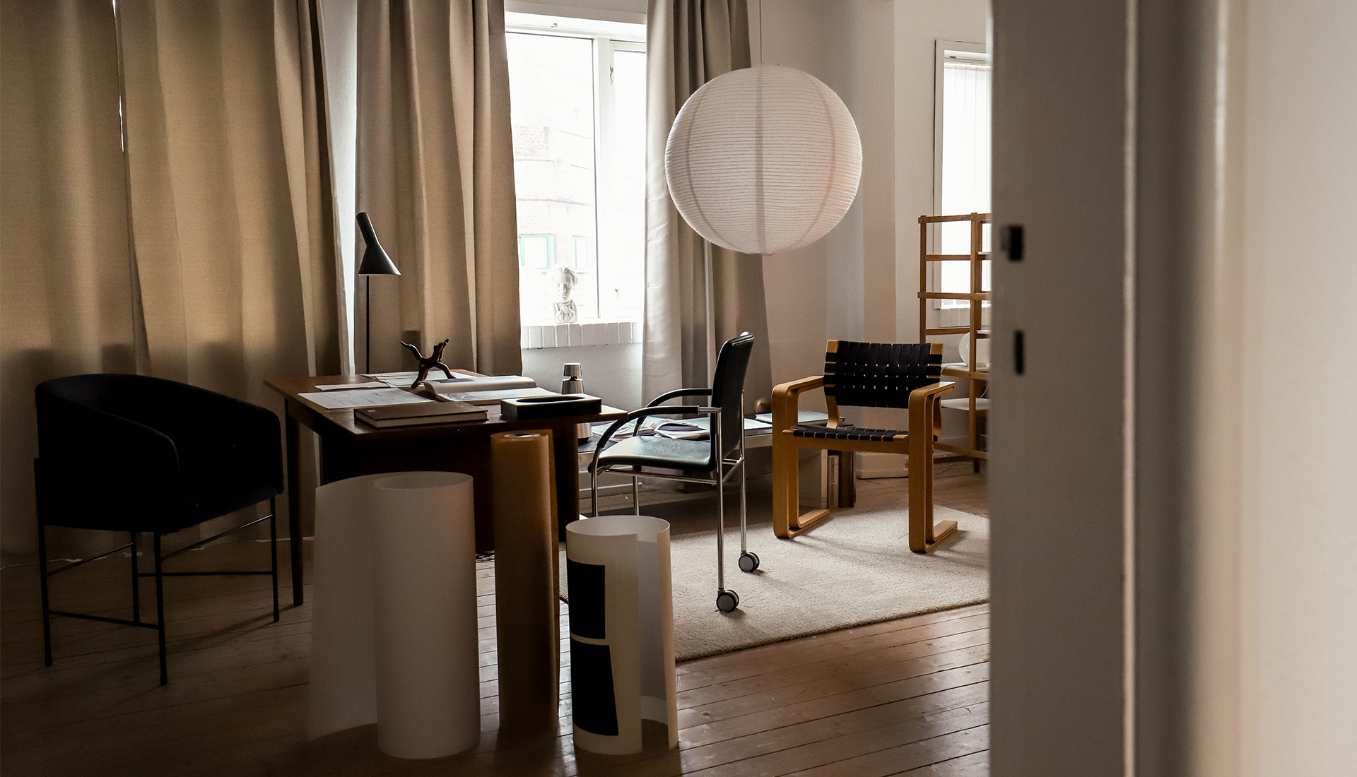
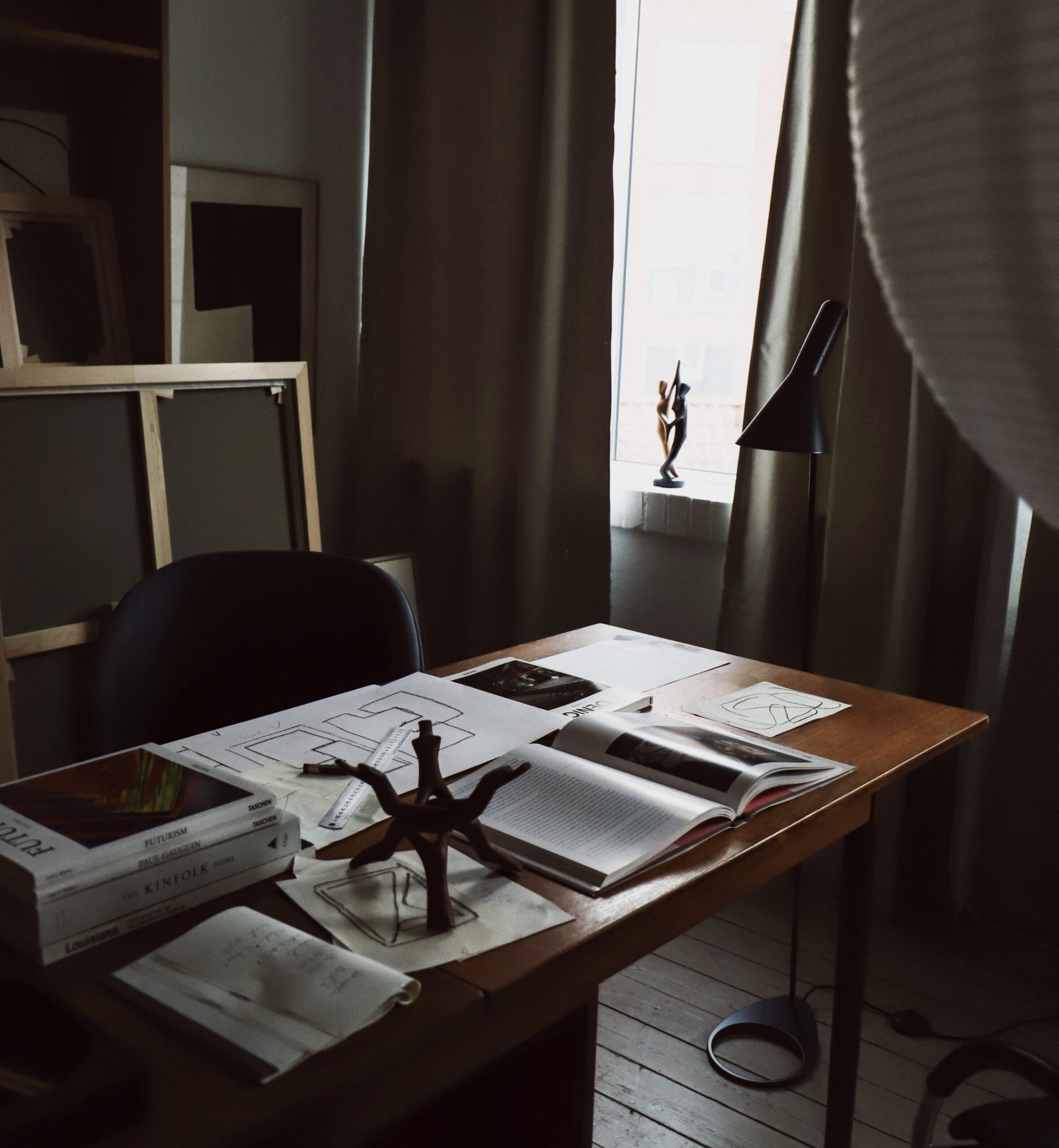
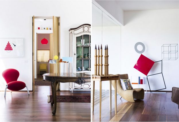
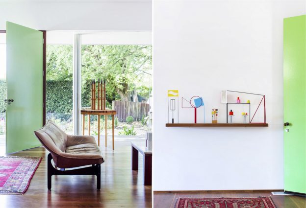
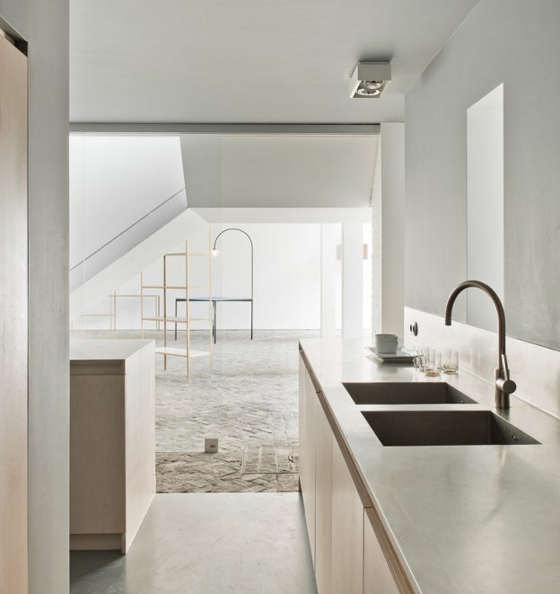
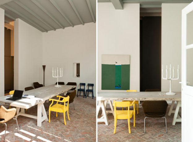
There is something rather wonderful about seeing art and sculpture in a relatable, residential setting rather than the rarefied environment of a white-walled gallery. Aalto’s interiors are typically congenial and light-filled and as was his way, everything down to the light fittings, fixtures and loose furniture were Aalto designed. The house itself emerges from the French countryside, its swooping roof of blue Normandy slate imitating the surrounding landscape, evocative also of the simple form of a Finnish laavu. Walls and base of nearby Chartres limestone create a patchwork with white rendered brick and panels of timber. The pine wood continues within, adding warmth and interest against the expanses of white walls. The roof, a simple but dramatic line when viewed externally, becomes a glorious feature of the large entrance hall on the inside – timber lined, it utilises Aalto’s often used organic curves – as seen in his signature Savoy vase, with its iconic quintet of curves. Column free and with vast expanses of wall for hanging art, this space is the predominant gallery space. The adjoining living room fronts on to the expansive view, with its panorama window, and provides a more intimate domestic setting for the art.

The bespoke light fittings and fixed and moveable furnishings are evident throughout the house, including an early version of Aalto’s Golden Bell pendant light (more Aalto lighting, here), and his classic Stool 60.

Call to the Wild / L’appel de la nature 

Maison Louis Carré, 2 chemin du Saint-Sacrement, 78490 Bazoches-sur-Guyonne, France

20th of June to 29th of November 2020 (advanced booking is necessary).

Photographs: Frederik Vercruysse, with thanks.

modernist works on paper.

I discovered the work of Carsten Nielsen, owner of Bycdesign Studio, on Instagram. Appealing to both my modernist and minimalist sensibiliites, Carsten’s works are simple and geometric in form, bold, and resolutely modern.

Born and raised in Aalborg, Denmark – the ‘Paris of the North’ – inspiration came early, from photographs of buildings and geometric shapes through to mathematical equations. His background is print making and photography, and he only started printing shape and form onto paper and canvas in 2016.

‘The simple lines create a new object fascinates me, and force me to think art in a new way though the simple lines’. 

His inspiration is mid-centry design, both in classic furniture and architecture and modern art. He works from his home studio which forms the perfect backdrop for his works.

bycdesign studio


the hypatia collection.

Good art and beautifully designed chairs. Two of my very favourite things will be brought together in an exhibition by the Madrid-based artist Nikoleta Sekulovic, at Rebecca Hossack gallery in London. 

The Hypatia Collection, named after an Ancient Greek female philosopher famous for being the greatest mathematician and astronomer of her time, consists of ten paintings of female nudes, each seated on a chair from furniture company Viaduct’s collection. Each chair has been personally selected by the sitter. 

The paintings are acrylic and graphite on canvas, in a limited palette of mostly white, greys, black and browns; the soft, muted forms of the figures both contrast with and complement the angular lines of the chairs. I love how the paintings feel both modern and timeless. Nikoleta Sekulovic, Hypatia, 2019, acrylic and graphite on canvas, 180 x 130 cmNikoleta Sekulovic, Nossis of Locri, 2019, acrylic and graphite on canvas, 167 x 150 cmNikoleta Sekulovic, Moero of Byzantium, 2019, acrylic and graphite on canvas, 170 x 125 cm
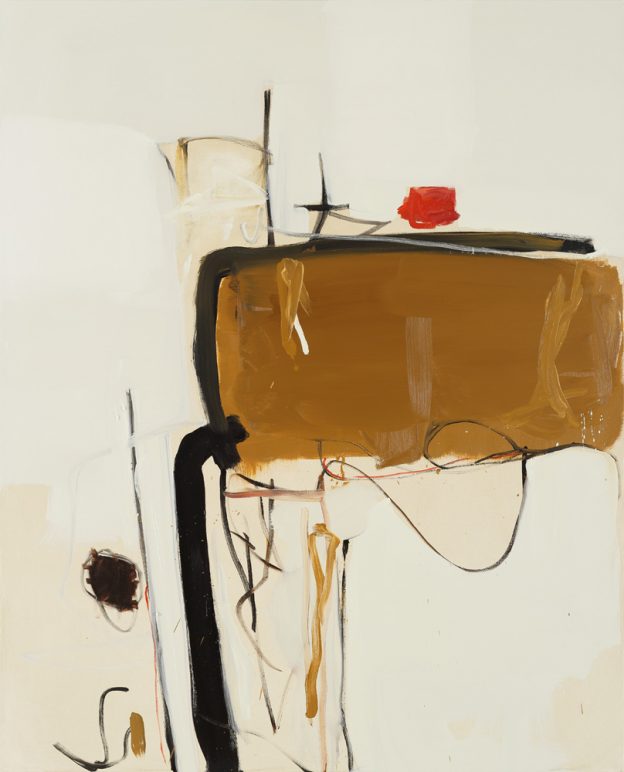
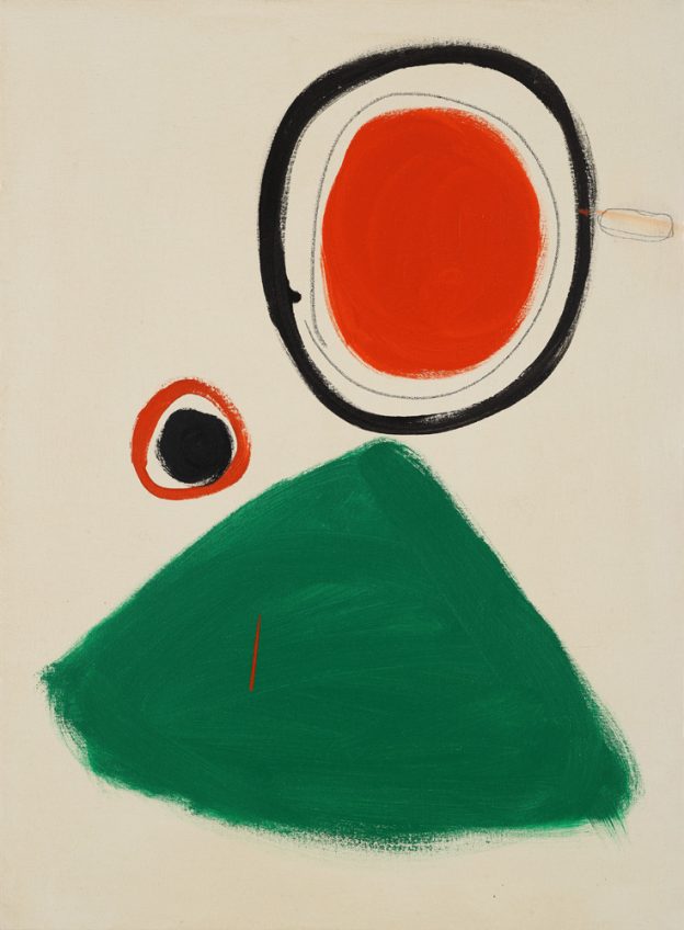
Nikoleta Sekulovic, Anyte of Tagea, 2019, acrylic and graphite on canvas, 160 x 165 cmNikoleta Sekulovic, Aesara of Lucania, 2019, acrylic and graphite on canvas, 150 x 160 cm
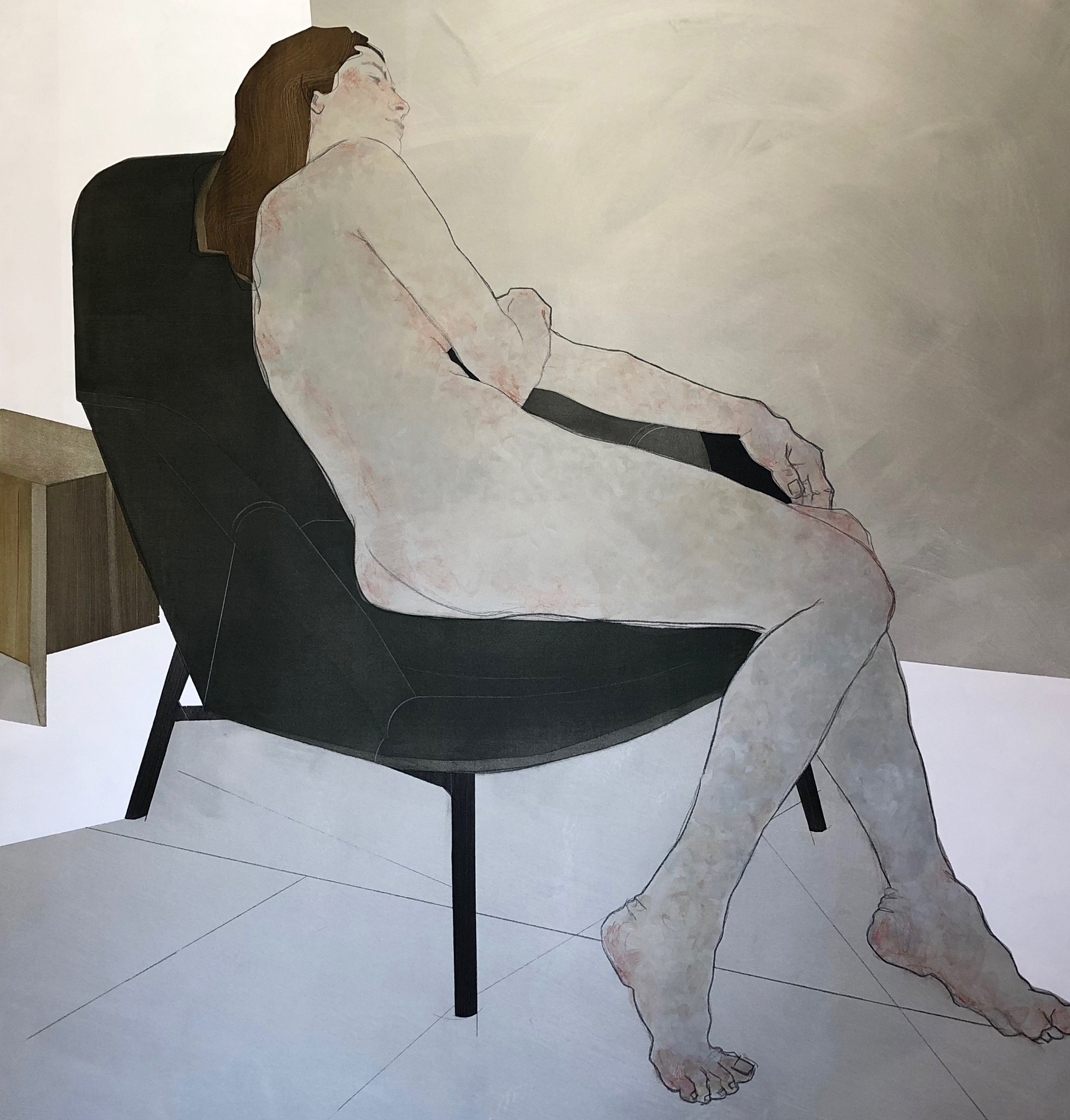
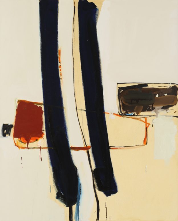
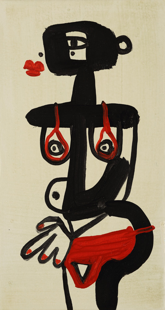
Nikoleta Sekulovic, Porcia Catonis, 2019, acrylic and graphite on canvas, 150 x 175 cm

The models, all known to the artist and all fellow mothers, are given classical titles – the names of ancient Greek female poets and philosophers, and a small historical description of her will be inscribed on the back.

‘…. perhaps the most significant concept behind the combination of a muse and designer furniture is the idea of finding the stillness within, even if it is for a fleeting moment.’ Nikoleta Sekulovic.

The chairs include several of my personal favourites –  He Said chair by Mattiazi, Hiroshima dining chair by Maruni, Tri-Angle stool by Karakter, the enigmatic Eugene lounge chair by E15, amongst others.Nikoleta Sekulovic is an artist presently based in Madrid. Born in Rome to a German mother and a Serbian father, she has worked in London, Paris and New York.

The Hypatia Collection, 28 January – 21 February 2020, Rebecca Hossack Art Gallery, Conway Street, London.

Images courtesy Rebecca Hossack Gallery


the wonderful world of peter d. cole.

Peter D. Cole is known for his wonderfully exuberant and playful works. I discovered him on Instagram, his works colour-bright set against their pure, white background.

His abstract, watercolour paintings and bold, minimal sculptures are firmly rooted in the landscape of his native Australia; a simple vocabulary of singular elements floating on a sea of colour. Forms are broken down to represent the most fundamental elements of sky, earth, sun and moon, picked out in primary reds, vivid yellows, intense blues and other clear, saturated hues.

Displaying the modernist language of his art school training in the mid 1960s, he cites Miro, Calder and González as influences, along with the Constructivists Moholy Nagy and El Lissitzky. Specific works too – Giacometti’s The Palace at 4am and Le Corbusier’s Ronchamp – have informed his sculptural pieces, styled out of powder-coated steel, aluminium, marble and brass.

Peter works from a purpose built studio adjoining his home in country Victoria, having designed both studio and house himself. Influenced by Japanese houses and the natural desire to capture the afternoon breeze, the main house sits on an elevated platform with a simple set of stairs leading to the entrance. The high ceilinged, white walled, light filled rooms offer perfect, gallery-style spaces in which to display his work.

The palette of materials is thus restrained, starting with floors of richly polished timber and walls of glass, creating an almost invisible boundary with the outdoors. Extraneous elements have been removed –  doors are recessed into wall thicknesses or simply framed in wood; junctions abut each other crisply. Elements of singular colour counterbalance the bold hues of Peter’s sculptures. Door handles and drawer pulls were designed and made by the artist, along with many of the light fittings. Furniture is a mix of antique and modern. Marc Newson’s idiosyncratic pieces are stand-outs, from the fabulous Wicker and Embryo chairs to the Super Guppy floor lamp, all of which sit comfortably amongst Peter’s bold, architectural forms.

More about the artist here, and his website, here

Photographs: Sean Fennessy via Peter D. Cole, with thanks.


henrietta dubrey.

I first discovered the work of Henrietta Dubrey at the Affordable Art Fair in Hampstead last year, where one painting – an angular face with jet black hair and black-clad torso, set against a pale blue background – caught my attention. This year, I recognised her work immediately and determined to find out more.

Henrietta trained at the Wimbledon School of Art and then the Royal Academy Schools. Inspiration came from the Middle Generation St Ives painters who followed Barbara Hepworth and Ben Nicholson: Terry Frost, Roger Hilton, Peter Lanyon, Bryan Wynter and Patrick Heron, amongst others. Family holidays in St Ives as a child were a strong influence in this; as was the sea and surf and sandy beaches. She now lives in Cornwall.

Her body of work is both abstract and figurative, with a palette of subdued colour – earthy tones and sky blues. Her abstract paintings are at once calm and energetic, with the occasional jolt of bold colour. Figures are naive and deceptively simple, drawn wth a bold, confident hand and economy of line. I see so many influences, not only the St Ives painters, but international modernists too – Picasso, Miro and the Cubists. I love the simplicity, composition and strong forms.

Henrietta’s extensive body of work can be found on her website, here. She is represented by Edgar Modern, Bath and has an upcoming exhibition at Strover gallery, Cambridge. The Affordable Art Fair, Hampstead, finishes today.

Feature Image: Vocabulary 2017 58 x 156 cms

Early Afternoon 2017 130 x 105 cms
Go For It 2017 38 x 49 cms
Late Afternoon 2017 130 x 105 cms
Messenger 2017 45 x 33 cms
Abstract Woman 2017 79 x 65 cms
Chalky Down 2017 71 x 44 cms
Catalan Dream 2017 55 x 41 cms
Blow Me a Kiss 2017 25 x 13 cms

All images courtesy of the artist.

mvs at gallery valerie traan.

An exhibition of Muller van Severen’s latest skeletal, sculptural forms has just opened at the wonderful Valerie Traan gallery. I’ve previously written about this gallery, which is also home to the gallerist, here (and an interview here).

The gallery comprises a series of indoor and outdoor spaces featuring products by designers and artists, blurring the lines between the disciplines and the environment. The public and semi-private zones are separated by a glass partition and open kitchen, with plywood cabinets, stainless steel surfaces and concrete floor creating a visual transition between the contemporary gallery and the more rustic residence, with that beautiful, original brick herringbone floor.

12ValerieTraan_ohl.08ValerieTraan_ohl.09ValerieTraan_ohl.06ValerieTraan_ohl.Images, Verne Photography, via. Feature image, Muller van Severen

Studies for Office KGDVS Solo House, Muller van Severen, until June 25th, 2016
Gallery Valerie Traan, Reyndersstraat 12, 2000 Antwerp, Belgium

saul leiter in london.

85527. Snow 1960 � Saul Leiter, courtesy of HackelBury Fine Art Howard Greenberg Gallery

An exhibition of Saul Leiter’s wonderful imagery, capturing everyday moments on the streets of mid-century New York, is now showing in London. I previously wrote about his charismatic  photographs here, as well as his colourful paintings, here.

Saul Leiter: Retrospective, The Photographers’ Gallery, 16-18 Ramillies St, London W1F 7LW, until 3 April 2016.

Image: Snow 1960, Saul Leiter, courtesy of HackelBury Fine Art/ Howard Greenberg Gallery

a journey of delight : calder at tate modern.

calder-mobile_ohl.

‘There’s something totally joyous and unpretentious about the work which communicates to people,’ she added. ‘He’s one of the few artists who can sit in both camps: the public and the elite world.’ Farah Nayeri, NY Times

For those who have not lost their childish fascination with colours and shapes, movement and balance, Calder’s work remains a delight and inspiration. There is little darkness in his work, only a restless, fascinated mind, immersed in a journey of delight.

Calder plays it straight. Calder’s work is exactly what it appears to be. The strength of his work is this directness, without subtext; a refreshing lack of hidden meaning. We see Calder’s delicate mercury sculpture sitting with the vast canvas of Guernica in the background; Picasso’s dark genius and Calder’s lightness working brilliantly together. Picasso’s primary themes are those of humanity; Calder’s are of nature; he plays with lines, mass, force and momentum.

Calder emerged in an era when art was still catching up with the discoveries of 19th Century science and the technology of the 20th – not least the moving image. Calder’s work brings movement centre stage into art in a way that surpasses other artists often unsatisfactory attempts of that era to incorporate time (I’m thinking of cubism). Apart, of course, from the most successful new art form of the 20th Century, the movie itself.

Human visual aesthetics is derived from a highly developed appreciation of the body in both movement and poise. Calder’s unflinching preoccupation with mechanics; his exploration of the fine line between balance and movement, his testing of how far a rod or sinew can be stretched and still hold, resonates with what we naturally find beautiful and satisfying.

Calder does all this, and brings it into delicate and playful fusion with the rawness of his materials, the formal language of late Matisse and a touch of the surreality of Miro. I’m going back for more.

calder-horse_ohl.

calder-trapeze_ohl.

calder-balance_ohl.

You can read Farah Nayeri’s article, here:

Alexander Calder: Performing Sculpture, Tate Modern, until 3 April, 2016

Guest post by Jeremy Walker, architect and cardboard sculptor (HeathWalker Studio). Photos: owl’s house london using iPhone 6.

bold, with modernist undertones.

I discovered Louis Reith through Instagram, his images all bold graphics and modernist undertones. Dutch born, Reith has a background in graphic design which is clearly evident in his work, along with his fascination with book design and printed matter.

Crossing media from ink drawing to collage to three-dimensional installations, all works are nevertheless strongly connected, with monochromatic palettes and bold forms. I love the modernist quality, the images and typography from an earlier era abstracted in a new, contemporary way. I can imagine them in a very modern context – big spaces and white walls, or set against a more traditional interior of wood panelling and intimate spaces.

LouisReith_Untitled(Nachttuin15)2014_CollageOfFoundBookPages_20.5x28cm

Untitled, collage of found book pages, 20-5x28cm

LouisReith_Untitled2015_SoilOnWoodenPanel_122x183cm

Untitled 2015 soil on wooden panel, 122x183cm

LouisReith_Untitled2015_SoilOnWoodenPanel_66x122cm

Untitled 2015 soil on wooden panel, 66x122cm

InstallationViewOfArchivASoloExhibitionAtNinasagt.GalerieDüsseldorfDE

Installation view, Archiv, at Nina Sagt Gallerie, Dusseldorf
LouisReith_Untitled(Aarde)2014_SoilOnWoodInstallation_128x189cm
Installation view, Soil on wood, 2014, 128x189cm

More Louis Reith, here.

Feature image: Untitled, collage of found book pages, 20-5x28cm.

All images courtesy of the artist.

lightscape.

A review of James Turrell at Houghton Hall

The role of an artist is to show us the world in a new light. To open our eyes to what we already see.

Turrell is a connoisseur of light and as a pilot is intimate with the sky in all its variance. Here in Norfolk he reveals the subtlety and variety of our maritime sky, the moisture in the air softening the light in a way that would never be seen in Arizona.

Turrell believes our eyes are most suited to seeing at dusk when there is very little light. St Elmo’s Breath is his most ephemeral piece at Houghton and reveals to us that we can see much more than we ever thought possible. The effect is so subtle that at first it is hard to believe you are really seeing anything, but gradually the photons start to accumulate and a silken carpet of red light reveals the space to us.

The poetic rationalism of his work has a strong resonance with the Palladian architecture of Houghton. Models of his work inside a crater in Pasadena reveal platonic volumes hollowed out from the earth which frame the nebulous phenomena of the sky so we might see them afresh.

JWTurrell2_ohl.

turrell-purple_ohl.

James Turrell at Houghton Hall until 24th October 2015.

Guest review by Jeremy Walker, HeathWalker Studio, with thanks. Photographs, owl’s house london.