Category Archives: wonderful spaces.

redefining minimalism in paris.

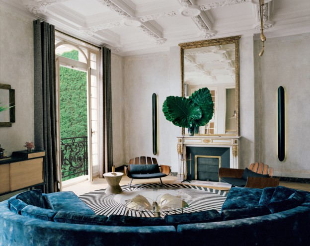
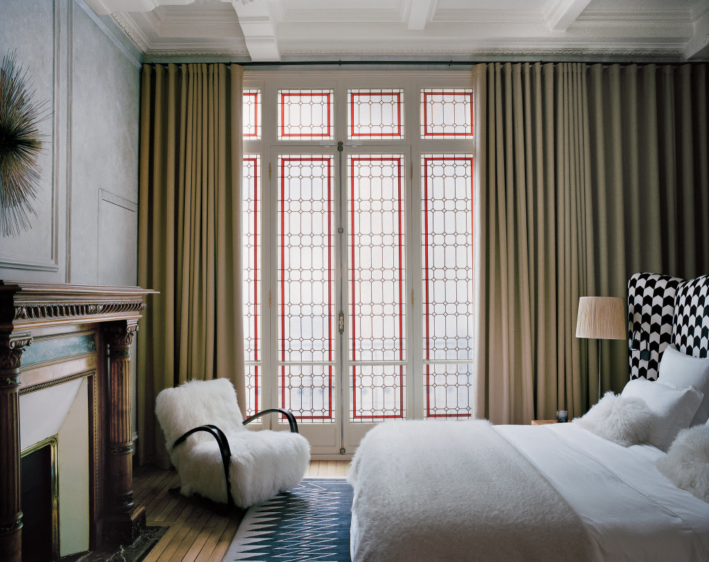
This Parisian apartment mixes classical, period detailing with ‘30s ornamentation, ‘70s retro fun, and contemporary clean lines and modern hues. Located in a typically ornate Haussmann building, the vertical lines of the soaring ceilings are emphasised and enhanced with full-height window treatments and bold paintwork; the curved forms of the furniture and furnishings soften this effect and bring the scale back down to earth.

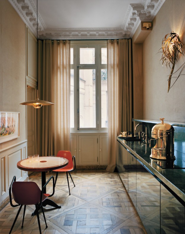
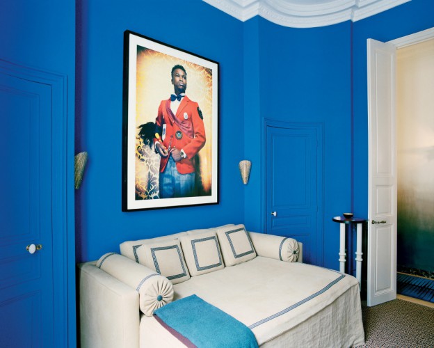
The main walls have a pale grey, distressed finish, with ghosted images of the original panelling. A deep blue, curvaceous sofa dominates the living room, flanked by other low lying, curved pieces. A traditional, glass fronted vitrine containing porcelain figures is lined with non-traditional, tangerine-coloured fabric.The kitchen juxtaposes jade green granite with gold fixtures and original parquet floors. Matt gold walls line a corridor leading to a red bathroom with black marble basin. A guest room is painted out in boldest Majorelle-Blue, the colour named after the French artist of the same name, who was inspired by the colours of Morocco.

studioKo3

studioKo2studioKo5

studioko_ohl.studio-ko-paris-t-magazine-ohl.The apartment is designed by Studio Ko, a Paris based practice known for their minimal aesthetic (see my previous post, here). Featured in the New York Times Style magazine, the article defines the look as ‘spare elegance, with rich colour and quietly luxurious furnishings’. It talks of ‘redefining minimalism’. It is a bold, exuberant look, but minimal too; there are no layers, rather, each piece has space to breathe and stand alone. The colour palette isn’t overly restricted. The pieces work together because of their juxtaposition, and the backdrop serves to unify. It’s light and airy, so there is a feeling of space, even where space is restricted. The look is dramatic, but not dark, so one can inhabit the spaces without resorting to artificial light. I love this style of interior decorating. What about you?

Photos by Francois Halard.

a very modern hotel.

Futurist, modernist, dynamic: the gull-winged TWA terminal at JFK airport is the epitome of mid-century design. Evoking a bird in flight, it is also a force in concrete construction. It was certainly a major influence on me during my architectural studies, as I poured over the images of this and other iconic modernist imagery by architectural photographer Ezra Stoller.

The TWA terminal was the last project by Finnish born architect Eero Saarinen (completed in 1962), who said of it:

All the curves, all the spaces and elements right down to the shape of the signs, display boards, railings and check-in desks were to be of a matching nature. We wanted passengers passing through the building to experience a fully-designed environment, in which each part arises from another and everything belongs to the same formal world.

It is this all inclusive design that gives the building its streamlined, organic quality; everything is considered, everything belongs (I particularly adore the sunken, built-in seating). It is perhaps this that became the building’s downfall; it was unable to adapt and expand.

The terminal is about to undergo a complete refurbishment as a hotel and museum. The photographer Max Touhey was given access to document the building alongside a team of surveyors using 3-D laser scanners. Touhey made 700 photographs, a few hundred of which were bracketed (several exposures of each shot are used to ensure the light is correct), or used in a time lapse video.

twa terminal 03twa terminal 05twa terminal 10twa terminal 02twa terminal 01twa terminal 09twa terminal 07

TWA terminal, Eero Saarinen. Photographs by Max Touhey. Via wired.com; lattimes.com; somewhereiwouldliketolive.com

a pool house of cool, black simplicity.

There is a striking simplicity about this pool house with its sleek, black facade. Laid out symmetrically, it is centred about the pool and a recessed seating area, replete with fireplace and log store. Pocket sliding doors are concealed, but ready if required to separate the building from the outdoors.

The pool itself is a beautiful, elegant thing – it simply drops away as if a puddle had formed on the surface. The pale grey pavers of Belgian bluestone, with their specially aged finish (a combination of flaming and sandblasting) line the pool as well as the surrounding terrace. The building exterior is clad with ash Thermowood – heat-treated timber produced and manufactured in Finland – and finished with 3 layers of an opaque, off-black stain. The properties of this type of wood make it ultimately stable, so it can be used with millimetre precision, unlike timber which will expand and contract and change colour over time.

CD_POOLHOUSE_02-ohl.CD_POOLHOUSE_05-ohl.

CD_POOLHOUSE_08-ohl.CD_POOLHOUSE_12-ohl.CD_POOLHOUSE_09-ohl.CD_POOLHOUSE_15-ohl.

Finely textured, pale- coloured internal walls are a stunning contrast to the black exterior. The monochrome palette continues with fittings and fixtures of dark metal, and a Belgian bluestone water trough, carved out of one solid block and aged afterwards.

All the furniture and hardware in the project is custom designed, except the vintage bench and the fabulous ‘Boomerang’ easy chair by Swedish furniture designer Yngve Ekström, which definitely appeals to my Australian sensibility…

CD Poolhouse by Antwerp-based designer Marc Merckx, with thanks. Photos Dominique Smet

house of the year 2015.

Drawing on classical country houses and Palladio, with Mies van der Rohe restraint and order, and European style courtyards, this house sets a new English country house style, without turning to mid-century language to express itself. David Chipperfield’s Fayland house in Buckinghamshire is Architecture Review’s House of The Year. Better known for his commercial buildings, art galleries and retail stores, his architecture is all about restraint.

A loggia extends across the length of the building, enabling the main living spaces to face the expansive landscape. The floor plan is laid out enfilade, meaning all doors are laid out along a single axis, providing a vista through the entire suite of rooms. This is reminiscent of grand European houses, and a style we use a lot in retail store planning.

1433813_FaylandHouseChipperfield121433810_FaylandHouseChipperfield4 1433811_FaylandHouseChipperfield11 1433816_FaylandHouseChipperfield13 1433817_FaylandHouseChipperfield5 1433819_FaylandHouseChipperfield10

The palette of materials is neutral and luxe – terrazzo floors, exposed concrete ceiling, white marble bathrooms and kitchen. The rooms are lined with the same brick inside and out. The bricks are white, laid with a lime mortar of a similar tone. The technique used – the mortar applied thickly then sponged off – leaves a residue creating a sfumato effect, giving a soft, homogenous look, far from the industrial look of a regular raw brick wall. The details are sublime with nothing extraneous – skirtings, architraves and cornices are not required where junctions between surfaces align with millimetre precision. Dark metal framed windows frame the view and save the palette from feeling anodyne.

What do you think of House of the Year?
Fayland House by David Chipperfield, via Architecture Review.

The RIBA have also announced their winners for 2015, here.

villa altona.

Villa Altona is located on a dramatically sloping site in Sweden, with villas on one side and forest on the other. These site characteristics have clearly generated the form, placement and tones of the building. It is a bold, modern structure, with a low pitch roof, covered in sedum. Designed by The Common Office, it is considered one of Sweden’s most interesting buildings by the Swedish Association of Architects. And it’s for sale.

The interior is almost one continuous room, rising up over several levels, connected by a thinly profiled metal stair. At the top, a large, central retractable skylight (providing access to a roof terrace, of course), fills the interior with light and adds transparency to the building. Light abounds, with window walls everywhere. Family and private zones are separated, or not, with large sliding walls.

villa-altona_ohl.

villa-altona4_ohlvilla-altona3_ohl.villa-altona8_ohl.villa-altona7_ohl.villa-altona2_ohl

Floor and roof slabs are concrete, cast in situ and left raw. Slender steel columns offer support.
A perforated metal floor gives an industrial feel, with the main floor of oak parquet. This is the least successful material to my mind: the sections of parquet too small for the scale of the building. Otherwise the materials are used boldly – stainless steel, mirror, brushed concrete.

What do you think?

Villa Altona, The Common Office, for sale here, via

house of concrete and corten.

Concrete is the predominant material used in this beautifully considered renovation in an otherwise archetypal Victorian terrace in West London.

Cast insitu and finely detailed, it is used for floors, walls and furniture elements. Forming a storage unit or bench, walls and plinths change level or quietly recede, accommodating the day-to-day activities of a family – eating, reading, playing – whilst blurring the traditional division of rooms. The boundary is further blurred between indoor and outdoor spaces with a large window seat projecting into the garden.

The facade is clad in Corten steel with its wonderful rusted, oxide patina. Inside, Grey Elm joinery,  pale walls and brass fixtures also soften the palette and add warmth to the cool, grey concrete.

mxl-ingersoll-web-12_ohl.mxl-ingersoll-web-18_ohl.mxl-ingersoll-web-7_ohl.mxl-ingersoll-web-29a-web.1428664808mxl-ingersoll-web-32_ohl.mxl-ingersoll-web-27_ohl.

Moving up through he building, the existing structure and materials are allowed to coexist with the new. A palette of Douglas Fir floor boards, light coloured walls and exposed brickwork are the basis for a loft extension. A built-in desk extends the width of the study and becomes an open shelf as it wraps around the corner.

To me, this is the perfect solution for contemporary family living. What you think?

More Ingersoll Road by Mclaren Excell, here.

covert house.

CF074314_440

Covert House has been much acclaimed in the architectural press of late. It offers a successful case study for good design despite difficult site demands – the house is mainly underground, restricted by a 3.5 meter height limit and huge boundary setbacks. But equally successful to my mind is the interior. There is too often an overwhelming gap between architecture and interior, with architects neglecting the interior for sake of the big architectural expression, and interior designers having little if any influence over the outside form. Here, the architect owners have embraced both.

Concrete is used outside and in in various forms – cast in situ, left raw, highly polished. In its unfinished state, it provides the perfect backdrop. The imperfections – discolouration and mottling – show the effort and craft involved in making the structure. Light abounds, via light wells and the white and light reflecting surfaces. The effect is elegant and light-handed and the resulting spaces appear calm and domiciliary. Furniture is mostly mid-century and there is a mix of timbers used in the furnishings, and a timber lined bathroom. The only soft surfaces appear to be the upholstery fabrics.

CF074233_440CF074325_440CF074240_440CF074342w2_440CF074368_440

For me, concrete has always been the ultimate building material (more concrete inspiration, here). It can work very successfully in commercial interiors. Here, it is equally successful in a residential setting. What do you think? Would you live here?

Covert House by DHDSA, via The Architects’ Journal. Photographs: Christoffer Rudquist via

Another successful concrete house, here.

apartment of shadow and light.

This apartment in Rome feels light and dark and shadowy, with its monochromatic palette and natural tones. The wonderfully sensual wall finish throughout is a mix of clay and aggregates – essentially refined earth – one of the beautiful, organic finishes of the Italian company Matteo Brioni.

villasciarra2villasciarra1villasciarra6villasciarra5villasciarra7

A dark grey terracotta floor, laid in herringbone pattern, adds a decorative element to the otherwise austere surfaces, as does the beamed ceiling. Raw materials are used to their best effect, the detailing bringing the refinement – a low, linear concrete ledge acts as fireplace and seat; fine metal shelves frame a library wall; a folded metal stair, with mesh panels forming the balustrade, serve their purpose without affectation.

The kitchen combines dark stone, sleek, brushed stainless steel and beautiful, metal framed ribbed glass doors, which work to soften and blur the hard working utility zone. Copper pendant lights lift the monochrome palette.

The choice of furnishings is simple – a mix of mid-century Alvar Aalto, Eames and others.

Villa Sciarra, Rome, by MORQ Architects, via Elle Decor Italia and Matteo Brioni. Photographs, Kasia Gatkowski. There are also some beautiful pictures of the apartment unfurnished, here

milanese home couture.

Design store Spotti Milano’s current showroom interiors are a collaboration with multidisciplinary design studio (and fellow Milanese), Studiopepe. Called Home Couture, these interiors or ‘setups’ are rather beautifully curated vignettes. At first appearing distinctively Italian, they beautifully mix Italian luxe with Scandinavian simplicity and French classic contemporary.

Wall surfaces range from silks to chevron patterned stone to classical mouldings in modern hues. Textures are rich and luxurious, colours are warm and subdued. Sofas, a dining table and chaise by Maxalto share floor space with classic Saarinen pieces – Tulip tables and conference chairs – and Carl Hansen CH25 lounge chairs. Light fittings range from a Jonathan Adler brass chandelier to the classic Serge Mouille floor lamp. images_studiopepe-spotti_ohl05Home-Couture-by-Studiopepe-for-Spotti-Milano_ohl.Home-Couture-by-Studiopepe-for-Spotti-Milano_ohl02Home-Couture-by-Studiopepe-for-Spotti-Milano_ohl03

Next up for Spotti Milano will be a spring collaboration with Raf Simons and Kvadrat. Just another reason I should be heading to Milan, along with Salone del Mobile in April and Expo 2015 in May…

Home Couture by Spotti Milano and Studiopepe, via
Photos: Silvia Rivoltella

house of tallowwood and scandinavian simplicity.

living-room_ohl.Situated in a very typical, coastal Victorian landscape of scrub and tea trees, this house is designed around a courtyard, blurring the lines between outside and in. Throughout, Japanese and Scandinavian influences are evident, from the simple, open plan layout to the beautiful detailing, influx of light, and restrained palette of textures and tones.

The L-shaped building surrounds the courtyard, with master bedroom at one end, and the children’s bedrooms at the other. Between, the open-plan living space leads out onto the terrace, partially sheltered by the overhanging roofline. In a separate pavilion, a studio and guest room is the ultimate garden room, with a fully openable window wall, wood burning stove and high-light windows.

All of the surfaces are lined with wood – a beautiful, pale, honey coloured indiginous eucalyptus called tallowwood. Exposed, laminated oregon beams form the roof structure, the lines continuing down to form a grid of shelving in the open plan living and kitchen spaces. The focal point of the living space is a free standing, dark-grey brick chimney, which contrasts beautifully with the wood; the only other contrast comes from simple white joinery and white mosaic tiled kitchen benchtop.

tallow-wood-kitchen_ohl.shiver_me_timbers-studio-wood-stoveofuro-tub-master-bath_ohl.beds_ohl

Everywhere, fully retractable windows open rooms up to the outside, with clerestory windows bringing even more light in. The simplicity of the design is underpinned by the simple lines of the Scandinavian furniture – Alvar Aalto daybed and stools, Hans Wegner Wishbone chairs, Nanna Ditzel hanging rattan chair and Marimekko textiles. The perfect weekender.

Pirates Bay House, O’Connor + Houle. Photographs, Richard Powers.
Via Interiors we Love, dwell.com