Category Archives: wonderful spaces.

from the archive: a parisian pied-à-terre.

51 rue Raynouard is an apartment block in the16th arrondissement in Paris, designed and built in 1932 by Auguste Perret. Perret is a seminal architect of the 20th century, responsible for heading the re-build of Le Havre post–Second World War (now a World Heritage Site), and for his pioneering use of reinforced concrete. He constructed no. 51 to house his design firm and his family, in an apartment on the top floor. His concern was not so much how his building looked from the ground, but rather how the world outside would appear from his building. Perret  wrote that the apartment ‘is filled with sunlight from dawn to dusk’. Now a listed building, architectural interventions are restricted and the architect owner has refused to make even minor repairs. But he has certainly filled it with pretty things…

paris-match-dining-roomparis-match-living-roomparis-match-bedroomparis-match-banquetteparis-match-bathroom

The walls throughout are lined with French oak panelling in the most beautiful pale honey colour, floors are narrow timber boards of a similar hue and columns are made from stone-blasted concrete, not the marble one would expect of the era.

The furniture is a master-class of design classics. In the dining room, black marble-topped Eero Saarinen table and Eames wire chairs. I spy an AJ floor lamp by Arne Jacobsen and Flos desk lamp. Red Utrecht armchairs by Gerrit Rietveld and his Zig Zag chair sit alongside more modern pieces – Low Pad chairs by Jasper Morrison and a Still coffee table which echoes the circular plaster feature ceiling above. A beautiful, circular stone basin sits within the turquoise-green bathroom.

Modern High Design Pied-à-Terre Paris, via Dwell, here, and ‘One hundred houses for one hundred European Architects’ by Gennaro Postiglione.

Photographs: Hotze Eisma.

Or do you prefer a pared back parisian, here?

brazilian modernism: midcentury furniture in brasilia.

Brazilian modernism is some of the most enigmatic and delightful of the modernist genre, often designed by well known architects of the times – Oscar Niemeyer and Lina Bo Bardi, for example. The forms of their furniture are as iconic as their buildings – strong in form, playful and spirited. 

Here, the owner of specialist gallery Naiara gallery, Neri, shares her thoughts and findings on the best of mid-century Brazilian furniture, and where to find it in Brasilia’s civic buildings.

Furniture making has always been one of the main industries in Brasilia, the capital of Brazil since 1960. Throughout the 1950s Brazil had experienced an economic boom, which expanded the middle classes. As such, there was more demand for furniture. Some of it, like the letter Z-inspired creations of José Zanine Caldas, was made from plywood on assembly lines. This increased its affordability; at the time most residential furniture was still hand-crafted. Around the same time, Michel Arnoult introduced cheap, ready-to-assemble furniture for middle-class interiors. He used finer woods, like imbuia and pau-marfim, in the manufacture.

Little wonder then that Brasilia’s civic buildings contain many fine examples of vintage furniture. The works of top designers like Sergio Rodrigues, Joaquim Tenreiro, Lina Bo Bardi (more Lina Bo Bardi, here), and Anna Maria Niemeyer can all be found here.

Stylish and minimalistic, this beautiful furniture turns administrative interiors into art gallery settings. It’s worth noting though that much of this modernist furniture gets overshadowed by the architecture. You must pass through the exterior walls to glimpse the treasure trove of art and furnishings within.

Here are four government buildings in Brasilia where you can see some of the best examples of Brazilian vintage furniture.

The Palácio da AlvoradaPhotograph: Gonzalo Viramonte

When Juscelino Kubitschek became president in 1955, he revived the idea of building a new capital within Brazil’s interior. He chose Oscar Niemeyer as its architect, and Brasilia was inaugurated as the new capital in 1960.

The first government building constructed was The Palácio da Alvorada, completed in only a year. This magnificent structure has become symbolic of Brazilian modernist architecture. Niemeyer applied principles of simplicity and modernity to the design. The facade is famous for its colonnade of white lancet-tip arches which look like upside-down concrete kites. These same arches inspired the patterning used in the Brasilia chairs and cabinets made by the US furniture maker, Broyhill.

Niemeyer invited Sergio Rodrigues and Joaquim Tenreiro to contribute furniture for The Palácio da Alvorada. And in fact their works grace many other civic buildings he designed. But it was his own daughter, Anna Maria Niemeyer, who did the lion’s share of the interior design. In keeping with the current trends, she chose to combine Persian rugs and antiques with modern designs. The large conference tables, and any other furniture she could not source, she designed herself.

Inside, visitors walk up ramps on plush, deep red carpets. The walls are decorated with tapestries, mirrors, jacaranda panelling and abstract gold tiles. Beside the grand piano stand upholstered, brass-and-leather copies of Mies van der Rohe’s iconic Barcelona chair. Elsewhere on the main floor can be seen copies of Lina Bo Bardi’s Bowl chair, still produced today over six decades later.

Jorge Zalsupin’s unique 1960’s L’Atelier designs are on show here too, as well as at Planalto Palace, all brought in by Oscar Niemeyer. Zalsupin created a bewildering array of one-off chairs, stools, desks and side tables, often in jacaranda rosewood.

Between 2004 and 2006, The Palácio da Alvorada underwent modernisation work. All the furniture and decorative objects were restored to their original condition.

Brasilia Palace Hotel

The Brasilia Palace Hotel was the second Niemeyer building to be completed. In its time, it has played host to such dignitaries as Queen Elizabeth, Dwight Eisenhower, Indira Ghandi and Che Guevara. It was opened in 1958, two years before Brasilia became inaugurated.

The Brasilia Palace Hotel is a work of art in itself, eschewing today’s sterile urban standards. Inside, much of the furniture it houses also has considerable aesthetic appeal. There are the distinctive khaki-coloured womb chairs designed by Eero Saarinen in the 1950s. In the public spaces are provided Bardi Bowl chairs, which were designed by Lina Bo Bardi in 1951. Both vintage designs express modernity and simple functionality and are bold art statements for their time.

Other chairs on display show the same timeless economy of design and structural rigour. Pride of place is given to Oscar Niemeyer’s black rocking chair with its futuristic contours and laminated wood surface. You feel safe rocking in this, as well as very comfortable.

You’ll also find large, plush, wine red Odilon armchairs, which almost swallow you up in comfort. And the ‘Beto’ armchairs designed by Sergio Rodrigues will delight with their chunky jacaranda rosewood arms.

During the latter years of the last century the Brasilia Palace Hotel fell into neglect and disuse. After extensive restoration, it reopened in 2006.

Palácio do Planalto

Photograph: Andrew Prokos

Similar in design to The Palácio da Alvorada, The Palácio do Planalto is the official workplace of the Brazilian president and was opened in 1960. Its large white marble lancet-tip arches give the impression that the building barely touches the ground. As with many other of Brasilia’s government buildings, The Palácio do Planalto underwent restoration between 2009 and 2010. As part of its restoration, the lounge area on the fourth floor is furnished with 1960s modernist Brazilian furniture.

Black leather easy chairs with distinctive sweeping metal supports furnish the reception area. Introduced in 1971, they were the first furniture Niemeyer designed in his long and illustrious career. You’ll also find his famous black Marquesa bench elsewhere in the building, designed with tight half-coils at both ends and a braided wood seat.

Niemeyer also designed one of the very long tables, which can seat 38 ministers, 19 on either side.

A long sweeping white ramp takes visitors from the ground floor to the first. Close by are examples of jacaranda rosewood chairs and stools designed by Sergio Rodrigues.

Itamaraty Palace

Photograph: Yellowtrace

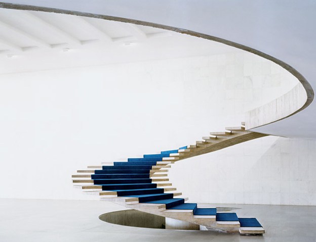
Also known as The Palace of the Arches, this building is the headquarters of Brazil’s Ministry of Foreign Affairs. It looks out onto a large, beautiful water garden and houses one of the largest art collections in Brazil. Itamaraty means ‘river of small stones’ in the ancient Latin American language of Nheengatu.

Inside, there is a monumental 2.3 metre-wide spiral staircase without a bannister. As well as being rich in statues, rugs and other objets d’art, the palace interior houses a selection of Brazilian modernist furniture. Included is the distinctive cane-back ‘Itamaraty’ dining chairs made from indigenous jacaranda hardwood. They were designed by the pioneer of modernist Brazilian furniture, Joaquim Tenreiro, who first made a name for himself in the 1940s.

1  Marquesa chaise, 1974, Oscar Niemeyer and Anna Maria Niemeyer, Espasso; 2.  Itamaraty dining chairs, 1965, Joaquim Tenreiro, 1stDibs; 3.  Lia armchair, 1962, Sergio Rodrigues, Artsy; 4.  Armchair for Linha Z, 1950s, José Zanine Caldas, Pamona; 5.  Cubo chair, Jorge Zalszupin, Naiara Gallery; 6.  Rio rocking chaise, 1970s, Oscar Niemeyer and Anna Maria Niemeyer; 7.  Bowl chair, 1951, Lina Bo Bardi, Arper; 8.  Alta armchair and ottoman, 1971, Oscar Niemeyer and Anna Maria Niemeyer, Espasso

References: Brazil Modern: The Rediscovery of Twentieth-Century Brazilian Furniture, by Aric Chen, published by The Monacelli Press; Itamaraty Palace – About Brasilia & Brazil; In design, Niemeyer also created icons, Casa Vogue, Dec 8th, 2012; BRASILIA 50 ANOS/ The Buildings :: The Palace of the Dawn as Seen by Elizabeth Bishop in August 1958, June 29th, 2010

Founded in 2018, Naiara is a specialist  gallery dedicated to Brazilian midcentury design, showcasing Brazil’s top designers, such as Joaquim Tenreiro, Sergio Rodrigues, Lina Bo Bardi, Jose Zanine Caldas, Jorge Zalszupin, Carlo Hauner & Martin Eisler, Branco & Preto as well as beautifully crafted unassigned designer pieces.

Featured Image, spiral staircase inside the Itamaraty Palace; here.

Some content on this page was disabled on December 5, 2020 as a result of a DMCA takedown notice from Andrew Prokos Photography. You can learn more about the DMCA here:

https://en.support.wordpress.com/copyright-and-the-dmca/

from the archive: intimate spaces, defined.

Since I first wrote about the work of Romain Laprade, he has gone on to photograph campaigns for Isabel Marant, Kinfolk and Aesop amongst others: a dizzying array of exciting brands. His work is stylish and bold, often reminiscent of a movie still, and always distinctive. From the archive – my post from 2017:

Bold, modernist spaces in and around European cities dominate the site of French photographer Romain Laprade. He seeks out the intimate places often forgotten or deemed unimportant – foyers and entry halls – transition spaces that are too often seen as a luxury. It is these spaces that in reality allow a building to breathe, provide a place for occupants to pause, a space to contemplate or to stop and chat before passing through.

Romain started working as a graphic designer, working at French Vogue for 4 years. Now 28, his obsession is photography. The places he has found and photographed – the ones I like the most – are the foyers of modernist buildings from the ‘60s and ‘70s, most often in Paris. These wonderful interiors are rich in colour and texture – black granite cladding inlaid with bronze, or rows of mosaic tiles in bold hues of orange or red; bold concrete forms standing like voluptuous, oversized chess pieces, and floors of verde green marble. All surfaces have been considered – fine, dark bricks laid obliquely adjoin a ceiling of glossy black and red tiles; a vertical screen of rich brown wood opposes perfectly proportioned piers of tiny, matt black mosaic.

rl_paris15_ohl12rl_paris15_ohl13rl_paris15_ohl14rl_avpauldormer_ohl04

Images 1, 2 , 3,  Paris 15; image 4 and feature image, Av. Paul Doumer, 1960, Paris.
rl_2016_brusi_ohl18rl_leperiscope_ohl05rl_lemeridien_ohl15rl_lemeridien_ohl16
Image 5, Carrer de Brusi, Barcelona; image 6, Le persicope, 1972, Paris; images 7, 8, Le Meridien, 1964, Paris.rl_crimee_ohl02rl_creteil_ohl01rl_beaugrenelle_ohl06
 Image 9, Crimée, 1968, Paris; image 10, Créteil; image 11, Beaugrenelle.

See more Romain Laprade imagery, including beautiful fashion photographs for John Galliano and Tomasini Paris, here.

All images, courtesy Romain Laprade.

the tractor shed.

It’s been a good long while since I’ve been here, so I’m starting with a project we completed late last year. I’m very much looking forward to regular postings again.

The Tractor Shed involved the conversion of a dilapidated tractor shed in Hertfordshire into a 4-bedroom home for an artist, including two generous studio spaces.

Approaching the house from the north, the simple, bold openings of the elevation are evocative of the original building with its giant barn doors; the entry though is not here, but through a small porch recess to the side where a last glance of the landscape can be seen through a corner window before entering.

An unfolding sequence of spaces of different scales are tied together with unexpected glimpses between rooms and strong connections to the landscape. On entering the hall, light filters down through rough-sawn oak slats into the hallway below from a skylight at the apex. The dramatic scale of the barn is fully revealed in the main studio and open-plan kitchen. The lowered ceiling height in the adjoining dining area is intimate yet expansive, opening onto the garden and landscape beyond. Adjacent to this is a cosy snug room with deep heather-brown walls, a raised timber floor and wood burning stove. A traditionally proportioned living room with a large picture window to one side is centred around a wood-burning stove set into a herring-bone brick lined recess. Oak floor boards are used to line all surfaces of the the stairwell; this immersion  is interrupted by a glimpse through a cutout slot down to the seating nook below. Split landing levels at first floor allow generous raked ceilings in bedrooms to the south and two smaller scale bedrooms to the north. Eaves are utilised for the most intimate spaces; a dressing room with a slot window down to the main studio and a hidden mezzanine.

A restrained palette of materials is left as natural as possible and evoke the building’s industrial past – polished concrete floors to the living spaces downstairs, an oak-faced plywood kitchen, and solid oak floors upstairs. The  original precast concrete frame is left expressed rather than hidden, and is seen at different scales as one moves through the building. Timber used for the exterior cladding was cut from trees felled from the client’s own land, which he blackened using a blow-torch – after scouring YouTube videos for instruction – creating a soft, variegated effect. 

Tractor Shed by HeathWalker Studio.

Photographs: Adrien Fouéré (@weareurbananimals)


lubetkin’s house.

If you’re the architect of one of the best examples of modernist architecture in this country, then chances are your own apartment – in the same building – is going to be fabulous.

Berthold Lubetkin designed this penthouse as this own home, set atop Highpoint II (Highpoint I had been designed 3 years earlier in 1935) with its panoramic views across London and afar. I wrote about Highpoint I previously, here.

A striking entrance lobby sets the scene, with tiled floor, richly textured, timber-board cladding (a gib door leads to a cloakroom behind), and thick, vertical louvres of sand-blasted Norwegian pine. These striking finishes are bold, almost rustic, an unusual choice within the refined and elegant building. But they are contained, and as such are not allowed to dominate. The views beyond remain the scene-stealer.

The main space is rectilinear, open plan and 12 metres long. A barrel vaulted ceiling forms the double-height space, with lengths of fully retractable glazing extending along both walls. The rich, dark tiled floor contrasts with the white walls and window surrounds; then, more rough-hewn, wide boards of timber clad the walls vertically in the low-ceilinged snug at one end. A slab of creamy travertine beneath the windows on one side forms a continuous seat, the terrace beckoning beyond.

Elsewhere, walls are white and bare, and colour is used boldly but sparingly in tiles and feature walls.

The penthouse is for sale on The Modern house, here.

A Grade 1 listing means that the owner is unable to alter the apartment, but then, why would you want to?

The Lubetkin Penthouse, Highpoint II, London, N6. More, here.

a neapolitan modernist.

If our summer vacation involved a trip to the south of Italy, then this is where I would want to stay.

Built by Italian architect Michele Capobianco in 1964, the aptly named Villa Bianca is all geometric lines and elegance. Perfectly suited to the heat of its southern location, slim, double height columns elevate it high above its already lofty perch on the hills above Naples; the roof over-sailing the floors below, forming shady, travertine-lined terraces to sit and while. The garden too, is a sculptural, lush oasis of palms and grasses.

Inside, the entrance hall is a double volume, airy space, with artworks placed nonchalantly here and there. A stair to one side is flanked by a low wall which rises up to form a gallery at first floor level. All is white and cool. Dark wood adds warmth; tiled floors change pattern and tone depending on which room they inhabit. A secondary, circular stair spirals up, changing floor pattern as it arrives on each level. A beautiful fireplace niche, patterned with hand made brick, offers a place to sit and contemplate.

Simple, rectilinear furniture compliment the simple layout, the palette of dark wood and black leather bringing a sophistication to the mix.

Villa Bianca, Gulf of Naples, Italy, here.

I’ve also been seduced by this beautiful, contemporary farmhouse in Puglia. And I’m still looking forward to visiting this glamorous modernist in Portugal.


a bauhaus vision in white.

Originally designed in 1934 by architect Nachman Kaplansky, Villa Kaplansky demonstrates the clean, geometric lines that were part of the Bauhaus movement’s influence. The exterior, with its linear, three bayed facade sitting on a raised plinth, uses the simple, functional language of the Modernists; the interior, recently remodelled, utilises these forms too, but with a contemporary take on ‘30s modern, adding an air of elegance.

Surfaces are kept pure and white, uninterrupted by skirtings or cornicing. Architraves align with wall planes. Thinly profiled jambs of black metal frame the outside through openings that are low and linear, or perfectly circular. The circle motif appears again and again, from deeply recessed skylights to the spiral stair wrapping itself ribbon-like through the double-height volume. Mirrors are round, as is a fabulous freestanding bathroom basin unit.

Contrast comes from the mid-brown timber joinery, in random width sections adding richness and texture, and mosaic tiles lining horizontal and vertical surfaces in wet areas. Beautiful marmoreal (or engineered marble here) forms the seamless kitchen island and floor surfaces, contrasted with the pale, creamy-pink fluted profile of the joinery units.

Loose furniture is bold with simple lines, from the ‘70s classic Ligne Roset Togo sofa in tan leather, to the Eames lounge chair and LCM dining chairs; to Muller van Severen’s modern classic recliner (more, here).

Beyond the main residence at the back of the garden is another building: a rectilinear, concrete pavilion with circular cutouts. It’s a beauty. (See more, here)

Villa Kaplansky, Antwerp, by B-architecten in collaboration with ByPerez.

Photographer: Frederik Vercruysse, with thanks.


abode.

These beautiful spaces belong to Abode, a waterside development in Greenwich, created by lifestyle magazine-of-the-moment, Cereal magazine.

Not your typical contemporary palette of white and wood, and not an Eames DSW chair in sight, this prototype offers a sophisticated alternative: contemporary and vintage furnishings sit against a backdrop of moody greys and dark-stained woods with granite, brass and poured concrete floors.

The soft, micro-fine wall surfaces have an ultra matt finish and seamless edges, flowing from floor to wall to ceiling, all in smudgy, earth tones. Polished concrete floors run through the open plan spaces, changing to ebony wood in the study. The black stained cupboards of the kitchen run along one wall, extending through the full-height glass and onto the terrace, a built-in BBQ at the far end. A pure white island unit prevents the overall palette from being too subdued, as does the lacquered brass splashback.

Classic pieces of furniture abound, including walnut Cherner dining chairs, Fritz Hansen marble-topped dining table, Charlotte Perriand stools, Bruno Mathsson daybed, and other vintage Scandinavian pieces. Marble plinths, Georg Jensen silverware and bold, modernist artwork complete the elegant, understated look. I’m moving in.

Abode by Cereal magazine and Conran and Partners, London SE10. More, here.


forest house.

Reminiscent of house of 150 trees, this beautiful forest house is situated in a rural region of Gent. Contemporary yet traditional, the Japanese aesthetic of wabi-sabi, which celebrates the imperfect, impermanent, and incomplete, is clearly evident here. Other influences include Frank Lloyd Wright, Carlo Scarpo and Andrea Branzi, who was a friend of the architect owners, Eddy Francois and Caroline de Wolf.

The house, as an extension of its environment, utilises natural, earthy materials. The vertical mullions of solid timber separating the floor to ceiling windows rise like tree trunks; the earth-toned, raw brick floor has the outdoor quality of a forest floor. Concrete soffits line some ceilings, others are wood with exposed beams continuing the line of the mullions. White plasterboard walls float beneath. Skinny brick walls with deeply recessed mortar joints to add texture, become the structure both inside and out.

housewoods05_ohleddy-francois09_ohleddy-francois14_ohlhousewoods03_ohleddy-francois13_ohleddy-francois07_ohleddy-francois10_ohl

Forest House, Gent, by Eddy Francois and Caroline de Wolf.

Photographs 2,3, 6,7,8: Jean-Luc Laloux; image 1,5: Sarah Blee; all others, unknown.

intimate spaces, defined.

Bold, modernist spaces in and around European cities dominate the site of French photographer Romain Laprade. He seeks out the intimate places often forgotten or deemed unimportant – foyers and entry halls – transition spaces that are too often seen as a luxury. It is these spaces that in reality allow a building to breathe, provide a place for occupants to pause, a space to contemplate or to stop and chat before passing through.

Romain started working as a graphic designer, working at French Vogue for 4 years. Now 28, his obsession is photography. The places he has found and photographed – the ones I like the most – are the foyers of modernist buildings from the ‘60s and ‘70s, most often in Paris. These wonderful interiors are rich in colour and texture – black granite cladding inlaid with bronze, or rows of mosaic tiles in bold hues of orange or red; bold concrete forms standing like voluptuous, oversized chess pieces, and floors of verde green marble. All surfaces have been considered – fine, dark bricks laid obliquely adjoin a ceiling of glossy black and red tiles; a vertical screen of rich brown wood opposes perfectly proportioned piers of tiny, matt black mosaic.

rl_paris15_ohl12rl_paris15_ohl13rl_paris15_ohl14rl_avpauldormer_ohl04

Images 1, 2 , 3,  Paris 15; image 4 and feature image, Av. Paul Doumer, 1960, Paris.
rl_2016_brusi_ohl18rl_leperiscope_ohl05rl_lemeridien_ohl15rl_lemeridien_ohl16
Image 5, Carrer de Brusi, Barcelona; image 6, Le persicope, 1972, Paris; images 7, 8, Le Meridien, 1964, Paris.rl_crimee_ohl02rl_creteil_ohl01rl_beaugrenelle_ohl06
 Image 9, Crimée, 1968, Paris; image 10, Créteil; image 11, Beaugrenelle.

See more Romain Laprade imagery, including beautiful fashion photographs for John Galliano and Tomasini Paris, here.

All images, courtesy Romain Laprade.