Tag Archives: design

from the archive: a parisian pied-à-terre.

51 rue Raynouard is an apartment block in the16th arrondissement in Paris, designed and built in 1932 by Auguste Perret. Perret is a seminal architect of the 20th century, responsible for heading the re-build of Le Havre post–Second World War (now a World Heritage Site), and for his pioneering use of reinforced concrete. He constructed no. 51 to house his design firm and his family, in an apartment on the top floor. His concern was not so much how his building looked from the ground, but rather how the world outside would appear from his building. Perret  wrote that the apartment ‘is filled with sunlight from dawn to dusk’. Now a listed building, architectural interventions are restricted and the architect owner has refused to make even minor repairs. But he has certainly filled it with pretty things…

paris-match-dining-roomparis-match-living-roomparis-match-bedroomparis-match-banquetteparis-match-bathroom

The walls throughout are lined with French oak panelling in the most beautiful pale honey colour, floors are narrow timber boards of a similar hue and columns are made from stone-blasted concrete, not the marble one would expect of the era.

The furniture is a master-class of design classics. In the dining room, black marble-topped Eero Saarinen table and Eames wire chairs. I spy an AJ floor lamp by Arne Jacobsen and Flos desk lamp. Red Utrecht armchairs by Gerrit Rietveld and his Zig Zag chair sit alongside more modern pieces – Low Pad chairs by Jasper Morrison and a Still coffee table which echoes the circular plaster feature ceiling above. A beautiful, circular stone basin sits within the turquoise-green bathroom.

Modern High Design Pied-à-Terre Paris, via Dwell, here, and ‘One hundred houses for one hundred European Architects’ by Gennaro Postiglione.

Photographs: Hotze Eisma.

Or do you prefer a pared back parisian, here?

from the archive: lessons in modernism.

If I could be anywhere this coming week it would be Palm Springs for Modernism week and the Palm Springs Art Fair. Palm Springs is of course a modernism enthusiasts’ delight, with its plentiful single and split level homes, all shifting planes and open plan layouts, with big glass sections and cantilevered floors.

Instead, I’m rediscovering the work of one of my favourite proponents of the style, the Melbourne architect and writer Robin Boyd. His work and in particular his writing were hugely influential on me growing up in the suburbs of Melbourne. His two key tomes – Australia’s Home and The Australian Ugliness – defined for me everything that was wrong with suburban living.

One of his best known works is Walsh Street house designed by Boyd for his family in 1957. It now houses the Robin Boyd Foundation and remains in its original condition.

Walshst-backroomWalshst-diningroomWalshst-mezzWalshst-balconyWalshst-kids2Walshst-bathroom

Furnished with pieces designed by Boyd’s contemporaries – Grant Featherston and Clement Meadmore (whom I once met, and visited his home in NY) amongst others – it demonstrates the design principles championed in his books, utilising an introspective layout, with the main house and a separate children’s pavilion facing inwards toward a central courtyard. (This was in direct contrast to the usual model of building a suburban house in the middle of the block).

The finishes are bold and intense – deep, saturated colours and dark-painted brickwork walls; rich red woodwork, glimmering mosaic and even copper (how very contemporary…). Floor-to-ceiling plate glass, soaring ceilings and clerestory windows ensure light and nature are ever present.

An (almost) fitting substitute for a trip to Palm Springs…

Walsh Street House via Photographs, Eve Wilson

the tractor shed.

It’s been a good long while since I’ve been here, so I’m starting with a project we completed late last year. I’m very much looking forward to regular postings again.

The Tractor Shed involved the conversion of a dilapidated tractor shed in Hertfordshire into a 4-bedroom home for an artist, including two generous studio spaces.

Approaching the house from the north, the simple, bold openings of the elevation are evocative of the original building with its giant barn doors; the entry though is not here, but through a small porch recess to the side where a last glance of the landscape can be seen through a corner window before entering.

An unfolding sequence of spaces of different scales are tied together with unexpected glimpses between rooms and strong connections to the landscape. On entering the hall, light filters down through rough-sawn oak slats into the hallway below from a skylight at the apex. The dramatic scale of the barn is fully revealed in the main studio and open-plan kitchen. The lowered ceiling height in the adjoining dining area is intimate yet expansive, opening onto the garden and landscape beyond. Adjacent to this is a cosy snug room with deep heather-brown walls, a raised timber floor and wood burning stove. A traditionally proportioned living room with a large picture window to one side is centred around a wood-burning stove set into a herring-bone brick lined recess. Oak floor boards are used to line all surfaces of the the stairwell; this immersion  is interrupted by a glimpse through a cutout slot down to the seating nook below. Split landing levels at first floor allow generous raked ceilings in bedrooms to the south and two smaller scale bedrooms to the north. Eaves are utilised for the most intimate spaces; a dressing room with a slot window down to the main studio and a hidden mezzanine.

A restrained palette of materials is left as natural as possible and evoke the building’s industrial past – polished concrete floors to the living spaces downstairs, an oak-faced plywood kitchen, and solid oak floors upstairs. The  original precast concrete frame is left expressed rather than hidden, and is seen at different scales as one moves through the building. Timber used for the exterior cladding was cut from trees felled from the client’s own land, which he blackened using a blow-torch – after scouring YouTube videos for instruction – creating a soft, variegated effect. 

Tractor Shed by HeathWalker Studio.

Photographs: Adrien Fouéré (@weareurbananimals)


peter’s house.

petershouse_dining-ohl

I uncovered the beautiful interior of this converted garage whilst researching materials for the transformation of an agricultural building into a residence.

As with all good design, inspiration comes from the context and fabric of the original building, in this case raw brick and blackened steel. A narrow site and desire for natural light has prompted a glass walled atrium to be cut through the three floors. The clever placement of dark mirrors throughout has created a striking effect; not light and bright but spacious and theatrical.

The beautifully considered material palette includes concrete used on vertical as well as horizontal planes, clean, white and grey terrazzo forming the kitchen island and bathroom fittings and walls, and super-wide Dinesen oak floorboards used three ways – as a floor, as a wall, and as a ceiling lining. The blackened steel is used as both perforated panels flanking the stair, and as a wall lining in the double-height kitchen.

petershouse_kitchen-ohlpetershouse_living-ohlpeters-house-by-david-thulstrup-ohl02peters-house-by-david-thulstrup-ohl

Downstairs, furnishings and curtains are strong of form and bold of hue – deep purples, bright reds and vivid yellows show to great effect the form of such classic furniture as the Pierre Paulin Groovy chair and the Rietveld designed Utrecht armchair.

By contrast, the bedroom and study are softened with full height curtains, in a perfect shade of nude blush.

Peter’s House, Copenhagen by Studio David Thulstrup, via

Photographer: Peter Krasilnikoff

m + o 2016: favourite things and new discoveries.

Maison et Objet is the prodigious design fair that occurs bi-annually in Paris as part of Paris Design Week, and I made it back there this September. Below are some favourite things and new discoveries.

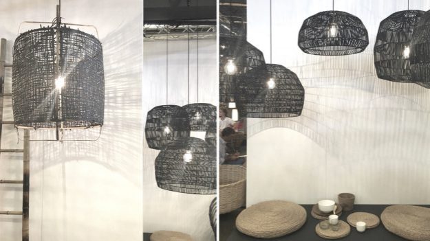
Natural materials where strongly evident throughout the show. Netherlands based Ay illuminate produce lighting and accessories hand-woven from bamboo, sisal and other natural (waste) materials, working with artisans in Asia and Africa. The resulting designs are contemporary,  organic and very desirable.

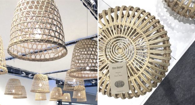
Sika-design have been producing wicker furniture since the ‘50s, and are perhaps best known for their fabulous Hanging Egg chair and simple classic, rattan poufs (which I am supposed to call ’ottoman’).

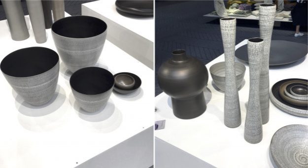
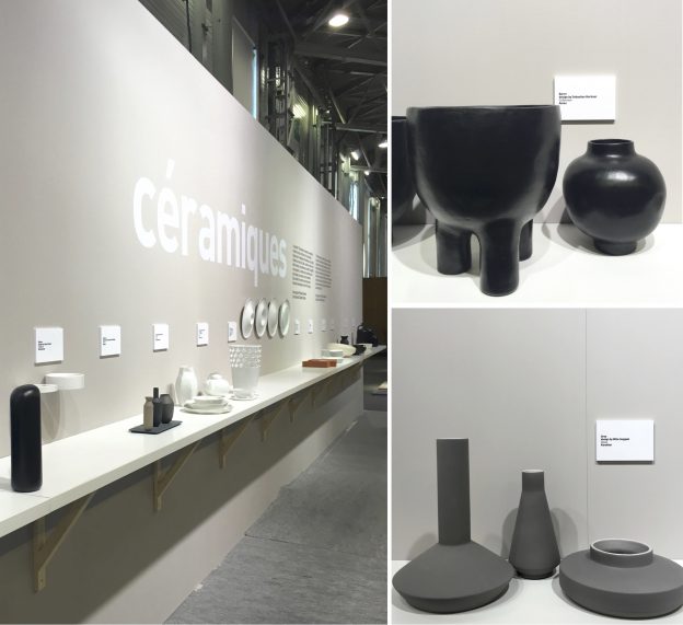
Italian ceramicist Nina Menardi showed a vast collection of elegantly shaped and coloured ceramics, all inspired by nature. My favourite pots were called Barro, made from black terracotta and designed by Sebastian Herkner, who was also the designer behind some fabulous, smoky glass table lamps called Boule, for German brand Pulpo.

Pulpo was a new discovery for me, with the same designer responsible for a glass ceramic side table made of 100% waste material from industrial glass production in shades of ocean blue, polar white and champagne brown. Pulpo also showed striking containers in tinted and silvered glass, giving way to an iridescent effect; a trend also evident at Tom Dixon.

ay-luminate02-mo2016_ohl ay-luminate-mo2016_ohlsilka-design-mo2016_ohlrina-menardi-mo2016_ohlceramiques-m0_ohlpulpo-mo2016_ohl

Images 1 + 2, 3  Ay Illuminate; Images 4 + 5  Sika-design; Images 6 + 7  Nina Menardi; Images 8, 9, 10  Ceramics display / Barro, design by Sebastian Herkner / Grey, design by Milia Seyppel; Images 11 + 12 Boule lamp / Pulpo display.

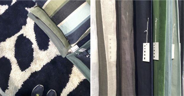
Deep, rich hues of green, yellow and blue prevailed, either as a background colour or in the products themselves. I loved Swedish brand Linum’s Big and Bold collection with strong colours and abstract shapes.

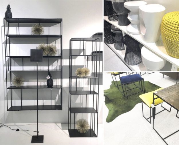
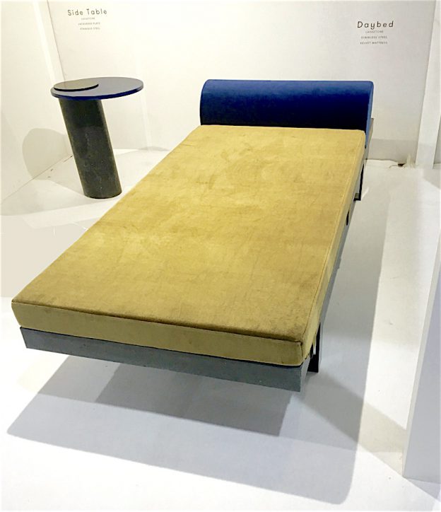
Major Dutch brand Pols Potten have been around for 30 years, producing minimal, everyday products. More mainstream than a lot of Dutch design (which is characteristically quirky and playful – think Moooi and Droog); their products are commercial and always current. The French designer Charlotte Juillard showed a set of stunning bedroom pieces – daybed, side table and mirror – the lava stone bases giving a strength and elegance to the design.

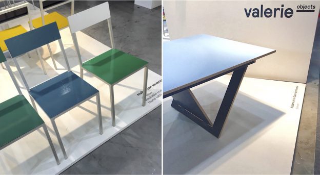
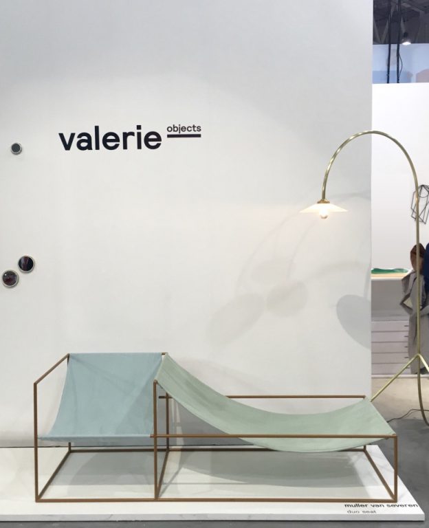
Valerie Objects is an Antwerp based design label who work with designers, architects and artists. I always like the work of Muller van Severen (read previous blog posts, here and here), and was again drawn to the simple lines and clear colours of their products.

linum-mo2106_ohlpols-potten_ohlcharlotte-juillard-mo16_ohlvalerie-object-mo_ohlvalerie-object02-mo16_ohlImages 1 + 2  Linum; Images 3, 4, 5  Pols Potten; Image 6 Charlotte Juillard; Images 7 + 8, 9 Valerie Objects

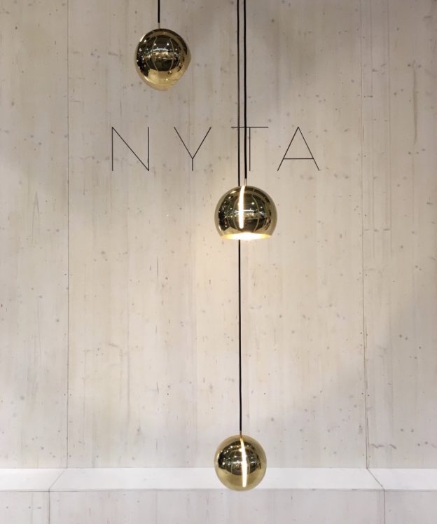
I’m always on the look-out for new and interesting lights. Nyta are a young and dynamic German brand with a small but strong capsule collection. Stalwart DCW Editions are always big on architectural style, and showed my all-time favourite lamp, the Mantis lamp, in all its guises – floor, wall and table. This lamp was originally created in 1951 in homage to Alexander Calder. They also showed the latest incarnation of the classic Gras lamp, the poetic Acrobates de GRAS (a suspended version), and another reedit, Bernard Balas’ Here Comes the Sun from 1970.

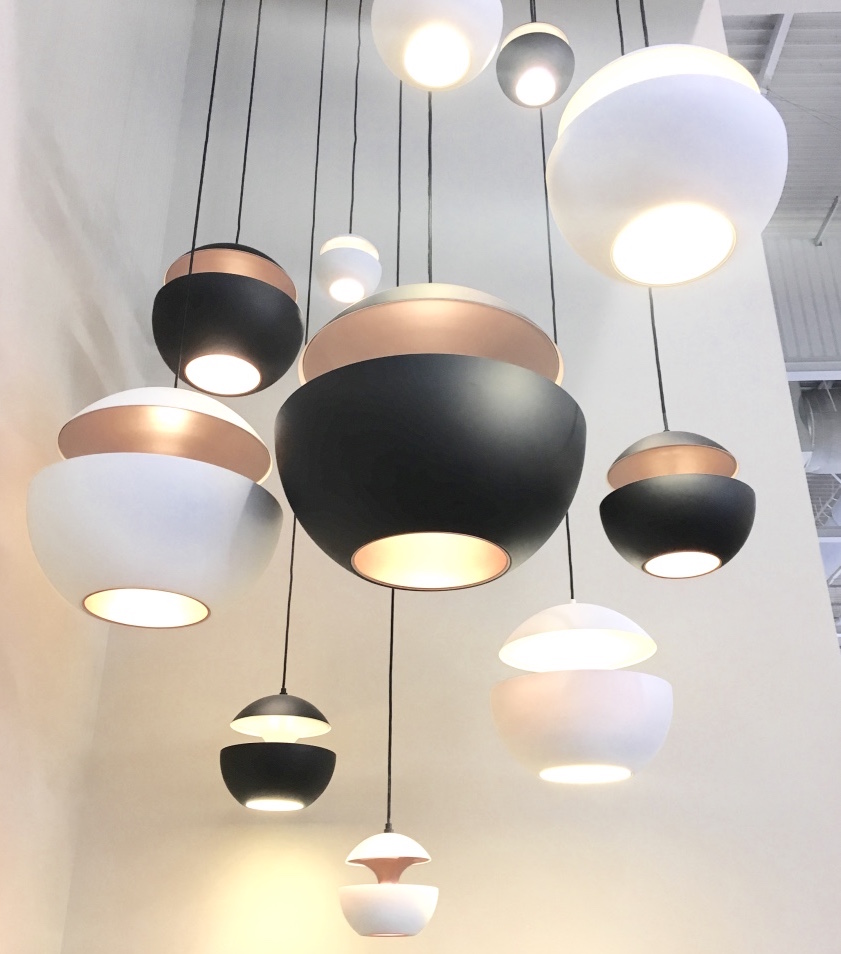
Another Parisian lighting brand, Henri Bursztyn, showed striking, bold forms. Forestier had a strong presence with their decorative fittings showing a definite 1920s and ’30s flavour. This era was also the influence behind Gubi’s latest collection, with the Danish brand’s stand referencing the architecture of the Schindler House (1921), with geometric lines, free-standing screens and lots of oriental fabrics, black chrome and coloured glass.

nyta-mo16_ohlmantis-m+o16_ohl.dcw-editions-mo16_ohlforestier-mo16_ohlhenri-bursztyn_ohl

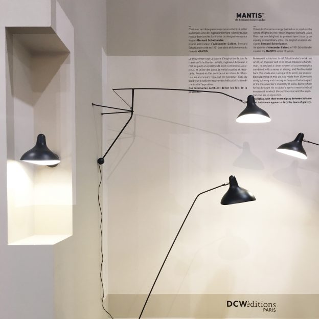
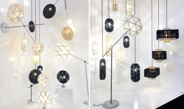
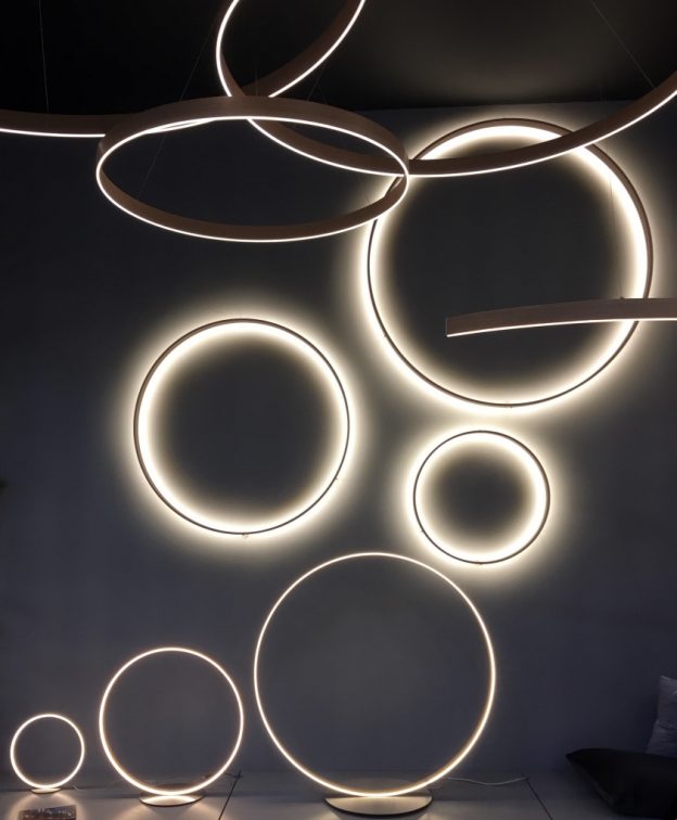
Image 1  Tilt globe, Nyta; Image 2  Mantis, DCW Editions;  Image 3  Here comes the Sun, DCW Editions; Images 4 + 5  Forestier; Image 6  (and feature image) Henri Burstyn

What do you think? Any favourites?

Maison et Objet, Paris, 2-6 September 2016. Next event, January 20-24, 2017.

All photographs, owl’s house london taken with iPhone 6.

serpentine summer.

One of the highlights of summer in London for me is the annual launch of the Serpentine pavilion. Every year, an internationally renowned architect is invited by the Serpentine galleries to create their first built structure in the UK. My personal favourite of the pavilions over the years was the pavilion of Oscar Niemeyer, not least because I managed to score an invitation to the opening night party that year.

Bjarke Ingels’ 2016 pavilion is a beautifully sculpted mass of slender, fibreglass boxes, stacked to form a twisting, tent-like structure. But also this year, four Summer Houses have been added to the program. These architectural follies offer a contemporary interpretation of an adjacent, 18th century Neoclassical summerhouse, Queen Caroline’s Temple. They are on show until October 9th, after which they will be sold off and disassembled. They are for sale, here, with prices ranging from £95,000 to £125,000.

2_nle_serpentine_-_photo_c_iwan_baan_2-1-950x633

1_barkow_leibinger_-_photo_c_iwan_baan_1-1-950x6331_yona_friedman_-_photo_c_iwan_baan_2-1-950x6331_asif_khan_-_image_c_iwan_baan_2-950x633

The Summer House of Berlin studio Barkow Leibinger is designed ‘in the round’ and out of plywood, conceived as a series of structural bands. It’s fun to traverse and sit amongst, with its curving ribbon of wood hovering overhead and twisting back around forming places to rest.

Nigerian architect Kunlé Adeyemi’s summer house is the most literal interpretation of the neo-classical summer house, offering an inverse replica of the original temple in form and proportion. Using prefabricated building blocks of rough sandstone, the composition takes the basic elements of architecture – a room, a doorway and a window – and forms a simple, elegant shelter.

The summer house of Yona Friedman comprises a series of metal rings of differing diameters that can be disassembled and re-assembled to form various compositions. Some of the voids are filled with transparent polycarbonate, most are open. It’s not so much a shelter as a backdrop for display.

Asif Khan has designed his Summer House as a series of undulating vertical posts, whose forms appear to enclose and open up to reveal the view beyond as one passes through. The ground is conceived as a continuous gravel landscape, punctuated by stepping stones. The sound of the gravel offers another dimension to this summer house, which has a wonderful fluidity and to me is the most successful of the four. Though don’t expect it to offer any shelter from this country’s inclement weather.

Serpentine Summer Houses, Hyde Park, until October 9th, 2016.

All images, Iwan Baan, via The Modern House; feature image, owl’s house london Instagram.


a contemporary stable block in white.

Researching barn conversions for a current project led me to this reworked, nineteenth century stable block situated in a lovely bit of rural north Norfolk (and currently for sale, here). For me it’s a perfect example of a conversion that acknowledges its provenance without suffering for it.

The spaces are laid out along the length, each opening onto the tranquil landscape beyond. The long narrow footprint is divided simply into two – living and sleeping – the one open and light filled, the other enclosed and calm. In the living spaces, black floor to ceiling Crittal windows frame the view and maximise the light, opening up completely to create a flowing indoor/outdoor space. A fireplace wall book-ends one side, taking on the vaulted form of the structure.

stable-acre_ohl06stable-acre_ohl.05stable-acre_ohl03stable-acre_ohl.04stable-acre_ohl07

The materials used are simple and locally sourced, including concrete floor, beton brut walls, white painted brickwork, and externally, profiled metal roof and timber cladding. The detailing is refined and carefully crafted. With the materials expressed in their pure form or painted white, texture provides all the decoration that is needed.

Stable Acre, Norfolk by David Kohn Architects. Winner of the RIBA regional award in 2012.

bohemian beauty.

I love the undone quality of this villa. A holiday villa, it lacks pretension and exudes character – exactly how a holiday home should be.

Vernacular elements – white washed walls, shuttered windows and beamed ceilings – set the scene. Then inside, a charming mix of provincial, art deco and midcentury pieces and objet have been brought together. With the exception of the sofa and Bouroullec armchair and ottoman, everything has been sourced second hand. From the brocantes of Paris, to local flea markets and antique shops, an array of wonderful pieces cohabit – pieces by Charlotte Perriand, Pierre Guariche (chairs and lighting), and Eero Saarinen Tulip chairs and tables.

casona_familiar-ohl.casona_familiar2-ohl.casona_familiar4-ohl.casona_familiar5-ohlcasona_familiar3-ohl.

I could happily spend my summer here; what about you?

La Villa Familiar via  Photographs: Gonzalo Machabo


colour play in barcelona.

Located in a typical, turn of the century apartment building in Barcelona is this vibrant interior. Little has been done to alter the layout over the three floors, and views through to the outside are not evident. However, clever cut outs have been created within, offering unusual angles and vistas through from one level to the next.

The most striking element, though, are the colours. Deep forest green, pale salmon, strong white and cobalt blue are used to stunning effect on adjacent as well as distant planes. The result allows each surface to take on a sculptural, stand alone quality, whilst still working together in a sort of Escher-style sum of parts. A surrealist sky above a bathroom void draws the eye up. The overall effect is mesmerising.

casahorta_ohlcasahorta_06-ohl.casahorta_08-ohl.

casahorta_14-ohl.

casahorta_02-ohl.

Apart from the vibrant paintwork, decoration is restricted to the typically colourful tiled floors of the era.

I also love the way colour blocking is used in this interior.

What do you think of this combination of colours?

Casa Horta, Barcelona by Guillermo Santoma. Photography: José Hevia


fabulous fendi.

A hotel should be more than a home away from home. Otherwise, why leave? To my mind, a hotel should be fabulous and luxurious and transport one to a different world, far removed from one’s usual habitat.

The newly opened Fendi hotel in Rome combines fabulous with colour, using the most vivid, intense hues. The luxury brand have reconfigured the 17th-century Palazzo Fendi with three separate architecture firms to create a boutique hotel, their largest store, an art gallery space, an apartment, and a restaurant.

Using elements characteristic of the fashion line – geometry and colour blocking, for example – the hotel has an unmistakably Italian aesthetic. Maintaining the original herringbone wood floors and plaster walls, the look is updated with intense hues and jewel tones of blue and green. The interiors were conceived by Milanese Dimore Studio and architect Marco Costanzi, who have created beautiful details using sumptuous materials.

tk

tk

tk

tk

Classic Italian and modernist pieces abound, too; from a daybed by Gio Ponti, Murano glass chandeliers by Venini, art by Lucio Fontana and Josef Albers.

Fendi Private Suites Hotel via WSJ magazine.