Tag Archives: Louis Poulsen

sorrento simplicity.

Sorrento is a beautiful coastal town on Victoria’s Mornington peninsula, and I have very fond memories of seemingly endless summer days spent on the beach there. This summer house captures the vibe perfectly in its simplicity and feels just about right on these gorgeous, late September days.

Share-Design-Inspiration-Blog-Sorrento-Beach-House-by-Shareen-Joel-Design-06 Share-Design-Inspiration-Blog-Sorrento-Beach-House-by-Shareen-Joel-Design-04 sorrento-simplicity2_ohl sorrento-simplicity_ohl.
Natural materials reflect the surrounding landscape with timber floorboards, in this case Fir with a white oil finish, and the woody exterior, stained black. Clean white walls reflect the coastal light, with texture provided by the timber lined ceilings, again kept white. The living spaces are open plan with the clever insertion of a log-burning stove and bank of cupboards on one side, and kitchen units on the other. The joinery is kept consistent throughout – white cabinetry and palest grey glass mosaic tiles adding texture and tone wherever a waterproof surface is required. Built-in shelves and a low ledge behind the bed are always a good idea. A second bathroom is kept simple with panels of ply and a reclaimed metal trough.

Scandinavian classics are plentiful with low-slung leather armchairs, Louis Poulsen’s PH5 light, and lots of pieces by Hay and Iittala.

House in Sorrento by Shareen Joel Design. Photographs, Brooke Holm. Via

old, iconic and new :: a stool and a light.

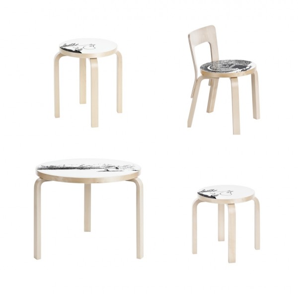
Having grown up in Australia, I made my first acquaintance with the Moomins rather later than my Swedish/Finnish counterparts. Enchanted still, I love the expressive, stylised images and beautiful linework of Tove Jansson’s illustrations, not to mention the characters themselves. Alvar Aalto stools are the archetypal stool (I have two, and they won’t be my last). Finnish brand Artek is releasing four pieces from the Aalto collection with Moomin characters lolloping across the face. Table 90B, Stool 60, Children’s Stool NE60 and Children’s chair N65 are all participating.  More Artek re-releases from an earlier post, here. More from Artek, here.

artek_moomins_four-ohl

Another exciting re-issue, Louis Poulsen’s wonderful, iconic PH5 (I wrote about a perfect pendant, here) has been released with new colour combinations, including coconut white, army green/dark grey, dark grey/turquoise and wasabi green. The spacers which hold the shades in position are finished in bronze, and they are all a soft, matt finish.

poulsen_artek_four-ohl

I love the soft coconut white-on-white, and the dark grey/turquoise; what about you? More, here.

Also love this round-up of five modern design icons in Dwell, including Eero Aarnio and Lina Bo Bardi, here.

a light called artichoke.

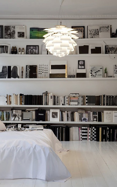
Louis Poulsen, purveyor of light fittings, produces some true classics. Icons of Scandinavian mid century design, ubiquitous and recognisable everywhere. I came across these new images for Louis Poulsen’s latest catalogue and simply could not resist. So I thought I’d first do a little research…

Perhaps the two most distinctive, the wonderfully named Artichoke and the rather more dry PH5 were both designed in 1958 by Dane Poul Henningsen. He was an architect and critic, but his main focus was lighting and he collaborated with Louis Poulsen over his career. He designed not just aesthetically, but scientifically, using refraction to create soft, glare-free lighting. He grew up with petroleum lamps, and, with the advent of harsh electrical lighting in the 1920s, his objective turned to creating an ambient, warm glow rather than to ‘flood the home with light’. His first design was a three sided lamp of brass and opal glass, exhibited in the Danish Pavillion at the Paris Exposition of Decorative Arts in 1924. It was picked up by his peers and used internationally by amongst others, Mies van der Rohe in his Villa Tugendhat. The first PH lamp.

Image Villa Tugendhat

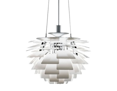
The PH Artichoke is characterised by 72 leaves forming 12 rows of 6 leaves each, which are positioned to provide 360 degree glare-free light when viewed from any angle. They also shield the  light source, redirecting and reflecting the light onto the underlying leaves. The result is a luminous glow.

The PH5 was developed as a response to constant changes to the shape and size of incandescent bulbs by bulb manufacturers of the time. The light produced is also glare-free regardless of where it is positioned, the multiple concentric shades emitting the light both downward and laterally. A version designed for use with energy saving lamps was introduced in 1994, and the PH50, in high gloss colours for the 50th anniversary.

Photographed by Jacob Termansen. Images Elle Decor.

Two very distinctive designs, one designer. What do you think? Unique and individual, or ubiquitous and much-copied?