Tag Archives: Danish design

a danish shelter in black.

We all seem to respond to the idea of living more simply and in closer proximity to nature. Like the cabins I wrote about in the NZ wilderness (here), these shelters offer a pared-back environment, but very little, if anything, is compromised.

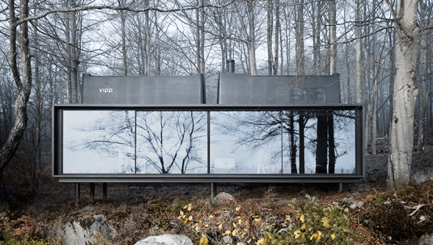
Vipp Shelter is a 55m2 cabin comprising living, bathing and eating areas, and sleeping for 4. They are prefabricated in Denmark and brought to site – anywhere in the world you happen to own a piece of wilderness – where they are erected in a few days. The facade is sheet metal, fully insulated and painted black. And everything is included. There is a complete kitchen, in matt black, with Vipp fittings and all cutlery, kitchen utensils and plates. A fully functioning bathroom, with towels. The sleeping loft has an integrated bed with bedding. All lighting is included. A functioning fireplace, floor heating.

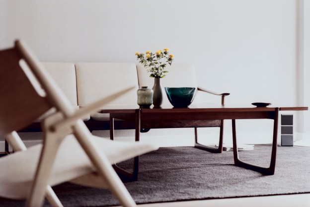
The interior aesthetic is contemporary Danish; like a Vipp bin the vibe is modern – not minimal, but clean and industrial. But unlike a Vipp bin, there is no choice of colour. As Henry Ford said, you can have any colour so long as it’s black.

vipp-shelter-morten-bo-jensen-ohl3vipp-shelter-morten-bo-jensen-ohl.vipp-shelter-morten-bo-jensen-ohl2vipp-shelter-morten-bo-jensen-ohl3Which cabin would you own?

More about Vipp Shelter, here. Photographs, via

capturing a moment.

Most often a photographer of fashion and beautiful women, Carsten Witte’s current work focuses on the cycle of beauty and transience. His flawless and perfect women seem to be captured ‘like in a butterfly collection, forever preserved on the crest of their perfection’; caught at the moment before beauty is lost.

His interior photographs for me also appear to capture a moment – the point just before someone enters the room, or the point just after someone has left. Quietly, serenely captivating.

DanishDesign02DanishDesign03DanishDesign04DanishDesign01DanishDesign5

More Carsten Witte, here

More in the gallery, here

a light called artichoke.

Louis Poulsen, purveyor of light fittings, produces some true classics. Icons of Scandinavian mid century design, ubiquitous and recognisable everywhere. I came across these new images for Louis Poulsen’s latest catalogue and simply could not resist. So I thought I’d first do a little research…

Perhaps the two most distinctive, the wonderfully named Artichoke and the rather more dry PH5 were both designed in 1958 by Dane Poul Henningsen. He was an architect and critic, but his main focus was lighting and he collaborated with Louis Poulsen over his career. He designed not just aesthetically, but scientifically, using refraction to create soft, glare-free lighting. He grew up with petroleum lamps, and, with the advent of harsh electrical lighting in the 1920s, his objective turned to creating an ambient, warm glow rather than to ‘flood the home with light’. His first design was a three sided lamp of brass and opal glass, exhibited in the Danish Pavillion at the Paris Exposition of Decorative Arts in 1924. It was picked up by his peers and used internationally by amongst others, Mies van der Rohe in his Villa Tugendhat. The first PH lamp.

Image Villa Tugendhat

The PH Artichoke is characterised by 72 leaves forming 12 rows of 6 leaves each, which are positioned to provide 360 degree glare-free light when viewed from any angle. They also shield the  light source, redirecting and reflecting the light onto the underlying leaves. The result is a luminous glow.

The PH5 was developed as a response to constant changes to the shape and size of incandescent bulbs by bulb manufacturers of the time. The light produced is also glare-free regardless of where it is positioned, the multiple concentric shades emitting the light both downward and laterally. A version designed for use with energy saving lamps was introduced in 1994, and the PH50, in high gloss colours for the 50th anniversary.

Photographed by Jacob Termansen. Images Elle Decor.

Two very distinctive designs, one designer. What do you think? Unique and individual, or ubiquitous and much-copied?

a danish home.

I don’t think anyone does a sublime white interior better than the Danes, and this one is exemplar. It is a turn-of-the-century apartment near Copenhagen; the white backdrop with pale wood floors and white wash of classic features is all calmness and serenity. It is minimal yet inviting. Warmth eminates all around, in texture and tone. Materials are kept natural, textiles neutral. All images The Guardian

I spy…

… design classics: Carl Hansen‘s 008 coffee table + Hans Wegner CH25 armchair; Eames DSR chair; Fritz Hansen Grand Prix chairs; Catifa chair by Arper; Tolomeo floor and desk lamp, Artemide. Bits + pieces, by nord

I could happily dwell here, could you ?

Photographs Heide Lerkenfeldt