Brazilian modernism is some of the most enigmatic and delightful of the modernist genre, often designed by well known architects of the times – Oscar Niemeyer and Lina Bo Bardi, for example. The forms of their furniture are as iconic as their buildings – strong in form, playful and spirited.
Here, the owner of specialist gallery Naiara gallery, Neri, shares her thoughts and findings on the best of mid-century Brazilian furniture, and where to find it in Brasilia’s civic buildings.
Furniture making has always been one of the main industries in Brasilia, the capital of Brazil since 1960. Throughout the 1950s Brazil had experienced an economic boom, which expanded the middle classes. As such, there was more demand for furniture. Some of it, like the letter Z-inspired creations of José Zanine Caldas, was made from plywood on assembly lines. This increased its affordability; at the time most residential furniture was still hand-crafted. Around the same time, Michel Arnoult introduced cheap, ready-to-assemble furniture for middle-class interiors. He used finer woods, like imbuia and pau-marfim, in the manufacture.
Little wonder then that Brasilia’s civic buildings contain many fine examples of vintage furniture. The works of top designers like Sergio Rodrigues, Joaquim Tenreiro, Lina Bo Bardi (more Lina Bo Bardi, here), and Anna Maria Niemeyer can all be found here.
Stylish and minimalistic, this beautiful furniture turns administrative interiors into art gallery settings. It’s worth noting though that much of this modernist furniture gets overshadowed by the architecture. You must pass through the exterior walls to glimpse the treasure trove of art and furnishings within.
Here are four government buildings in Brasilia where you can see some of the best examples of Brazilian vintage furniture.
The Palácio da Alvorada Photograph: Gonzalo Viramonte
When Juscelino Kubitschek became president in 1955, he revived the idea of building a new capital within Brazil’s interior. He chose Oscar Niemeyer as its architect, and Brasilia was inaugurated as the new capital in 1960.
The first government building constructed was The Palácio da Alvorada, completed in only a year. This magnificent structure has become symbolic of Brazilian modernist architecture. Niemeyer applied principles of simplicity and modernity to the design. The facade is famous for its colonnade of white lancet-tip arches which look like upside-down concrete kites. These same arches inspired the patterning used in the Brasilia chairs and cabinets made by the US furniture maker, Broyhill.
Niemeyer invited Sergio Rodrigues and Joaquim Tenreiro to contribute furniture for The Palácio da Alvorada. And in fact their works grace many other civic buildings he designed. But it was his own daughter, Anna Maria Niemeyer, who did the lion’s share of the interior design. In keeping with the current trends, she chose to combine Persian rugs and antiques with modern designs. The large conference tables, and any other furniture she could not source, she designed herself.
Inside, visitors walk up ramps on plush, deep red carpets. The walls are decorated with tapestries, mirrors, jacaranda panelling and abstract gold tiles. Beside the grand piano stand upholstered, brass-and-leather copies of Mies van der Rohe’s iconic Barcelona chair. Elsewhere on the main floor can be seen copies of Lina Bo Bardi’s Bowl chair, still produced today over six decades later.
Jorge Zalsupin’s unique 1960’s L’Atelier designs are on show here too, as well as at Planalto Palace, all brought in by Oscar Niemeyer. Zalsupin created a bewildering array of one-off chairs, stools, desks and side tables, often in jacaranda rosewood.
Between 2004 and 2006, The Palácio da Alvorada underwent modernisation work. All the furniture and decorative objects were restored to their original condition.
Brasilia Palace Hotel
The Brasilia Palace Hotel was the second Niemeyer building to be completed. In its time, it has played host to such dignitaries as Queen Elizabeth, Dwight Eisenhower, Indira Ghandi and Che Guevara. It was opened in 1958, two years before Brasilia became inaugurated.
The Brasilia Palace Hotel is a work of art in itself, eschewing today’s sterile urban standards. Inside, much of the furniture it houses also has considerable aesthetic appeal. There are the distinctive khaki-coloured womb chairs designed by Eero Saarinen in the 1950s. In the public spaces are provided Bardi Bowl chairs, which were designed by Lina Bo Bardi in 1951. Both vintage designs express modernity and simple functionality and are bold art statements for their time.
Other chairs on display show the same timeless economy of design and structural rigour. Pride of place is given to Oscar Niemeyer’s black rocking chair with its futuristic contours and laminated wood surface. You feel safe rocking in this, as well as very comfortable.
You’ll also find large, plush, wine red Odilon armchairs, which almost swallow you up in comfort. And the ‘Beto’ armchairs designed by Sergio Rodrigues will delight with their chunky jacaranda rosewood arms.
During the latter years of the last century the Brasilia Palace Hotel fell into neglect and disuse. After extensive restoration, it reopened in 2006.
Palácio do Planalto
Photograph: Andrew Prokos
Similar in design to The Palácio da Alvorada, The Palácio do Planalto is the official workplace of the Brazilian president and was opened in 1960. Its large white marble lancet-tip arches give the impression that the building barely touches the ground. As with many other of Brasilia’s government buildings, The Palácio do Planalto underwent restoration between 2009 and 2010. As part of its restoration, the lounge area on the fourth floor is furnished with 1960s modernist Brazilian furniture.
Black leather easy chairs with distinctive sweeping metal supports furnish the reception area. Introduced in 1971, they were the first furniture Niemeyer designed in his long and illustrious career. You’ll also find his famous black Marquesa bench elsewhere in the building, designed with tight half-coils at both ends and a braided wood seat.
Niemeyer also designed one of the very long tables, which can seat 38 ministers, 19 on either side.
A long sweeping white ramp takes visitors from the ground floor to the first. Close by are examples of jacaranda rosewood chairs and stools designed by Sergio Rodrigues.
Itamaraty Palace
Photograph: Yellowtrace
Also known as The Palace of the Arches, this building is the headquarters of Brazil’s Ministry of Foreign Affairs. It looks out onto a large, beautiful water garden and houses one of the largest art collections in Brazil. Itamaraty means ‘river of small stones’ in the ancient Latin American language of Nheengatu.
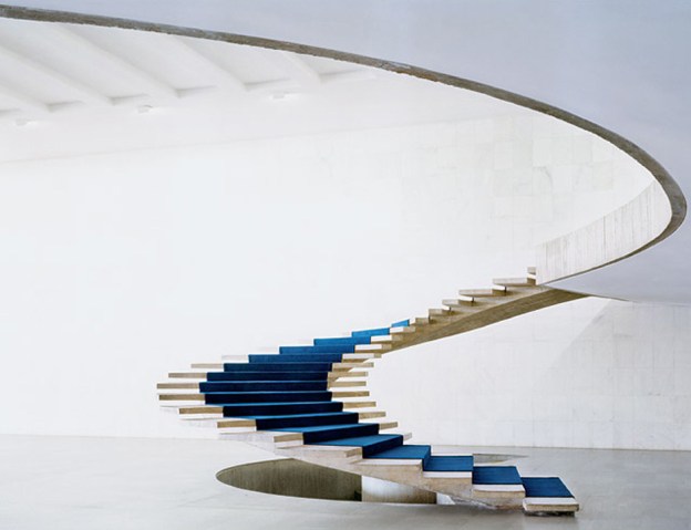
Inside, there is a monumental 2.3 metre-wide spiral staircase without a bannister. As well as being rich in statues, rugs and other objets d’art, the palace interior houses a selection of Brazilian modernist furniture. Included is the distinctive cane-back ‘Itamaraty’ dining chairs made from indigenous jacaranda hardwood. They were designed by the pioneer of modernist Brazilian furniture, Joaquim Tenreiro, who first made a name for himself in the 1940s.
1 Marquesa chaise, 1974, Oscar Niemeyer and Anna Maria Niemeyer, Espasso; 2. Itamaraty dining chairs, 1965, Joaquim Tenreiro, 1stDibs; 3. Lia armchair, 1962, Sergio Rodrigues, Artsy; 4. Armchair for Linha Z, 1950s, José Zanine Caldas, Pamona; 5. Cubo chair, Jorge Zalszupin, Naiara Gallery; 6. Rio rocking chaise, 1970s, Oscar Niemeyer and Anna Maria Niemeyer; 7. Bowl chair, 1951, Lina Bo Bardi, Arper; 8. Alta armchair and ottoman, 1971, Oscar Niemeyer and Anna Maria Niemeyer, Espasso
References: Brazil Modern: The Rediscovery of Twentieth-Century Brazilian Furniture, by Aric Chen, published by The Monacelli Press; Itamaraty Palace – About Brasilia & Brazil; In design, Niemeyer also created icons, Casa Vogue, Dec 8th, 2012; BRASILIA 50 ANOS/ The Buildings :: The Palace of the Dawn as Seen by Elizabeth Bishop in August 1958, June 29th, 2010
Founded in 2018, Naiara is a specialist gallery dedicated to Brazilian midcentury design, showcasing Brazil’s top designers, such as Joaquim Tenreiro, Sergio Rodrigues, Lina Bo Bardi, Jose Zanine Caldas, Jorge Zalszupin, Carlo Hauner & Martin Eisler, Branco & Preto as well as beautifully crafted unassigned designer pieces.
Featured Image, spiral staircase inside the Itamaraty Palace; here.
Some content on this page was disabled on December 5, 2020 as a result of a DMCA takedown notice from Andrew Prokos Photography. You can learn more about the DMCA here:


