Tag Archives: design

fab four: limited edition prints.

fabfour 1

1. Judith Hopf, Nose (a collaboration with Martin Ebner), 2008

Silkscreen on paper
40 x 50cm

They say: Hopf has worked in a wide range of media, offering an absurdist-and ultimately utopian-exploration of artistic forms and everyday conventions. This silkscreen print was inspired by the work of Bridget Riley, whose style is here unexpectedly used to depict a nose. I say: what fun!

Available from The ICA 

fab four2

2. Typeseat print, designed and manufactured by Tim Fishlock.

Edition of 300 prints. 50 x 70cm.

Screen print by Tim Fishlock using classic chairs to depict the letters of the alphabet.

Available from Twentytwentyone.

fab four3

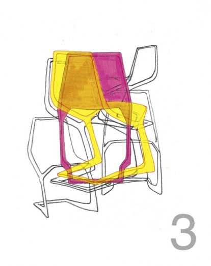
3. The Chairs, limited edition print by Konstantin Grcic.

Screen print on 280gsm paper, A2 size.

Konstantin Grcic is an industrial designer who has designed products and furniture for manufacturers such as Authentics, Flos, Krups and Magis. The subject of this print, his MYTO chair was selected for the Design Museum’s Designs of The Year award and exhibition in 2009. The Chairs is screen-printed in seven colours, including three fabulous fluros…

Available from the Design Museum shop.

fab four44. L03, 2012, designed by Ronan Bouroullec, manufactured by Wrong Shop.

Digital print using mineral-based Ultrachrome K3 pigmented inks with resin. Hahnemuhle certified 310g Museum Etching paper.

Unframed: 158.6 x 111.8cm.

Hand-drawn sketches from the individual collections of industrial design brothers Ronan and Erwan Bouroullec produced in series as prints. The original works formed part of recent exhibitions at the Vitra Design Museum and Centre Pompidou Metz.

Available from Twentytwentyone.

Fab four limited edition prints. Which, if any, do you like?
More fab four, here.

open and close house.

It begins as a linear box, then, a system of wooden, slatted blinds create a dynamic, evolving facade. The blinds and openings operate separately and so allow for different compositions, sometimes controlled and sometimes random. At any given moment and for whatever reason (privacy, protection from the sun) the facade can change. Thus: ‘we can achieve a composition that is balanced, dynamic, haphazard, closed or open within the same framework’.

Within, the space is simple. White perimeter walls, dividing walls that don’t meet the ceiling, others that shoot past. Linear slots in the ceiling contain the lighting. A poured concrete floor provides a seamless transition throughout. The stair comprises timber treads cantilevered off a concrete wall, with formwork bolt holes forming the decorative element on the surface of the concrete in a controlled pattern. The balustrade comprises sheets of iron-free glass (so are transparent, not green in colour) which are without frames or evident fixings.

The furniture is classic and simple – Eames DSR chairs, a Barcelona coffee table, a parasol-like pendant over the solid wood dining table (I’m not familiar with this particular pendant, but it’s rather lovely).

ks_080313_02-940x468ks_080313_13-940x626ks_080313_04-940x626ks_080313_15-630x420ks_080313_14-940x626ks_080313_18-940x1321

The wood slats are continued inside, which together with the external slatted blinds, cast wonderful lines of sharp, playful light.

Kfar Shmaryahu House in Israel by Pitsou Kedem Architects via 

More wonderful spaces, here

house of the year.

A little further from home this time, this house has just been awarded House of the Year 2012 by World Architecture News (WAN), the global architecture news web-site.

The location is spectacular – situated on top of a granite rock, overlooking a man-made dam. Rather than being overwhelmed by its elevation, the house appears to float over it, with changing levels to take advantage of the views all around. It is a relatively simple structure, with two granite blocks, excavated from the site, to anchor the building and enclose the bedrooms; an over-sized timber platform and roof to protect from the harsh sun, and two glass boxes spanning between. All materials are locally sourced, except the specialist items – the glass, for example.

The magic lies with the shifting planes, which follow the gradient of the hillside perch. A sunken terrace here, an over-sailing roof there.

21494_3_OUTSIDELOUNGE21494_5_INTERIORSINK21494_4_OUTSIDELOUNGE21494_6_INTERIORSTAIR21494_2_EXTERIOR

Gota Residence, East Africa, by Sforza Seilern Architects. Read what the judges said, here.

More wonderful spaces, here

things of wood.

fab four

1. A balancing metal disc on 5 sections of wood, this side table is all lightness and minimalism. The wood can be raw ash or oiled walnut with a white or black anodised top. Minimato table by Matthias Ferwagner, here

2. A little bit Bentwood, a little bit Elbow, this chair combines elements of some designer classics; simple and beautifully detailed in palest beech. It looks Scandinavian, but comes via Italy. Pelleossa chair by Francesco Faccin seen, here 

3. These lamps by Swedish company Note Design Studio are ceramic and wood, and very, very Scandinavian in their warmth and tactility.

4. Beautiful, decorative handcrafted pendants that can be hung individually or in a cluster, there are six variants, with names like Aztec and Abacus. Customisable in length and configuration, they could be simply hung from a hook. Bohemian, but in a good way. Bright Beads by Marz Designs, via Contemporist.

Which is your favorite?

More found objects, here 

More fab four, here

composition.

bookshop in day

I think the design of the facade of this bookshop in Sao Paolo is almost perfect. Here’s why:

  1. The entrance is clearly defined and inviting; comprising pivoting, double-sided bookcases, the scale of the facade is brought down to human scale at the doorway, enticing one in.
  2. The signage is clear and dynamic.
  3. The lighting allows it to glitter at night like a jewel box.
  4. The facade is simple and without unnecessary embellishment; it’s all about what’s going on inside – the books.
  5. It is made of concrete; to my mind, a wonderful, expressive material with integrity and strength, the most interesting of materials (evidenced by my most-pinned Pinterest board, ‘I love concrete’)
  6. Composition – it is asymmetrical and follows the ‘one third, two thirds’ rule. The rule of thirds divides a line into roughly 2/3 and 1/3. It is a simplified version of the golden ratio, used in art and architecture to proportion work – especially in the form of the golden rectangle, in which the ratio of the longer side to the shorter is the golden ratio – in the belief that this proportion is aesthetically pleasing. It is also used extensively in photography. I recently attended a photography workshop with the fabulous Emily Quinton (details, here), and this one rule changed the way we shot our photographs. photgraphy workshop2Its use creates a more dynamic composition. Symmetry and balance can be, well, dull, whereas a composition where the elements are placed to one side, adds a tension between the elements and the empty space. It can be applied both horizontally and vertically. The lower third of the bookshop, the opening, could be considered positive, while the upper part is negative. What do you think of this building? Do you like the composition and asymmetry? bookshop at night

More about Livraria de Vila bookshop, São Paulo by Brazilian studio Isay Weinfeld Arquitecto, here

Still life images, owl’s house london.

More good design series, here.

black maria.

dezeen_Black-Maria-by-Richard-Wentworth-and-GRUPPE_2

King’s Cross in London has been undergoing a metamorphosis over the last 10 years, from red light district to transitory train hub to destination in its own right. One of its latest reincarnations is as a major international contemporary arts destination.

The second installation in the newly created space is Black Maria, a commission by the British artist Richard Wentworth working in collaboration with GRUPPE, a young Swiss architectural practice. For four weeks the timber structure will inhabit the concourse, a top lit atrium space which forms a street connecting the historic Granary Building with the new Central Saint Martins College of Art and Design.

Named after Thomas Edison’s 1893 timber film studio in New Jersey – the world’s first cinema and film production studio – Black Maria is an auditorium where passers-by are invited to find their own uses and purposes. The theatrical structure with its proscenium arch and broad terraced steps is merely a backdrop: the audience will become the players. During the day, Black Maria acts as a public space, into which one can freely walk, work, pause. At night, doors become screens, stairs become seating, and Black Maria turns into a space for discussions and screenings. It is a space where, thrillingly, anything can happen.

dezeen_Black-Maria-by-Richard-Wentworth-and-GRUPPE_1dezeen_Black-Maria-by-Richard-Wentworth-and-GRUPPE_7sqadezeen_Black-Maria-by-Richard-Wentworth-and-GRUPPE_6sqadezeen_Black-Maria-by-Richard-Wentworth-and-GRUPPE_8

Black Maria is part of Relay, a nine – year arts programme. A list of Black Maria Events can be seen here.

All images via Dezeen

More happenings, here

a perfect pendant.

mid-century-modern-pendant-light-4

Often referred to as the Hand Grenade, A110 ceiling lamp was designed by Alvar Aalto for the building of the Finnish Engineers’ Association in 1952. It mixes midcentury with minimalism (how perfect!) – two cylinders, one inside the other, with a gap so the light is reflected upwards, and a perforated brass ring at the bottom diffuses the light downwards. Made of lacquered aluminium with a polished brass ring, the lamp looks fabulous hung individually or in a group.

A new version has been added with a slight reworking and a new colour combination of white and yellow or black and red: Special Edition A110 lamp designed by Mike Meiré. He was also responsible for the special edition Stool 60 (here). The white version represents day and the black version represents night.

How perfect is that?

a110

1 + 2    Original A110 lamp

3 + 4    Special Edition A110 lamp

Manufactured by Artek. You can get one, here. Feature image via

More found objects, here

black + white house.

I discovered this house on Pinterest and had to investigate further. The beautifully framed views were the first thing that caught my eye; the cutouts with their wonderfully deep window reveals hint at the sheer thickness of the walls beneath. The next thing that captures the imagination is the restrained but dynamic palette of whitest white and blackest black, which offers the perfect backdrop to the soft, watercolour view beyond. An original brick wall is retained and painted dusky black, offering softness and texture to the otherwise crisp, smooth surfaces. The junctions between old and new float past each other and provide a slot where light is allowed to emanate from, or left in shadow. The palette of materials is kept minimal; a simple wood kitchen bar sits like a sculptural piece in the otherwise white space, with the rest of the kitchen concealed behind a white wall of doors.

1339549279-gba-house-g-s-luc-roymans-7-672x10001339549802-gba-house-g-s-luc-roymans-10-1000x6581339549819-gba-house-g-s-luc-roymans-12-717x10001339550008-gba-house-g-s-luc-roymans-16-785x10001339550088-gba-house-g-s-luc-roymans-19b-708x10001339550020-gba-house-g-s-luc-roymans-18-673x10001339549404-gba-house-g-s-luc-roymans-8-1000x6091339548936-mainimage-gba-house-g-s-luc-roymans-1-829x1000

This 19th century corner house is located on the waterfront overlooking the old city harbour docks of Ghent, Belgium. The original house was stripped back to facade, stairwell and roof truss. The rooms and living spaces are conceived as a ‘stack of volumes, a white sculpture inserted in the existing casing’. The functions of the house are inverted, with the bedrooms on the ground floor, the living areas above. The architects have aimed to create a ‘symbiosis between contemporary residential living and the charm of a 19th century Belgian corner house’.

I’d move in tomorrow, would you?

House G-S in Ghent, Belgium via Arch Daily

Photography, Luc Roymans

More wonderful spaces, here