Tag Archives: Isay Weinfeld Arquitecto

ampersand house.

More inspiring design from Belgium; this time Ampersand House, a gallery of art and design located in the centre of Brussels. It is also a home, which the owners define as a living gallery, a constantly changing place depending on what is on show. They curate the gallery as an ever evolving environment mixing vintage, contemporary and prototype work to inspire a dialogue with and between collectors and creatives. Almost everything is available for sale.

The style is an eclectic mixture of pieces of different periods, from strict modernism to French opulence, with the only rule being the pieces need to be connected either by texture, material, colour or shape, for a cohesive overall aesthetic. I love the influences the owners cite, from the work of the architect and Brazilian designer Isay Weinfeld, to the mid-twentieth century furniture of Sergio Rodrigues to Australian architect Glenn Murcutt and French designer Pierre Paulin. What a fabulous design sourcebook.

ampersand2-ohl.mg_0164ampersand3-ohl.ampersand5-ohl.ampersand6-ohl.

http://www.ampersandhouse.com

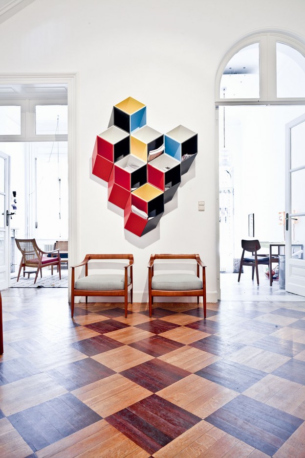
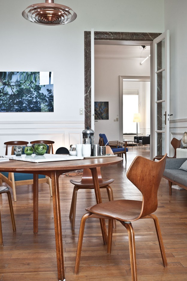
Ampersand House via  Photos: Karel Balas

More wonderful spaces, here

composition.

bookshop in day

I think the design of the facade of this bookshop in Sao Paolo is almost perfect. Here’s why:

  1. The entrance is clearly defined and inviting; comprising pivoting, double-sided bookcases, the scale of the facade is brought down to human scale at the doorway, enticing one in.
  2. The signage is clear and dynamic.
  3. The lighting allows it to glitter at night like a jewel box.
  4. The facade is simple and without unnecessary embellishment; it’s all about what’s going on inside – the books.
  5. It is made of concrete; to my mind, a wonderful, expressive material with integrity and strength, the most interesting of materials (evidenced by my most-pinned Pinterest board, ‘I love concrete’)
  6. Composition – it is asymmetrical and follows the ‘one third, two thirds’ rule. The rule of thirds divides a line into roughly 2/3 and 1/3. It is a simplified version of the golden ratio, used in art and architecture to proportion work – especially in the form of the golden rectangle, in which the ratio of the longer side to the shorter is the golden ratio – in the belief that this proportion is aesthetically pleasing. It is also used extensively in photography. I recently attended a photography workshop with the fabulous Emily Quinton (details, here), and this one rule changed the way we shot our photographs. photgraphy workshop2Its use creates a more dynamic composition. Symmetry and balance can be, well, dull, whereas a composition where the elements are placed to one side, adds a tension between the elements and the empty space. It can be applied both horizontally and vertically. The lower third of the bookshop, the opening, could be considered positive, while the upper part is negative. What do you think of this building? Do you like the composition and asymmetry? bookshop at night

More about Livraria de Vila bookshop, São Paulo by Brazilian studio Isay Weinfeld Arquitecto, here

Still life images, owl’s house london.

More good design series, here.