Tag Archives: architecture

an exemplary modernist.

‘For a long time I have dreamed of executing dwellings in such conditions for the good of humanity. The building at Highgate is an achievement of the first rank’. Le Corbusier, 1935.

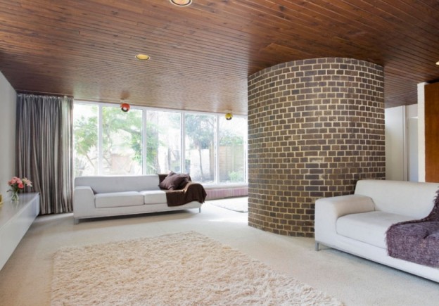
Berthold Lubetkin, one of several émigré proponents of Modernism in 1930s London, and a disciple of Le Corbusier, designed the apartment building Highpoint, in Highgate, North London. An early example of the International style, and engineered by Ove Arup, I had the opportunity to visit Highpoint last weekend, on an open day for the sale of one of the apartments. Recently refurbished, the attention to the original detail was superb. (That apartment was sold immediately, and sadly, not to me, so the photographs I am showing here are for another in the building).

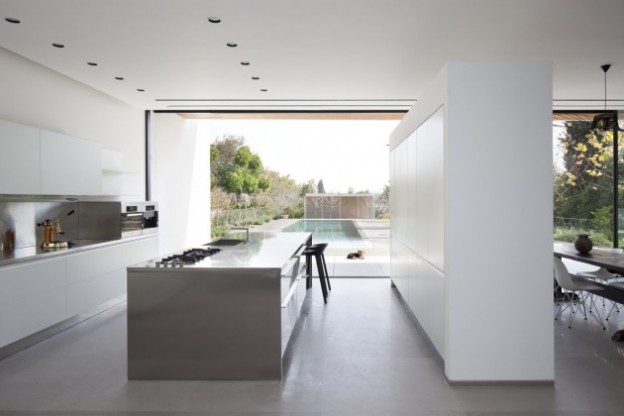
Original features and fittings – cork floors, door furniture, bathroom fittings – have mostly been replaced. Other fittings are consistent for the era – the Arne Jacobsen wall lights for example. The colours were inspired by Le Corbusier’s ‘polychromie architecturale’ – two palates of colour he produced for the wallpaper company Salubra in 1931 and 1959.

DSC_6902_LargeDSC_6896_LargeDSC_6816_LargeDSC_6861_LargeDSC_5917_LargeDSC2808_Large

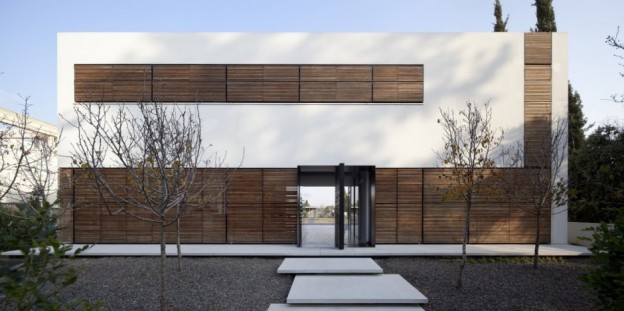
Highpoint is a much lauded, grade 1 listed Modernist building. Rendered white, as was the modernist way, the building is monolithic but elegant. Berthold Lubetkin is among the most important figures of the Modern Movement in Britain. Born in Georgia in 1901, he studied in Berlin and Paris, before moving to London in 1931. The following year he founded the famous Tecton practice with 6 other Architectural Association graduates.

Lubetkin and Tecton’s buildings are among the most iconic of the period, and include the marvellous penguin pool at London Zoo, again, designed in conjunction with the engineer Ove Arup.

Highpoint, Highgate via The Modern House

More wonderful spaces, here

a pared back parisian.

Beautiful photographs, a beautiful home. Housed in an 1860s Haussmann building, the original shell has been retained – parquet floor, period mouldings – and given a wash of warm white. With high ceilings and a wealth of natural light, steel grey creates atmosphere and compliments the wood and white. Fabulous furniture pieces are placed rather than hung, against a wall here, or hanging from a door knob there. A blackboard-painted curved wall in the hallway invites guests to write and draw. Artwork in the children’s bedroom is in the form of a montage of photographs.

Beautifully shot by NY-dwelling Englishman, Paul Raeside, the photographs capture the spirit of the space and the family who live there.

paul raeside - atypyk - 5395paris apartment_paulraeside1paris apartment_paulraeside2paul raeside - atypyk - 5414paul raeside - atypyk - 5601parisapartment_paulraeside3

More Paul Raeside, here

More wonderful spaces, here

sculpture house.

A double-height, fully glazed wall at the garden side of the house, extends the sense of the outdoors through to the interior. The interior of the building features three sculptural elements – a block of stone forming the central kitchen unit, a perfectly formed, curved stair, and a stone shelf and fireplace wall.

Interior finishes are kept simple – painted white or fabricated in super-hard white Corian, a man-made, solid-surface material composed of marble dust, bauxite, polyester resins and pigments. All floor surfaces, including the stairs are wood, stained almost black.

Russel_Hill_Road_gh3_afflante_com_1Russel_Hill_Road_gh3_afflante_com_2Russel_Hill_Road_gh3_afflante_com_4Russel_Hill_Road_gh3_afflante_com_3_0Russel_Hill_Road_gh3_afflante_com_8russell-hill-06

The furniture pieces are sculptural, classic, fabulous: Egg chair, Cherner chair, Smoke chair, Butterfly stool, Rosy Angelis floor lamp…

Russel Hill Road by gh3, via 

Images courtesy © Ben Rahn

More wonderful spaces, here

now house.

It is one of the biggest challenges facing designers – how to integrate traditional and contemporary and make it fit for now.  Pastiche doesn’t work, nor does simply ignoring the original. This house shows one way of mixing new with old, with an end result that is functional and fabulous.

The existing house is a typical, Eastern Australian 1920s bungalow, highly decorative to the street, or public, elevation. In stark contrast, the side elevations of the house were – originally – completely unadorned. The new addition to the rear takes its cue from this diminution in decoration and presents a flat elevation to the rear garden; a simple box form with playful, cut outs for windows. Within, the decorative elements lessen too; the walls become simple planes dressed in white, the free-standing kitchen units stand on a poured concrete floor. All that is left to add are lovely pieces of furniture and a family.

house-boone-murray-tribe-studio-architects_121112house-boone-murray-tribe-studio-architects_121112 (5)house-boone-murray-tribe-studio-architects_121112 (6)hall old + newhouse-boone-murray-tribe-studio-architects_121112(6)

Hence, ‘the public face of the house is decorative and frilly, while the private face is quiet, honest and unadorned. It is the unpretentious face of private family life’.

House Boone Murray by Tribe Studio Architects via

Photographs, Peter Bennetts

More wonderful spaces, here

corten house.

I first came upon the architecture of John Winter (1930-2012) three years ago, experiencing it first hand in a beach house he owned on the north east Norfolk coast (you can stay there too; details, here). Inspired by Charles Eames’ west coast cabin (he worked with Eames when he moved to San Francisco early in his career), he designed and built the house out of renewable timber, steel and aluminium. It is the simplest of plans being rectilinear in form, with windows running along both of the long sides, and my favorite of all interior spaces – a sunken lounge.

The subject of this post however, is not that house but this one, in Highgate, North London. Built in 1967 by John Winter for his own use, this is a wonderful, proper modernist house, given a rare Grade II* listing by English Heritage: ‘This is a highly influential and unusual house in its structure, materials, plan and aesthetic. It is still a model for minimal housing, as influential today as it was when it was built’.

DSC_1875_LargeDSC_1867_LargeDSC_1735_LargeDSC_1886_LargeDSC_1802_Large

Constructed around a steel frame, the house has huge double-glazed picture windows that flood the interior with light. It is clad in Corten, a steel alloy that weathers naturally to a beautiful dark rust colour. This was the first domestic use of the material in Britain, and the proportions of the house and grid were designed around the dimensions of the standard, factory-produced Corten sheet, so that nothing was wasted.

DSC_1711_LargeHOME_NEW_DSC_2819_2_Large

It has three floors with, unusually for the time, the living room on the top floor, to take advantage of the views over the utterly charming Highgate cemetery and Waterlow park opposite. The interior is all original – kitchen, built-in storage, quarry tiles. The long, low linear shelf which runs the length of one wall is a detail he used often. And there is, of course, fabulous original  furniture – Barcelona arm chairs and coffee table, and Eames’ LCW wood lounge chairs and ubiquitous (but no less than fabulous) DSR chair.

It’s for sale, and sadly, I won’t be buying it. Corten house via The Modern House.

More wonderful spaces, here. More design heros, here.

open and close house.

It begins as a linear box, then, a system of wooden, slatted blinds create a dynamic, evolving facade. The blinds and openings operate separately and so allow for different compositions, sometimes controlled and sometimes random. At any given moment and for whatever reason (privacy, protection from the sun) the facade can change. Thus: ‘we can achieve a composition that is balanced, dynamic, haphazard, closed or open within the same framework’.

Within, the space is simple. White perimeter walls, dividing walls that don’t meet the ceiling, others that shoot past. Linear slots in the ceiling contain the lighting. A poured concrete floor provides a seamless transition throughout. The stair comprises timber treads cantilevered off a concrete wall, with formwork bolt holes forming the decorative element on the surface of the concrete in a controlled pattern. The balustrade comprises sheets of iron-free glass (so are transparent, not green in colour) which are without frames or evident fixings.

The furniture is classic and simple – Eames DSR chairs, a Barcelona coffee table, a parasol-like pendant over the solid wood dining table (I’m not familiar with this particular pendant, but it’s rather lovely).

ks_080313_02-940x468ks_080313_13-940x626ks_080313_04-940x626ks_080313_15-630x420ks_080313_14-940x626ks_080313_18-940x1321

The wood slats are continued inside, which together with the external slatted blinds, cast wonderful lines of sharp, playful light.

Kfar Shmaryahu House in Israel by Pitsou Kedem Architects via 

More wonderful spaces, here

house of the year.

A little further from home this time, this house has just been awarded House of the Year 2012 by World Architecture News (WAN), the global architecture news web-site.

The location is spectacular – situated on top of a granite rock, overlooking a man-made dam. Rather than being overwhelmed by its elevation, the house appears to float over it, with changing levels to take advantage of the views all around. It is a relatively simple structure, with two granite blocks, excavated from the site, to anchor the building and enclose the bedrooms; an over-sized timber platform and roof to protect from the harsh sun, and two glass boxes spanning between. All materials are locally sourced, except the specialist items – the glass, for example.

The magic lies with the shifting planes, which follow the gradient of the hillside perch. A sunken terrace here, an over-sailing roof there.

21494_3_OUTSIDELOUNGE21494_5_INTERIORSINK21494_4_OUTSIDELOUNGE21494_6_INTERIORSTAIR21494_2_EXTERIOR

Gota Residence, East Africa, by Sforza Seilern Architects. Read what the judges said, here.

More wonderful spaces, here

a 70s modernist.

A big linear space, not high ceilinged but light and white and bright, with large windows on three sides. A curved, raw brick half-circle creates a dynamic division within the living space, and provides a back-drop for the beautiful metal spiral stair that meanders up to the next level.

The otherwise white box is given texture and mood with a dark timber-lined ceiling, adding interest and warmth. The ceiling opens to form a roof light allowing light to flood in over the kitchen.

HOME_RECEPTION2_LargeTWO_RECEPTION1_LargeTHREE_KITCHEN_DINING_Largekitchenstair

FOUR_BEDROOM_LargeThis three-bedroom house was built in the 1970s; the best bits were kept, refurbished and an extension added. In a vibrant part of London, close to the lovely green spaces of Highbury Fields, and it’s for sale… I could, could you?

Via The Modern House

More wonderful spaces, here

composition.

bookshop in day

I think the design of the facade of this bookshop in Sao Paolo is almost perfect. Here’s why:

  1. The entrance is clearly defined and inviting; comprising pivoting, double-sided bookcases, the scale of the facade is brought down to human scale at the doorway, enticing one in.
  2. The signage is clear and dynamic.
  3. The lighting allows it to glitter at night like a jewel box.
  4. The facade is simple and without unnecessary embellishment; it’s all about what’s going on inside – the books.
  5. It is made of concrete; to my mind, a wonderful, expressive material with integrity and strength, the most interesting of materials (evidenced by my most-pinned Pinterest board, ‘I love concrete’)
  6. Composition – it is asymmetrical and follows the ‘one third, two thirds’ rule. The rule of thirds divides a line into roughly 2/3 and 1/3. It is a simplified version of the golden ratio, used in art and architecture to proportion work – especially in the form of the golden rectangle, in which the ratio of the longer side to the shorter is the golden ratio – in the belief that this proportion is aesthetically pleasing. It is also used extensively in photography. I recently attended a photography workshop with the fabulous Emily Quinton (details, here), and this one rule changed the way we shot our photographs. photgraphy workshop2Its use creates a more dynamic composition. Symmetry and balance can be, well, dull, whereas a composition where the elements are placed to one side, adds a tension between the elements and the empty space. It can be applied both horizontally and vertically. The lower third of the bookshop, the opening, could be considered positive, while the upper part is negative. What do you think of this building? Do you like the composition and asymmetry? bookshop at night

More about Livraria de Vila bookshop, São Paulo by Brazilian studio Isay Weinfeld Arquitecto, here

Still life images, owl’s house london.

More good design series, here.

old house, new house.

The wonderful, spare structure of the original house in rural Spain has been retained. A concrete floor is poured, a new staircase inserted, a simple tread and handrail detail added; old walls are kept raw, carefully considered niches are added. The house, old and new, is painted white. A sculpture placed here, a pop of colour there.

Contemporary_House_in_Spain_Benjamin_Cano_afflante_com_3Contemporary_House_in_Spain_Benjamin_Cano_afflante_com_2_2Contemporary_House_in_Spain_Benjamin_Cano_afflante_com_2_0Contemporary_House_in_Spain_Benjamin_Cano_afflante_com_2Contemporary_House_in_Spain_Benjamin_Cano_afflante_com_5Contemporary_House_in_Spain_Benjamin_Cano_afflante_com_7Contemporary_House_in_Spain_Benjamin_Cano_afflante_com_8Contemporary_House_in_Spain_Benjamin_Cano_afflante_com_10Contemporary_House_in_Spain_Benjamin_Cano_afflante_com_13

Can you feel the warmth? Contemporary house in Spain by Benjamin Caro via

Images by Belén Imaz

More wonderful spaces, here