Tag Archives: architecture

the sun never knew..

Louis-Kahn-Visual-Archive-by-Naquib-Hossain-3

‘The sun never knew how great it was until it hit the side of a building’ Louis Kahn (1901-1974). From the current exhibition at the Design Museum (until 12 October 2014)

We are off on holiday at last, to catch the last of the summer. Happy weekend.

Image: Louis Kahn visual archive by Naquib Hossain

where architects live.

02_c_aki_furudate

As a voyeur of interiors, I love peering into other people’s homes. There is a departure between architecture and interior design and architects often don’t involve themselves with interiors, leaving the design to somebody else. An interesting thing then, to see architects’ own homes.  An exhibition in April called Where Architects Live looks at the private homes of eight world-renowned architects. 

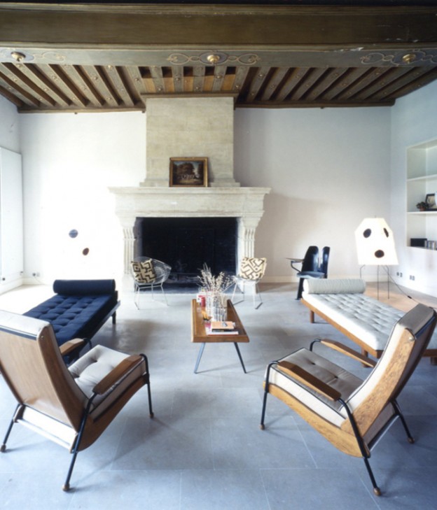
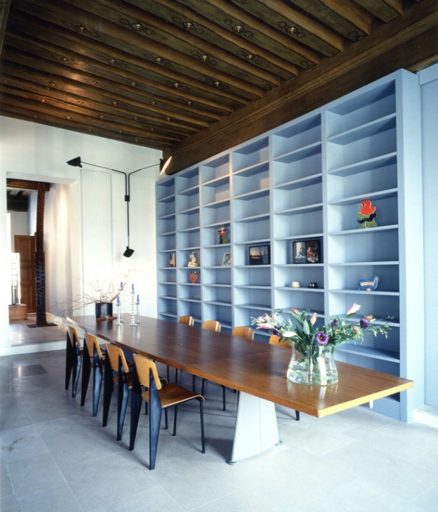
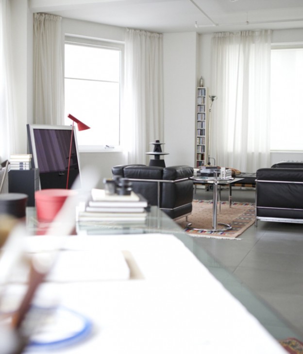
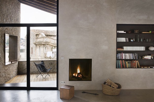
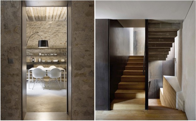
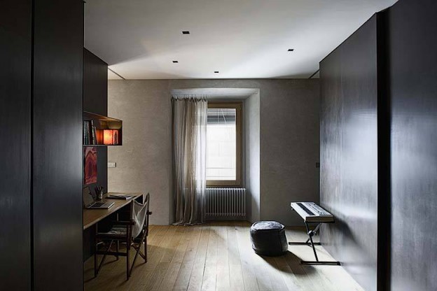
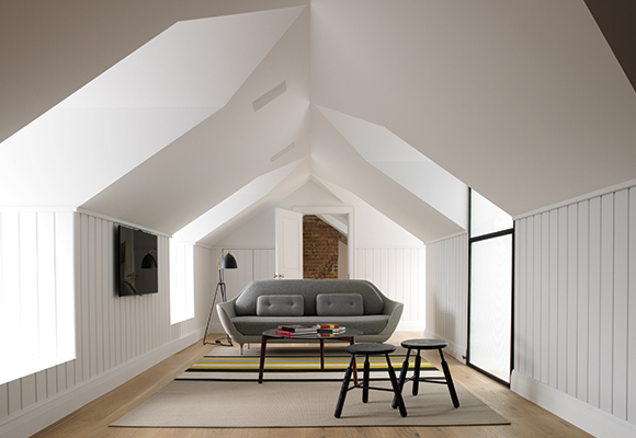
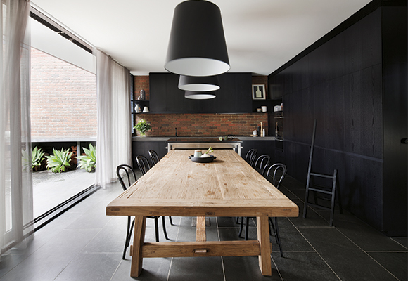
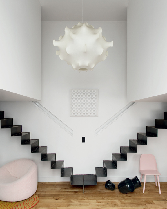
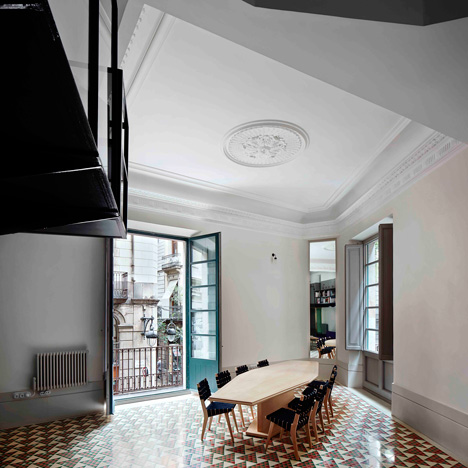
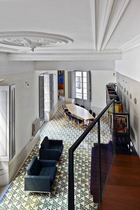
Of those on preview, one of my favourites is the Paris home of Massimiliano Fuksas, an Italian architect known for his work in urban problems and the suburbs, as well as his ‘big’ architecture, Shenzhen airport, for example. A fabulous mix of materials old and new, original Jean Prouvé furniture, and masses of artwork, it feels at once calm yet vibrant. The home of David Chipperfield, as would be expected, is a more restrained affair – a concrete building in Berlin with simple, minimal space and one or two deep colours like the forest green sofa. Zaha Hadid’s home is unsurprisingly white, with lots of her own avant garde and Russian revolution-era inspired artwork and furniture. Mario Bellini’s home is bold, angular and dark-hued. I can’t wait to see more in April.

03_c_aki_furudate

Photographs 1 + 2, Fuksas home, Aki Furudate

chipperfield02_cdavide_pizzigoni

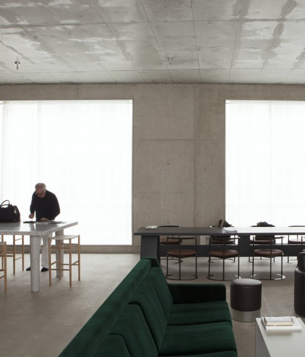
Photograph of Chipperfield home, Davide Pizzigoni

zaha_hadid02_cdavide_pizzigoni

Photograph of Zaha Hadid home, Davide Pizzigoni

mario_bellini02_cdavide_pizzigoni

Photograph of Mario Bellini home, Davide Pizzigoni

libeskind04_cnicola_tranquillino

Photograph of Daniel Libeskind home, Nicola Tranquillino

Where Architects Live,  Salone del Mobile, Milan 8-13th April 2014 via

slip house.

An apt successor to the concrete-and-pink gallery house of my previous post, Slip House comprises ‘a simple, sculptural form of three cantilevered boxes (or slipped) boxes’. The shifting planes break up the bulk of the building, adding to this sculptural quality. Largely constructed from glass, steel and concrete, these raw materials are evident inside and out. This is architecture in its raw form, designed by an architect as his own home. It was also an RIBA award winner –  best house in the UK for 2013. It is also nobly eco friendly, sustainable and energy efficient with triple glazing, solar panels and wildflower roofs all contributing to its performance.

slip_house2-ohl.slip_house3-ohl.slip_house4-ohl.slip_house5-ohl.slip_house9-ohl.

The house is arranged over three floors with a large roof garden on top. Full-height glazing at either end together with an open plan layout (the perimeter walls carry the load) allow the light into the centre; necessary in an infill site with neighbouring terraces in close proximity. It has the requisite architectural details – shadow gap at the junctions between vertical and horizontal surfaces, and where elements of different materials conjoin. It is minimal in its use of materials and finishes, with an utterly retrained palette. 

Could you live here? It’s marvellously accomplished, but personally I find the purity a little relentless. I’m also not keen on the pinkish hue of the birch plywood, seen on much of the bespoke joinery, as it sits alongside the dull grey of the exposed concrete. I’d have to add some disharmony – lots of textures, some colour.

Slip House by Carl Turner Architects for sale, here. Photography: Tim Crocker

gallery house in concrete and pink.

A triple-height gallery housing a collection of prized paintings is concealed behind the wooden shingle facade of this house in Stuttgart. Like any well-designed gallery, the design is all about the internal spaces and how they play to the artworks that will embellish their walls. It is an inward looking house, with no long views. Rather, light and interior space are the game-players, allowing the artwork – a collection of old masters paintings – to take centre-stage. 

images_stuttgard-ohl.images2_stuttgard-ohl.

Gallery space and living spaces are separated. A massive concrete core, extending ever up through four floors, acts as the spine of the building, housing the stair, kitchen, bathrooms and services. Clerestory windows bring light down into the gallery, while dedicated spotlights recessed into the concrete core on opposing sides light the artworks. Skylights along the ridge of the roof allow daylight into the living zones. 

Walls are painted in a curious dark shade of pink, which works beautifully against the raw concrete. Joinery, doors and bookshelves slotted into recesses add texture and warmth.

Shingle house by (se)arch architekten, via  Photography: Zooey Braun

Another wonderful home and gallery space, here

happy weekend.

sensing_spaces-ohl.

Seven architects from around the world – Alvaro Siza, Eduardo Souto de Moura and Kengo Kuma included, have created a series of site-specific installations and inserted them into the main galleries and front courtyard of the RA. More than just a shelter or a flashy building, architecture has the ability to shape and form how we feel everyday. We are invited to touch, climb, walk, talk, sit, contemplate. And more – as you enter the galleries, a sign orders you to tweet, and photography is encouraged. A rare treat in the rarefied environment of this grand institution. Definitely one for the littles… 

Sensing Spaces: Architecture Reimagined until 6 April 2014
Royal Academy of Arts, London. More, here. Image via

catalan house.

In the ancient Catalan city of Girona is this apartment, in a building dating from the 16th century. The vernacular of exposed timber beams and rough stone walls is cleverly countered with the contemporary materials – black metal, wood veneer cabinetry stained black, rendered walls, solid timber floors. Openings and junctions are lined and restrained with black metal, horizontal surfaces are either recessed or allowed to float freely. Textures abound in the simple, raw palette of materials and neutral furniture.

And the good news? If you want to escape the sudden onslaught of fiercely cold weather in Northern Europe, it’s available to rent. There are two apartments, El Badiu (the gallery) and El Jardi (the garden), or it can be rented in its entirety.

alemanys-5-anna-noguera_ohl.alemanys-5-anna-noguera_2-ohl.images-ohlalemanys-5-anna-noguera_4-ohl.alemanys-5-anna-noguera_3-ohl.

Alemanys 5, Girona by architect Anna Noguera, via. Photographs, Anna Noguera

Are you ready for sunshine yet? I also love this property, Shelter7 in Ghent, also available to rent through travel site Welcome Beyond.

More wonderful spaces in sunny climes, here

50 best rooms.

I love the idea of a ‘best rooms’ award – not house, or interior, but room. Aussie interiors publication Australian House and Garden does one annually. The contenders vary wildly in style and presumably budget (it’s not clear what the criteria is). This year features a bathroom designed by the architecture studio of friends from my Melbourne University days, in typically quirky style, rich in materiality and texture (no 23!). These are my favourites:

04 04.   Geometric cut-outs in an all-white volume by Decus

1414. Black-stained wood, exposed brick and a contrasting diaphonous curtain by Beatrix Rowe Interior Design

1515. Pale wood and simple, geometric shapes by O’Connor and Houle Architecture

2323. Rich-red slatted wood and bold white pattern by AlsoCan architects

26

26. Linear indoor/outdoor space by Drew Heath Architects

3131. Heightened sense of scale and a wall of art by Sarah Davison Interior Design

46

46.   Black framing against white-on-white elements by Whiting Architects

Which is your favourite? 50 Best Rooms of 2013, here

More good design, here

house of the year 2013

I attended WAN House of the Year award night in London late last week. It went to this house, a summer house on an island in the Stockholm archipelago by Swedish studio Tham & Videgård Arkitekter.

The most striking thing about the house is its simple, dynamic form: a row of zig-zagging, raw concrete gables that stretch across the site like a line of boathouses. Rather than the usual vernacular of a timber dwelling drawing on the forest for its context, the building takes its inspiration from the granite bedrock found on the island. One of the gables forms a glass canopy roofing the terrace, that also splits the building into two separate volumes. This provides a vista through the building to the seafront from the forest beyond and vice versa, as well as acting as the entrance.  Three of the gables house the living and dining rooms; pale ash doors doors slide open to reveal the bedrooms behind.

Along with the facade, the terrace and interior floors are made of exposed concrete. The raw concrete has been cast in-situ against plywood boards, giving a subtle grain and wonderfully worn quality to the surface. The interior is simply painted white, window frames and joinery are ash.

23485_3_win323485_4_win423485_2_win223485_1_win1

House Lagnö by Tham & Videgård Arkitekter, here. Photography: Åke E:son Lindman

What do you think of house of the year? It’s certainly less dramatic than last year’s winner, here

a parisian delight.

The classical symmetry of a staircase running up from the centre to the left and to the right is re-interpreted in this otherwise utterly modern, tiny loft apartment in Paris. White, suspended boxes housing the bedroom and bathroom are then positioned left and right. Beneath, the living space on one side, and the kitchen on the other. The staircase of folded metal creates a bold, geometric statement.

petits_espaces_4608_north_576x_whitepetits_espaces_3218_north_576x_whitepetits_espaces_5376_north_576x_whitepetits_espaces_7873_north_576x_whitepetits_espaces_6052_north_576x_whitepetits_espaces_5705_north_576x_white

The palette of white walls, black metal and oak floor is punctuated by shots of bold colour and form. In the main salon are fabulous classic furniture pieces from the 60s and 70s – the marvelous, resin Taraxacum S2 suspension light takes centre stage, the Tre Pezzi armchair (in white Mongolian goat hair, no less), Pierre Paulin’s voluptuous Pumpkin sofa. Muuto chairs in this season’s palest pink and mint, a dark yellow wall. Oak pocket cupboard doors are simply decorated with diagonal strips of oak (a clever detail that – the diagonal used as a symbol in architectural drawing to indicate whether the door is left or right opening). The full-height doors open to reveal the kitchen units, finished in matt black.

Un Espace en Suspension, Paris, via AD Magazine

Photographs: Vincent Leroux

More wonderful spaces, here

world interior of the year.

Inside Awards World interior of the Year 2013 is the refurbishment of a piano nobile (or main floor) apartment in the Gothic Quarter of Barcelona. A triangular-shaped site, it is situated at a major crossroads in the city. Stripping back the internal partitions revealed the vertex, reconnecting the apartment with the streets beyond.

A look within reveals minimal intervention. The shell of the building and its classical elements are retained. A balcony that connects bedrooms and en-suite bathrooms is lined with books, becoming a high-level library. Simple, rectilinear furniture compliments the simple layout. But the materials palette is an ecelectic mix, unrestrained and rich in colour and materials – gold, black painted metal, dark red wood, cobalt blue tiles, green glass. More than I would ever put together in one space.

But I love how the architects have interpreted the brief, thus: the new mosaic floor is decorated with a triangular pattern matching the geometry of the plan. The tile pattern is graded in colour from green at one end of the apartment to red at the other to differentiate the clients’ private spaces – two brothers who share the space as a holiday home.  At the street corner the red and green tiles are at their most mixed; this is the dining area which is also the meeting place for family and friends.

dezeen_Inside-Awards-2013-day-two-winners-announceddezeen_Carrer-Avinyo-34-by-David-Kohn-Architects_7dezeen_Carrer-Avinyo-34-by-David-Kohn-Architects_6dezeen_Carrer-Avinyo-34-by-David-Kohn-Architects_567

What do you think of the interior of the year? Apartment in Barcelona by David Kohn Architects via

More wonderful spaces, here