

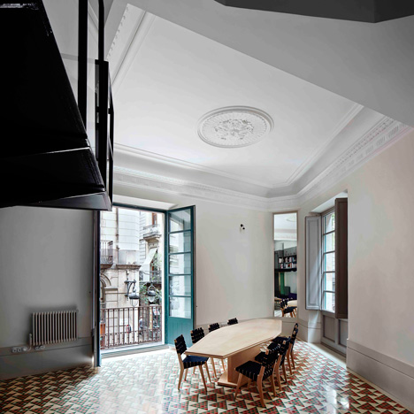
Inside Awards World interior of the Year 2013 is the refurbishment of a piano nobile (or main floor) apartment in the Gothic Quarter of Barcelona. A triangular-shaped site, it is situated at a major crossroads in the city. Stripping back the internal partitions revealed the vertex, reconnecting the apartment with the streets beyond.
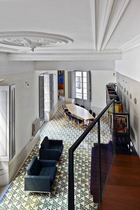
A look within reveals minimal intervention. The shell of the building and its classical elements are retained. A balcony that connects bedrooms and en-suite bathrooms is lined with books, becoming a high-level library. Simple, rectilinear furniture compliments the simple layout. But the materials palette is an ecelectic mix, unrestrained and rich in colour and materials – gold, black painted metal, dark red wood, cobalt blue tiles, green glass. More than I would ever put together in one space.
But I love how the architects have interpreted the brief, thus: the new mosaic floor is decorated with a triangular pattern matching the geometry of the plan. The tile pattern is graded in colour from green at one end of the apartment to red at the other to differentiate the clients’ private spaces – two brothers who share the space as a holiday home. At the street corner the red and green tiles are at their most mixed; this is the dining area which is also the meeting place for family and friends.


What do you think of the interior of the year? Apartment in Barcelona by David Kohn Architects via
More wonderful spaces, here

Such a difficult space to address . Beautifully airy and restrained .
I do hope the brothers respect each others private space … no overstepping the wrong colour tile 😉
yes i like especially how it stays true to its provenance; i can’t imagine that interior anywhere other than Barcelona.
i hope they don’t step over the lines! at first i was unimpressed by the tile idea, but actually i like the simple acknowledgement of each family within the space. J
I saw the corner on the floor plan and nearly had a heart attack! It wasn’t an easy project, that’s true. Can’t say I am very fond of the mirror or the materials chosen. It seems like too many things on such a small space. What do you think?
yes a triangular plan is always going to be tricky! I have had to revisit this interior many times to ‘understand’ it. to me it has a very southern european sensibility; it isn’t a generic interior that could fit anywhere. as i mentioned, i would never put so many colours and finishes in one space! but i think it’s clever in its interpretation of the brief, and very contextual, and perhaps that’s why it has proved successful. great to hear from you, Virginia.
What an interesting space to plan around. It was so cleverly designed. The triangles would not have been my first choice but I understand the thought process behind it and the integration of the colour scheme of the furnishings against the floor makes the space cohesive. xD
hi doris, i love that there are levels of complexity here which have to be discovered… it makes it an interior that reveals itself slowly, which to my mind is a good thing! happy weekend x
Reblogged this on E'n'M.
thank you for the reblog!