Tag Archives: design

tension and contrast.

This is the first in a series called good design, or, a little ponderance on the art of Good Design. The aim is to discuss and debate design and the creative process, using key words and the wise words of others to analyse and ponder.

Coco Chanel famously instructed: ‘when accessorising always take off the last thing you put on’. This is, to my mind, the essence of the matter: not too much, not too little.

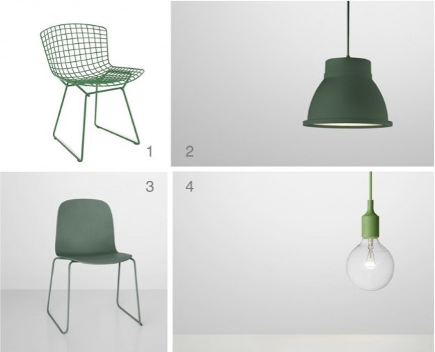
There is no greater exponent of the ‘form follows function’ mantra then the spare lines of the Muji brand. Utilitarian, perhaps in the extreme, nothing is extraneous; even the packaging is just enough to package, not masking what lies within but allowing the form of the product to be clearly expressed. This video, one in a series called Why Design being run by Herman Miller, talks about the design process, and the inspiration of the designers, the founding partners of Industrial Facility. They design for Muji, Established & Sons, and Herman Miller, amongst others. Their work, as evidenced in the Muji brand, is typified by an economy of line, texture, and detail.

For them, the design process is anything but balanced; they talk of existing ‘just on the edge of functioning’ and the fragile existence of living in a big city, where, at any time, one feels the balance could tip. However rather than detract, this inspires: ‘We need tension and contrast to be able to create’. Inspiration comes from Primrose Hill, a place after my own heart, where one can regroup, with the hustling, bustling city pulsating below:

See the full series here.

What do you think; are tension and contrast necessary in order to create? Does your inspiration come from unexpected places?

Feature images, Muji.com

stairs to inhabit.

The brief was to replace a patio with a timber deck for barbequing, entertaining, contemplating.

The design was conceived as two rooms, roughly four metres in depth, opening off the two external doors, with an interconnecting narrow boardwalk. The Balau timber boards were laid perpendicular to each other, to emphasise the notion of rooms. With a drop of just under a metre to the garden, four steps were required. These were positioned roughly one-third of the way along, to offset the otherwise symmetrical elevation. Then, taking up around two-thirds of the length, two very deep, very wide stairs were formed – stairs to inhabit. The stairs can be sat upon, played upon, inhabited…

wilmerhatch deck

This project was completed a month or so ago for a family home in Surrey. I have since spied this wonderful house in Tokyo, aptly named Coil House; the house is entirely comprised of flights of inhabitable stairs.

coil house

Defined by 44 steps of varying depths and widths, Coil is a spiral of continuously ascending spaces, designed for a family in Tokyo.

To maximize the tiny, oblong lot, three square wooden columns were planted along the plot’s central axis, each one wrapped with treads. While large, open landings act as rooms, level changes eliminate the need for partitions and doors with the winding of the stairs separating the spaces.

The three-story climb begins at the wedge-shaped foyer. Four steps descend to the bathroom, while 13 broad treads, ranging in depth and doubling as the library, ascend to a series of large landings, designated as living and sleeping areas. At the top of the house, the sequence culminates in a compact galley kitchen, and an elevated dining area.

A masterful use of a narrow space, entirely eliminating the need for corridors.

I love to inhabit stairs; for me they provide the perfect perch for talking on the phone. What about you – do you utilise your stairs for purposes other than climbing?

Images and more Coil House, here  /  Feature image, Prada store NY, via

colour of the year.

Pantone have just announced their colour of the year for 2013 – emerald green. The colour, specifically Pantone 17-5641 Emerald, is described as ‘lively, radiant, lush.. vivid and verdant’.

Every year Pantone choose a colour, derived from various sources and influences; last year it was a vivid orange called Tangerine Tango. Green is in fact the most abundant hue in nature – the human eye sees more green than any other color in the spectrum.

Pantone is a standard language for colour communication between designer and manufacturer. Pantone’s founder created a system of identifying, matching and communicating colours to solve the problems associated with producing accurate colour matches in the graphic arts community. His insight – that the spectrum is seen and interpreted differently by each individual – led to the innovation of the Pantone matching system, a book of standardised colour in fan format. Different manufacturers in different locations could all refer to the same system to ensure colours matched without direct contact with one another. It is now used in all the industries, and its influence will be seen in fashion, packaging, graphics, interiors.

Emerald is certainly a bold choice for an interior. It works with basic black and white, and also with mid to dark-coloured woods. Pinterest is abuzz with emerald imagery, so here some chairs, a floor, a wall, and some fabulous emerald products…

emerald images 3

Images clockwise:  1  /  2  /  3  /  4

products

Products: 1  /  2  /  3  /  4

What do you think of this year’s colour?

folklore.

Islington in North London is home to an abundance of design stores, from the big players – Twentytwentyone, Coexistence, Aria – to the smaller independants, to the wonderous antiques and ephemera shops that line the cobble-stoned Camden Passage.

The latest addition to Upper Street is Folklore, a collection of simple and functional, often recycled, homewares, furniture, art and lighting. The aesthetic of the interior is raw and natural but refined, with pale walls, white painted floors and reclaimed timber panels, all housed behind a simple, dark framed shopfront. There is a wonderful cohesion between interior and product, with the products displayed on hanging shelving made from reclaimed scaffolding planks which have been sanded back and left untreated. With the ethos that ‘better living is possible through design’, the product focus is clearly on well crafted and functional pieces.

Products are sourced globally, for ‘simplicity, craftsmanship, quality and durability’. Some products are unique to the store; of note, a dining table by Soren Rose Studio in Copenhagen, and textile designs by local artist David Shillinglaw. Others are recognisably current and sought after – Scrapwood Wallpaper by Dutch designer Piet Hein Eek and the PJ60 Desk Lamp by Orsjo. One of my favorites is the recently relaunched J110 by Danish design house Hay (see my previous Hay product review, here) and some beautiful, simple clever lighting pieces like the Pulp pendant, made, unbelievably, from old newspapers.

IMG_1712_2

IMG_1635_2

collage jpg1 J110 chair (image by Hay) / 2 111 Navy chair / 3 Nicolle chair / 4 Dip chair

It is definitely worth a visit! Details, here

bronze.

Bronze is the subject of the eponymous exhibition at the Royal Academy (deemed ‘utterly splendid’ by the marvellous Andrew Graham Dixon, read the review, here). It traces works in bronze from antiquity to now, from Rodin to Henry Moore, Ghiberti to Louise Bourgeois.

It is also something of a current trend in interiors, so this is my homage to the exhibition – the best of interior bronze. But first, the chemistry: it’s an alloy of copper, with tin, zinc and lead in lesser amounts. Inherently tough and resistant but much more malleable than its sculptural rivals, stone and wood, it has been used in household objects as well as sculpture for centuries. It ranges in colour from palest gold to darkest blue-brown, and can be matt finish or polished.

Enjoy the bronze edit!

1  tile   /   11 light (see my review, here)   /  111 light    /  1V  stool    /   V  trough    /   V1 mirror

Bronze is at the Royal Academy of Arts in London until December 9.

owly things for henry.

Found – four fab owly things… and the moon ! They’re all on my, I mean Henry’s, wish list…

1. a cushion called clive, zeenashah.com

2. owl t-sirt, by nord

3. la lune print, the calm gallery

4. owl cushion, donna wilson

More fab four here

a light called artichoke.

Louis Poulsen, purveyor of light fittings, produces some true classics. Icons of Scandinavian mid century design, ubiquitous and recognisable everywhere. I came across these new images for Louis Poulsen’s latest catalogue and simply could not resist. So I thought I’d first do a little research…

Perhaps the two most distinctive, the wonderfully named Artichoke and the rather more dry PH5 were both designed in 1958 by Dane Poul Henningsen. He was an architect and critic, but his main focus was lighting and he collaborated with Louis Poulsen over his career. He designed not just aesthetically, but scientifically, using refraction to create soft, glare-free lighting. He grew up with petroleum lamps, and, with the advent of harsh electrical lighting in the 1920s, his objective turned to creating an ambient, warm glow rather than to ‘flood the home with light’. His first design was a three sided lamp of brass and opal glass, exhibited in the Danish Pavillion at the Paris Exposition of Decorative Arts in 1924. It was picked up by his peers and used internationally by amongst others, Mies van der Rohe in his Villa Tugendhat. The first PH lamp.

Image Villa Tugendhat

The PH Artichoke is characterised by 72 leaves forming 12 rows of 6 leaves each, which are positioned to provide 360 degree glare-free light when viewed from any angle. They also shield the  light source, redirecting and reflecting the light onto the underlying leaves. The result is a luminous glow.

The PH5 was developed as a response to constant changes to the shape and size of incandescent bulbs by bulb manufacturers of the time. The light produced is also glare-free regardless of where it is positioned, the multiple concentric shades emitting the light both downward and laterally. A version designed for use with energy saving lamps was introduced in 1994, and the PH50, in high gloss colours for the 50th anniversary.

Photographed by Jacob Termansen. Images Elle Decor.

Two very distinctive designs, one designer. What do you think? Unique and individual, or ubiquitous and much-copied?

more black dahlia.

A follow up to my earlier post, black dahlia; Brown, Pink, White with Diamond is another work by the artist Lena Wolff. Lena explores abstract drawing, light sculptures and installations, and this piece shows clearly the geometries and iconic patterns derived from early American quilts of the eighteenth and nineteenth centuries which inspire much of her work.

More about Lena Wolff can be found here.

black dahlia.

Lena Wolff is an artist based in San Francisco. I came across her work on the internet and loved the geometric pattern, simplicity and rich tones. Lena is formally trained in fine art, however she describes her work as coming from a ‘realm where art, design and craft intersect’. She attributes her early influences and interest in craft to the beautiful things made by hand by her forebears.

Her work is dynamic in its rhythm and geometric pattern, but there is a quiet stillness also. I like the flatness – the art sits on the surface rather than emanating from hidden depths. The richness for me lies in the tonal colour and composition.

Her work, which is mainly collage, incorporates geometric abstractions, revealing pattern and form. Much of her iconic imagery is derived from early American quilt making from the eighteenth and nineteenth centuries. She describes her work as grounded in ‘tradition and democracy’. The Black Dahlia, for example, is a variation on a pattern – Golden Dahlia – which was popular in the United States in the 1930s. There are clear links from then to now: ‘historical connections across time and between disciplines of artistic practice’.

Find out more about Lena’s work here and her online shop here

Found, 2010

paper collage with powdered graphite watercolor, gouache, hole-punched and hand-cut paper, 12 x 30 inches

Vine with Moons and Red Sun, 2011

paper collage with watercolor, gouache, hole punch and hand-cut paper, 39 x 30 inches

Black Dahlia, 2012

letterpress relief print, edition of 40, 13 x 12.5 inches, made at Kala Art Institute on a Vanercook Letterpress

White Owl Branch, 2007

paper collage with powdered graphite, pinpricks, watercolor, gouache, hole punch and hand-cut paper, 30 x 22 inches

All images Lena Wolff

owly things.

The new regular post – fab four. Four fabulous finds. Starting with owly things.

1. Owl by Matt Pugh from Places and Spaces

2. Tawny owl dinner plate from Liberty

3. Owls by Puebco from Places and Spaces (seen here!)

4. Barn owl by iittala from Skandium