Tag Archives: colour

colour play in barcelona.

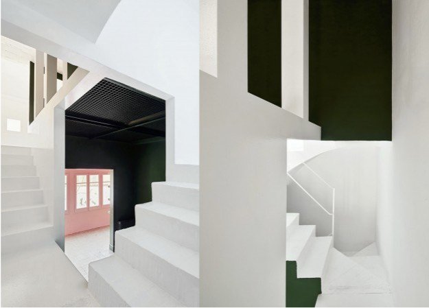
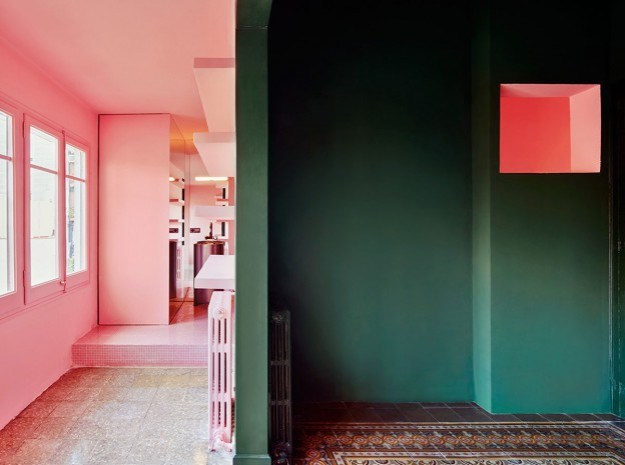
Located in a typical, turn of the century apartment building in Barcelona is this vibrant interior. Little has been done to alter the layout over the three floors, and views through to the outside are not evident. However, clever cut outs have been created within, offering unusual angles and vistas through from one level to the next.

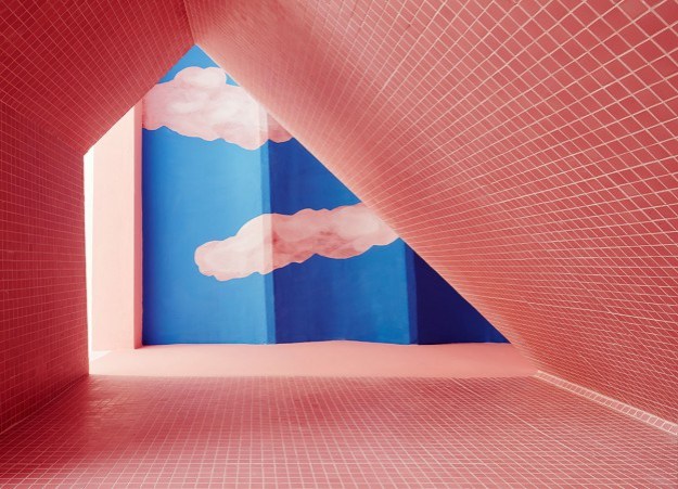
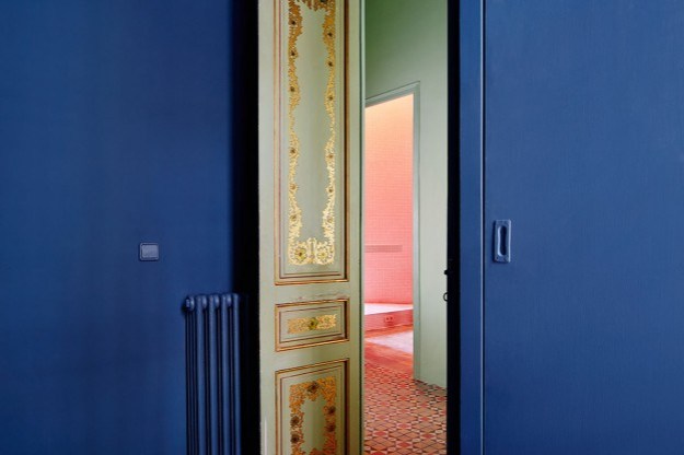
The most striking element, though, are the colours. Deep forest green, pale salmon, strong white and cobalt blue are used to stunning effect on adjacent as well as distant planes. The result allows each surface to take on a sculptural, stand alone quality, whilst still working together in a sort of Escher-style sum of parts. A surrealist sky above a bathroom void draws the eye up. The overall effect is mesmerising.

casahorta_ohlcasahorta_06-ohl.casahorta_08-ohl.

casahorta_14-ohl.

casahorta_02-ohl.

Apart from the vibrant paintwork, decoration is restricted to the typically colourful tiled floors of the era.

I also love the way colour blocking is used in this interior.

What do you think of this combination of colours?

Casa Horta, Barcelona by Guillermo Santoma. Photography: José Hevia


colour of the year.

Pantone have just announced their colour of the year for 2013 – emerald green. The colour, specifically Pantone 17-5641 Emerald, is described as ‘lively, radiant, lush.. vivid and verdant’.

Every year Pantone choose a colour, derived from various sources and influences; last year it was a vivid orange called Tangerine Tango. Green is in fact the most abundant hue in nature – the human eye sees more green than any other color in the spectrum.

Pantone is a standard language for colour communication between designer and manufacturer. Pantone’s founder created a system of identifying, matching and communicating colours to solve the problems associated with producing accurate colour matches in the graphic arts community. His insight – that the spectrum is seen and interpreted differently by each individual – led to the innovation of the Pantone matching system, a book of standardised colour in fan format. Different manufacturers in different locations could all refer to the same system to ensure colours matched without direct contact with one another. It is now used in all the industries, and its influence will be seen in fashion, packaging, graphics, interiors.

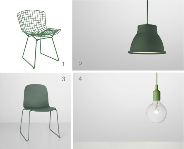
Emerald is certainly a bold choice for an interior. It works with basic black and white, and also with mid to dark-coloured woods. Pinterest is abuzz with emerald imagery, so here some chairs, a floor, a wall, and some fabulous emerald products…

emerald images 3

Images clockwise:  1  /  2  /  3  /  4

products

Products: 1  /  2  /  3  /  4

What do you think of this year’s colour?