an enigmatic modernist.

AXI-Christine-Erhard_ohl

A XI 2011

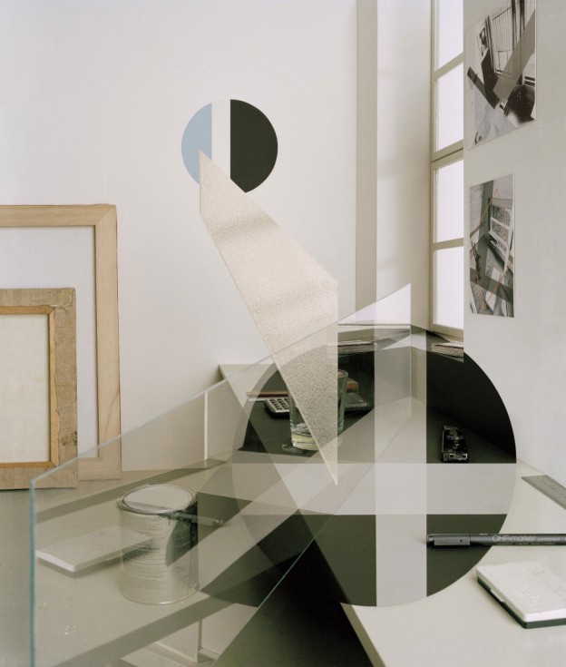
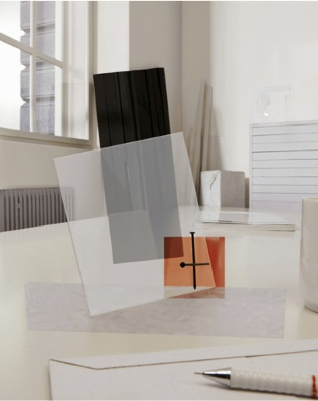
Crossing the boundary between photography, art and sculpture, German artist Christine Erhard’s work is familiar and ambiguous at the same time. The  architectural subject matter and modernist aesthetic seem familiar, until the unusual viewpoint and use of materials cause the imagery to appear distorted and other worldly.

Initially studying sculpture, Christine Erhard became increasingly interested in the images of the object, rather than the objects themselves, until photography and its ability to manipulate became her primary focus. She explores various movements within Modernism, with the avant-garde architecture of the Russian Constructivists a theme she returns to over and again.

Christine cites artists of the 1920s such as Laszlo Moholy-Nagy as her inspiration; artists who work in various disciplines – painting, poetry, graphic design, photography. Like Moholy-Nagy, there is a strong graphic quality to her work. For me, these works are both familiar and enigmatic, and very appealing.

AXX-Christine-Erhard_ohl.

AXX 2011

MI2_ohl

MI II 2012

QV111_ohl

QVIII  2012

More of Christine Erhard’s work, here. All images courtesy of the artist.

antwerp house in blue/grey.

veerle_wenes_en_amberes_307556_1200x800

veerle_wenes_en_amberes_202974908_1200x800 veerle_wenes_en_amberes_575021604_1200x800 veerle_wenes-ohlveerle_wenes2-ohlLike Ampersand house (I write about it here and here), this home in Antwerp doubles as a gallery space. The first thing that one notices is the wall colour: an intense, muted grey/green. The second thing is the cobblestone floor and exposed brick. Originally built as a workshop in the 19th century, it translates beautifully into the 21st, with contemporary materials – resin floors and polished concrete elements – adding to the simple fixturing that allow the gallery’s pieces to be shown to best effect.

Much of the furniture is by Muller Van Severen, who describe their pieces as ‘sitting somewhere between art and design’. I love their simple, industrial but elegant aesthetic.

Gallery house in Antwerp via AD. Photographs: Ricardo Labougle

happy weekend.


fridayskies_owlshouselondon.

owl’s house london on Instagram. Happy weekend.


home of the year 2014.

An eyrie is defined as ‘the nest of an eagle or other bird of prey, built in a high inaccessible place’. A perfect moniker, then, for these two cabins, built on an inlet on the New Zealand coast, and awarded 2014 Home of the Year by Home magazine.

Barely larger than their four sheets of plywood, the cabins are off-grid and autonomous, their outsides burnt black. I love the description of the architects’ vision, a ‘poetic of small boats bobbing in a sea of grass’. There are no doors. One climbs up boulders and in through a window instead. Each comprises a tiny bathroom (both have showers that are outdoors), a kitchen, a sitting area and a sleeping loft. Each has two large windows and wooden hatches that allow ventilation of the bathroom and sleeping areas. A window in the ceiling allows a view of the night sky. The interior of one of the cabins is covered in honey-coloured ply; the other is inky black. A perfect owl’s house.

eyrie16eyrie09HE0414_H_KAIPARA_011-1024x1536

HE0414_H_KAIPARA_005-1024x682eyrie07

Photography, Jeremy Toth (feature image, images 2, 3, 6) and Darryl Ward (images 4, 5)

Eyrie by Cheshire Architects, via. More cabins for living in, here and here

not just copper orange.

colour-futures2015_ohl

The big news in colour is Copper Orange, Colour of the year 2015. Copper has been an emergent trend for a while now, and shows no sign of waning (the Facade of the Year is also copper).

Colour forecasting is a fascinating world, as I discovered in a workshop I attended this morning given by the paint and coatings manufacturer AkzoNobel. It’s not just about the colours we will be buying into in the year ahead; it is an indicator of the way we live and what we are striving for. The other big ideas behind the colour forecast for 2015 are themes of transparency and layering (refer the House of the Year 2014, a transparent house); his and hers, a celebration of the differences between us; merging and gradient colours and non repeating pattern (no more matchy matchy); noticing the undiscovered and negative space.

Fascinating. More, here. Happy weekend.

happy halloween.

Haunting pictures of abandoned theatres by photographer Julia Solis. Elegant and evocative, they also provoke thought of contemporary issues of urban decay and economic downturn.

solis_palace-600x401solis_philadelphia-600x456solis_sanitarium-600x399

Stages of Decay, Julia Solis, available here.

a parisian in barcelona.

Caught in its original condition with just the addition of a rich, chevron patterned oak floor, this apartment contains an enviable collection of modernist delights and objet trouve. Looking very much like a Parisian apartment of the Haussmann era (more Parisians here, and here), the striking furniture is all postwar, French, too: Jean Prouvé, Charlotte Perriand, and an inventory of the wonderful, organic light fittings of Serge Mouille.

piso_de_anticuario_en_barcelona_329126761_1200x901

piso_de_anticuario_en_barcelona_176509230_1200x784piso_de_anticuario_en_barcelona_208971356_1200x784images_ohlpiso_de_anticuario_en_barcelona_368220607_901x1200

It is a very strong aesthetic; each piece of furniture a statement in itself, and each in strong, saturated primary colour. There are lovely details too – the little shelves above the radiators, for example.

Apartment in Barcelona, AD Espana. Photos by Pablo Zamora

the collector.

helly-nahmadgallery_ohl.

It’s art fair season here in London, and the big daddy of them all, Frieze Art Fair, concluded at the weekend.

The white box format with which galleries usually display their wares was changed perhaps for ever more by the innovative booth of Helly Nahmad gallery. The booth, called ‘The Collector’ was a perfect replica of the Paris apartment of a fictional art collector called Corrado N, dating from 1968. Replete with old issues of Paris Match, overflowing ashtrays, and the artwork of Picasso, Miro and (my personal favourite) Lucio Fontana, the studio portrayed the life of a ‘passionate, intellectual reclusive’, who lived and breathed art.

More, Art News. Photo, Fausta Maria Bolettier Continue reading

the anatomy of a building.

lasdun_royal_college_of_physicians_front_dec_2005

Sir Denys Lasdun created a radical new headquarters for the Royal college of Physicians 50 years ago. Unlike anything else in the classical, verdant green surroundings of Regent’s Park, his building was bold, restrained and unashamedly modern. He is also the architect responsible for one of my other favourite of all London buildings, the National theatre, Southbank.

Lasdun’s building is comprised of three contrasting materials, expressing the form of the building and defining the three distinct zones. The grand, ceremonial areas are clad in off-white mosaic, appearing to float above the lower administrative areas constructed from dark blue engineering bricks. Concrete was used for the fire escape and functional, hard-working parts of the building.

rcp-exterior-03

This extraordinary building is the subject of a current exhibition, now until 13 February 2015.
‘The anatomy of a building: Denys Lasdun and the Royal College of Physicians’, Royal College of Physicians, St Andrew’s Place, Regent’s Park, London. More, here

Photograph via and RCP 

sorrento simplicity.

Sorrento is a beautiful coastal town on Victoria’s Mornington peninsula, and I have very fond memories of seemingly endless summer days spent on the beach there. This summer house captures the vibe perfectly in its simplicity and feels just about right on these gorgeous, late September days.

Share-Design-Inspiration-Blog-Sorrento-Beach-House-by-Shareen-Joel-Design-06 Share-Design-Inspiration-Blog-Sorrento-Beach-House-by-Shareen-Joel-Design-04 sorrento-simplicity2_ohl sorrento-simplicity_ohl.
Natural materials reflect the surrounding landscape with timber floorboards, in this case Fir with a white oil finish, and the woody exterior, stained black. Clean white walls reflect the coastal light, with texture provided by the timber lined ceilings, again kept white. The living spaces are open plan with the clever insertion of a log-burning stove and bank of cupboards on one side, and kitchen units on the other. The joinery is kept consistent throughout – white cabinetry and palest grey glass mosaic tiles adding texture and tone wherever a waterproof surface is required. Built-in shelves and a low ledge behind the bed are always a good idea. A second bathroom is kept simple with panels of ply and a reclaimed metal trough.

Scandinavian classics are plentiful with low-slung leather armchairs, Louis Poulsen’s PH5 light, and lots of pieces by Hay and Iittala.

House in Sorrento by Shareen Joel Design. Photographs, Brooke Holm. Via