Category Archives: wonderful spaces.

now house.

It is one of the biggest challenges facing designers – how to integrate traditional and contemporary and make it fit for now.  Pastiche doesn’t work, nor does simply ignoring the original. This house shows one way of mixing new with old, with an end result that is functional and fabulous.

The existing house is a typical, Eastern Australian 1920s bungalow, highly decorative to the street, or public, elevation. In stark contrast, the side elevations of the house were – originally – completely unadorned. The new addition to the rear takes its cue from this diminution in decoration and presents a flat elevation to the rear garden; a simple box form with playful, cut outs for windows. Within, the decorative elements lessen too; the walls become simple planes dressed in white, the free-standing kitchen units stand on a poured concrete floor. All that is left to add are lovely pieces of furniture and a family.

house-boone-murray-tribe-studio-architects_121112house-boone-murray-tribe-studio-architects_121112 (5)house-boone-murray-tribe-studio-architects_121112 (6)hall old + newhouse-boone-murray-tribe-studio-architects_121112(6)

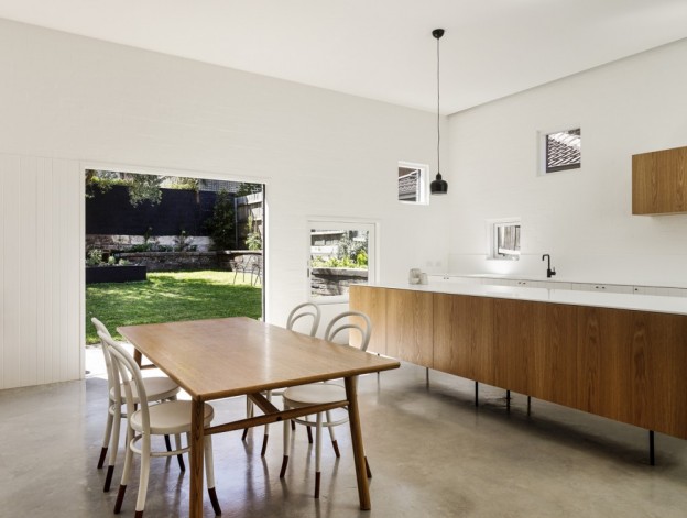
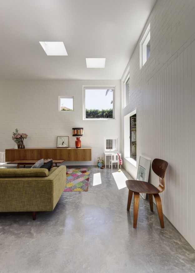
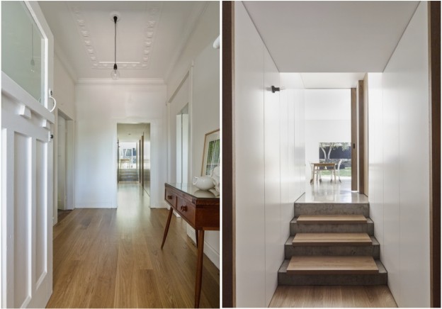
Hence, ‘the public face of the house is decorative and frilly, while the private face is quiet, honest and unadorned. It is the unpretentious face of private family life’.

House Boone Murray by Tribe Studio Architects via

Photographs, Peter Bennetts

More wonderful spaces, here

corten house.

I first came upon the architecture of John Winter (1930-2012) three years ago, experiencing it first hand in a beach house he owned on the north east Norfolk coast (you can stay there too; details, here). Inspired by Charles Eames’ west coast cabin (he worked with Eames when he moved to San Francisco early in his career), he designed and built the house out of renewable timber, steel and aluminium. It is the simplest of plans being rectilinear in form, with windows running along both of the long sides, and my favorite of all interior spaces – a sunken lounge.

The subject of this post however, is not that house but this one, in Highgate, North London. Built in 1967 by John Winter for his own use, this is a wonderful, proper modernist house, given a rare Grade II* listing by English Heritage: ‘This is a highly influential and unusual house in its structure, materials, plan and aesthetic. It is still a model for minimal housing, as influential today as it was when it was built’.

DSC_1875_LargeDSC_1867_LargeDSC_1735_LargeDSC_1886_LargeDSC_1802_Large

Constructed around a steel frame, the house has huge double-glazed picture windows that flood the interior with light. It is clad in Corten, a steel alloy that weathers naturally to a beautiful dark rust colour. This was the first domestic use of the material in Britain, and the proportions of the house and grid were designed around the dimensions of the standard, factory-produced Corten sheet, so that nothing was wasted.

DSC_1711_LargeHOME_NEW_DSC_2819_2_Large

It has three floors with, unusually for the time, the living room on the top floor, to take advantage of the views over the utterly charming Highgate cemetery and Waterlow park opposite. The interior is all original – kitchen, built-in storage, quarry tiles. The long, low linear shelf which runs the length of one wall is a detail he used often. And there is, of course, fabulous original  furniture – Barcelona arm chairs and coffee table, and Eames’ LCW wood lounge chairs and ubiquitous (but no less than fabulous) DSR chair.

It’s for sale, and sadly, I won’t be buying it. Corten house via The Modern House.

More wonderful spaces, here. More design heros, here.

open and close house.

It begins as a linear box, then, a system of wooden, slatted blinds create a dynamic, evolving facade. The blinds and openings operate separately and so allow for different compositions, sometimes controlled and sometimes random. At any given moment and for whatever reason (privacy, protection from the sun) the facade can change. Thus: ‘we can achieve a composition that is balanced, dynamic, haphazard, closed or open within the same framework’.

Within, the space is simple. White perimeter walls, dividing walls that don’t meet the ceiling, others that shoot past. Linear slots in the ceiling contain the lighting. A poured concrete floor provides a seamless transition throughout. The stair comprises timber treads cantilevered off a concrete wall, with formwork bolt holes forming the decorative element on the surface of the concrete in a controlled pattern. The balustrade comprises sheets of iron-free glass (so are transparent, not green in colour) which are without frames or evident fixings.

The furniture is classic and simple – Eames DSR chairs, a Barcelona coffee table, a parasol-like pendant over the solid wood dining table (I’m not familiar with this particular pendant, but it’s rather lovely).

ks_080313_02-940x468ks_080313_13-940x626ks_080313_04-940x626ks_080313_15-630x420ks_080313_14-940x626ks_080313_18-940x1321

The wood slats are continued inside, which together with the external slatted blinds, cast wonderful lines of sharp, playful light.

Kfar Shmaryahu House in Israel by Pitsou Kedem Architects via 

More wonderful spaces, here

house of the year.

A little further from home this time, this house has just been awarded House of the Year 2012 by World Architecture News (WAN), the global architecture news web-site.

The location is spectacular – situated on top of a granite rock, overlooking a man-made dam. Rather than being overwhelmed by its elevation, the house appears to float over it, with changing levels to take advantage of the views all around. It is a relatively simple structure, with two granite blocks, excavated from the site, to anchor the building and enclose the bedrooms; an over-sized timber platform and roof to protect from the harsh sun, and two glass boxes spanning between. All materials are locally sourced, except the specialist items – the glass, for example.

The magic lies with the shifting planes, which follow the gradient of the hillside perch. A sunken terrace here, an over-sailing roof there.

21494_3_OUTSIDELOUNGE21494_5_INTERIORSINK21494_4_OUTSIDELOUNGE21494_6_INTERIORSTAIR21494_2_EXTERIOR

Gota Residence, East Africa, by Sforza Seilern Architects. Read what the judges said, here.

More wonderful spaces, here

a 70s modernist.

A big linear space, not high ceilinged but light and white and bright, with large windows on three sides. A curved, raw brick half-circle creates a dynamic division within the living space, and provides a back-drop for the beautiful metal spiral stair that meanders up to the next level.

The otherwise white box is given texture and mood with a dark timber-lined ceiling, adding interest and warmth. The ceiling opens to form a roof light allowing light to flood in over the kitchen.

HOME_RECEPTION2_LargeTWO_RECEPTION1_LargeTHREE_KITCHEN_DINING_Largekitchenstair

FOUR_BEDROOM_LargeThis three-bedroom house was built in the 1970s; the best bits were kept, refurbished and an extension added. In a vibrant part of London, close to the lovely green spaces of Highbury Fields, and it’s for sale… I could, could you?

Via The Modern House

More wonderful spaces, here

old house, new house.

The wonderful, spare structure of the original house in rural Spain has been retained. A concrete floor is poured, a new staircase inserted, a simple tread and handrail detail added; old walls are kept raw, carefully considered niches are added. The house, old and new, is painted white. A sculpture placed here, a pop of colour there.

Contemporary_House_in_Spain_Benjamin_Cano_afflante_com_3Contemporary_House_in_Spain_Benjamin_Cano_afflante_com_2_2Contemporary_House_in_Spain_Benjamin_Cano_afflante_com_2_0Contemporary_House_in_Spain_Benjamin_Cano_afflante_com_2Contemporary_House_in_Spain_Benjamin_Cano_afflante_com_5Contemporary_House_in_Spain_Benjamin_Cano_afflante_com_7Contemporary_House_in_Spain_Benjamin_Cano_afflante_com_8Contemporary_House_in_Spain_Benjamin_Cano_afflante_com_10Contemporary_House_in_Spain_Benjamin_Cano_afflante_com_13

Can you feel the warmth? Contemporary house in Spain by Benjamin Caro via

Images by Belén Imaz

More wonderful spaces, here

black + white house.

I discovered this house on Pinterest and had to investigate further. The beautifully framed views were the first thing that caught my eye; the cutouts with their wonderfully deep window reveals hint at the sheer thickness of the walls beneath. The next thing that captures the imagination is the restrained but dynamic palette of whitest white and blackest black, which offers the perfect backdrop to the soft, watercolour view beyond. An original brick wall is retained and painted dusky black, offering softness and texture to the otherwise crisp, smooth surfaces. The junctions between old and new float past each other and provide a slot where light is allowed to emanate from, or left in shadow. The palette of materials is kept minimal; a simple wood kitchen bar sits like a sculptural piece in the otherwise white space, with the rest of the kitchen concealed behind a white wall of doors.

1339549279-gba-house-g-s-luc-roymans-7-672x10001339549802-gba-house-g-s-luc-roymans-10-1000x6581339549819-gba-house-g-s-luc-roymans-12-717x10001339550008-gba-house-g-s-luc-roymans-16-785x10001339550088-gba-house-g-s-luc-roymans-19b-708x10001339550020-gba-house-g-s-luc-roymans-18-673x10001339549404-gba-house-g-s-luc-roymans-8-1000x6091339548936-mainimage-gba-house-g-s-luc-roymans-1-829x1000

This 19th century corner house is located on the waterfront overlooking the old city harbour docks of Ghent, Belgium. The original house was stripped back to facade, stairwell and roof truss. The rooms and living spaces are conceived as a ‘stack of volumes, a white sculpture inserted in the existing casing’. The functions of the house are inverted, with the bedrooms on the ground floor, the living areas above. The architects have aimed to create a ‘symbiosis between contemporary residential living and the charm of a 19th century Belgian corner house’.

I’d move in tomorrow, would you?

House G-S in Ghent, Belgium via Arch Daily

Photography, Luc Roymans

More wonderful spaces, here

a glamorous modernist.

In a series of low-slung, white, modernist buildings set among vineyards is this hotel. The warm, earth-toned interiors are dominated by wood and slate, with timber slat walls dividing the linear spaces according to function. Copper light fittings and bronze sculptural pieces add glamour to the wonderfully textural, bespoke furniture pieces.

l'and vineyard1

mk_161212_10

mk_161212_13mk_161212_16mk_161212_17mk_161212_19patio2_10828729794ec38b5c8020amk_161212_26-940x626

This is the first project in Portugal to be certified under BREEAM. BREEAM (BRE – Environmental Assessing Method) is a standardised environmental assessment method and rating system for buildings. A BREEAM assessment uses recognised measures of performance to evaluate a building’s specification, design, construction and use. The measures used represent a broad range of categories and criteria from energy to ecology. More about BREEAM, here

So – good looks AND green credentials. I think I’d like to be checking in about now…

L’and Vineyards, Montemor, Portugal by StudioMK27 with Promontorio architects; photography Fernando Guerra.

More wonderful spaces, here

eclectic loft style.

Industrial, eclectic, contemporary, this apartment in Paris is wonderfully open and spacious, yet intimate.

The interior has been stripped back to its shell, and the structure – concrete columns and beams and the odd brick wall – kept in their raw state. The original iron work of the window frames (and a wonderful transparent screen between the bathroom and bedroom, just glimpsed in the photographs) have been painted black, causing them to recede.  There is a lightness of touch – the structure is expressed, but it doesn’t overwhelm. A wide-planked American oak floor has been added for warmth.

The palette and fittings are kept simple with shades of grey, black and white, allowing the fabrics and materials of the found objects – a mix of industrial pieces and flea market finds – to add their own exuberant colour and texture. I spy contemporary design classics too – Eames DSW side chair (on sale, here), Bertoia side chair, Butterfly chair.

paris loftparis loft2Antonio-Virga-Bonnard-Apartment-5

Photography Birgitta Wolfgang Drejer via 

There is an interesting article entitled The Raw Design Movement, here, identifying the use of raw materials as an interior design trend going forward in 2013. This isn’t a new idea, but I’m all for materials left in their natural state. What do you think of the use of natural, unembellished  materials in interiors? Does this eclectic, raw loft space inspire you?

More wonderful spaces, here.