Tag Archives: design

mid century east.

Yesterday’s Mid Century East show at Erno Goldfinger’s marvellous Haggerston school was the usual trove of fabulous modernist finds. Apart from the pieces, what I love about the show is how everyone who attends is passionate about design. Dealers love what they do and love to talk about their wares. And, of course, the pieces themselves always come with a fascinating provenance.

A brief walk-through below, featuring just a few favourite pieces and their dealers; some known, others new.

MARDEN_ohl

Mar-Den had the wonderful, on-end, angled brick wall as a backdrop in which to display, in the beautifully proportioned double-height space of the hall.

PF_ohl.

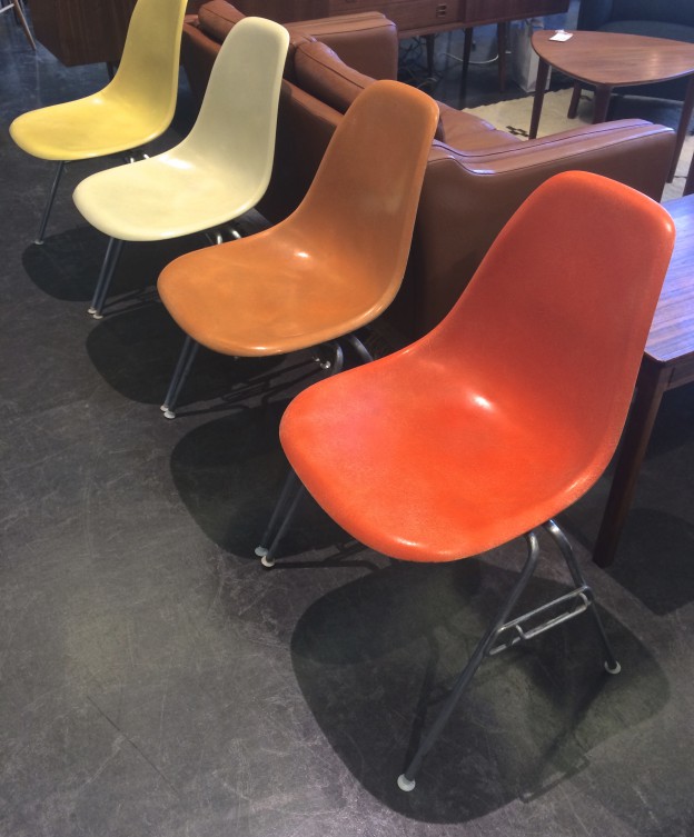
Pink Flamingoes specialise in American design, and showed Eames classics in fabulous colours.

BB_ohl.BB_ohl.

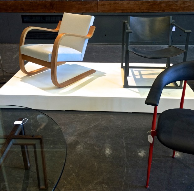
Beton Brut specialise in architect-led design from post-War France, Italy, Netherlands and Scandinavia. I’m yet to visit their new showroom in East London but they have a very seductive  website in the meantime.

SFA_ohl.

Saunders Fine Art always tempt with their modern British and European art and also collectables.

KULA_ohl.

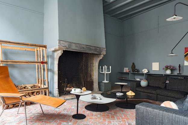
My favourite of the show was a pair of lounge chairs from the ‘50s, with a wonderful back-story, having been languishing with their original owners in the south of France until now. From The Kula.

MCEimages_ohl

Lovely accessories at Fragile Design

1934_ohl.

1934, named for Gerrit Rietveld’s ‘crate furniture’ series in 1934, has a tightly curated collection of simple, functional pieces.

saloneMCM_ohl

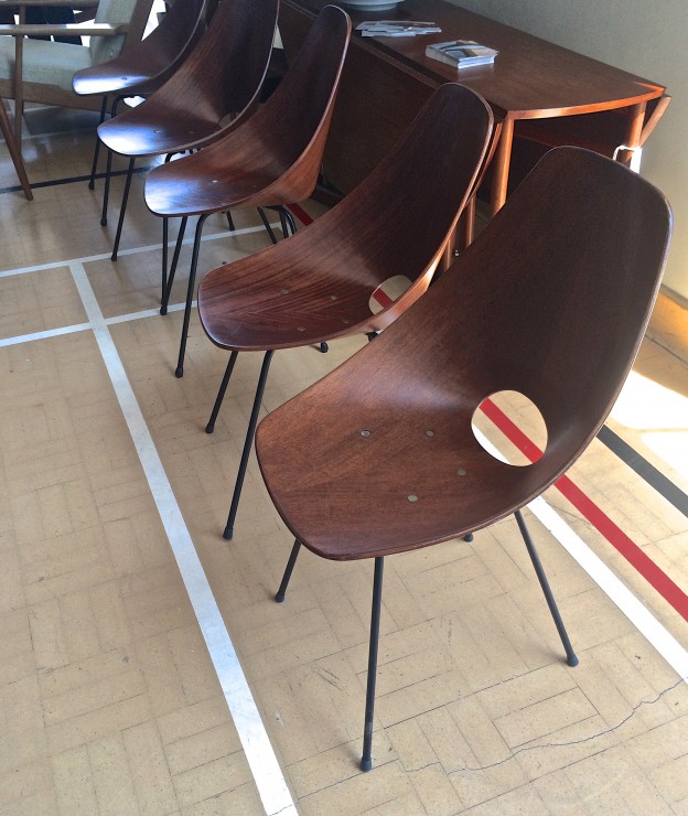
Gorgeous Vittorio Nobili Medea Chairs (and a few knock-out light fittings) at
Salone MCM

Dd you go? Any favourites? More mid-century show round-ups, here and here.

All images owl’s house london taken on my iPhone 5.

lessons in modernism.

If I could be anywhere this coming week it would be Palm Springs for Modernism week and the Palm Springs Art Fair. Palm Springs is of course a modernism enthusiasts’ delight, with its plentiful single and split level homes, all shifting planes and open plan layouts, with big glass sections and cantilevered floors.

Instead, I’m rediscovering the work of one of my favourite proponents of the style, the Melbourne architect and writer Robin Boyd. His work and in particular his writing were hugely influential on me growing up in the suburbs of Melbourne. His two key tomes – Australia’s Home and The Australian Ugliness – defined for me everything that was wrong with suburban living.

One of his best known works is Walsh Street house designed by Boyd for his family in 1957. It now houses the Robin Boyd Foundation and remains in its original condition.

Walshst-backroomWalshst-diningroomWalshst-mezzWalshst-balconyWalshst-kids2Walshst-bathroom

Furnished with pieces designed by Boyd’s contemporaries – Grant Featherston and Clement Meadmore (whom I once met, and visited his home in NY) amongst others – it demonstrates the design principles championed in his books, utilising an introspective layout, with the main house and a separate children’s pavilion facing inwards toward a central courtyard. (This was in direct contrast to the usual model of building a suburban house in the middle of the block).

The finishes are bold and intense – deep, saturated colours and dark-painted brickwork walls; rich red woodwork, glimmering mosaic and even copper (how very contemporary..). Floor-to-ceiling plate glass, soaring ceilings and clerestory windows ensure light and nature are ever present.

An (almost) fitting substitute for a trip to Palm Springs…

Walsh Street House via Photographs, Eve Wilson

house of simple ambiguity.

The first thing that struck me about this building was the beautifully proportioned front facade (read my take on composition, here); next, the stratified brickwork – thin linear strips graduating to larger brick sections as the eye travels up the building.

Located in an historical centre but lacking any character of its own, this house also faces the challenge of its narrowness, a 6.5m width. To resolve the problem of getting light in, a series of outdoor spaces create a transition between the rooms, thus becoming rooms themselves. Privacy, solar gain, ventilation and light are all addressed and resolved in one fell swoop. The sequence of spaces also creates a lovely ambiguity about what is an interior and what is an exterior space.

Because the colour and rhythm of the exterior masonry is visible from within, the interior walls are painted white, with just the window reveals left raw. There are simple, pale wood floorboards and an exposed (but beautifully detailed) metal ceiling. Sometimes, the materials are reversed, and the ceiling or walls are lined with wood. The zig zag line of the stair soffit plays against the pattern of the metal ribbed ceiling as it rises up, as well as the rhythm of the wood planks.

house-1014-h-arquitectes_10_mg_00-78_79-ohl.image2-ohl.house-1014-h-arquitectes_08_mg_0054_55_tall-ohl.image1-ohl.house-1014-h-arquitectes_12_mg_0559_60_tall-ohl.

A kid’s room contains a single piece of furniture serving all necessary functions – sleeping, reading and storage.

Perfectly proportioned on the outside, simply and beautifully detailed within.

House 1014 by H Arquitectes, via Photographs: Adrià Goula

memphis-styled sound.

I love these images for Bang + Olufsen’s latest range, featuring the work of photographer Phillip Karlberg (it’s worth a look at his portfolio, with stunning photographs for Kasthall, amongst others). The products, all angular shapes and luxe materials – brushed aluminium, oak and black, are styled against a palette of white marble, blush pink, vibrant blue and pale silver.

b+o_ohl.b+o2_ohl.b+o3_ohl.b+o4_ohl.

There are distinct references to the Memphis movement, which is having a moment in interior and product design, but without the flamboyance. A sort of minimal, refined post-modernism. I think its a great look, what about you?

here comes the sun.

olafur eliasson, contact, 2014
 image © iwan baan

olafur eliasson, contact, 2014
 image © iwan baan

I’m always deeply impressed by industrial designers who design products that function well and look good too, products that you can’t imagine being without (hello, toothbrush! hi, umbrella!). Here’s a chance to create something functional, beneficial, and hopefully, beautiful too. Natural Light is an international competition for design students to create a special edition solar lamp, with the intention of bringing sustainable light to areas in Africa where there is none. The original Little Sun lamp – a simple, vibrant-hued flower lamp – did just that. Thousands of Little Suns were distributed to nine African countries, replacing expensive and polluting alternatives such as kerosene lamps. littlesun_ohl.

Little Sun is a social business who produce sustainable lighting solutions for off-grid African communities; the artist Olafur Eliasson is a co-founder. Eliasson is probably best known for The Weather Project, the dynamic and captivating sun installation that inhabited Tate Modern’s Turbine Hall in 2003-2004 (see his gorgeous current project at the Louis Vuitton Fondation, here) oe_weather-project

The Natural Light competition is a collaboration between Little Sun and Velux. Velux promote sustainable architecture and publish research into daylight, its effects on well-being and the environment. Their informative magazine contains useful information for designers on daylight and sustainable architecture, and of course they produce all manner of blinds.

Further details on the competition, Natural Light, here. disclaimer2

antwerp house in blue/grey.

veerle_wenes_en_amberes_307556_1200x800

veerle_wenes_en_amberes_202974908_1200x800 veerle_wenes_en_amberes_575021604_1200x800 veerle_wenes-ohlveerle_wenes2-ohlLike Ampersand house (I write about it here and here), this home in Antwerp doubles as a gallery space. The first thing that one notices is the wall colour: an intense, muted grey/green. The second thing is the cobblestone floor and exposed brick. Originally built as a workshop in the 19th century, it translates beautifully into the 21st, with contemporary materials – resin floors and polished concrete elements – adding to the simple fixturing that allow the gallery’s pieces to be shown to best effect.

Much of the furniture is by Muller Van Severen, who describe their pieces as ‘sitting somewhere between art and design’. I love their simple, industrial but elegant aesthetic.

Gallery house in Antwerp via AD. Photographs: Ricardo Labougle

happy weekend.


fridayskies_owlshouselondon.

owl’s house london on Instagram. Happy weekend.


not just copper orange.

colour-futures2015_ohl

The big news in colour is Copper Orange, Colour of the year 2015. Copper has been an emergent trend for a while now, and shows no sign of waning (the Facade of the Year is also copper).

Colour forecasting is a fascinating world, as I discovered in a workshop I attended this morning given by the paint and coatings manufacturer AkzoNobel. It’s not just about the colours we will be buying into in the year ahead; it is an indicator of the way we live and what we are striving for. The other big ideas behind the colour forecast for 2015 are themes of transparency and layering (refer the House of the Year 2014, a transparent house); his and hers, a celebration of the differences between us; merging and gradient colours and non repeating pattern (no more matchy matchy); noticing the undiscovered and negative space.

Fascinating. More, here. Happy weekend.

a parisian in barcelona.

Caught in its original condition with just the addition of a rich, chevron patterned oak floor, this apartment contains an enviable collection of modernist delights and objet trouve. Looking very much like a Parisian apartment of the Haussmann era (more Parisians here, and here), the striking furniture is all postwar, French, too: Jean Prouvé, Charlotte Perriand, and an inventory of the wonderful, organic light fittings of Serge Mouille.

piso_de_anticuario_en_barcelona_329126761_1200x901

piso_de_anticuario_en_barcelona_176509230_1200x784piso_de_anticuario_en_barcelona_208971356_1200x784images_ohlpiso_de_anticuario_en_barcelona_368220607_901x1200

It is a very strong aesthetic; each piece of furniture a statement in itself, and each in strong, saturated primary colour. There are lovely details too – the little shelves above the radiators, for example.

Apartment in Barcelona, AD Espana. Photos by Pablo Zamora

sorrento simplicity.

Sorrento is a beautiful coastal town on Victoria’s Mornington peninsula, and I have very fond memories of seemingly endless summer days spent on the beach there. This summer house captures the vibe perfectly in its simplicity and feels just about right on these gorgeous, late September days.

Share-Design-Inspiration-Blog-Sorrento-Beach-House-by-Shareen-Joel-Design-06 Share-Design-Inspiration-Blog-Sorrento-Beach-House-by-Shareen-Joel-Design-04 sorrento-simplicity2_ohl sorrento-simplicity_ohl.
Natural materials reflect the surrounding landscape with timber floorboards, in this case Fir with a white oil finish, and the woody exterior, stained black. Clean white walls reflect the coastal light, with texture provided by the timber lined ceilings, again kept white. The living spaces are open plan with the clever insertion of a log-burning stove and bank of cupboards on one side, and kitchen units on the other. The joinery is kept consistent throughout – white cabinetry and palest grey glass mosaic tiles adding texture and tone wherever a waterproof surface is required. Built-in shelves and a low ledge behind the bed are always a good idea. A second bathroom is kept simple with panels of ply and a reclaimed metal trough.

Scandinavian classics are plentiful with low-slung leather armchairs, Louis Poulsen’s PH5 light, and lots of pieces by Hay and Iittala.

House in Sorrento by Shareen Joel Design. Photographs, Brooke Holm. Via