Tag Archives: architecture

a cabin for living.

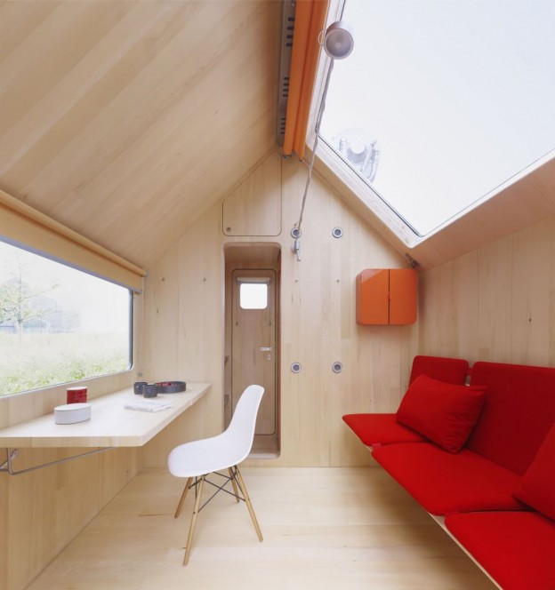
Diogene is a minimalist living unit that functions as a self-contained system independent of its environment. It is named after the ancient philosopher Diogenes, who is said to have lived in a barrel because he considered worldly luxuries to be superfluous.

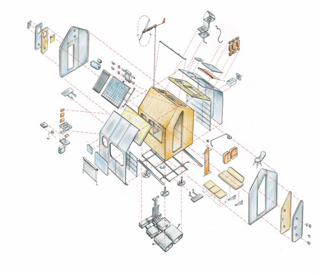
Designed by Renzo Piano (who paradoxically also designed Western Europe’s tallest building, the Shard), Diogene is fully equipped with everything one needs to live. The front serves as a living room, with a pull-out sofa on one side and a folding table under the window on the other. Behind a partition are a shower, toilet and kitchen. It is constructed from wood which also informs the interior; the exterior is coated with aluminium cladding for weather protection. With a footprint of 2.5 x 3 metres when fully assembled, it can be loaded onto a lorry and transported anywhere. The house’s simple exterior, corresponding to a child’s image of a house, belies the complexity of photovoltaic cells and solar modules, a rainwater tank, biological toilet, natural ventilation and triple glazing, all required to allow it to exist autonomously. Diogene has many possible uses: It can serve as a weekend house, as a studio, or as an office. It can be placed freely in nature, but also right next to a workplace, even in the middle of an open plan office.

vitra_diogene_owl'shouselondon.vitra_diogene.

Renzo Piano cites Le Corbusier’s Cabanon as one of his architectural references. Le Corbusier, who believed a house was a ‘machine for living’, constructed the cabin for his own use in the 1950s in Cap Martin in the Côte d’Azur. Based on human proportions – the walls are 2.26m high, the height of a six-foot man with one arm above his head –  it is for me the ultimate summerhouse. More on Cabanon, here

CABANON-LE-CORBUSIER-de-jeunes-gens-modernes-4-jpeg_201019

Image of Cabanon via Domus

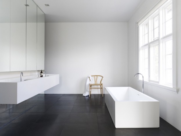
Renzo Piano’s Diogene is installed on the Vitra campus in Germany. What do you think? Could you live in a house this size? Or is this Airstream caravan, with full size bathtub, more your style? (via the wonderful Girl and the Abode)

More good design series, here

interior of the year.

I’m always curious to see what is new and happening in my home town of Melbourne, especially when it comes to design. Winner of the Residential Design awards at this year’s Australian Interior Design Awards was this house – Park House in Melbourne. The design was celebrated for its ‘seamless and effortless spatial flow, which achieves a sincere sense of livability and controlled softness throughout’.

Everything in this home is highly controlled, from the super-fine, curved metal balustrade and opposing recessed handrail through to the vertical garden. However, an organic quality also exists – horizontally, in the flow of the spaces, as well as vertically, with curved, plastered walls continuing up past the ceiling planes, allowing the light to stream down in between in a controlled, but playful, manner.

The palette and detailing is again purposefully restrained, with a clear emphasis on materiality. Wood ceilings, for example, are a wonderful way to bring in warmth and softness as a counterpoint to the hard stone floors. Glass, plaster and metal elements are all utilised in the creation of the flowing forms and spaces. Furniture and fittings are perfectly suited and again selected for finish and form.

park house on owl's house london2owl's house london. park house4owl's house london. park house1park-house-05

The house was a collaboration between Leeton Pointon Architects + Interiors and Allison Pye Interiors. Park House via Australian Design Review, here. Photographs, Peter Bennetts.

Which of the elements stand out for you?

More wonderful spaces, here

an italian summer house :: from the archive.

There is good reason this 17th-century oil mill in southern Italy looks more like a furniture showroom than an inhabited summer house. The dwelling is filled to the brim with the designs of the owners, the architects (and husband and wife team) behind Palomba Serafini Associati, who have together designed bathrooms, kitchens, furniture and lighting for some of the biggest names in Italian design: Boffi, Cappellini, Foscarini and Zanotta.

Retaining the rawness of the existing structure, they have made few interventions, retaining ancient stone floors, walls and arches. A lack of windows in the old mill has been overcome with the use of skylights carved out of the stone, as well as a patio at the rear, allowing the daylight to flood in. In the kitchen they have adapted to the existing space, adding only a sleek, minimal but multi-functional stainless steel island, originally designed for the Italian cabinetry company Elmar. A stainless steel screen separates the work and sleeping areas.

As well as their manufactured products, the home contains bespoke pieces, all commissioned from local craftspeople. One piece that really stands out is the Lama chaise longue, originally designed for Zanotta in steel and leather (see it, here); here they have upholstered it in straw and red metal. It is a beautiful and fluid stand-alone piece.

owl's house london1owl's house london2

palomba-kitchenowl's house london3

 Via Dwell. Images by Francesco Bolis.

What do you think of Italian summer house – showroom or home?

More wonderful spaces, here

a chelsea townhouse.

The renovation of this brick townhouse in New York’s Chelsea neighbourhood was designed to connect the garden level spaces with the exterior and to create open living spaces throughout. With this intention it succeeds – a large glass sliding wall system connects the living room and garden, framing the view; casement windows at the upper levels have been fully glazed to allow the master bedroom and bathroom uninhibited views to outside. A spiral stair within winds organically between the two levels, the continuation of the wood floor assists the flow upwards between the spaces.

The palette is a simple one – grey oil-stained European White Oak, white walls and large slabs of white marble. Lighting in linear slots between horizontal and vertical planes provides an ambient, warm glow. The white and grey-veined Calacatta marble of the kitchen worktop forms a strong sculptural element, with everyday utensils and appliances hidden away behind doors. The marble slabs also create a seamless bathroom, where the surfaces are seemingly carved out of stone. (Similar to Carrara marble, Calacatta marble also comes from the Carrara region of Italy, but has a bolder, more dramatic vein, which can vary from grey to brown. It is also a whiter white, which makes it more valuable).

Built-in storage and shelving and beautiful mid-century furniture pieces furnish the spaces simply.

temp_kitch_1images2 ny townhouse by ohl

temp_stair_4temp_liv_1temp_bed_2

ext ny townhouse by ohl

Templer Townhouse by Workshop for Architecture LLP, here.

More wonderful spaces, here.

house of lightness and glass.

I love floor to ceiling glass, allowing the inside and outside to coexist, bringing light in and blurring the boundaries between outside and in. Glass boxes, however, where the glass forms two or three sides and a ceiling, can so easily feel cold and clinical. Perhaps it has much to do with the climate in this country, but I can’t think of anywhere I’d less rather be on a cold, grey day.

This addition, however, feels like a place I would like to be. Perhaps it is the sculptural quality – not a box, but an architectural form with a raking roofline. Perhaps the interplay of solid white planes with the glass, or the double height space allowing the light to plunge through the volume. Contrasting against the darker, more formal spaces of the original house – lounge, study, dining room – are the lighter, informal areas of the new – the open plan kitchen and casual living. Vertical voids cut through the house to unite the cellar, ground and first floors, allow light to filter down gradually, creating beautiful shards of light and shadow.

gh_140513_07 gh_140513_09 gh_140513_12 gh_140513_01

The joinery and furniture is kept simple and rectilinear, further emphasising the lightness of the space, with pale ceramic flooring (not timber, which would fade over time in the sunlight), and glass stair treads.

Glass house in Winchester, England, by AR Design Studio, via

More wonderful spaces, here

a perfect case study.

singletonhousedailyicon

The case study houses of the 1940s, ’50s and ’60s have long been my idea of the perfect contemporary home – open plan, maximum glazing, simple, functional. Perhaps the climate helps (these homes were most often built in California), but they seem to embody a free and easy lifestyle and optimism. Post war construction methods and new materials made the houses possible, and yet…

The Case Study house program stated that: each ‘house must be capable of duplication and in no sense be a individual performance.. It is important that the best material available be used in the best possible way in order to arrive at a ‘good’ solution of each problem, which in the overall program will be general enough to be of practical assistance to the average AmerIcan in search of a home in which he can afford to live…’ I just adore this philosophy.

Nine architects were involved in the initial scheme, including Richard Neutra and Charles Eames. I have often wondered how they could get these simple, easy-to-build forms so right; contemporary architecture today very often loses sight of its modernist roots.

Now a new partnership between the son of Richard Neutra, and the California Architecture Conservancy, means one can license the right to build from the plans of Richard Neutra. More about the scheme, here. Neutra (1892-1970), one of the most important of the mid-century modernist architects, became famous for the simple geometries of his designs, which were often made of steel and glass, and the prefabricated elements that made them extremely easy to build. Known for rigorously geometric yet open and airy structures, Neutra blended the interior and exterior of a space such that it would ‘place man in relationship with nature; that’s where he developed and where he feels most at home’. This philosophy grew from a feeling that “our environment is often chaotic, irritating, inhibitive and disorienting. It is not generally designed at all, but amounts to a cacophonous, visually discordant accretion of accidental events, sometimes euphemized as ‘urban development’ and ‘economic progress’’’.*

neutbuc05dailyiconneutbuc06dailyiconneutrareu04dailyiconneupes06dailyicon

neupes04dailyiconTroxell08dailyiconTroxell01dailyicon1 / 2 / 3 / 4 / 5 / 6 / 7 / 8  (not all were the case study models, but too good not to show).

A very funny account of what it must be like to live in a mid-century modern home with children, here

More wonderful spaces, here. And my take on the fabulous mid-century modern show at Lord’s in London this past weekend on next Thursday’s post…

* Quotation from Neutra’s biography, Life and Shape, available from this dreadful-looking Neutra web-site..

house in a wren tower.

Just back from the beautiful Brecon Beacons and days filled with sunshine, dappled light and daffodils. And most challengingly, no internet! So with no post on Monday this week, we begin with Thursday’s post… I can’t quite imagine calling a Grade 1 listed, Sir Christopher Wren-designed tower in central London home. If I could, this is what I hope it would look like.

Alterations were made to Christ Church tower, to form a single family house over twelve (12!) levels. Masterfully restrained, the palette is of wood floors and white painted walls. A curved glass handrail, simply pinned off the concrete stair, winds ever upwards; the upper-most level is connected by the narrowest, wood, double-tread stair. Landings allow moments to pause, furnished with beautiful classic pieces.

wren images 1wren images 2wren images 4wren images 5wren images 3wren images 6

Christ Church tower, London by Boyarsky Murphy Architects

Another house on many levels, here

house of 150 trees.

One of the most important elements of good design is context – the way a building sits within its environment, or the way the setting influences the design. Just as design is a response to a set of needs or problems, context shapes the design response. Without context there is only  art or decoration. This beautiful Danish summerhouse is a perfect example of context in design – the owner harvested 150 pine trees from the land, then cut them into beams to build his home.

Wood in its different guises create the horizontal planes – panels of ply on the ceiling, knotty pine floor boards. The interconnecting vertical planes are of complimentary materials – steel, glass and brick – all kept in their raw state. A towering, angled chimney made of blonde, double-long bricks sits centrally within the open-plan space, housing the fireplace and oven. A white concrete bench top wraps around the chimney from the kitchen to the living area. The house features large floor-to-ceiling windows, the glazing angling up and folding over to form the roof, creating views up and beyond the trees to the sky. Over the kitchen and dining area, a matte-black roof follows the same plane, then breaks form and folds straight outward, hovering above a patio. Adjacent to the main house  is the studio, whose slanted exterior beams and horizontal knotty pine walls repeat those of the primary structure.

ohl-danish-holiday-home-06ohl-danish-holiday-home-05ohl-danish-holiday-home-03-600x447ohl-danish-holiday-home-01-600x450

The exposed, galvanized-steel framing is echoed in the pendant lamps over the dining table and chair legs;  the table was made from the same pine that was milled on-site.

Summerhouse, via dwell and http://www.brask-leonhardt.dk/

More good design series, here. More wonderful spaces, here.

a contemporary classicist.

Originally built in1929, this Melbourne home has been meticulously restored and updated to create a cohesive series of beautifully proportioned, contemporary spaces.

Marking the transition between original and new, openings are lined with steel to become portals, frames are painted black allowing them to recede. A two storey glazed structure to the rear brings light to the centre of the home, defining a new circulation core to the building. A large, glazed skylight tracks the path of the sun, filling the interior with more light.

A blackest black, high gloss floor becomes a reflecting pool for the furniture pieces that sit upon it. White walls are a counterpoint for the contemporary art to reside. Kitchen and bathroom cupboards are white and elegantly minimal. The joinery is allowed to break through the external wall at the rear as the connection between indoor and outdoor living. Furniture is classic Scandinavian – Wishbone chairs, Tulip table, AJ floor lamp, as well as Italian, with simple and bold pieces by Antonio Citterio.

sy_190413_04-940x705sy_190413_05sy_190413_10-940x705

sy_190413_08-940x705sy_190413_09-940x705sy_190413_14-940x705sy_190413_02-940x1253sy_190413_01-940x705

A perfect backdrop for a modern family, who will add the vibrance and colour to this masterfully restrained home.

South Yarra residence by Carr Design Group, via

More wonderful spaces, here