holly frean.

1933_1000

Na Na Na Na Na, after Sir William Nicholson’s Portrait of Gertrude Jekyll of 1920, 2012

“Intimate in scale, richly coloured, playfully serious, seriously playful…”

Rather aptly named, Before and After is an exhibition of the work of Holly Frean at Rebecca  Hossack Gallery in London. Apt, because there is something reassuring and familiar about the contorted faces – these are paintings we have seen before. Their formats, too, are traditional – oval shaped, like portraiture of the past.

But these paintings are thoroughly modern. Layered thickly and jewel-coloured, they feel intimate, like they have been painted for you, the viewer. I want to peer into them rather than stand back from them. The wonderful titles just add to the playfulness…

cat womanmonaandy warhol

What do you think? Do you feel a sense of familiarity and fondness when you view these paintings? 

Before and After, Rebecca Hossack Gallery, until 19 January 2013.

More in the gallery series, here

gio ponti.

villa arreaza, caracus

Architect, craftsman, editor, writer, set designer and industrial designer. Founding editor of Domus magazine. Gio Ponti (1891-1979) has long been a design hero of mine, and how wonderfully relevant his designs are even today – all geometric patterns and blue-greys, and all imbued with exuberance and life.

Gio Ponti didn’t simply create buildings. He conceived the building’s interior as well, creating furniture, lighting, appliances, and ceramics, glassware, and silverware. Alice Rawsthorn in the NY Times called him a ‘designer of a thousand talents’ (read the review, here)

ponti furniture

Furniture images via

The Design Museum opened a wonderful exhibition of his work in 2002. Two quotes of his really resonated for me, as a mantra to follow and at the same time demonstrating his spirit and passion:

‘The architect must imagine for each window, a person at the sill, for each door a person passing through’.

‘Enchantment, a useless thing, but as indispensable as bread’.

Ponti originally trained as an architect and entered industrial design by developing products for Richard Ginori, an 18th-century ceramics manufacturer in Florence, for whom he later became artistic director. As an architect, Ponti’s designs embodied and embraced every era in which he worked. The classical style of his earliest houses in the 1920s, evident also in his designs for Ginori, were heavily influenced by Andrea Palladio’s 16th-century villas. In the forties he designed costumes and sets for the opera and ballet, as well as gleaming chrome espressomakers for La Pavoni. He also started another magazine, Stile. After the war he helped rejuvenate Italian ship travel with a commission to fit out four ocean liners. In the fifties his collaborations with Piero Fornasetti resulted in a series of surreally beautiful residences in Milan. In addition he built the iconic, modernist skyscraper, the Pirelli Tower (1956) in Milan, the Villa Planchart (1953-57) and the Villa Arreaza (1956) in Caracas, Venezuela, which are among the most exquisite houses of the modernist period. There is a wonderful article written by Ponti himself describing the Villa Planchart and his design process, in an archival issue of Domus (read it, here).

planchart01dailyicon

ponti02dailyiconponti01dailyicon

arreaza4

Images of Villa Planchart via Gio Ponti archive and Daily Icon

Ponti used his writing and editorial roles to champion designers and artists whom he admired, including Carlo Mollino, Piero Fornasetti and Lucio Fontana, and in the process contextualised Italian design within contemporary culture. He always encouraged young designers, even when they challenged his own thinking. Among them were Alessandro Mendini and Ettore Sottsass, who were at the forefront of the 1970s post-modernist movement, which emerged as an alternative to modernism.

‘It is neither necessary to be a dogmatic follower of modern design or a dogmatic follower of traditional design to be modern and traditional, nor even to be preoccupied with all of this’.

More design heros, here

the list: what to see in 2013.

A look forward to some exciting exhibitions and talks coming up in London in the first half of 2013:

jeurgen teller

1. Juergen Teller: Woo

23 January – 17 March 2013

A journey through his landmark fashion and commercial photography from the 90s, presenting classic images of celebrities such as Lily Cole, Kate Moss and Vivienne Westwood, as well as more recent landscapes. Juergen Teller is one of few photographers to operate in both the art world and at the centre of the commercial sphere, working with Marc Jacobs and Celine, among others.

Institute of Contemporary Arts

tim walker

2. Tim Walker: Story Teller

Until 27 January 2013

Extravagant in scale and ambition and instantly recognisable, Tim Walker’s photographs are full of life, colour and humour.

3. Valentino: Master of Couture

Until 3 March 2013

Celebrating the life and work of one of fashion’s most inspirational and influential designers. A lovely review on A Nomadic Abode, here

both, Somerset House 

steilineset memorial

4. Santiago Calatrava, RIBA lecture series, Tuesday 29 January, 7pm

5. Peter Zumthor, RIBA lecture series, Tuesday 05 February, 6:30pm

6. Emerging Architecture

Until 21 February 2013

The exhibition features award winning projects covering buildings, interiors, product design, engineering structures, urbanism and landscape – architecture’s emerging generation from 2012.

7

7. Mariko Mori: Rebirth

Until 17 February 2013

Japanese artist Mariko Mori’s first major exhibition in London for 14 years, including some of Mori’s most acclaimed works from the last 11 years, alongside new works created especially for the exhibition. Read the Guardian review, here

Royal Academy of Arts

whaam

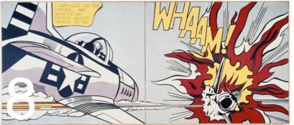
8. Lichtenstein: A Retrospective

21 February – 27 May 2013

The first full-scale retrospective of this artist in over twenty years.

Tate Modern

9. David Bowie Retrospective

23 March – 28 July 2013

Guardian review, here

Victoria & Albert Museum

10. Chromazone: Colour in Contemporary Architecture

Until 19 May 2013

Featuring key projects by major UK and international architects who use colour to create identity and define space in an attenpt to heighten the user experience of a building.

Victoria & Albert Museum

patrick caulfield

11. Patrick Caulfield and Gary Hume

5 June – 1 September 2013

A focused selection of work by Gary Hume (born 1962), in parallel with British painter Patrick Caulfield (1935–2005), illuminating the comparable work of these two artists from different generations.

Tate Britain

This is my pick of exhibitions and talks to look forward to; I’d love to know your thoughts!

owly books for henry.

owly books

1. A Bit Lost by Chris Haughton – beautiful, stylish graphics (at least for adults!), and a simple, sweet story. Get it, here

2. Good Luck Baby Owls by Giles Milton – a gorgeous story about two baby owls who desperately want to learn how to fly. Get it, here

3. Little Owl’s Night by Divya Srinivasan – a different take on the activities of nocturnal animals, seen through the eyes of the little owl. Beautiful, colourful illustrations that pop off the black background. Get it, here

4. The Nonsense Verse of Edward Lear – wonderful literary nonsense, reissued in 2012 to celebrate the bicentenary of Edward Lear. Poetry, prose and limericks, including the Owl and the Pussycat. Get it, here

More in the fab four series, here

tension and contrast.

This is the first in a series called good design, or, a little ponderance on the art of Good Design. The aim is to discuss and debate design and the creative process, using key words and the wise words of others to analyse and ponder.

Coco Chanel famously instructed: ‘when accessorising always take off the last thing you put on’. This is, to my mind, the essence of the matter: not too much, not too little.

There is no greater exponent of the ‘form follows function’ mantra then the spare lines of the Muji brand. Utilitarian, perhaps in the extreme, nothing is extraneous; even the packaging is just enough to package, not masking what lies within but allowing the form of the product to be clearly expressed. This video, one in a series called Why Design being run by Herman Miller, talks about the design process, and the inspiration of the designers, the founding partners of Industrial Facility. They design for Muji, Established & Sons, and Herman Miller, amongst others. Their work, as evidenced in the Muji brand, is typified by an economy of line, texture, and detail.

For them, the design process is anything but balanced; they talk of existing ‘just on the edge of functioning’ and the fragile existence of living in a big city, where, at any time, one feels the balance could tip. However rather than detract, this inspires: ‘We need tension and contrast to be able to create’. Inspiration comes from Primrose Hill, a place after my own heart, where one can regroup, with the hustling, bustling city pulsating below:

See the full series here.

What do you think; are tension and contrast necessary in order to create? Does your inspiration come from unexpected places?

Feature images, Muji.com

stairs to inhabit.

The brief was to replace a patio with a timber deck for barbequing, entertaining, contemplating.

The design was conceived as two rooms, roughly four metres in depth, opening off the two external doors, with an interconnecting narrow boardwalk. The Balau timber boards were laid perpendicular to each other, to emphasise the notion of rooms. With a drop of just under a metre to the garden, four steps were required. These were positioned roughly one-third of the way along, to offset the otherwise symmetrical elevation. Then, taking up around two-thirds of the length, two very deep, very wide stairs were formed – stairs to inhabit. The stairs can be sat upon, played upon, inhabited…

wilmerhatch deck

This project was completed a month or so ago for a family home in Surrey. I have since spied this wonderful house in Tokyo, aptly named Coil House; the house is entirely comprised of flights of inhabitable stairs.

coil house

Defined by 44 steps of varying depths and widths, Coil is a spiral of continuously ascending spaces, designed for a family in Tokyo.

To maximize the tiny, oblong lot, three square wooden columns were planted along the plot’s central axis, each one wrapped with treads. While large, open landings act as rooms, level changes eliminate the need for partitions and doors with the winding of the stairs separating the spaces.

The three-story climb begins at the wedge-shaped foyer. Four steps descend to the bathroom, while 13 broad treads, ranging in depth and doubling as the library, ascend to a series of large landings, designated as living and sleeping areas. At the top of the house, the sequence culminates in a compact galley kitchen, and an elevated dining area.

A masterful use of a narrow space, entirely eliminating the need for corridors.

I love to inhabit stairs; for me they provide the perfect perch for talking on the phone. What about you – do you utilise your stairs for purposes other than climbing?

Images and more Coil House, here  /  Feature image, Prada store NY, via

colour of the year.

Pantone have just announced their colour of the year for 2013 – emerald green. The colour, specifically Pantone 17-5641 Emerald, is described as ‘lively, radiant, lush.. vivid and verdant’.

Every year Pantone choose a colour, derived from various sources and influences; last year it was a vivid orange called Tangerine Tango. Green is in fact the most abundant hue in nature – the human eye sees more green than any other color in the spectrum.

Pantone is a standard language for colour communication between designer and manufacturer. Pantone’s founder created a system of identifying, matching and communicating colours to solve the problems associated with producing accurate colour matches in the graphic arts community. His insight – that the spectrum is seen and interpreted differently by each individual – led to the innovation of the Pantone matching system, a book of standardised colour in fan format. Different manufacturers in different locations could all refer to the same system to ensure colours matched without direct contact with one another. It is now used in all the industries, and its influence will be seen in fashion, packaging, graphics, interiors.

Emerald is certainly a bold choice for an interior. It works with basic black and white, and also with mid to dark-coloured woods. Pinterest is abuzz with emerald imagery, so here some chairs, a floor, a wall, and some fabulous emerald products…

emerald images 3

Images clockwise:  1  /  2  /  3  /  4

products

Products: 1  /  2  /  3  /  4

What do you think of this year’s colour?

maisie broadhead.

I first saw Maisie Broadhead’s work at her debut solo exhibition out of art school at Sarah Myerscough Gallery in Mayfair. An exhibition at the same gallery is now taking place, and her work is also being exhibited at the National Gallery and the Design Museum in London.

Exquisitely photographed, the lighting, composition, and attention to detail are superb.  She has recreated the works of old masters – Vermeer, Valasquez, Hogarth – given the models a gender twist and dressed them in contemporary clothes. The richness of the imagery is the first thing one sees; a second look reveals the rather outrageous humour of a coke bottle with a brightly coloured straw, or the plucked eyebrow of a man where a voluptuous maiden would otherwise have been. The trick is played further as one initially perceives a painting; a much closer inspection reveals a beautifully orchestrated photograph.

Maisie Broadhead, Which Weigh to Go, 2009. Digital C-Type Print, Edition of 10, 42.5 x 38 cm

Which Weigh to Go, 2009. Digital C-Type Print, Edition of 10, 42.5 x 38 cm

Maisie Broadhead, She Pulled my Heir, 2008. Digital C-Type Print, Edition of 10, 62 x 75 cm

She Pulled my Heir, 2008. Digital C-Type Print, Edition of 10, 62 x 75 cm

Maisie Broadhead, Nipple Pinch, 2009-1.  C-Type Print, 125 x 96 cm

Nipple Pinch, 2009. C-Type Print, 125 x 96 cm

Keep_Them_Sweet

Keep Them  Sweet, 2010. Digital C-Type Print, 145cm x 106cm and 75cm x 55cm

I adore these works, but I can’t help feeling that the titles could be a little more provocative, seductive even, and add to the game of charades.

I would be happy with any one of these photographs on my wall. What do you think, could you live with a Maisie Broadhead?

Rose Tinted Monocle, 15 Nov 2012 – 19 Jan 2013 Sarah Myerscough Gallery