Category Archives: wonderful spaces.

an italian summer house :: from the archive.

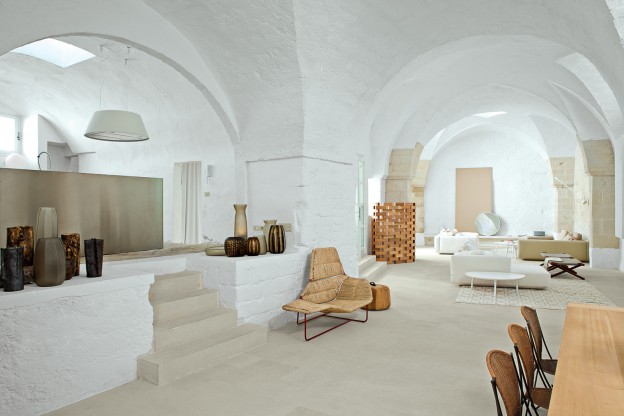
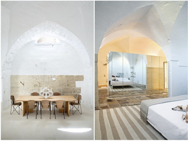
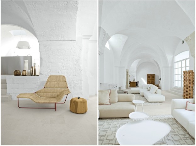
There is good reason this 17th-century oil mill in southern Italy looks more like a furniture showroom than an inhabited summer house. The dwelling is filled to the brim with the designs of the owners, the architects (and husband and wife team) behind Palomba Serafini Associati, who have together designed bathrooms, kitchens, furniture and lighting for some of the biggest names in Italian design: Boffi, Cappellini, Foscarini and Zanotta.

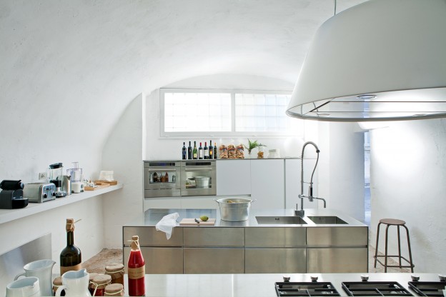
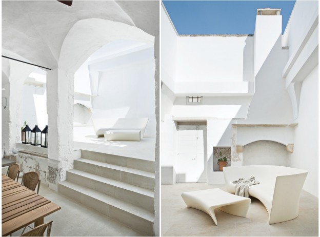
Retaining the rawness of the existing structure, they have made few interventions, retaining ancient stone floors, walls and arches. A lack of windows in the old mill has been overcome with the use of skylights carved out of the stone, as well as a patio at the rear, allowing the daylight to flood in. In the kitchen they have adapted to the existing space, adding only a sleek, minimal but multi-functional stainless steel island, originally designed for the Italian cabinetry company Elmar. A stainless steel screen separates the work and sleeping areas.

As well as their manufactured products, the home contains bespoke pieces, all commissioned from local craftspeople. One piece that really stands out is the Lama chaise longue, originally designed for Zanotta in steel and leather (see it, here); here they have upholstered it in straw and red metal. It is a beautiful and fluid stand-alone piece.

owl's house london1owl's house london2

palomba-kitchenowl's house london3

 Via Dwell. Images by Francesco Bolis.

What do you think of Italian summer house – showroom or home?

More wonderful spaces, here

a chelsea townhouse.

The renovation of this brick townhouse in New York’s Chelsea neighbourhood was designed to connect the garden level spaces with the exterior and to create open living spaces throughout. With this intention it succeeds – a large glass sliding wall system connects the living room and garden, framing the view; casement windows at the upper levels have been fully glazed to allow the master bedroom and bathroom uninhibited views to outside. A spiral stair within winds organically between the two levels, the continuation of the wood floor assists the flow upwards between the spaces.

The palette is a simple one – grey oil-stained European White Oak, white walls and large slabs of white marble. Lighting in linear slots between horizontal and vertical planes provides an ambient, warm glow. The white and grey-veined Calacatta marble of the kitchen worktop forms a strong sculptural element, with everyday utensils and appliances hidden away behind doors. The marble slabs also create a seamless bathroom, where the surfaces are seemingly carved out of stone. (Similar to Carrara marble, Calacatta marble also comes from the Carrara region of Italy, but has a bolder, more dramatic vein, which can vary from grey to brown. It is also a whiter white, which makes it more valuable).

Built-in storage and shelving and beautiful mid-century furniture pieces furnish the spaces simply.

temp_kitch_1images2 ny townhouse by ohl

temp_stair_4temp_liv_1temp_bed_2

ext ny townhouse by ohl

Templer Townhouse by Workshop for Architecture LLP, here.

More wonderful spaces, here.

house of lightness and glass.

I love floor to ceiling glass, allowing the inside and outside to coexist, bringing light in and blurring the boundaries between outside and in. Glass boxes, however, where the glass forms two or three sides and a ceiling, can so easily feel cold and clinical. Perhaps it has much to do with the climate in this country, but I can’t think of anywhere I’d less rather be on a cold, grey day.

This addition, however, feels like a place I would like to be. Perhaps it is the sculptural quality – not a box, but an architectural form with a raking roofline. Perhaps the interplay of solid white planes with the glass, or the double height space allowing the light to plunge through the volume. Contrasting against the darker, more formal spaces of the original house – lounge, study, dining room – are the lighter, informal areas of the new – the open plan kitchen and casual living. Vertical voids cut through the house to unite the cellar, ground and first floors, allow light to filter down gradually, creating beautiful shards of light and shadow.

gh_140513_07 gh_140513_09 gh_140513_12 gh_140513_01

The joinery and furniture is kept simple and rectilinear, further emphasising the lightness of the space, with pale ceramic flooring (not timber, which would fade over time in the sunlight), and glass stair treads.

Glass house in Winchester, England, by AR Design Studio, via

More wonderful spaces, here

a perfect case study.

singletonhousedailyicon

The case study houses of the 1940s, ’50s and ’60s have long been my idea of the perfect contemporary home – open plan, maximum glazing, simple, functional. Perhaps the climate helps (these homes were most often built in California), but they seem to embody a free and easy lifestyle and optimism. Post war construction methods and new materials made the houses possible, and yet…

The Case Study house program stated that: each ‘house must be capable of duplication and in no sense be a individual performance.. It is important that the best material available be used in the best possible way in order to arrive at a ‘good’ solution of each problem, which in the overall program will be general enough to be of practical assistance to the average AmerIcan in search of a home in which he can afford to live…’ I just adore this philosophy.

Nine architects were involved in the initial scheme, including Richard Neutra and Charles Eames. I have often wondered how they could get these simple, easy-to-build forms so right; contemporary architecture today very often loses sight of its modernist roots.

Now a new partnership between the son of Richard Neutra, and the California Architecture Conservancy, means one can license the right to build from the plans of Richard Neutra. More about the scheme, here. Neutra (1892-1970), one of the most important of the mid-century modernist architects, became famous for the simple geometries of his designs, which were often made of steel and glass, and the prefabricated elements that made them extremely easy to build. Known for rigorously geometric yet open and airy structures, Neutra blended the interior and exterior of a space such that it would ‘place man in relationship with nature; that’s where he developed and where he feels most at home’. This philosophy grew from a feeling that “our environment is often chaotic, irritating, inhibitive and disorienting. It is not generally designed at all, but amounts to a cacophonous, visually discordant accretion of accidental events, sometimes euphemized as ‘urban development’ and ‘economic progress’’’.*

neutbuc05dailyiconneutbuc06dailyiconneutrareu04dailyiconneupes06dailyicon

neupes04dailyiconTroxell08dailyiconTroxell01dailyicon1 / 2 / 3 / 4 / 5 / 6 / 7 / 8  (not all were the case study models, but too good not to show).

A very funny account of what it must be like to live in a mid-century modern home with children, here

More wonderful spaces, here. And my take on the fabulous mid-century modern show at Lord’s in London this past weekend on next Thursday’s post…

* Quotation from Neutra’s biography, Life and Shape, available from this dreadful-looking Neutra web-site..

house in a wren tower.

Just back from the beautiful Brecon Beacons and days filled with sunshine, dappled light and daffodils. And most challengingly, no internet! So with no post on Monday this week, we begin with Thursday’s post… I can’t quite imagine calling a Grade 1 listed, Sir Christopher Wren-designed tower in central London home. If I could, this is what I hope it would look like.

Alterations were made to Christ Church tower, to form a single family house over twelve (12!) levels. Masterfully restrained, the palette is of wood floors and white painted walls. A curved glass handrail, simply pinned off the concrete stair, winds ever upwards; the upper-most level is connected by the narrowest, wood, double-tread stair. Landings allow moments to pause, furnished with beautiful classic pieces.

wren images 1wren images 2wren images 4wren images 5wren images 3wren images 6

Christ Church tower, London by Boyarsky Murphy Architects

Another house on many levels, here

house of 150 trees.

One of the most important elements of good design is context – the way a building sits within its environment, or the way the setting influences the design. Just as design is a response to a set of needs or problems, context shapes the design response. Without context there is only  art or decoration. This beautiful Danish summerhouse is a perfect example of context in design – the owner harvested 150 pine trees from the land, then cut them into beams to build his home.

Wood in its different guises create the horizontal planes – panels of ply on the ceiling, knotty pine floor boards. The interconnecting vertical planes are of complimentary materials – steel, glass and brick – all kept in their raw state. A towering, angled chimney made of blonde, double-long bricks sits centrally within the open-plan space, housing the fireplace and oven. A white concrete bench top wraps around the chimney from the kitchen to the living area. The house features large floor-to-ceiling windows, the glazing angling up and folding over to form the roof, creating views up and beyond the trees to the sky. Over the kitchen and dining area, a matte-black roof follows the same plane, then breaks form and folds straight outward, hovering above a patio. Adjacent to the main house  is the studio, whose slanted exterior beams and horizontal knotty pine walls repeat those of the primary structure.

ohl-danish-holiday-home-06ohl-danish-holiday-home-05ohl-danish-holiday-home-03-600x447ohl-danish-holiday-home-01-600x450

The exposed, galvanized-steel framing is echoed in the pendant lamps over the dining table and chair legs;  the table was made from the same pine that was milled on-site.

Summerhouse, via dwell and http://www.brask-leonhardt.dk/

More good design series, here. More wonderful spaces, here.

a contemporary classicist.

Originally built in1929, this Melbourne home has been meticulously restored and updated to create a cohesive series of beautifully proportioned, contemporary spaces.

Marking the transition between original and new, openings are lined with steel to become portals, frames are painted black allowing them to recede. A two storey glazed structure to the rear brings light to the centre of the home, defining a new circulation core to the building. A large, glazed skylight tracks the path of the sun, filling the interior with more light.

A blackest black, high gloss floor becomes a reflecting pool for the furniture pieces that sit upon it. White walls are a counterpoint for the contemporary art to reside. Kitchen and bathroom cupboards are white and elegantly minimal. The joinery is allowed to break through the external wall at the rear as the connection between indoor and outdoor living. Furniture is classic Scandinavian – Wishbone chairs, Tulip table, AJ floor lamp, as well as Italian, with simple and bold pieces by Antonio Citterio.

sy_190413_04-940x705sy_190413_05sy_190413_10-940x705

sy_190413_08-940x705sy_190413_09-940x705sy_190413_14-940x705sy_190413_02-940x1253sy_190413_01-940x705

A perfect backdrop for a modern family, who will add the vibrance and colour to this masterfully restrained home.

South Yarra residence by Carr Design Group, via

More wonderful spaces, here

an exemplary modernist.

‘For a long time I have dreamed of executing dwellings in such conditions for the good of humanity. The building at Highgate is an achievement of the first rank’. Le Corbusier, 1935.

Berthold Lubetkin, one of several émigré proponents of Modernism in 1930s London, and a disciple of Le Corbusier, designed the apartment building Highpoint, in Highgate, North London. An early example of the International style, and engineered by Ove Arup, I had the opportunity to visit Highpoint last weekend, on an open day for the sale of one of the apartments. Recently refurbished, the attention to the original detail was superb. (That apartment was sold immediately, and sadly, not to me, so the photographs I am showing here are for another in the building).

Original features and fittings – cork floors, door furniture, bathroom fittings – have mostly been replaced. Other fittings are consistent for the era – the Arne Jacobsen wall lights for example. The colours were inspired by Le Corbusier’s ‘polychromie architecturale’ – two palates of colour he produced for the wallpaper company Salubra in 1931 and 1959.

DSC_6902_LargeDSC_6896_LargeDSC_6816_LargeDSC_6861_LargeDSC_5917_LargeDSC2808_Large

Highpoint is a much lauded, grade 1 listed Modernist building. Rendered white, as was the modernist way, the building is monolithic but elegant. Berthold Lubetkin is among the most important figures of the Modern Movement in Britain. Born in Georgia in 1901, he studied in Berlin and Paris, before moving to London in 1931. The following year he founded the famous Tecton practice with 6 other Architectural Association graduates.

Lubetkin and Tecton’s buildings are among the most iconic of the period, and include the marvellous penguin pool at London Zoo, again, designed in conjunction with the engineer Ove Arup.

Highpoint, Highgate via The Modern House

More wonderful spaces, here

a pared back parisian.

Beautiful photographs, a beautiful home. Housed in an 1860s Haussmann building, the original shell has been retained – parquet floor, period mouldings – and given a wash of warm white. With high ceilings and a wealth of natural light, steel grey creates atmosphere and compliments the wood and white. Fabulous furniture pieces are placed rather than hung, against a wall here, or hanging from a door knob there. A blackboard-painted curved wall in the hallway invites guests to write and draw. Artwork in the children’s bedroom is in the form of a montage of photographs.

Beautifully shot by NY-dwelling Englishman, Paul Raeside, the photographs capture the spirit of the space and the family who live there.

paul raeside - atypyk - 5395paris apartment_paulraeside1paris apartment_paulraeside2paul raeside - atypyk - 5414paul raeside - atypyk - 5601parisapartment_paulraeside3

More Paul Raeside, here

More wonderful spaces, here

sculpture house.

A double-height, fully glazed wall at the garden side of the house, extends the sense of the outdoors through to the interior. The interior of the building features three sculptural elements – a block of stone forming the central kitchen unit, a perfectly formed, curved stair, and a stone shelf and fireplace wall.

Interior finishes are kept simple – painted white or fabricated in super-hard white Corian, a man-made, solid-surface material composed of marble dust, bauxite, polyester resins and pigments. All floor surfaces, including the stairs are wood, stained almost black.

Russel_Hill_Road_gh3_afflante_com_1Russel_Hill_Road_gh3_afflante_com_2Russel_Hill_Road_gh3_afflante_com_4Russel_Hill_Road_gh3_afflante_com_3_0Russel_Hill_Road_gh3_afflante_com_8russell-hill-06

The furniture pieces are sculptural, classic, fabulous: Egg chair, Cherner chair, Smoke chair, Butterfly stool, Rosy Angelis floor lamp…

Russel Hill Road by gh3, via 

Images courtesy © Ben Rahn

More wonderful spaces, here