Category Archives: wonderful spaces.

peter’s house.

petershouse_dining-ohl

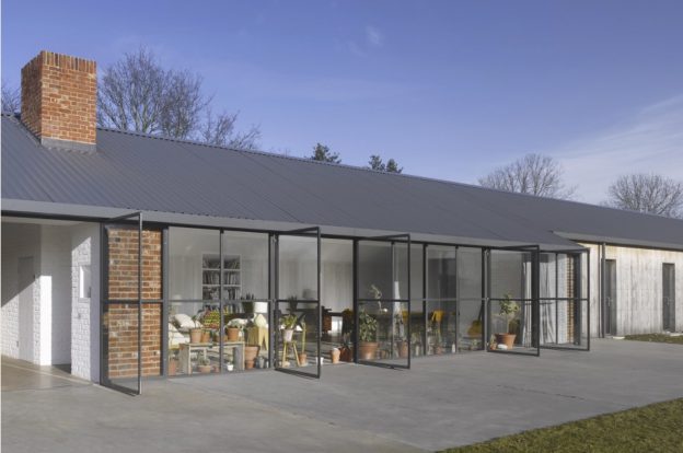
I uncovered the beautiful interior of this converted garage whilst researching materials for the transformation of an agricultural building into a residence.

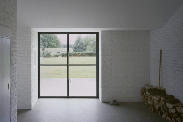
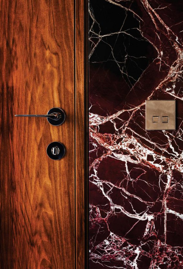
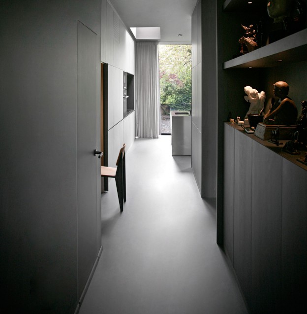
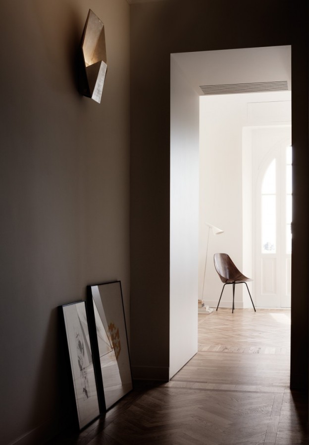
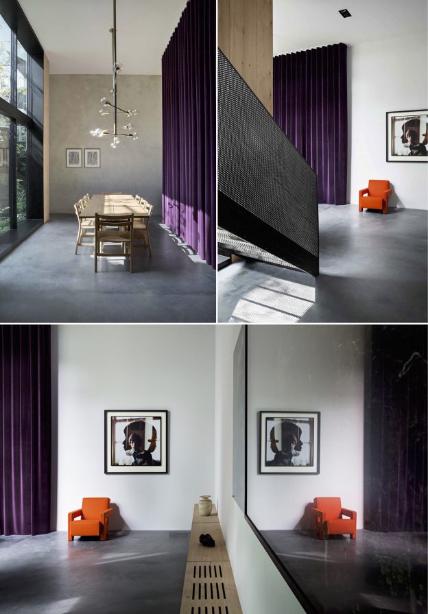
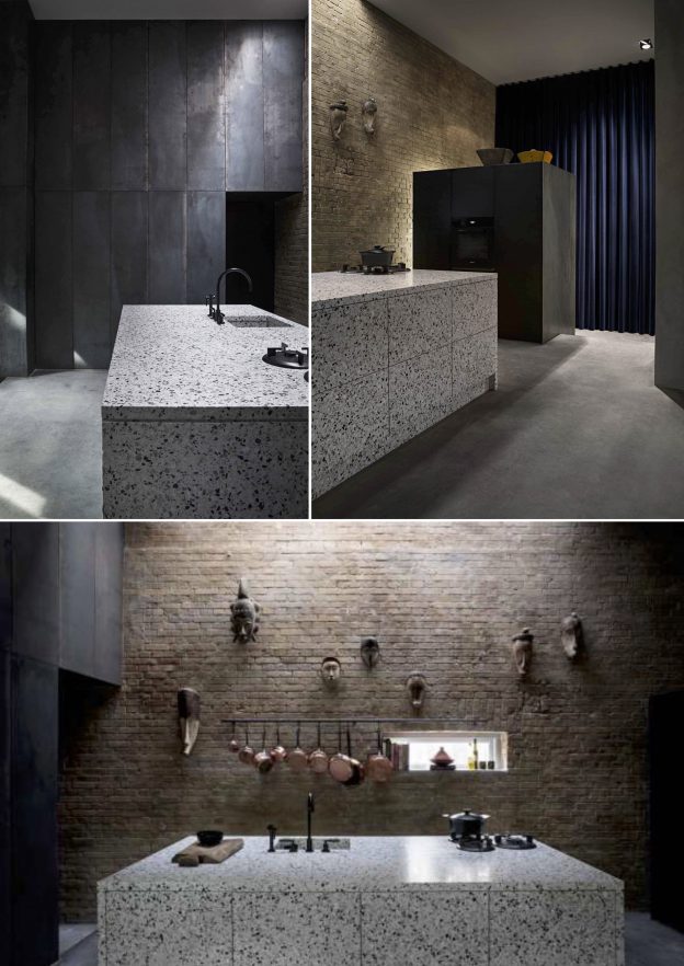
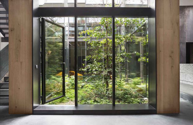
As with all good design, inspiration comes from the context and fabric of the original building, in this case raw brick and blackened steel. A narrow site and desire for natural light has prompted a glass walled atrium to be cut through the three floors. The clever placement of dark mirrors throughout has created a striking effect; not light and bright but spacious and theatrical.

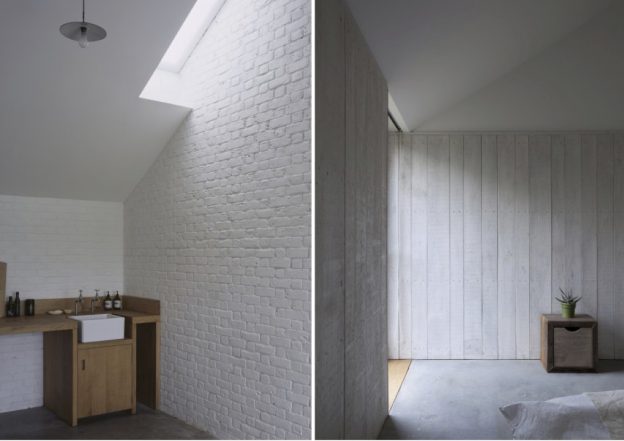
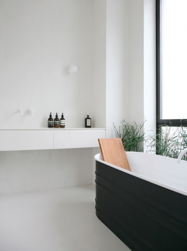
The beautifully considered material palette includes concrete used on vertical as well as horizontal planes, clean, white and grey terrazzo forming the kitchen island and bathroom fittings and walls, and super-wide Dinesen oak floorboards used three ways – as a floor, as a wall, and as a ceiling lining. The blackened steel is used as both perforated panels flanking the stair, and as a wall lining in the double-height kitchen.

petershouse_kitchen-ohlpetershouse_living-ohlpeters-house-by-david-thulstrup-ohl02peters-house-by-david-thulstrup-ohl

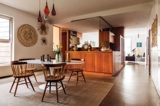
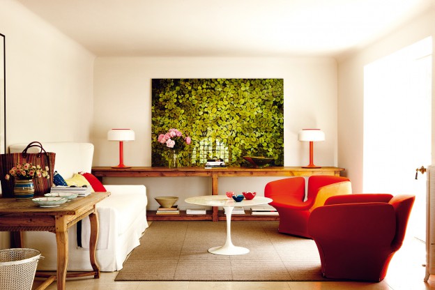
Downstairs, furnishings and curtains are strong of form and bold of hue – deep purples, bright reds and vivid yellows show to great effect the form of such classic furniture as the Pierre Paulin Groovy chair and the Rietveld designed Utrecht armchair.

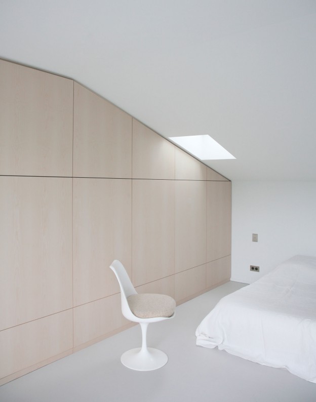
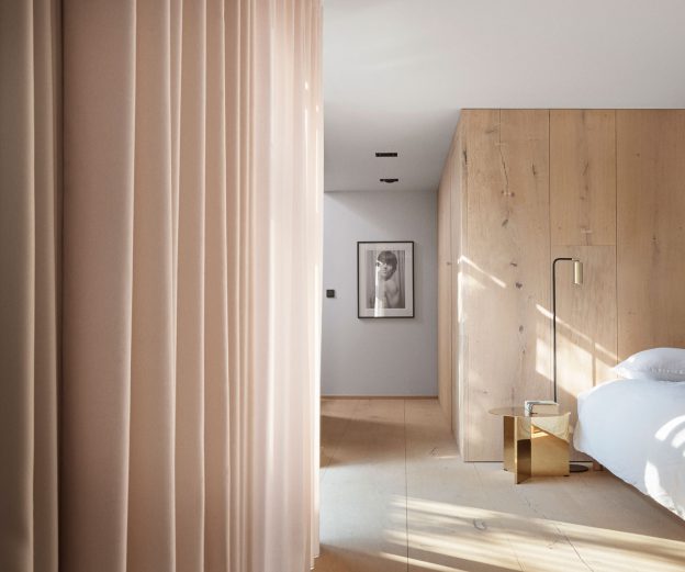
By contrast, the bedroom and study are softened with full height curtains, in a perfect shade of nude blush.

Peter’s House, Copenhagen by Studio David Thulstrup, via

Photographer: Peter Krasilnikoff

a contemporary stable block in white.

Researching barn conversions for a current project led me to this reworked, nineteenth century stable block situated in a lovely bit of rural north Norfolk (and currently for sale, here). For me it’s a perfect example of a conversion that acknowledges its provenance without suffering for it.

The spaces are laid out along the length, each opening onto the tranquil landscape beyond. The long narrow footprint is divided simply into two – living and sleeping – the one open and light filled, the other enclosed and calm. In the living spaces, black floor to ceiling Crittal windows frame the view and maximise the light, opening up completely to create a flowing indoor/outdoor space. A fireplace wall book-ends one side, taking on the vaulted form of the structure.

stable-acre_ohl06stable-acre_ohl.05stable-acre_ohl03stable-acre_ohl.04stable-acre_ohl07

The materials used are simple and locally sourced, including concrete floor, beton brut walls, white painted brickwork, and externally, profiled metal roof and timber cladding. The detailing is refined and carefully crafted. With the materials expressed in their pure form or painted white, texture provides all the decoration that is needed.

Stable Acre, Norfolk by David Kohn Architects. Winner of the RIBA regional award in 2012.

a perfect parisian pied a terre.

If the previous villa (‘Bohemian Beauty’, here) is my idea of the perfect vacation home, then this apartment in Paris and featured in the WSJ, may just be my perfect pied a terre. It hits just the right balance of minimal and relaxed, and proves that a minimal aesthetic doesn’t have to be uptight.

Walls throughout are lined with blond elm in a beautiful pale honey colour, floors are clad in neutral coverings. Materials are used simply and boldly – note the grey-veined marble in the bathroom used for the countertop, upstand, cabinetry and floor. I love this look.  A den is arranged in the centre of the space with wood-lined walls and warm-coloured, custom furniture; the master bedroom is lined too and can be closed off from the world with wooden shutters lining the windows. In the laundry, timber-lined cabinets add a richness to what is too often a sterile room of white cabinets. Artwork adds further warmth and personality.

tkAPC_WSJ-ohl-1tkAPC_WSJ-ohl-2APC_WSJ-ohl-3

Detailing couldn’t be simpler – edges and nosings are square profile, ensuring surfaces have a solidity to them; handles are simple and square-profiled as well. There are no cornices and skirtings are kept plain. The furniture is classic Scandinavian – a white marble-topped Saarinen Tulip table in the dining room, elsewhere an AJ floor lamp by Arne Jacobsen and the Saarinen Womb chair. Accessories are neutral and bold of form, often cane or straw and beautifully simple. Heaven.

Apartment by A.P.C. Jean Touitou’s Parisian home via WSJ

Photos: Matthieu Salvaing

bohemian beauty.

I love the undone quality of this villa. A holiday villa, it lacks pretension and exudes character – exactly how a holiday home should be.

Vernacular elements – white washed walls, shuttered windows and beamed ceilings – set the scene. Then inside, a charming mix of provincial, art deco and midcentury pieces and objet have been brought together. With the exception of the sofa and Bouroullec armchair and ottoman, everything has been sourced second hand. From the brocantes of Paris, to local flea markets and antique shops, an array of wonderful pieces cohabit – pieces by Charlotte Perriand, Pierre Guariche (chairs and lighting), and Eero Saarinen Tulip chairs and tables.

casona_familiar-ohl.casona_familiar2-ohl.casona_familiar4-ohl.casona_familiar5-ohlcasona_familiar3-ohl.

I could happily spend my summer here; what about you?

La Villa Familiar via  Photographs: Gonzalo Machabo


colour play in barcelona.

Located in a typical, turn of the century apartment building in Barcelona is this vibrant interior. Little has been done to alter the layout over the three floors, and views through to the outside are not evident. However, clever cut outs have been created within, offering unusual angles and vistas through from one level to the next.

The most striking element, though, are the colours. Deep forest green, pale salmon, strong white and cobalt blue are used to stunning effect on adjacent as well as distant planes. The result allows each surface to take on a sculptural, stand alone quality, whilst still working together in a sort of Escher-style sum of parts. A surrealist sky above a bathroom void draws the eye up. The overall effect is mesmerising.

casahorta_ohlcasahorta_06-ohl.casahorta_08-ohl.

casahorta_14-ohl.

casahorta_02-ohl.

Apart from the vibrant paintwork, decoration is restricted to the typically colourful tiled floors of the era.

I also love the way colour blocking is used in this interior.

What do you think of this combination of colours?

Casa Horta, Barcelona by Guillermo Santoma. Photography: José Hevia


fabulous fendi.

A hotel should be more than a home away from home. Otherwise, why leave? To my mind, a hotel should be fabulous and luxurious and transport one to a different world, far removed from one’s usual habitat.

The newly opened Fendi hotel in Rome combines fabulous with colour, using the most vivid, intense hues. The luxury brand have reconfigured the 17th-century Palazzo Fendi with three separate architecture firms to create a boutique hotel, their largest store, an art gallery space, an apartment, and a restaurant.

Using elements characteristic of the fashion line – geometry and colour blocking, for example – the hotel has an unmistakably Italian aesthetic. Maintaining the original herringbone wood floors and plaster walls, the look is updated with intense hues and jewel tones of blue and green. The interiors were conceived by Milanese Dimore Studio and architect Marco Costanzi, who have created beautiful details using sumptuous materials.

tk

tk

tk

tk

Classic Italian and modernist pieces abound, too; from a daybed by Gio Ponti, Murano glass chandeliers by Venini, art by Lucio Fontana and Josef Albers.

Fendi Private Suites Hotel via WSJ magazine.


a toulouse townhouse in grey.

Enhancing the original character of a house whilst creating a concordant, contemporary addition is a constant design challenge. Here, in a townhouse in Toulouse, it is achieved through beautiful, minimal detailing with seamless junctions, an interesting mix of decorative mouldings and plain, unadorned surfaces, and the use of flat, monotone hues.

The materials palette is restrained but varied – rich, walnut cabinetry in one room contrasts with natural birch veneer in another. But the palette overall is reined in using similar mid-tones – the grey oak parquet floor adjoins a pale grey, seamless resin floor; a brushed stainless steel kitchen island cube takes on the colour of the adjoining mid-grey walls. There are two aesthetics going on here, one minimal and one ornate, where the old meets the new. They come together beautifully with these sophisticated grey hues, all in a matt finish to add softness. Floor to ceiling windows with simple frames draw the eye to the beautiful landscape beyond.

Joinery is beautifully detailed: a niche within the kitchen cabinets is lined in pale birch veneer contrasting with the deep grey of the cupboard fronts; in the bedrooms, entire walls of storage are seamlessly integrated. Freestanding elements are simple and monolithic – a black glass shower cubicle, the kitchen island unit with its perfectly mitred edges.

RUE-DU-JAPON-by-RMGB-ohl-09RUE-DU-JAPON-by-RMGB-ohl-11RUE-DU-JAPON-by-RMGB-ohl-10RUE-DU-JAPON-by-RMGB-ohl-12RUE-DU-JAPON-by-RMGB-ohl-08RUE-DU-JAPON-by-RMGB-ohl-04RUE-DU-JAPON-by-RMGB-ohl-07

Furniture comprises simple, bold classics such as the angular Jean Prouvé dining table and chairs, and the fabulous mid-century Charlotte Perriand bookcase.

How different it would look if it were finished in shades of white throughout, not just in the bathroom. I think the mid-tones give it a richness and sophistication and work effortlessly with the surrounding landscape. What do you think?

Townhouse renovation, Rue du Japon, Toulouse by RMGB architects. All images, RMGB.

Via Yellowtrace


revisiting a modernist in berlin.

2216_03 001

Revisiting this beautiful modernist – the use of texture, simple but sophisticated colour palette and clean lines is a look I revert to time and again.

Part of the 1957 building exhibition in Berlin’s Tiergarten park, this Modernist glass atrium house was designed by Eduard Ludwig, an architect who studied briefly at the Bauhaus, and whose passion lay in the design of bungalow-style houses. He studied under Mies van der Rohe and the influence of modernist masterpiece the Barcelona Pavillion is evident here.

The simple lineality of the building is echoed internally with the floating linear kitchen cabinets, built-in, low-level storage lining the living area, and bathroom vanity in palest stone suspended against a full wall of mirror. Textured surfaces abound and are enhanced with splashes of intense colour in the palette of dark orange, black and off-white. Simple, classic furniture pieces like the shaker style chair (Hay do a simlar one, here) and brass domed kitchen pendant hold their own and yet perfectly compliment the space.

Atrium-House-in-Berlin-by-bfs-design-102214_03 0012214_12 0012215_11 0012215_02 001

Atrium-House-in-Berlin-by-bfs-design-1Beautifully restored by architectural firm bfs-design: Atrium House by Eduard Ludwig via Daily Icon.

Photos: Annette Kisling

simplicity – the ultimate sophistication: an apartment in rome.

This apartment in Rome starts with strong architectural features – an intricate parquet floor, high ceilings and elegantly arched windows, framing a view towards the dome of St Peters. Because that is enough, the rest is kept simple. The arches are echoed internally, but also countered, by unembellished, rectangular openings.

The palette is calm, with pale colours allowing  the light to bounce and play. Then come the details, which transform the apartment into a sophisticated, refined space. In the kitchen, an island bench in bronze contrasts with a grey-veined, white marble top; the materials mitred at the edges as if they were cast as one piece.

One of my favourite of stones, travertine, is used to clad the bathroom walls, with a mirror set flush with the surface, and washbasin formed out of stone. And the floor to ceiling joinery is adorned with nothing but linear, bronze inlay door handles.

Casa_Roma_0172-1471x1080Casa_Roma_0142-1471x1080Casa_Roma_0182-749x1080

Casa_Roma_022-1471x1080Casa_Roma_0252-749x1080casa-roma_ohlCasa_Roma_0122-749x1080I love the simplicity, what about you?
Apartment in Rome by Quincoces-Dragò & Partners. Photography, Alberto Strada

via est magazine


fabulous finds – at the chapel.

We bumped into At The Chapel by accident, on a pit stop whilst travelling home to London from Dorset. Either that, or we were drawn there instinctively, because as soon as we stepped inside we were captivated. Set within the rigorous stone walls of a Grade 11 listed former chapel, the interior is a design delight – contemporary without being cold, restrained without being minimal. It’s also a clever mix of bakery, restaurant, wine store, club room and guest rooms, so that there is always somewhere to eat, somewhere to sit, somewhere to chat. The atmosphere is buzzy, but not bustling.

The owners are Catherine Butler and Ahmed Sidki, who have built and run the place themselves. Ahmed is an architect and cabinet maker, who also runs a furniture workshop (bowwow.co.uk) and incredibly, has designed and built everything here. Using a palette of natural materials – reclaimed timber of different textures and tones, bronze, stainless steel, and concrete – he has created functional, beautiful pieces: chairs, tables, stools, the bar. Against the simple white background, everything is strong of form and perfectly placed. The rooms (there are 8 in total) add white marble to the palette, bringing an element of luxury. For me, the aesthetic is spot on.

ATCBakery_owlshouselondonATCBakery2_owlshouselondonATCWinestore2_owlshouselondonATCWinestore_owlshouselondonATCBed2_ohl.ATCBed_ohl.ATCBath_ohlATC-ext_ohl.

As much as I’d like to think we discovered this place, we are not alone. Bruton is becoming something of an outpost for all things creative, with Hauser & Wirth opening here last year (with the most stunning landscaped garden); a marvellous vintage homeware shop, Phillips and Skinner, which is full to bursting with fabulous finds (I was in vintage heaven); and now a new lifestyle store, Caro, which featured in this month’s Wallpaper magazine (link, here).

At The Chapel, High Street Bruton, Somerset, BA10 0AE

Feature image + photographs 6,7,8,9, At The Chapel; all others, owl’s house london.