Category Archives: happenings.

where architects live.

02_c_aki_furudate

As a voyeur of interiors, I love peering into other people’s homes. There is a departure between architecture and interior design and architects often don’t involve themselves with interiors, leaving the design to somebody else. An interesting thing then, to see architects’ own homes.  An exhibition in April called Where Architects Live looks at the private homes of eight world-renowned architects. 

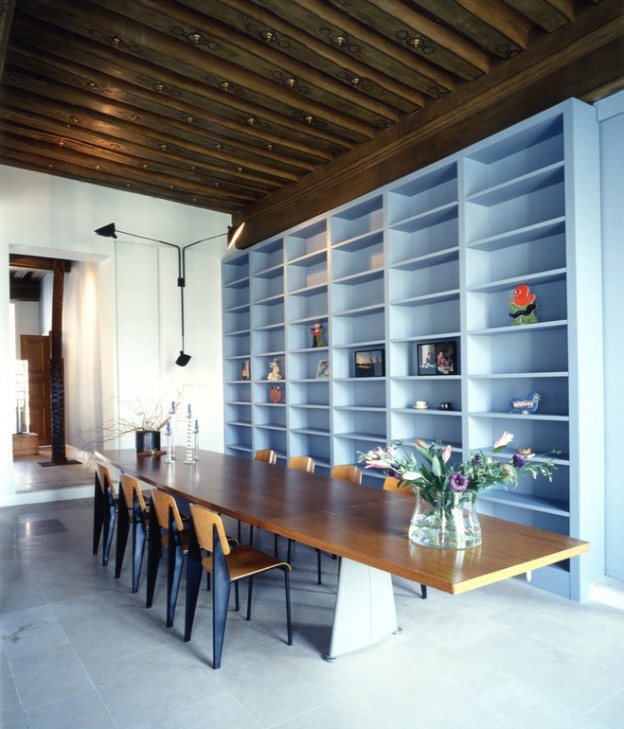
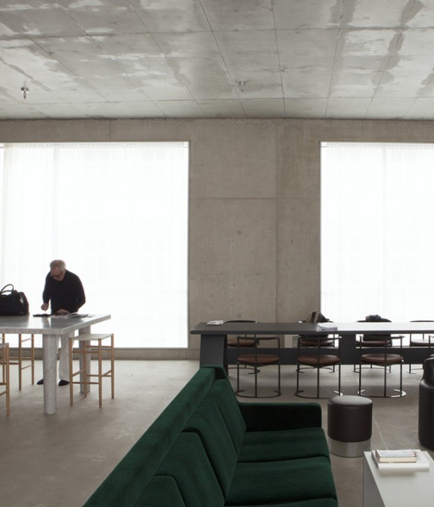
Of those on preview, one of my favourites is the Paris home of Massimiliano Fuksas, an Italian architect known for his work in urban problems and the suburbs, as well as his ‘big’ architecture, Shenzhen airport, for example. A fabulous mix of materials old and new, original Jean Prouvé furniture, and masses of artwork, it feels at once calm yet vibrant. The home of David Chipperfield, as would be expected, is a more restrained affair – a concrete building in Berlin with simple, minimal space and one or two deep colours like the forest green sofa. Zaha Hadid’s home is unsurprisingly white, with lots of her own avant garde and Russian revolution-era inspired artwork and furniture. Mario Bellini’s home is bold, angular and dark-hued. I can’t wait to see more in April.

03_c_aki_furudate

Photographs 1 + 2, Fuksas home, Aki Furudate

chipperfield02_cdavide_pizzigoni

Photograph of Chipperfield home, Davide Pizzigoni

zaha_hadid02_cdavide_pizzigoni

Photograph of Zaha Hadid home, Davide Pizzigoni

mario_bellini02_cdavide_pizzigoni

Photograph of Mario Bellini home, Davide Pizzigoni

libeskind04_cnicola_tranquillino

Photograph of Daniel Libeskind home, Nicola Tranquillino

Where Architects Live,  Salone del Mobile, Milan 8-13th April 2014 via

happy weekend.

sensing_spaces-ohl.

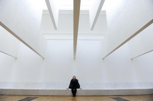
Seven architects from around the world – Alvaro Siza, Eduardo Souto de Moura and Kengo Kuma included, have created a series of site-specific installations and inserted them into the main galleries and front courtyard of the RA. More than just a shelter or a flashy building, architecture has the ability to shape and form how we feel everyday. We are invited to touch, climb, walk, talk, sit, contemplate. And more – as you enter the galleries, a sign orders you to tweet, and photography is encouraged. A rare treat in the rarefied environment of this grand institution. Definitely one for the littles… 

Sensing Spaces: Architecture Reimagined until 6 April 2014
Royal Academy of Arts, London. More, here. Image via

happy weekend.

isabella-maisiebroadhead_ohl.
Maisie Broadhead, Isabella – 1, 2014. Digital C-Tye Print, 51 x 45 cm. Sarah Myerscough Gallery

It’s London Art Fair week, the first show of the art world year, showing Modern British work of both established and emerging artists. And it’s not just about the art – it’s the most wonderful place to people-watch.

London Art Fair, Business Design Centre, Islington 15-19 January 2014.

More Maisie Broadhead, here

house of the year 2013

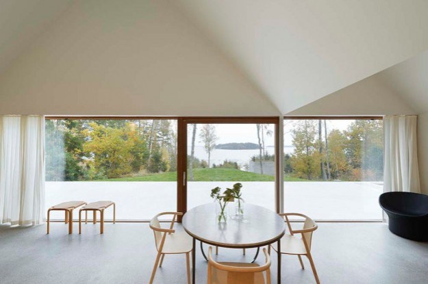
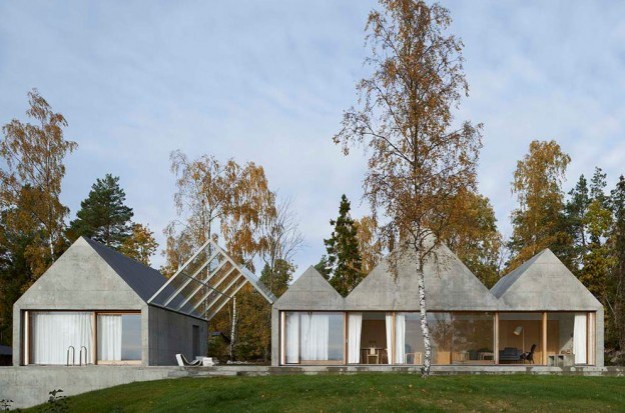
I attended WAN House of the Year award night in London late last week. It went to this house, a summer house on an island in the Stockholm archipelago by Swedish studio Tham & Videgård Arkitekter.

The most striking thing about the house is its simple, dynamic form: a row of zig-zagging, raw concrete gables that stretch across the site like a line of boathouses. Rather than the usual vernacular of a timber dwelling drawing on the forest for its context, the building takes its inspiration from the granite bedrock found on the island. One of the gables forms a glass canopy roofing the terrace, that also splits the building into two separate volumes. This provides a vista through the building to the seafront from the forest beyond and vice versa, as well as acting as the entrance.  Three of the gables house the living and dining rooms; pale ash doors doors slide open to reveal the bedrooms behind.

Along with the facade, the terrace and interior floors are made of exposed concrete. The raw concrete has been cast in-situ against plywood boards, giving a subtle grain and wonderfully worn quality to the surface. The interior is simply painted white, window frames and joinery are ash.

23485_3_win323485_4_win423485_2_win223485_1_win1

House Lagnö by Tham & Videgård Arkitekter, here. Photography: Åke E:son Lindman

What do you think of house of the year? It’s certainly less dramatic than last year’s winner, here

happy weekend.

frieze-collage_ohl.

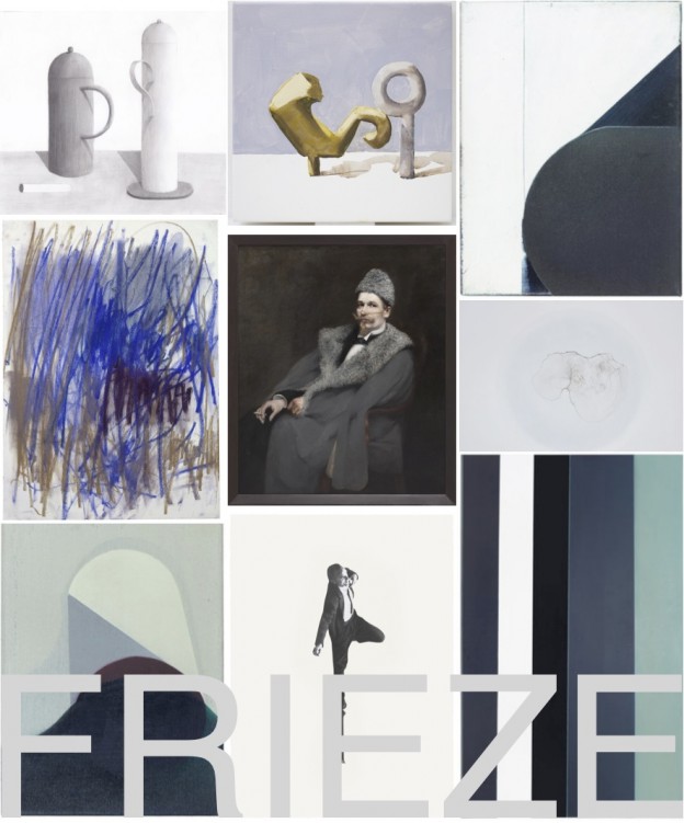
It’s Frieze art fair time here in London: provocative, dynamic… this show has the most amazing buzz and vitality, the atmosphere thick with expectation and possibility. I’m a huge fan.

 And if you can’t make it, Artsy – a great on-line resource for discovering contemporary art – has curated a selection of works by artists represented at the fairs from prominent galleries, here

Images and more Frieze, here

at the fair – midcentury show east.

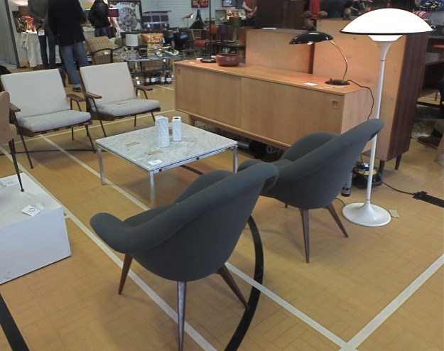
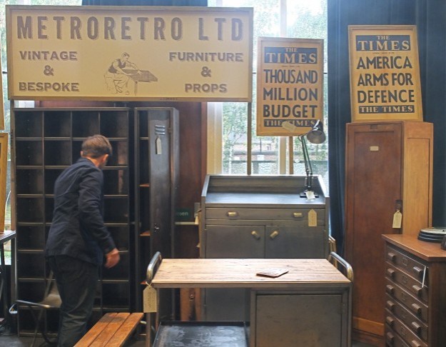
Midcentury Show East is a mid-century fair, featuring vintage furniture dealers and classics of British, American and Scandinavian twentieth-century design. I wrote about the midcentury show in St John’s Wood earlier this year, here.

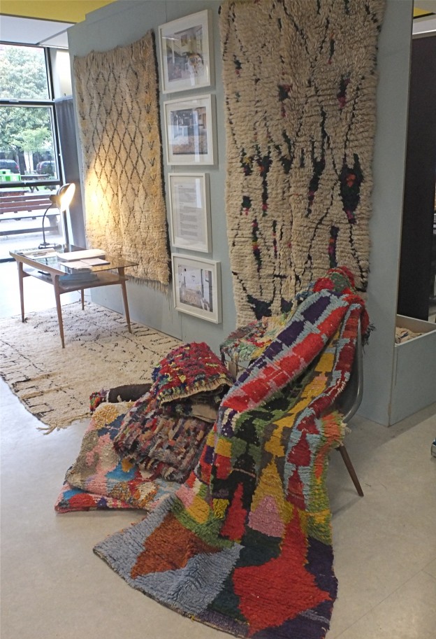
This past Sunday was the east London event, held in Haggerston School, a building designed by major Modernist proponent, architect Erno Goldfinger in the mid 1960s, probably best known for his Brutalist-style Trellick Tower. Fifty dealers were represented, the hall and gym holding the majority with the rest meandering through corridors and secondary spaces. Stalwarts like Lovely & Co, Elliot and Tate, Saunders Fine Art, Vintage Unit, and new (to me, at least): Osi Modern (who style so beautifully), Pink Flamingos who specialise in Eames, and Bleu.

osa_ohl.metroretro_ohl.beldi-rugs_ohl.

twentiethcenturymarks_ohl.pinkflamingos_ohl.

gplightandmore_ohl.

Sadly I’m not in the market for furniture until our house-hunting is over, and we have space with which to furnish… sigh. Maybe by the time the Dulwich fair comes around in December…

world interior of the year.

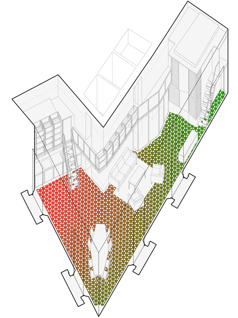
Inside Awards World interior of the Year 2013 is the refurbishment of a piano nobile (or main floor) apartment in the Gothic Quarter of Barcelona. A triangular-shaped site, it is situated at a major crossroads in the city. Stripping back the internal partitions revealed the vertex, reconnecting the apartment with the streets beyond.

A look within reveals minimal intervention. The shell of the building and its classical elements are retained. A balcony that connects bedrooms and en-suite bathrooms is lined with books, becoming a high-level library. Simple, rectilinear furniture compliments the simple layout. But the materials palette is an ecelectic mix, unrestrained and rich in colour and materials – gold, black painted metal, dark red wood, cobalt blue tiles, green glass. More than I would ever put together in one space.

But I love how the architects have interpreted the brief, thus: the new mosaic floor is decorated with a triangular pattern matching the geometry of the plan. The tile pattern is graded in colour from green at one end of the apartment to red at the other to differentiate the clients’ private spaces – two brothers who share the space as a holiday home.  At the street corner the red and green tiles are at their most mixed; this is the dining area which is also the meeting place for family and friends.

dezeen_Inside-Awards-2013-day-two-winners-announceddezeen_Carrer-Avinyo-34-by-David-Kohn-Architects_7dezeen_Carrer-Avinyo-34-by-David-Kohn-Architects_6dezeen_Carrer-Avinyo-34-by-David-Kohn-Architects_567

What do you think of the interior of the year? Apartment in Barcelona by David Kohn Architects via

More wonderful spaces, here

happy weekend.

tb_80

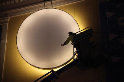
The Sun installation is a symbolic representation of the sun constantly changing from white to warm orange to burning red. The installation first travelled from Oslo to Tromsø in northern Norway, to light up the city in a period where it had no sunlight. It has now arrived in the UK to light up East London during London Design Festival (14-22 September) as part of the 100% Norway show at Tent London.

tb_78

The Sun by Christine Istad and Lisa Pacini via WAN.

And don’t forget the moon, here

nothing to see here : the wonderful world of oliver jeffers part II.

NOTHING TO SEE HERE_low

I first wrote about Oliver Jeffers here. A teller of fantastical children’s stories that are sweet and funny and with the most beautiful illustrations, Oliver Jeffers is also a figurative painter. His first London exhibition Nothing To See Here is at Lazarides Gallery in London opening tomorrow.

There is more than a touch of surrealism about his work, which also references familiar 18th and 19th century European landscape and still-life painting. Clearly an observer of modern life, the works question and provoke. The series of paintings which give the show its name show a classic rural landscape, or a reclining nude, defaced with the graffiti-like slogan Nothing To See Here, creating a tension between the picture and the words – which one is to be believed?

Oliver Jeffers’ world is an inquisitive one:

‘In contradicting modern scenes and subjects with references to classical painting, his depictions encourage the viewer to look a little closer at the world around them and question the mundane. Are we blindly ignorant or are our eyes wide open in the dark?’  

BEFORE AND AFTER PAINTING NO 1_lowTHE WALL MEDRES LR

Oliver Jeffers: Nothing To See Here 13th September to 3rd October 2013 Lazarides Rathbone, 11 Rathbone Place, London. All images courtesy of the gallery.

More Oliver Jeffers: www.oliverjeffers.com

More in the gallery, here

old, iconic and new :: a stool and a light.

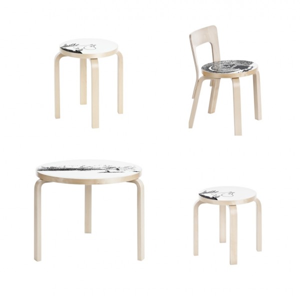
Having grown up in Australia, I made my first acquaintance with the Moomins rather later than my Swedish/Finnish counterparts. Enchanted still, I love the expressive, stylised images and beautiful linework of Tove Jansson’s illustrations, not to mention the characters themselves. Alvar Aalto stools are the archetypal stool (I have two, and they won’t be my last). Finnish brand Artek is releasing four pieces from the Aalto collection with Moomin characters lolloping across the face. Table 90B, Stool 60, Children’s Stool NE60 and Children’s chair N65 are all participating.  More Artek re-releases from an earlier post, here. More from Artek, here.

artek_moomins_four-ohl

Another exciting re-issue, Louis Poulsen’s wonderful, iconic PH5 (I wrote about a perfect pendant, here) has been released with new colour combinations, including coconut white, army green/dark grey, dark grey/turquoise and wasabi green. The spacers which hold the shades in position are finished in bronze, and they are all a soft, matt finish.

poulsen_artek_four-ohl

I love the soft coconut white-on-white, and the dark grey/turquoise; what about you? More, here.

Also love this round-up of five modern design icons in Dwell, including Eero Aarnio and Lina Bo Bardi, here.