

I think the design of the facade of this bookshop in Sao Paolo is almost perfect. Here’s why:
- The entrance is clearly defined and inviting; comprising pivoting, double-sided bookcases, the scale of the facade is brought down to human scale at the doorway, enticing one in.
- The signage is clear and dynamic.
- The lighting allows it to glitter at night like a jewel box.
- The facade is simple and without unnecessary embellishment; it’s all about what’s going on inside – the books.
- It is made of concrete; to my mind, a wonderful, expressive material with integrity and strength, the most interesting of materials (evidenced by my most-pinned Pinterest board, ‘I love concrete’)
- Composition – it is asymmetrical and follows the ‘one third, two thirds’ rule. The rule of thirds divides a line into roughly 2/3 and 1/3. It is a simplified version of the golden ratio, used in art and architecture to proportion work – especially in the form of the golden rectangle, in which the ratio of the longer side to the shorter is the golden ratio – in the belief that this proportion is aesthetically pleasing. It is also used extensively in photography. I recently attended a photography workshop with the fabulous Emily Quinton (details, here), and this one rule changed the way we shot our photographs.
 Its use creates a more dynamic composition. Symmetry and balance can be, well, dull, whereas a composition where the elements are placed to one side, adds a tension between the elements and the empty space. It can be applied both horizontally and vertically. The lower third of the bookshop, the opening, could be considered positive, while the upper part is negative. What do you think of this building? Do you like the composition and asymmetry?

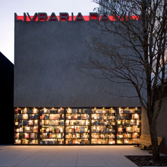
More about Livraria de Vila bookshop, São Paulo by Brazilian studio Isay Weinfeld Arquitecto, here
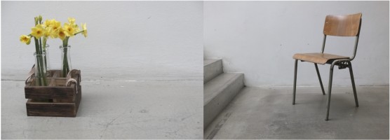
Still life images, owl’s house london.
More good design series, here.

I didn’t think that I would find concrete fascinating but clicking on your link and seeing your Pinterest board I’m beginning to see it in a different light or many different lights !
I like the look of the Emily Quinton workshop … very enticing images …
Looking forward to seeing more of your photography soon then 😉
oh, I’m so glad I may have converted you to the wonders of concrete! the photography is highly recommended, and yes, more photographs are imminent 🙂
I totally love your blog!
janxx
Jan Glennie-Smith +1 434 989 8482 jan@bellehavenonthejames.com https://www.bellehavenonthejames.com https://www.facebook.com/bellehavenonthejames
Jan – thank you so much, I’m thrilled. xx
Gosh Jane, I love the way the bookshelves open as doors into the shop. It’s pure genius! I also like the concrete facade and lighting. As always your post is beautifully written, articulate and informative. xD
hi doris, isn’t it wonderful? i think the pivoting book cases are inspired! i’m so glad you like it, and thanks for your wonderful comments as always. it’s much appreciated. j x
Nice review and interesting solution for the ground floor! What I like most is that this building has been designed specifically for a bookshop, and not like an ordinary store > with a concrete sign on the top too! 😉
thank you! agreed – bespoke design at its best. all the better for that concrete sign, too.. 🙂
I love this post and the way you have looked at the composition of the building. And I really like your images from the workshop. I hope you’re feeling inspired to take more!
thank you Emily. i love this cross-over between all of the arts – the same principles for good design apply to all!
Wow I love this!. I always find it difficult to look at architecture on pictures. I really want to be there now to experience the building. But what a fantastic place!
hey, glad you like it too! lovely to have your comments. J
Pingback: house of 150 trees. | owl's house.
Pingback: a cabin for living. | owl's house london.
Great blog, I love a great composition you explain it very simply, thanks!
Steve
http://www.relovehalifax.com
hello, that’s a wonderful compliment, thank you! i’m thrilled you are enjoying it. thanks for taking the time to comment. jane
Pingback: 50 best rooms. | owl's house london.
Definitely believe that which you stated. Your favorite justification appeared to be on the net the simplest
thing to be aware of. I say to you, I definitely get annoyed while people think about worries that they plainly don’t know about.
You managed to hit the nail upon the top as well as defined out the
whole thing without having side-effects ,
people can take a signal. Will probably
be back to get more. Thanks
thank you!
Pingback: house of simple ambiguity. | owl's house london.