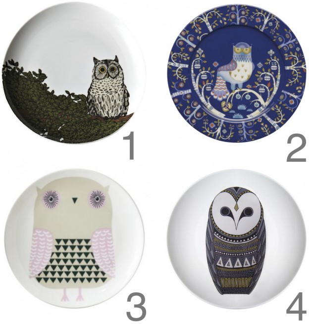
1. Owl on a branch desert plate by West Elm
2. Taika plate by iittala
3. Owl plate by Donna Wilson
4. The One Who Waits plate by Natasha Lawless
More fab four, here

1. Owl on a branch desert plate by West Elm
2. Taika plate by iittala
3. Owl plate by Donna Wilson
4. The One Who Waits plate by Natasha Lawless
More fab four, here

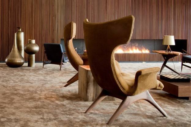
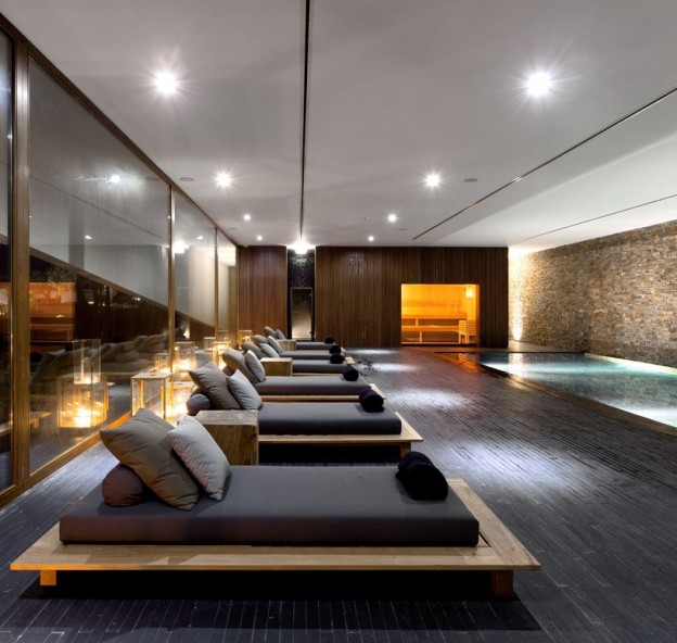
In a series of low-slung, white, modernist buildings set among vineyards is this hotel. The warm, earth-toned interiors are dominated by wood and slate, with timber slat walls dividing the linear spaces according to function. Copper light fittings and bronze sculptural pieces add glamour to the wonderfully textural, bespoke furniture pieces.


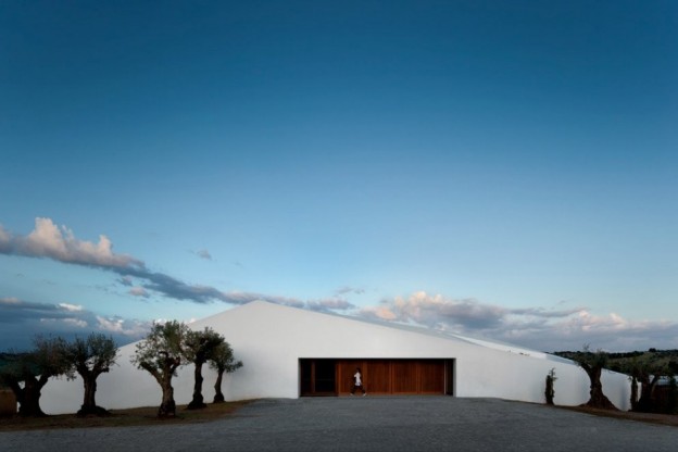
This is the first project in Portugal to be certified under BREEAM. BREEAM (BRE – Environmental Assessing Method) is a standardised environmental assessment method and rating system for buildings. A BREEAM assessment uses recognised measures of performance to evaluate a building’s specification, design, construction and use. The measures used represent a broad range of categories and criteria from energy to ecology. More about BREEAM, here
So – good looks AND green credentials. I think I’d like to be checking in about now…
L’and Vineyards, Montemor, Portugal by StudioMK27 with Promontorio architects; photography Fernando Guerra.
More wonderful spaces, here


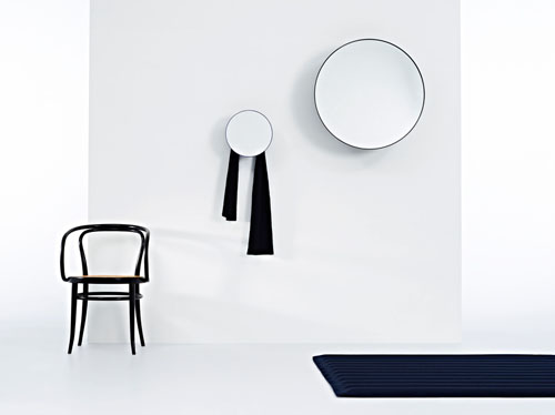
I haven’t seen a mirror this fabulous since Gubi introduced the elegant Adnet Circulaire L, (here). Many styles away, this one is set to inspire a multitude of copies, with its simple, geometric form and clean finish. It is a truncated cone, made of aluminium.
The images they have produced are beautiful and clever – is it a hook? Is it a table? Is it a random object? Is it big or small? The final image reveals the mirror – a very contemporary piece to hang on a wall or place on the floor. It is also a hook. And a table. And a random object. And it comes in both big and small.
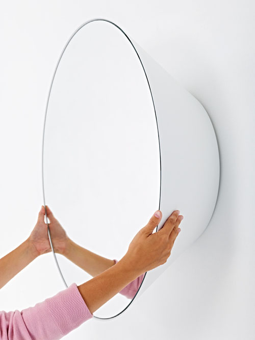
All images, Daily Icon. Edvard Mirror Collection, by Jean-Francois d’Or, for Reflect+, here
More found objects, here

Industrial, eclectic, contemporary, this apartment in Paris is wonderfully open and spacious, yet intimate.
The interior has been stripped back to its shell, and the structure – concrete columns and beams and the odd brick wall – kept in their raw state. The original iron work of the window frames (and a wonderful transparent screen between the bathroom and bedroom, just glimpsed in the photographs) have been painted black, causing them to recede. There is a lightness of touch – the structure is expressed, but it doesn’t overwhelm. A wide-planked American oak floor has been added for warmth.
The palette and fittings are kept simple with shades of grey, black and white, allowing the fabrics and materials of the found objects – a mix of industrial pieces and flea market finds – to add their own exuberant colour and texture. I spy contemporary design classics too – Eames DSW side chair (on sale, here), Bertoia side chair, Butterfly chair.


Photography Birgitta Wolfgang Drejer via
There is an interesting article entitled The Raw Design Movement, here, identifying the use of raw materials as an interior design trend going forward in 2013. This isn’t a new idea, but I’m all for materials left in their natural state. What do you think of the use of natural, unembellished materials in interiors? Does this eclectic, raw loft space inspire you?
More wonderful spaces, here.

This stool is about as good as it gets. An iconic form – simple, practical, stackable, durable. I have two at home and I use them as bedside tables… and something to stand on if I need to reach beyond tip toes. A perfect little piece of design.
The story started 80 years ago when Finnish architect and designer Alvar Aalto tested the sturdiness of his three-legged stool by repeatedly throwing the prototype to the floor at the Korhonen furniture factory. The simple wooden stool represented a new approach to furniture design, and a continuation of the brand of modernism initiated by Bauhaus. The use of wood instead of tubular steel was revolutionary at the time. Aalto had spent several years working on the stool’s design and the development of its curved, L-shaped legs.
Stool 60 was first introduced to the international public at the Wood Only exhibition in London in 1933, to rave reviews.
The stool celebrates its 80th birthday with two special editions:

The colours of the Stool 60 Anniversary Edition are taken directly from Aalto’s Paimio Sanatorium (1928–1933): the yellow of the floors, the green of the walls, the turquoise of the handrails and walls, and the orange, white and black of the furniture. The Paimio Sanatorium is considered to be the most important functionalist building by Aalto.
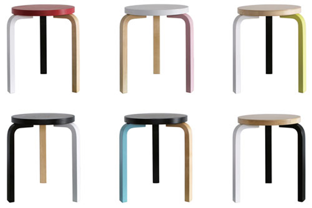
And German artist Mike Meiré’s Special Edition features four different colour ways – a red, black, white and birch stool, recalling the Bauhaus movement. A more industrial approach with sulphur yellow added to the black, white and birch. The third colour way is birch, white and light pink. The fourth is minty turquoise with birch and black.
Which would you choose? You can get one (or two…), here
All images, artek
More found objects, here

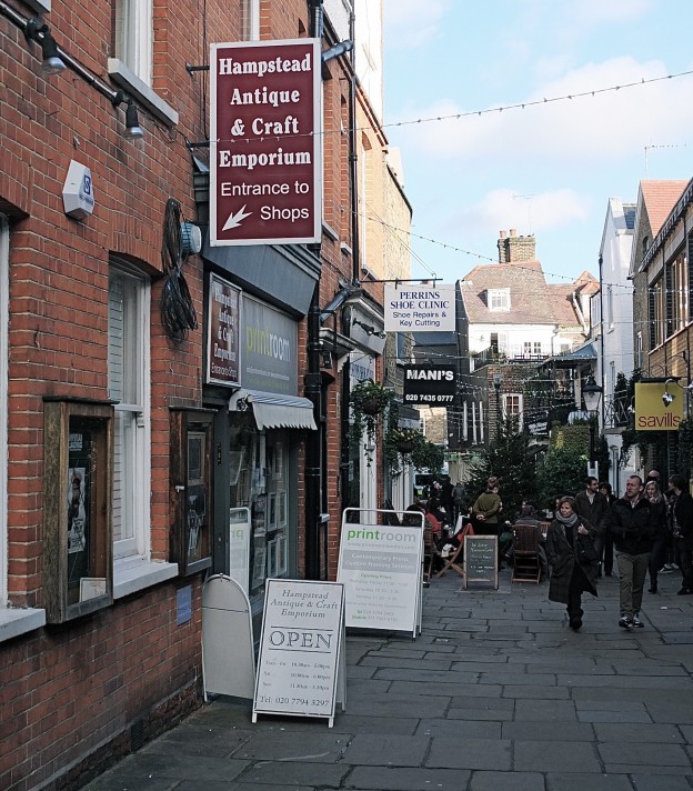
Hampstead Village in North London is a village in the true sense, and the most wonderful place to amble around. It is home to the wonderfully exuberant and eccentric Hampstead Antique Emporium, a narrow winding arcade of tiny antique shops, tucked behind Perrins Court.
Each is a place you want to peruse at leisure, where every piece for sale has a history. The owners are passionate about their wares, and that passion shows. Three of my favorites:
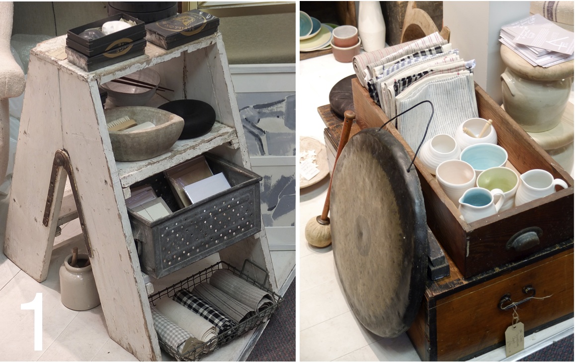
1. Maud and Mabel (feature image and above) exudes calm and serenity. The backdrop is natural and neutral, and the products are all tones of white, pale beige, pale blue and eau-de-nil. Karen has styled the shop to within an inch of its life – it is beautiful. She carries wonderful ceramics by top ceramicists; the tightly edited selection mean the pieces form a cohesive whole. There is a distinctly Japanese feel (2 of the ceramicists are Japanese) and the Japanese raku ware are standout pieces, as well as plates painted with a pattern of old lace. Other items are staunchly Brirish and utilitarian – string, scissors, cards, towels – but all things of beauty. Table linens and a small collection of clothing are soon to be added (hooray!)
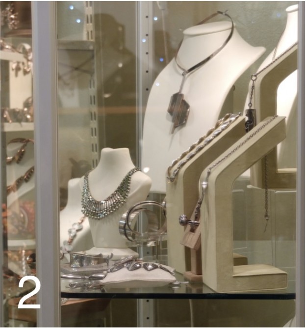
2. The Modernist stocks vintage jewellery from the 1930s to the 1970s, mainly Scandinavian and American; beautiful sculptural pieces, each one a statement. Vintage silver, copper, bronze and jewel-coloured 1950s enamels; it is the mid-century Danish stuff that really resonates for me – vintage Georg Jensen, Henning Koppel and Nianna Ditzel, amongst others (I have a silver choker from here that I adore). The owner Nicole’s interest in American Modernist copper jewellery was sparked by a piece her mother had bought in New York just after the war; spending time in NY she became hooked. Scandinavian silver was later added and the result is an amzing collection of unique pieces.

3. Loved Again is all 50s snd 60s homewares – sorbet-coloured melamine plates, baskets, mid-century furniture and plastics. It’s all about shape and colour, sourced from all around. Monica is a cook and it shows in the wonderful collection of 1950s kitchen aids, later to become household objects during the rise of mass production. Babycham glasses inprinted with sweet baby deers are best sellers and about as iconic of the era as it gets.
Hampstead Antique and Craft, 12 Heath Street Hampstead NW3
More found objects, here
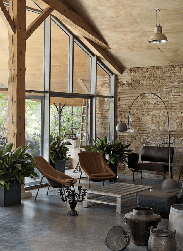
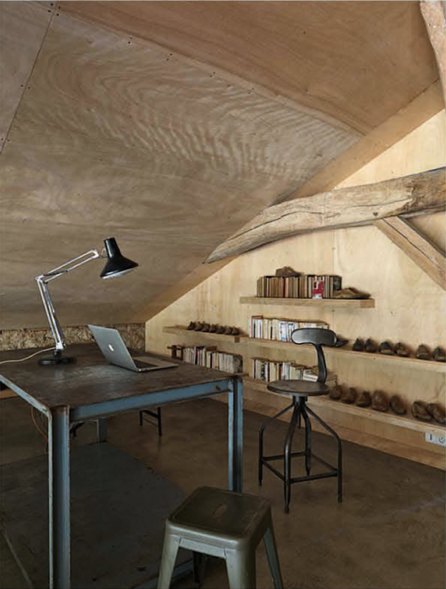
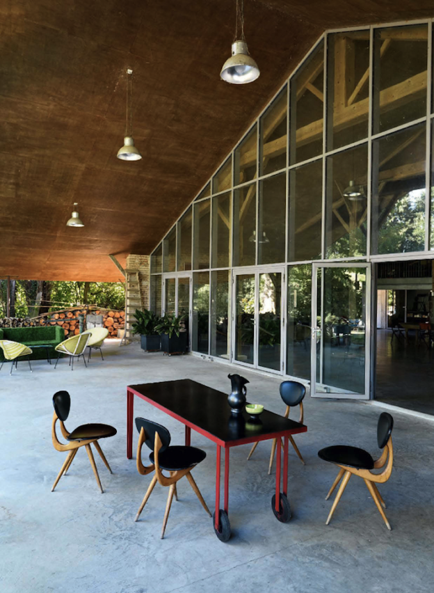
Undeniably rustic, this house exudes warmth and a lack of pretension. However, it is also contemporary, open plan and airy. The beauty lies in its simplicity – poured concrete floors, rough stone walls given refinement with bands of brickwork, large sections of ply lining the ceiling. I love the tactile quality of the materials, and also the honesty – materials are left in their natural state.
The detailing is kept simple too – a massive window frame is brought to rest at the wall and ceiling, without being cut in or forced into a recess. There are no skirtings, or mouldings, or other extraneous elements. There is an integrity to this approach, with every element and material given its due. The roof over-sails to form another room outside, with the minimal intervention of the glazed wall to keep the elements at bay.
The furniture is a wonderful mis-match of reclaimed and industrial pieces – free-standing floor lamps and industrial pendants, a metal desk and chair, a wood-topped dining table.
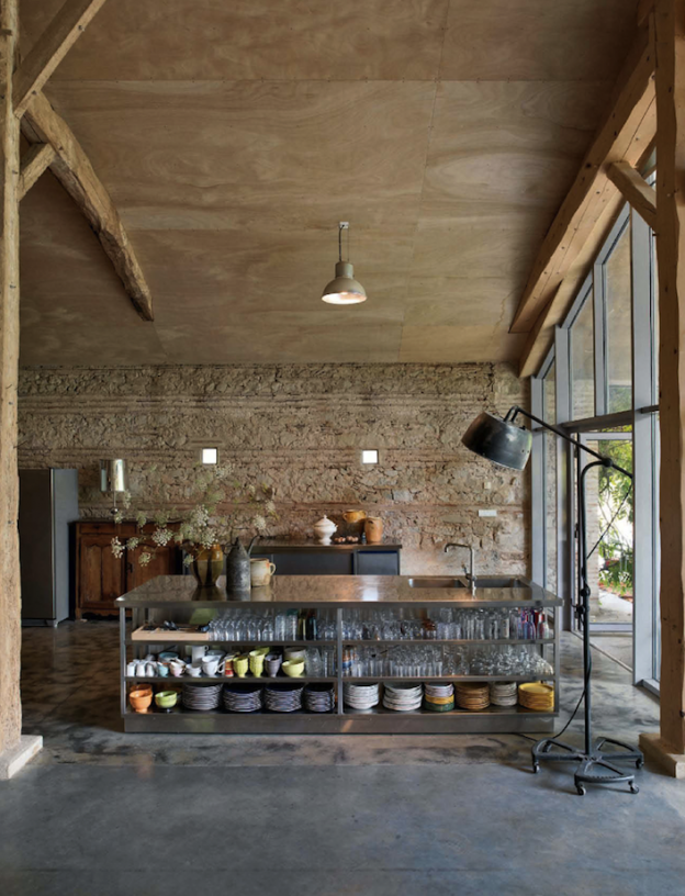

House in Lot-et-Garonne region, France, via French by Design.
More wonderful spaces, here

Architect, craftsman, editor, writer, set designer and industrial designer. Founding editor of Domus magazine. Gio Ponti (1891-1979) has long been a design hero of mine, and how wonderfully relevant his designs are even today – all geometric patterns and blue-greys, and all imbued with exuberance and life.
Gio Ponti didn’t simply create buildings. He conceived the building’s interior as well, creating furniture, lighting, appliances, and ceramics, glassware, and silverware. Alice Rawsthorn in the NY Times called him a ‘designer of a thousand talents’ (read the review, here)

Furniture images via
The Design Museum opened a wonderful exhibition of his work in 2002. Two quotes of his really resonated for me, as a mantra to follow and at the same time demonstrating his spirit and passion:
‘The architect must imagine for each window, a person at the sill, for each door a person passing through’.
‘Enchantment, a useless thing, but as indispensable as bread’.
Ponti originally trained as an architect and entered industrial design by developing products for Richard Ginori, an 18th-century ceramics manufacturer in Florence, for whom he later became artistic director. As an architect, Ponti’s designs embodied and embraced every era in which he worked. The classical style of his earliest houses in the 1920s, evident also in his designs for Ginori, were heavily influenced by Andrea Palladio’s 16th-century villas. In the forties he designed costumes and sets for the opera and ballet, as well as gleaming chrome espressomakers for La Pavoni. He also started another magazine, Stile. After the war he helped rejuvenate Italian ship travel with a commission to fit out four ocean liners. In the fifties his collaborations with Piero Fornasetti resulted in a series of surreally beautiful residences in Milan. In addition he built the iconic, modernist skyscraper, the Pirelli Tower (1956) in Milan, the Villa Planchart (1953-57) and the Villa Arreaza (1956) in Caracas, Venezuela, which are among the most exquisite houses of the modernist period. There is a wonderful article written by Ponti himself describing the Villa Planchart and his design process, in an archival issue of Domus (read it, here).

Images of Villa Planchart via Gio Ponti archive and Daily Icon
Ponti used his writing and editorial roles to champion designers and artists whom he admired, including Carlo Mollino, Piero Fornasetti and Lucio Fontana, and in the process contextualised Italian design within contemporary culture. He always encouraged young designers, even when they challenged his own thinking. Among them were Alessandro Mendini and Ettore Sottsass, who were at the forefront of the 1970s post-modernist movement, which emerged as an alternative to modernism.
‘It is neither necessary to be a dogmatic follower of modern design or a dogmatic follower of traditional design to be modern and traditional, nor even to be preoccupied with all of this’.
More design heros, here
A look forward to some exciting exhibitions and talks coming up in London in the first half of 2013:

1. Juergen Teller: Woo
23 January – 17 March 2013
A journey through his landmark fashion and commercial photography from the 90s, presenting classic images of celebrities such as Lily Cole, Kate Moss and Vivienne Westwood, as well as more recent landscapes. Juergen Teller is one of few photographers to operate in both the art world and at the centre of the commercial sphere, working with Marc Jacobs and Celine, among others.
Institute of Contemporary Arts

2. Tim Walker: Story Teller
Until 27 January 2013
Extravagant in scale and ambition and instantly recognisable, Tim Walker’s photographs are full of life, colour and humour.
3. Valentino: Master of Couture
Until 3 March 2013
Celebrating the life and work of one of fashion’s most inspirational and influential designers. A lovely review on A Nomadic Abode, here
both, Somerset House

4. Santiago Calatrava, RIBA lecture series, Tuesday 29 January, 7pm
5. Peter Zumthor, RIBA lecture series, Tuesday 05 February, 6:30pm
6. Emerging Architecture
Until 21 February 2013
The exhibition features award winning projects covering buildings, interiors, product design, engineering structures, urbanism and landscape – architecture’s emerging generation from 2012.

7. Mariko Mori: Rebirth
Until 17 February 2013
Japanese artist Mariko Mori’s first major exhibition in London for 14 years, including some of Mori’s most acclaimed works from the last 11 years, alongside new works created especially for the exhibition. Read the Guardian review, here

8. Lichtenstein: A Retrospective
21 February – 27 May 2013
The first full-scale retrospective of this artist in over twenty years.
9. David Bowie Retrospective
23 March – 28 July 2013
Guardian review, here
10. Chromazone: Colour in Contemporary Architecture
Until 19 May 2013
Featuring key projects by major UK and international architects who use colour to create identity and define space in an attenpt to heighten the user experience of a building.

11. Patrick Caulfield and Gary Hume
5 June – 1 September 2013
A focused selection of work by Gary Hume (born 1962), in parallel with British painter Patrick Caulfield (1935–2005), illuminating the comparable work of these two artists from different generations.
This is my pick of exhibitions and talks to look forward to; I’d love to know your thoughts!

William Morris.


