interior of the year.

I’m always curious to see what is new and happening in my home town of Melbourne, especially when it comes to design. Winner of the Residential Design awards at this year’s Australian Interior Design Awards was this house – Park House in Melbourne. The design was celebrated for its ‘seamless and effortless spatial flow, which achieves a sincere sense of livability and controlled softness throughout’.

Everything in this home is highly controlled, from the super-fine, curved metal balustrade and opposing recessed handrail through to the vertical garden. However, an organic quality also exists – horizontally, in the flow of the spaces, as well as vertically, with curved, plastered walls continuing up past the ceiling planes, allowing the light to stream down in between in a controlled, but playful, manner.

The palette and detailing is again purposefully restrained, with a clear emphasis on materiality. Wood ceilings, for example, are a wonderful way to bring in warmth and softness as a counterpoint to the hard stone floors. Glass, plaster and metal elements are all utilised in the creation of the flowing forms and spaces. Furniture and fittings are perfectly suited and again selected for finish and form.

park house on owl's house london2owl's house london. park house4owl's house london. park house1park-house-05

The house was a collaboration between Leeton Pointon Architects + Interiors and Allison Pye Interiors. Park House via Australian Design Review, here. Photographs, Peter Bennetts.

Which of the elements stand out for you?

More wonderful spaces, here

saul leiter – photographs.

‘I believe there is such a thing as a search for beauty’

You might not have heard of Saul Leiter. His photographs are amongst the most striking I have seen – abstracted imagery and exquisite composition. They capture and document urban life in mid-century New York. His photographs and paintings are the subject of a new exhibition at Hackelbury Fine Art in London and I attended the opening last night.

Leiter was an early pioneer of colour photography, yet he was never driven by the lure of success. His intention was always to be a painter. He started shooting colour and black-and-white street photography in New York in the 1940s. He had no formal training in photography, but his early work was included in two important shows at MoMA in the 1950s, and he became a successful fashion photographer in the 1950s and 60s.

Leiter’s personal colour photography remained, however, out of public view. He printed some of his black-and-white street photos, but kept most of his colour slides hidden away in boxes. It was only in the 1990s that he began to look back at his colour work and start to make prints. I saw an utterly captivating film about him recently on BBC4 –  In No Great Hurry, 13 Lessons in Life with Saul Leiter (also being shown at the ICA on the 27th June; details, here). It shows Leiter, who will turn 90 this year, in his studio, existing ‘on the periphery of the art world’, while simultaneously being widely regarded as one of the pioneering visions of colour photography. In No Great Hurry explores this contradiction of fame versus impact, with Leiter as the unwilling subject.

4. Red Umbrella c 1955 � Saul Leiter, courtesy of HackelBury Fine Art Howard Greenberg Gallery81671.Taxi 1957 � Saul Leiter, courtesy of HackelBury Fine Art  Howard Greenberg GalleryCanopy, 1958 © Saul Leiter courtesy of HackelBury Fine Art: Howard Greenberg Gallery

Snow 1960 / Red Umbrella c 1955 / Taxi 1957 / Canopy 1958 © Saul Leiter courtesy of HackelBury Fine Art/ Howard Greenberg Gallery

Throughout his life he continued to paint. The parallels between his photography and his painting are immediately evident. The exhibition at Hackelbury shows both media, and it is wonderful to see the paintings and photographs side-by-side. It is also exciting to see the photographs I know so well in the flesh. Smaller than I imagined, but intentionally so; one peers in, then becomes instantly drawn in to his world.

‘The ochres and reds of a passing taxi, the patterns of out of focus lights in Times Square, such details often find their equivalents in both the colour and form of particular paintings. Equally the delight in multiple layers of paint and texture can be seen in many of his exquisite street shots, which frequently use windows and mirrors to frame, veil, and abstract’. Philosopher and art historian Nigel Warburton interviewed Leiter, and has written this on the exhibition (and quoted, above).

What do you think of Saul’s photographs? Next week – his paintings and more on the current exhibition.

Images courtesy of Hackelbury Fine Art.

More in the gallery, here.

an italian summer house :: from the archive.

There is good reason this 17th-century oil mill in southern Italy looks more like a furniture showroom than an inhabited summer house. The dwelling is filled to the brim with the designs of the owners, the architects (and husband and wife team) behind Palomba Serafini Associati, who have together designed bathrooms, kitchens, furniture and lighting for some of the biggest names in Italian design: Boffi, Cappellini, Foscarini and Zanotta.

Retaining the rawness of the existing structure, they have made few interventions, retaining ancient stone floors, walls and arches. A lack of windows in the old mill has been overcome with the use of skylights carved out of the stone, as well as a patio at the rear, allowing the daylight to flood in. In the kitchen they have adapted to the existing space, adding only a sleek, minimal but multi-functional stainless steel island, originally designed for the Italian cabinetry company Elmar. A stainless steel screen separates the work and sleeping areas.

As well as their manufactured products, the home contains bespoke pieces, all commissioned from local craftspeople. One piece that really stands out is the Lama chaise longue, originally designed for Zanotta in steel and leather (see it, here); here they have upholstered it in straw and red metal. It is a beautiful and fluid stand-alone piece.

owl's house london1owl's house london2

palomba-kitchenowl's house london3

 Via Dwell. Images by Francesco Bolis.

What do you think of Italian summer house – showroom or home?

More wonderful spaces, here

the threshold.

the threshold owls house london.

gio ponti quotes

Image via

More Gio Ponti, here. More ponderings, here

a chelsea townhouse.

The renovation of this brick townhouse in New York’s Chelsea neighbourhood was designed to connect the garden level spaces with the exterior and to create open living spaces throughout. With this intention it succeeds – a large glass sliding wall system connects the living room and garden, framing the view; casement windows at the upper levels have been fully glazed to allow the master bedroom and bathroom uninhibited views to outside. A spiral stair within winds organically between the two levels, the continuation of the wood floor assists the flow upwards between the spaces.

The palette is a simple one – grey oil-stained European White Oak, white walls and large slabs of white marble. Lighting in linear slots between horizontal and vertical planes provides an ambient, warm glow. The white and grey-veined Calacatta marble of the kitchen worktop forms a strong sculptural element, with everyday utensils and appliances hidden away behind doors. The marble slabs also create a seamless bathroom, where the surfaces are seemingly carved out of stone. (Similar to Carrara marble, Calacatta marble also comes from the Carrara region of Italy, but has a bolder, more dramatic vein, which can vary from grey to brown. It is also a whiter white, which makes it more valuable).

Built-in storage and shelving and beautiful mid-century furniture pieces furnish the spaces simply.

temp_kitch_1images2 ny townhouse by ohl

temp_stair_4temp_liv_1temp_bed_2

ext ny townhouse by ohl

Templer Townhouse by Workshop for Architecture LLP, here.

More wonderful spaces, here.

fab four: planters.

It is a super busy week here in London, with Clerkenwell Design Week, May Design Series at Excel and Chelsea Flower Show all vying for one’s attention..

This is my homage to Chelsea Flower Show, celebrating its centenary this year, fab four: planters.

fab four on owls house.

  1. Bauhaus-inspired, laquered steel Kubus Bowl from Story North
  2. Clever little upside-down Sky Planter, here 
  3. Case study ceramic bowl from Modernica
  4. Beautiful Japanese terrarium by 10¹² TERRA

Do you have a favourite?

More on Chelsea Flower Show celebrating 100 years in AnOther Magazine, here 

More fab four, here 

house of lightness and glass.

I love floor to ceiling glass, allowing the inside and outside to coexist, bringing light in and blurring the boundaries between outside and in. Glass boxes, however, where the glass forms two or three sides and a ceiling, can so easily feel cold and clinical. Perhaps it has much to do with the climate in this country, but I can’t think of anywhere I’d less rather be on a cold, grey day.

This addition, however, feels like a place I would like to be. Perhaps it is the sculptural quality – not a box, but an architectural form with a raking roofline. Perhaps the interplay of solid white planes with the glass, or the double height space allowing the light to plunge through the volume. Contrasting against the darker, more formal spaces of the original house – lounge, study, dining room – are the lighter, informal areas of the new – the open plan kitchen and casual living. Vertical voids cut through the house to unite the cellar, ground and first floors, allow light to filter down gradually, creating beautiful shards of light and shadow.

gh_140513_07 gh_140513_09 gh_140513_12 gh_140513_01

The joinery and furniture is kept simple and rectilinear, further emphasising the lightness of the space, with pale ceramic flooring (not timber, which would fade over time in the sunlight), and glass stair treads.

Glass house in Winchester, England, by AR Design Studio, via

More wonderful spaces, here

at the fair – the mid century show.

Once you have your Richard Neutra-designed home (see my previous post, here), you will need to furnish it. Here’s my take on last Sunday’s Mid Century show at Lord’s in North London; a wonderful trove of Scandinavian classic furniture, simple, functional lighting, local salvage, industrial pieces, jewellery, art and ephemera. Forty seven businesses were represented, here are just a few of my favourites:

E&T photo by owl's house london

1. These gorgeous ducks also have the most wonderful provenance:

One particular spring day in 1959 in Frederiksberg, Copenhagen, a policeman found the time to stop the traffic in order to let a young duck family pass. It was a meaningful enough event to the passers-by that all the newspapers published a now famous photograph of the ducks. This captured moment ‘encapsulates the Danish attention to nature and detail and the ability to appreciate small everyday miracles’. Inspired by the duck family, Hans Bølling designed this pair of small wooden duck figures.

Duck and Duckling in teak by Hans Bølling 1959 at Elliot and Tate, specialists in finding and rsstoring the vintage Danish Furniture of Hans Wegner, Finn Juhl, Arne Jacobsen, amongst others.

LandCo photo2 by owl's house london l&c photo by owl's house london

2. Lovely and Company are an on-line vintage furniture store based in Brighton, UK.

One gets the same thrill scratching around here as any flea-market – they carry a clever mix of 20th Century design classics alongside soda crates and multi-drawer haberdashery chests. Ferm Living is represented, along with House Doctor and Tas-ka. They carry reams of Eames original fibreglass shells (the new version of the chair is in polypropylene), which can be mounted on new walnut bases.

Saunders Fine Art on owl's house london.

3. Beautiful mid-century art at Saunders Fine Art, specialists in Modern British and European painting (all images, Saunders Fine Art). Clockwise from top left:

Esbjörn (Bo) Lassen, Still Life, Daily News, Watercolour, 1946

Douglas Swan, Composition, Mixed media on paper, 1962

Jürgen Von Konow, Lowering the Nets, Oil on canvas1949

TMW photo by owl's house london

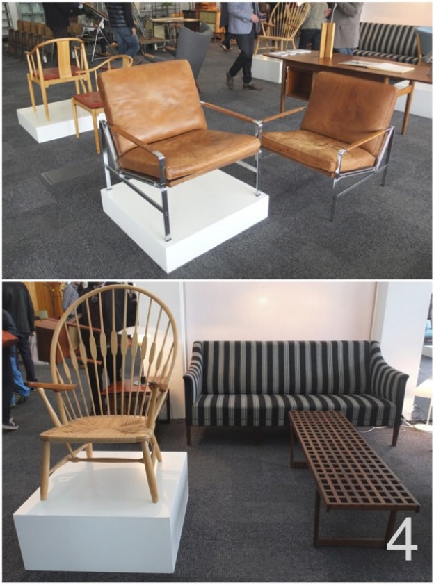
4. Based in Victoria Park, East London, The Modern Warehouse specialise in buying and selling mid century modern furniture and accessories from Scandinavia, U.S.A. and the UK. The collection is made up entirely of original vintage pieces, not reproductions.

The Modernist photo by owl's house london

5. The Modernist based in a wonderful little antique emporium in North London, is one of my favourite haunts: stunning vintage Georg Jensen silver jewellery along with other precious pieces, all from early to mid-century and all fabulous. I wrote about The Modernist in an earlier blog post on the Hampstead Emporium, here.

VU photo by owl's house london

6. Vintage Unit source and refurbish industrial furniture, lighting & accessories, with examples from Britain and the continent from the post war period. Their pieces are beautifully refurbished things of beauty as well as utility. Practical but decorative and collectable in their own right.

Retrouvius photo by owl's house london

7. Retrouvius is a stalwart in the architectural salvage business, full of wonderful reclamation pieces. They have released a book, Reclaiming Style, outlining the Retrouvius ‘re-use’ philosophy,  from sourcing material at demolition sites and filtering this into the warehouse to adapting materials for re-use in homes via their in-house design practice. I loved the stacks of worn, colourful aluminium pendants.

TCA photo by owl's house london

8. Twentieth Century Antiques are Edinburgh based, and specialise in modern design from 1920-1970. I rather liked the idea of the Jacobsen Egg chair, Danish rosewood sideboard and original Picasso exhibition poster on display in my own home…

AG photo by owl's house london

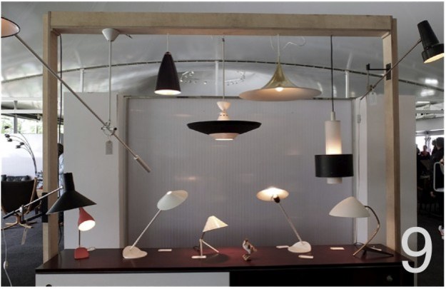
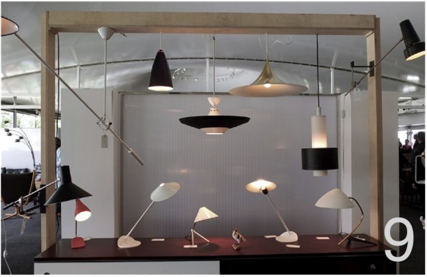
9. A fabulous array of classic lights including the sweet Pinnochio desk lamp from Augustus Greaves, who specialise in architect designed, post war modernist pieces (and have a beautiful web-site, as well).

Which pieces would you like to see in your home?

All images owl’s house london, unless noted otherwise.

More happenings, here.

a perfect case study.

singletonhousedailyicon

The case study houses of the 1940s, ’50s and ’60s have long been my idea of the perfect contemporary home – open plan, maximum glazing, simple, functional. Perhaps the climate helps (these homes were most often built in California), but they seem to embody a free and easy lifestyle and optimism. Post war construction methods and new materials made the houses possible, and yet…

The Case Study house program stated that: each ‘house must be capable of duplication and in no sense be a individual performance.. It is important that the best material available be used in the best possible way in order to arrive at a ‘good’ solution of each problem, which in the overall program will be general enough to be of practical assistance to the average AmerIcan in search of a home in which he can afford to live…’ I just adore this philosophy.

Nine architects were involved in the initial scheme, including Richard Neutra and Charles Eames. I have often wondered how they could get these simple, easy-to-build forms so right; contemporary architecture today very often loses sight of its modernist roots.

Now a new partnership between the son of Richard Neutra, and the California Architecture Conservancy, means one can license the right to build from the plans of Richard Neutra. More about the scheme, here. Neutra (1892-1970), one of the most important of the mid-century modernist architects, became famous for the simple geometries of his designs, which were often made of steel and glass, and the prefabricated elements that made them extremely easy to build. Known for rigorously geometric yet open and airy structures, Neutra blended the interior and exterior of a space such that it would ‘place man in relationship with nature; that’s where he developed and where he feels most at home’. This philosophy grew from a feeling that “our environment is often chaotic, irritating, inhibitive and disorienting. It is not generally designed at all, but amounts to a cacophonous, visually discordant accretion of accidental events, sometimes euphemized as ‘urban development’ and ‘economic progress’’’.*

neutbuc05dailyiconneutbuc06dailyiconneutrareu04dailyiconneupes06dailyicon

neupes04dailyiconTroxell08dailyiconTroxell01dailyicon1 / 2 / 3 / 4 / 5 / 6 / 7 / 8  (not all were the case study models, but too good not to show).

A very funny account of what it must be like to live in a mid-century modern home with children, here

More wonderful spaces, here. And my take on the fabulous mid-century modern show at Lord’s in London this past weekend on next Thursday’s post…

* Quotation from Neutra’s biography, Life and Shape, available from this dreadful-looking Neutra web-site..

house in a wren tower.

Just back from the beautiful Brecon Beacons and days filled with sunshine, dappled light and daffodils. And most challengingly, no internet! So with no post on Monday this week, we begin with Thursday’s post… I can’t quite imagine calling a Grade 1 listed, Sir Christopher Wren-designed tower in central London home. If I could, this is what I hope it would look like.

Alterations were made to Christ Church tower, to form a single family house over twelve (12!) levels. Masterfully restrained, the palette is of wood floors and white painted walls. A curved glass handrail, simply pinned off the concrete stair, winds ever upwards; the upper-most level is connected by the narrowest, wood, double-tread stair. Landings allow moments to pause, furnished with beautiful classic pieces.

wren images 1wren images 2wren images 4wren images 5wren images 3wren images 6

Christ Church tower, London by Boyarsky Murphy Architects

Another house on many levels, here