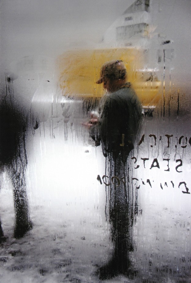
‘A window covered with raindrops interests me more than a photograph of a famous person’ Saul Leiter (1923-2013)
More Saul Leiter, here
Image courtesy HackelBury Fine Art Howard Greenberg Gallery

‘A window covered with raindrops interests me more than a photograph of a famous person’ Saul Leiter (1923-2013)
More Saul Leiter, here
Image courtesy HackelBury Fine Art Howard Greenberg Gallery

In the ancient Catalan city of Girona is this apartment, in a building dating from the 16th century. The vernacular of exposed timber beams and rough stone walls is cleverly countered with the contemporary materials – black metal, wood veneer cabinetry stained black, rendered walls, solid timber floors. Openings and junctions are lined and restrained with black metal, horizontal surfaces are either recessed or allowed to float freely. Textures abound in the simple, raw palette of materials and neutral furniture.
And the good news? If you want to escape the sudden onslaught of fiercely cold weather in Northern Europe, it’s available to rent. There are two apartments, El Badiu (the gallery) and El Jardi (the garden), or it can be rented in its entirety.

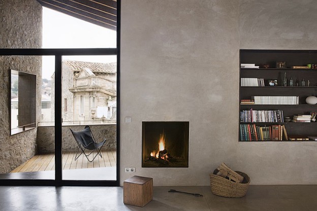
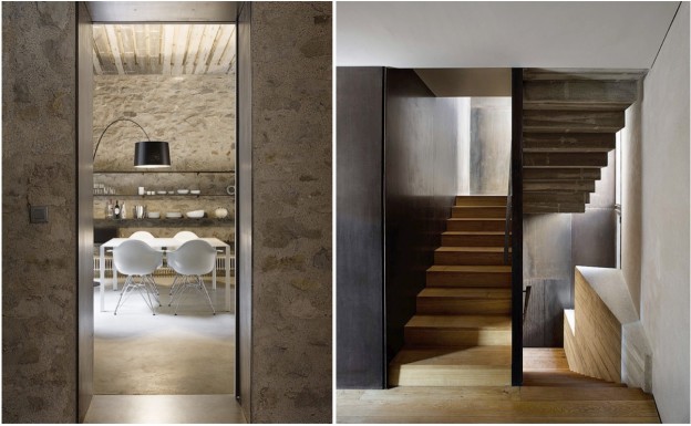

Alemanys 5, Girona by architect Anna Noguera, via. Photographs, Anna Noguera
Are you ready for sunshine yet? I also love this property, Shelter7 in Ghent, also available to rent through travel site Welcome Beyond.
More wonderful spaces in sunny climes, here
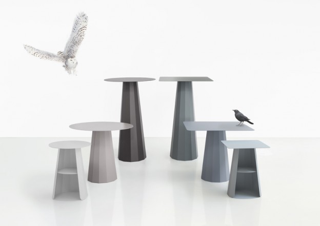
Love this range of tables by Paris-based designer Constance Guisset (not to mention the owl styling..) Originally designed in 2009 for the French Cultural Institute in Ankara, Turkey, the Ankara collection is all metal in a range of colours. More, here
I wrote about another of Constance Guisset’s products, the Vertigo pendant, here.
Always on the look out for a beautiful and functional floor lamp; they provide atmosphere as well as task lighting and these five are beauties. I’m showing all in black, but some, like the Grasshopper (no. 4), come in wonderful hues (I love the blue-grey). The Tolomeo is a classic that I have specified countless times – it works in so many different interiors.

Which is your favourite?
Talking about lighting, new and exciting lighting studio Cameron Design House have just launched a second range of beautiful, sculptural wood pendant lights, here. All made in North London with a very Scandinavian flavour.
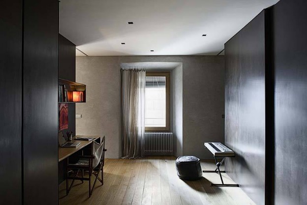
With Paris still very much on my mind, I came across this beautiful interior, again in a classic Haussmann building, via the always interesting D Pages (see my previous Paris post, here)

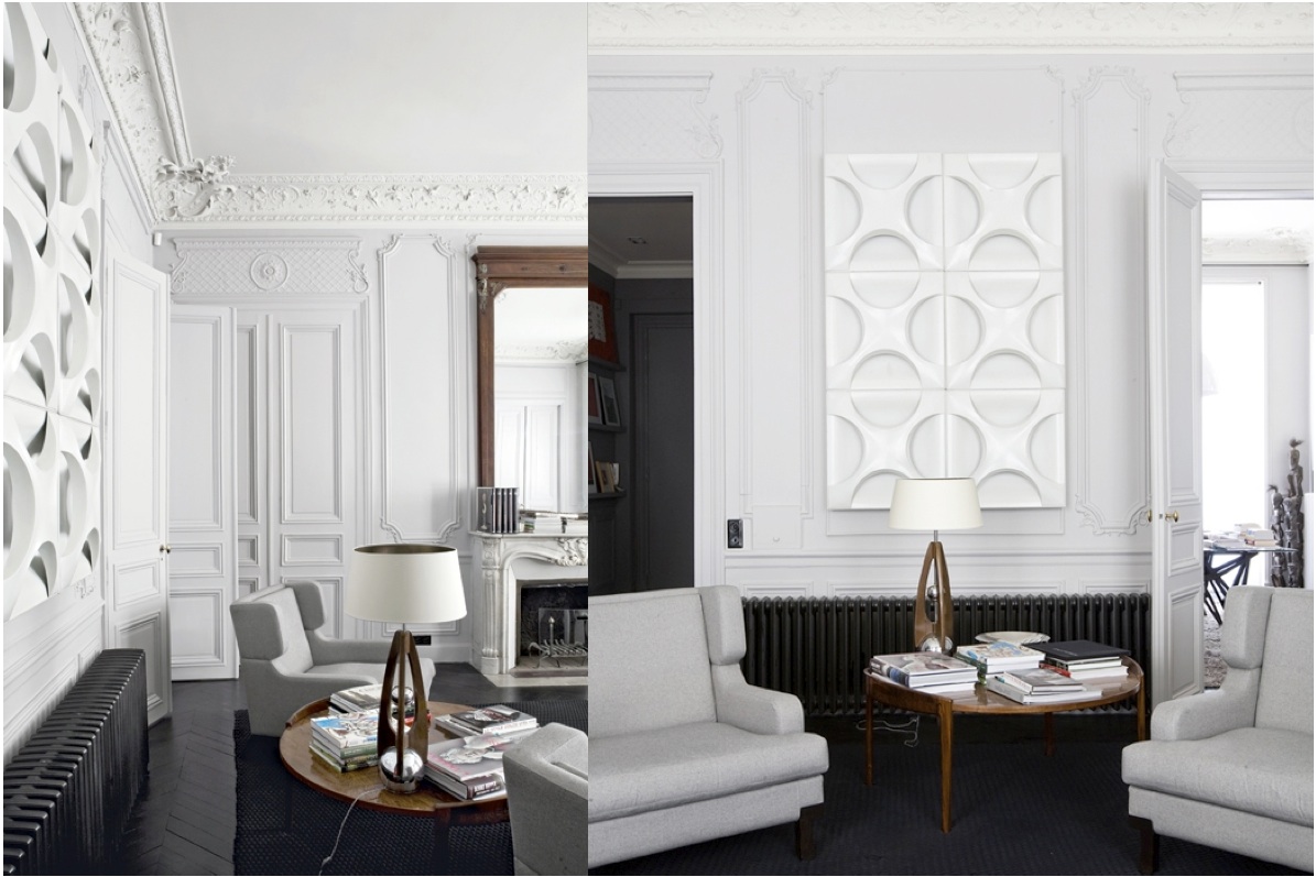

The designers job, in this case, was to allow the home to adapt to a contemporary lifestyle whilst maintaining, along with the period mouldings and fireplaces, its essence. Circulation through the space has been simplified, alignments and vistas created. Individual rooms remain but are opened up, allowing an open plan layout or closed off, as required.
From palest pearl to anthracite, grey is again the predominant wall colour, this time accented with white. Dark stained parquet on the floors and black lacquered MDF panels provide the main surfaces off which the fixtures hang. Rich timber Danish mid-century furniture and a three-dimensional tone-on-tone wall hanging sit alongside other classic and vintage pieces in the living spaces. Sofas and chairs are neutral in colour, strong in form. The black-stained solid oak kitchen has a central island and Zimbabwe black granite worktop and tiled splashback. Jade green artwork provides the colour. An anthracite grey library is off-set with a vivid red 60’s armchair and footstool.
The bathroom beautifully exemplifies the blend of old and new, with traditional fireplace, plasterwork and chandelier alongside colourful, framed lithographs and contemporary window treatments.
What do you think of this mix of old and new? Which Paris apartment, part 1 or part 11, is your favorite?
Casa Parigi by Studio Double G, here Photographs, Helenio Barbetta
More wonderful spaces, here
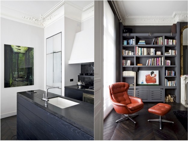
This beautiful interior intrigues for two reasons. First, we are heading to Paris for a few days and this home is housed in a classic Haussmann apartment; and second, we are in the throes of purchasing a new flat here in London, with very high ceilings, period detailing, and parquet floors. I cannot wait to start decorating (although we had better exchange first!)


The interior designer owner has painted the entire space in a darkish mid grey – walls, ceilings, mouldings, cornices, architraves. I love this contemporary idea – all surfaces are treated with equal importance, rather than the traditional route of picking out details and giving them a hierachy. Tall French doors and equally vertiginous mirrors bounce the light around and keep the apartment from feeling drab. Gleaming dark-stained herringbone floors reflect the light and continue to bounce it around.
Grey is a fabulous muse for vivid colours; the lilac pink sofas, although not to my taste, work beautifully. Red appears throughout in artwork, positioned to entice the eye from one room to the next. Quirky artworks abound, as do odd, mismatched chairs, giving a it a charming, off-beat yet utterly elegant air. The study appears to be a departure, with a half-painted wall (I love half-painted walls and have several pinned on Pinterest, here); black door frames, stair and rope handrail, ravishing teal-coloured curtains and bright red Eames shell chair.
New Paris Style via Habitually Chic. Photos by Richard Powers and Jean-Marc Palisse
Would you use grey for the walls in your home? A useful resource for selecting the right shade of grey can be found, here
More wonderful Parisian spaces, here. Bon weekend!
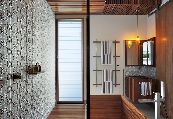
I love the idea of a ‘best rooms’ award – not house, or interior, but room. Aussie interiors publication Australian House and Garden does one annually. The contenders vary wildly in style and presumably budget (it’s not clear what the criteria is). This year features a bathroom designed by the architecture studio of friends from my Melbourne University days, in typically quirky style, rich in materiality and texture (no 23!). These are my favourites:
 04. Geometric cut-outs in an all-white volume by Decus
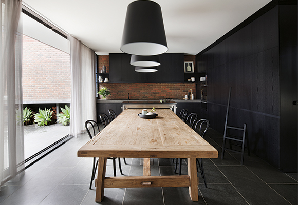 14. Black-stained wood, exposed brick and a contrasting diaphonous curtain by Beatrix Rowe Interior Design
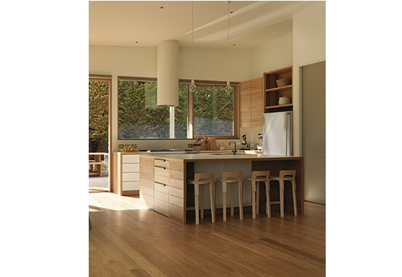 15. Pale wood and simple, geometric shapes by O’Connor and Houle Architecture
 23. Rich-red slatted wood and bold white pattern by AlsoCan architects

26. Linear indoor/outdoor space by Drew Heath Architects
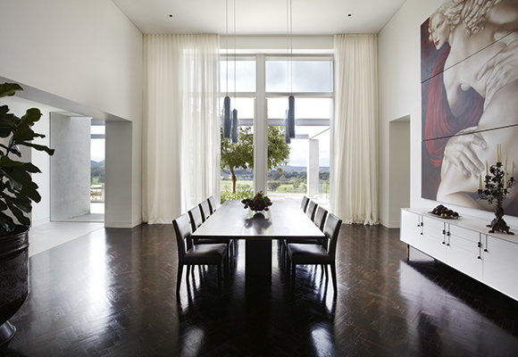 31. Heightened sense of scale and a wall of art by Sarah Davison Interior Design
46. Black framing against white-on-white elements by Whiting Architects
More good design, here
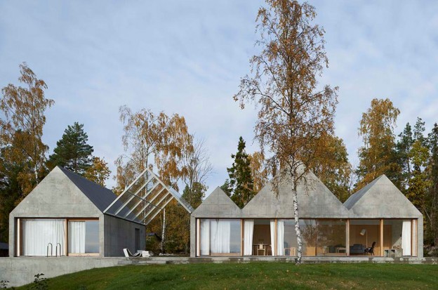
I attended WAN House of the Year award night in London late last week. It went to this house, a summer house on an island in the Stockholm archipelago by Swedish studio Tham & Videgård Arkitekter.
The most striking thing about the house is its simple, dynamic form: a row of zig-zagging, raw concrete gables that stretch across the site like a line of boathouses. Rather than the usual vernacular of a timber dwelling drawing on the forest for its context, the building takes its inspiration from the granite bedrock found on the island. One of the gables forms a glass canopy roofing the terrace, that also splits the building into two separate volumes. This provides a vista through the building to the seafront from the forest beyond and vice versa, as well as acting as the entrance. Three of the gables house the living and dining rooms; pale ash doors doors slide open to reveal the bedrooms behind.
Along with the facade, the terrace and interior floors are made of exposed concrete. The raw concrete has been cast in-situ against plywood boards, giving a subtle grain and wonderfully worn quality to the surface. The interior is simply painted white, window frames and joinery are ash.
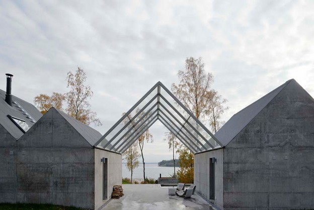
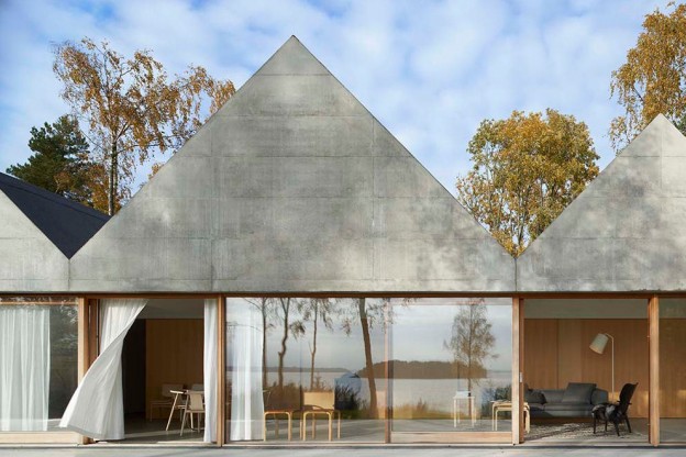


House Lagnö by Tham & Videgård Arkitekter, here. Photography: Åke E:son Lindman
What do you think of house of the year? It’s certainly less dramatic than last year’s winner, here
The classical symmetry of a staircase running up from the centre to the left and to the right is re-interpreted in this otherwise utterly modern, tiny loft apartment in Paris. White, suspended boxes housing the bedroom and bathroom are then positioned left and right. Beneath, the living space on one side, and the kitchen on the other. The staircase of folded metal creates a bold, geometric statement.
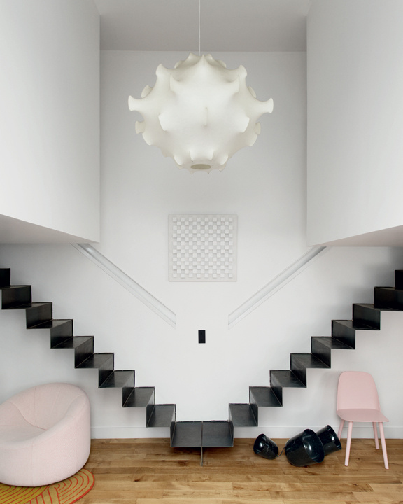


The palette of white walls, black metal and oak floor is punctuated by shots of bold colour and form. In the main salon are fabulous classic furniture pieces from the 60s and 70s – the marvelous, resin Taraxacum S2 suspension light takes centre stage, the Tre Pezzi armchair (in white Mongolian goat hair, no less), Pierre Paulin’s voluptuous Pumpkin sofa. Muuto chairs in this season’s palest pink and mint, a dark yellow wall. Oak pocket cupboard doors are simply decorated with diagonal strips of oak (a clever detail that – the diagonal used as a symbol in architectural drawing to indicate whether the door is left or right opening). The full-height doors open to reveal the kitchen units, finished in matt black.
Un Espace en Suspension, Paris, via AD Magazine
Photographs: Vincent Leroux
More wonderful spaces, here