
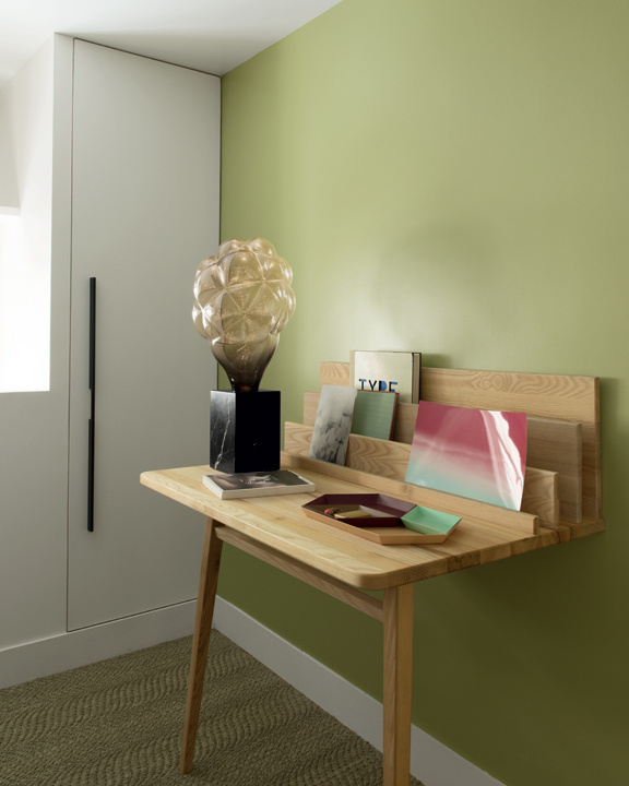
Tawny owl covered in fabric by Dutch designers Maarten Kolk & Guus Kusters
More Avifauna, here

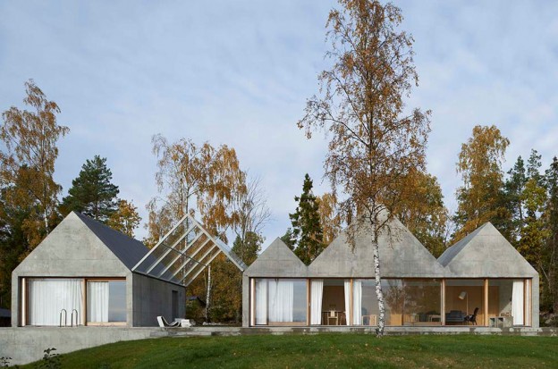
I attended WAN House of the Year award night in London late last week. It went to this house, a summer house on an island in the Stockholm archipelago by Swedish studio Tham & Videgård Arkitekter.
The most striking thing about the house is its simple, dynamic form: a row of zig-zagging, raw concrete gables that stretch across the site like a line of boathouses. Rather than the usual vernacular of a timber dwelling drawing on the forest for its context, the building takes its inspiration from the granite bedrock found on the island. One of the gables forms a glass canopy roofing the terrace, that also splits the building into two separate volumes. This provides a vista through the building to the seafront from the forest beyond and vice versa, as well as acting as the entrance. Three of the gables house the living and dining rooms; pale ash doors doors slide open to reveal the bedrooms behind.
Along with the facade, the terrace and interior floors are made of exposed concrete. The raw concrete has been cast in-situ against plywood boards, giving a subtle grain and wonderfully worn quality to the surface. The interior is simply painted white, window frames and joinery are ash.
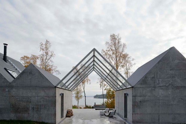
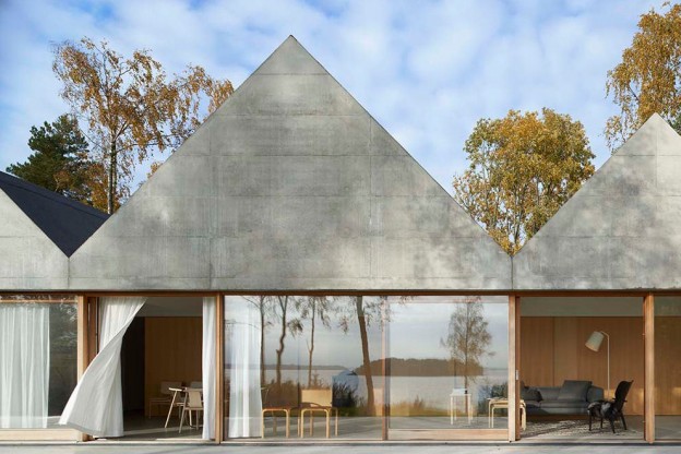


House Lagnö by Tham & Videgård Arkitekter, here. Photography: Åke E:son Lindman
What do you think of house of the year? It’s certainly less dramatic than last year’s winner, here
The classical symmetry of a staircase running up from the centre to the left and to the right is re-interpreted in this otherwise utterly modern, tiny loft apartment in Paris. White, suspended boxes housing the bedroom and bathroom are then positioned left and right. Beneath, the living space on one side, and the kitchen on the other. The staircase of folded metal creates a bold, geometric statement.
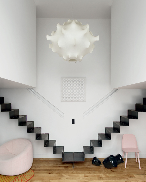


The palette of white walls, black metal and oak floor is punctuated by shots of bold colour and form. In the main salon are fabulous classic furniture pieces from the 60s and 70s – the marvelous, resin Taraxacum S2 suspension light takes centre stage, the Tre Pezzi armchair (in white Mongolian goat hair, no less), Pierre Paulin’s voluptuous Pumpkin sofa. Muuto chairs in this season’s palest pink and mint, a dark yellow wall. Oak pocket cupboard doors are simply decorated with diagonal strips of oak (a clever detail that – the diagonal used as a symbol in architectural drawing to indicate whether the door is left or right opening). The full-height doors open to reveal the kitchen units, finished in matt black.
Un Espace en Suspension, Paris, via AD Magazine
Photographs: Vincent Leroux
More wonderful spaces, here

It’s Frieze art fair time here in London: provocative, dynamic… this show has the most amazing buzz and vitality, the atmosphere thick with expectation and possibility. I’m a huge fan.
And if you can’t make it, Artsy – a great on-line resource for discovering contemporary art – has curated a selection of works by artists represented at the fairs from prominent galleries, here
Images and more Frieze, here
Midcentury Show East is a mid-century fair, featuring vintage furniture dealers and classics of British, American and Scandinavian twentieth-century design. I wrote about the midcentury show in St John’s Wood earlier this year, here.
This past Sunday was the east London event, held in Haggerston School, a building designed by major Modernist proponent, architect Erno Goldfinger in the mid 1960s, probably best known for his Brutalist-style Trellick Tower. Fifty dealers were represented, the hall and gym holding the majority with the rest meandering through corridors and secondary spaces. Stalwarts like Lovely & Co, Elliot and Tate, Saunders Fine Art, Vintage Unit, and new (to me, at least): Osi Modern (who style so beautifully), Pink Flamingos who specialise in Eames, and Bleu.

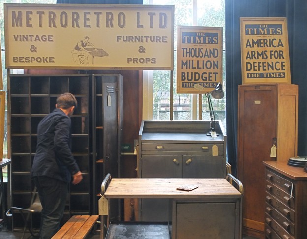


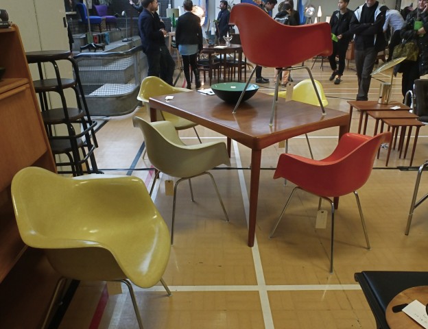

Sadly I’m not in the market for furniture until our house-hunting is over, and we have space with which to furnish… sigh. Maybe by the time the Dulwich fair comes around in December…

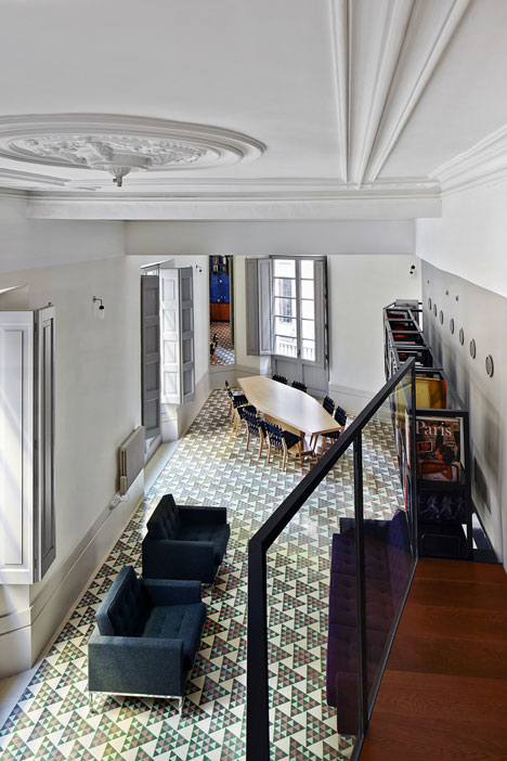
Inside Awards World interior of the Year 2013 is the refurbishment of a piano nobile (or main floor) apartment in the Gothic Quarter of Barcelona. A triangular-shaped site, it is situated at a major crossroads in the city. Stripping back the internal partitions revealed the vertex, reconnecting the apartment with the streets beyond.
A look within reveals minimal intervention. The shell of the building and its classical elements are retained. A balcony that connects bedrooms and en-suite bathrooms is lined with books, becoming a high-level library. Simple, rectilinear furniture compliments the simple layout. But the materials palette is an ecelectic mix, unrestrained and rich in colour and materials – gold, black painted metal, dark red wood, cobalt blue tiles, green glass. More than I would ever put together in one space.
But I love how the architects have interpreted the brief, thus: the new mosaic floor is decorated with a triangular pattern matching the geometry of the plan. The tile pattern is graded in colour from green at one end of the apartment to red at the other to differentiate the clients’ private spaces – two brothers who share the space as a holiday home. At the street corner the red and green tiles are at their most mixed; this is the dining area which is also the meeting place for family and friends.
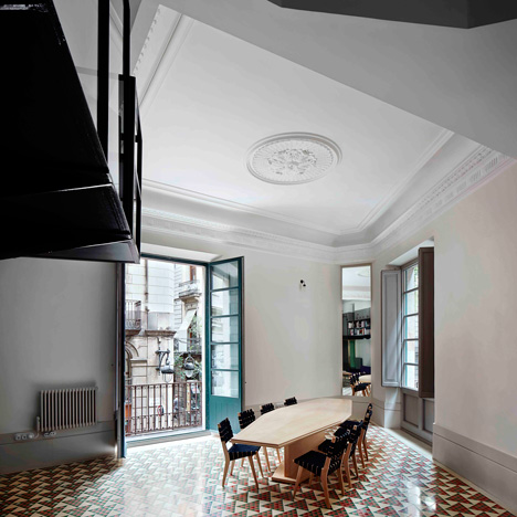


What do you think of the interior of the year? Apartment in Barcelona by David Kohn Architects via
More wonderful spaces, here
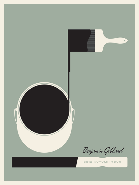

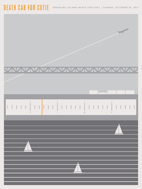
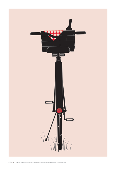
Recently discovered (via this lovely interior design blog), the graphic artist Jason Munn who began making posters ten years ago for local venues and independent musicians; he has now added design and illustration commissions to his repertoire. Some of his work is in the permanent collection at the San Francisco Museum of Modern Art and Denver Art Museum. I love the simple, clean graphics, retro quality and bold but muted colour palette..
Website and shop, here
Also love this limited edition poster Something for Syria with 100% of the proceeds going to Médecins Sans Frontières for the people of Syria. Only 250 editions printed (actually, 249…). Get one, here
 More gorgeous graphics, here

In the ancient port city of Old Jaffa in Israel, a building hundreds of years old has been stripped of all extraneous elements to reveal the original structure of broken clay and shells, vaulted ceilings and huge archways. These textures and materials have been left expressed, and contemporary elements added to allow the home to respond to modern life.
Highly tensioned stainless steel cables form a vertical balustrade, drawing the eye on up. Cor-ten steel treads cantilever out of a béton brut wall; the concrete left unfinished with the imprint of the plywood formwork used for pouring still visible on the surface. Openings are framed out in darkest metal. Niches are carved into the stone to create storage and space for a desk. Furnishings are kept simple – exposed concrete floors are scattered with patterned rugs; the floating, dancing Vertigo pendant lamp one of only a few decorative elements (I wrote about Vertigo a little while back, here)


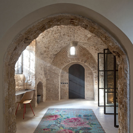

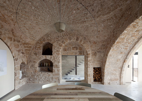
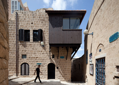
Jaffa House by Pitsou Kedem architects, via Photography, Amit Geron.
More wonderful spaces, here.
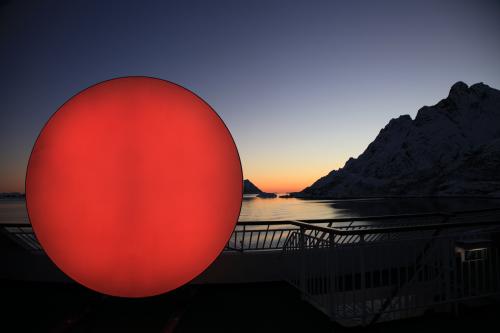
The Sun installation is a symbolic representation of the sun constantly changing from white to warm orange to burning red. The installation first travelled from Oslo to Tromsø in northern Norway, to light up the city in a period where it had no sunlight. It has now arrived in the UK to light up East London during London Design Festival (14-22 September) as part of the 100% Norway show at Tent London.

The Sun by Christine Istad and Lisa Pacini via WAN.
And don’t forget the moon, here
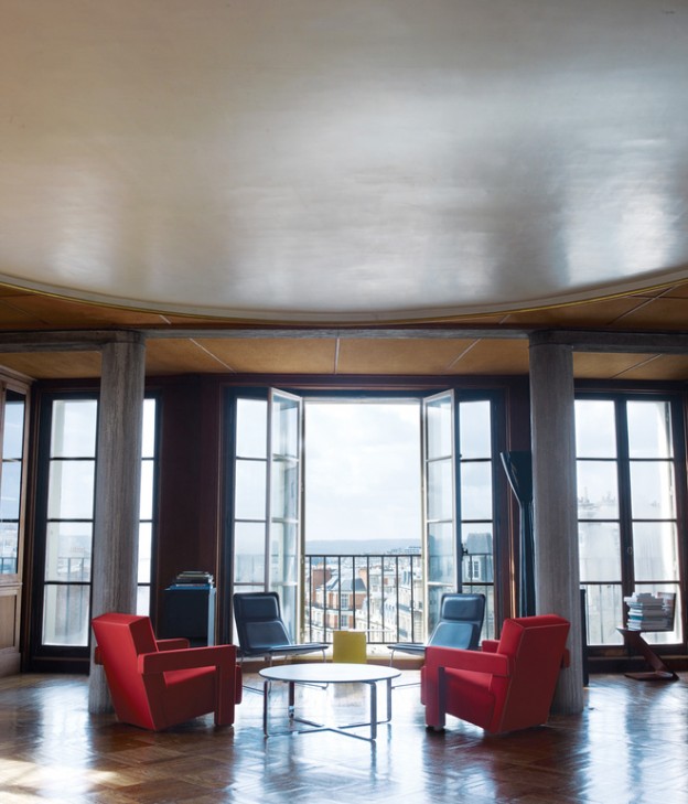
51 rue Raynouard is an apartment block in the16th arrondissement in Paris, designed and built in 1932 by Auguste Perret. Perret is a seminal architect of the 20th century, responsible for heading the re-build of Le Havre post–Second World War (now a World Heritage Site), and for his pioneering use of reinforced concrete. He constructed no. 51 to house his design firm and his family, in an apartment on the top floor. His concern was not so much how his building looked from the ground, but rather how the world outside would appear from his building. Perret wrote that the apartment ‘is filled with sunlight from dawn to dusk’. Now a listed building, architectural interventions are restricted and the architect owner has refused to make even minor repairs. But he has certainly filled it with pretty things…

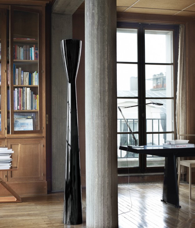

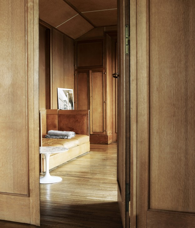
The walls throughout are lined with French oak panelling in the most beautiful pale honey colour, floors are narrow timber boards of a similar hue and columns are made from stone-blasted concrete, not the marble one would expect of the era.
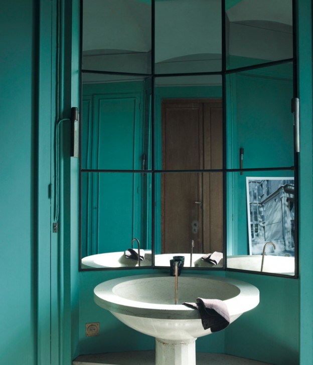
The furniture is a master-class of design classics. In the dining room, black marble-topped Eero Saarinen table and Eames wire chairs. I spy an AJ floor lamp by Arne Jacobsen and Flos desk lamp. Red Utrecht armchairs by Gerrit Rietveld and his Zig Zag chair sit alongside more modern pieces – Low Pad chairs by Jasper Morrison and a Still coffee table which echoes the circular plaster feature ceiling above. A beautiful, circular stone basin sits within the turquoise-green bathroom.
Modern High Design Pied-à-Terre Paris, via Dwell, here, and ‘One hundred houses for one hundred European Architects’ by Gennaro Postiglione.
Photographs: Hotze Eisma.
Or do you prefer a pared back parisian, here?
