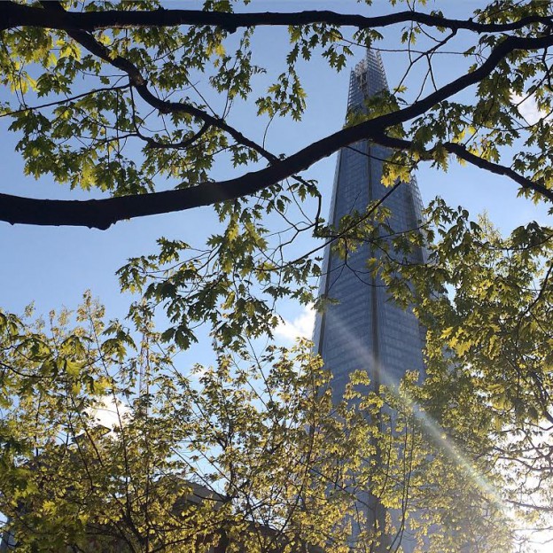
View from the penthouse of the wonderful Isokon building, from a private tour at the weekend.
Follow owl’s house london Instagram, here.

View from the penthouse of the wonderful Isokon building, from a private tour at the weekend.
Follow owl’s house london Instagram, here.
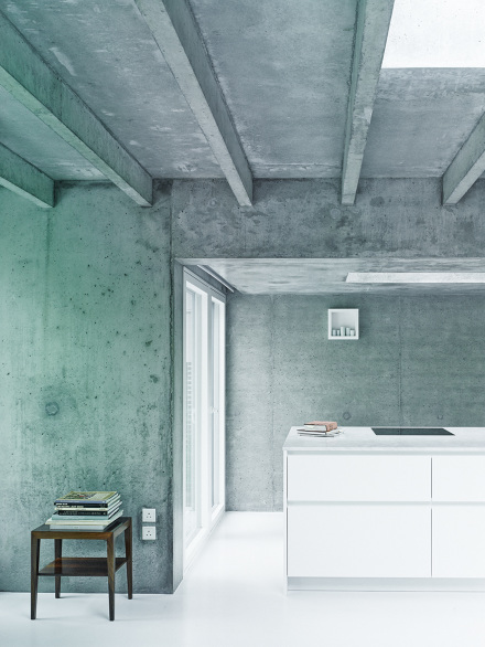
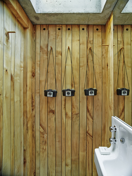
Covert House has been much acclaimed in the architectural press of late. It offers a successful case study for good design despite difficult site demands – the house is mainly underground, restricted by a 3.5 meter height limit and huge boundary setbacks. But equally successful to my mind is the interior. There is too often an overwhelming gap between architecture and interior, with architects neglecting the interior for sake of the big architectural expression, and interior designers having little if any influence over the outside form. Here, the architect owners have embraced both.
Concrete is used outside and in in various forms – cast in situ, left raw, highly polished. In its unfinished state, it provides the perfect backdrop. The imperfections – discolouration and mottling – show the effort and craft involved in making the structure. Light abounds, via light wells and the white and light reflecting surfaces. The effect is elegant and light-handed and the resulting spaces appear calm and domiciliary. Furniture is mostly mid-century and there is a mix of timbers used in the furnishings, and a timber lined bathroom. The only soft surfaces appear to be the upholstery fabrics.

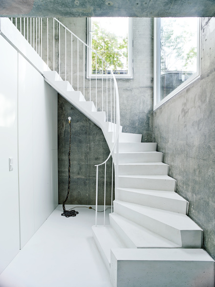


For me, concrete has always been the ultimate building material (more concrete inspiration, here). It can work very successfully in commercial interiors. Here, it is equally successful in a residential setting. What do you think? Would you live here?
Covert House by DHDSA, via The Architects’ Journal. Photographs: Christoffer Rudquist via
Another successful concrete house, here.
 Situated in a very typical, coastal Victorian landscape of scrub and tea trees, this house is designed around a courtyard, blurring the lines between outside and in. Throughout, Japanese and Scandinavian influences are evident, from the simple, open plan layout to the beautiful detailing, influx of light, and restrained palette of textures and tones.
The L-shaped building surrounds the courtyard, with master bedroom at one end, and the children’s bedrooms at the other. Between, the open-plan living space leads out onto the terrace, partially sheltered by the overhanging roofline. In a separate pavilion, a studio and guest room is the ultimate garden room, with a fully openable window wall, wood burning stove and high-light windows.
All of the surfaces are lined with wood – a beautiful, pale, honey coloured indiginous eucalyptus called tallowwood. Exposed, laminated oregon beams form the roof structure, the lines continuing down to form a grid of shelving in the open plan living and kitchen spaces. The focal point of the living space is a free standing, dark-grey brick chimney, which contrasts beautifully with the wood; the only other contrast comes from simple white joinery and white mosaic tiled kitchen benchtop.


Everywhere, fully retractable windows open rooms up to the outside, with clerestory windows bringing even more light in. The simplicity of the design is underpinned by the simple lines of the Scandinavian furniture – Alvar Aalto daybed and stools, Hans Wegner Wishbone chairs, Nanna Ditzel hanging rattan chair and Marimekko textiles. The perfect weekender.
Pirates Bay House, O’Connor + Houle. Photographs, Richard Powers.
Via Interiors we Love, dwell.com

Koluma 01, architecture Peter Zumthor, 2007. Photograph, Hélène Binet, ammann // gallery
Tightly cropped and thick with atmosphere, Hélène Binet’s photographs capture the play of light on the structures of some of contemporary architecture’s leading figures, including Zaha Hadid, Daniel Libeskind and Peter Zumthor. Binet is this year’s recipient of the Julius Shulman Institute Excellence in Photography Award.
Hélène Binet: Fragments of Light, February 28 — March 29, 2015. Woodbury University Hollywood Gallery, 6518 Hollywood Boulevard, Los Angeles, CA 90028
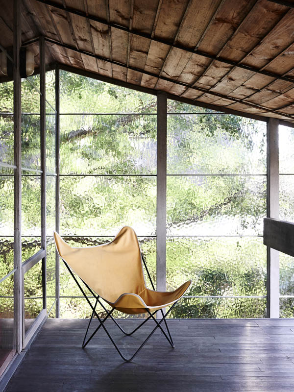
The Bridge House was another of the homes designed by modernist architect and writer Robin Boyd (see previous post, here), and it has just been extensively renovated. It is a little difficult to see what remains of the original home, designed in 1953, but the renovation is progressive and contemporary, rather than simply a pastiche. It is interesting to compare this home with the Walsh Street one, which remains unchanged since the ’50s.
The house’s unusual shape is a masterclass in designing according to context: two elliptical steel trusses straddle an old river bed, easement and dramatically sloping site. The resulting longitudinal window walls create a wedge-shaped plan and maximise internal views of the site’s established trees. A timber and steel bridge connect street level to the mid level entry point of the house.


The interior is luxe and rich – floors are pale oak and travertine, a circular, ridged oak insertion holds a wine cellar. Walls are kept white, offsetting the black highlights and black metal windows that so beautifully frame the outdoor green.
Which do you prefer? I’d happily settle for either.
Bridge House, via. Photographs: Lisa Cohen

If I could be anywhere this coming week it would be Palm Springs for Modernism week and the Palm Springs Art Fair. Palm Springs is of course a modernism enthusiasts’ delight, with its plentiful single and split level homes, all shifting planes and open plan layouts, with big glass sections and cantilevered floors.
Instead, I’m rediscovering the work of one of my favourite proponents of the style, the Melbourne architect and writer Robin Boyd. His work and in particular his writing were hugely influential on me growing up in the suburbs of Melbourne. His two key tomes – Australia’s Home and The Australian Ugliness – defined for me everything that was wrong with suburban living.
One of his best known works is Walsh Street house designed by Boyd for his family in 1957. It now houses the Robin Boyd Foundation and remains in its original condition.


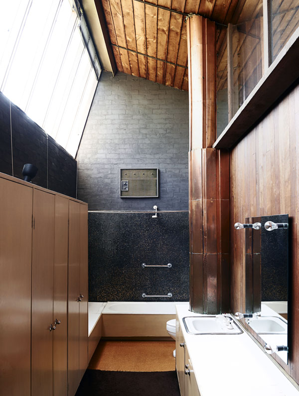
Furnished with pieces designed by Boyd’s contemporaries – Grant Featherston and Clement Meadmore (whom I once met, and visited his home in NY) amongst others – it demonstrates the design principles championed in his books, utilising an introspective layout, with the main house and a separate children’s pavilion facing inwards toward a central courtyard. (This was in direct contrast to the usual model of building a suburban house in the middle of the block).
The finishes are bold and intense – deep, saturated colours and dark-painted brickwork walls; rich red woodwork, glimmering mosaic and even copper (how very contemporary..). Floor-to-ceiling plate glass, soaring ceilings and clerestory windows ensure light and nature are ever present.
An (almost) fitting substitute for a trip to Palm Springs…
Walsh Street House via Photographs, Eve Wilson
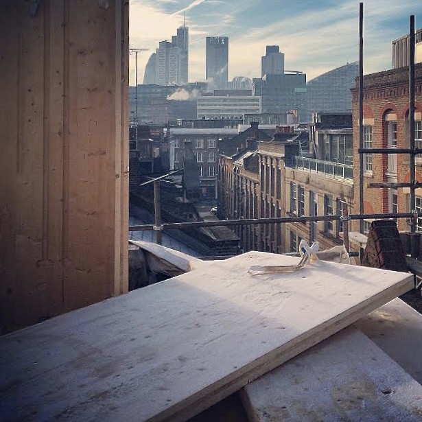
building site, shoreditch.
image: owl’s house london on instagram using iPhone 5. Follow me, here
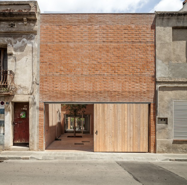
The first thing that struck me about this building was the beautifully proportioned front facade (read my take on composition, here); next, the stratified brickwork – thin linear strips graduating to larger brick sections as the eye travels up the building.
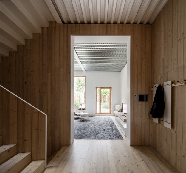
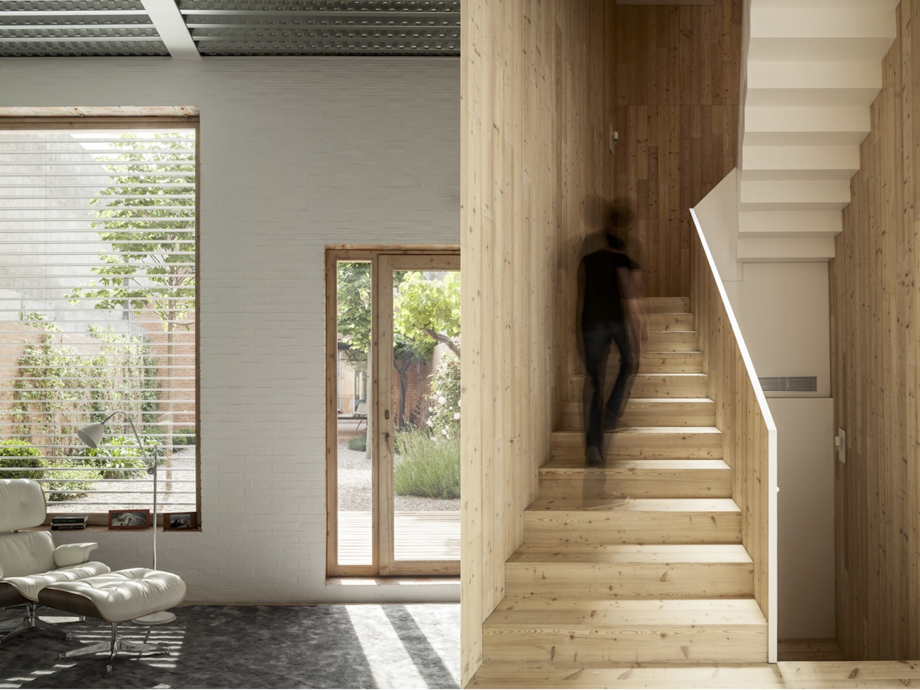
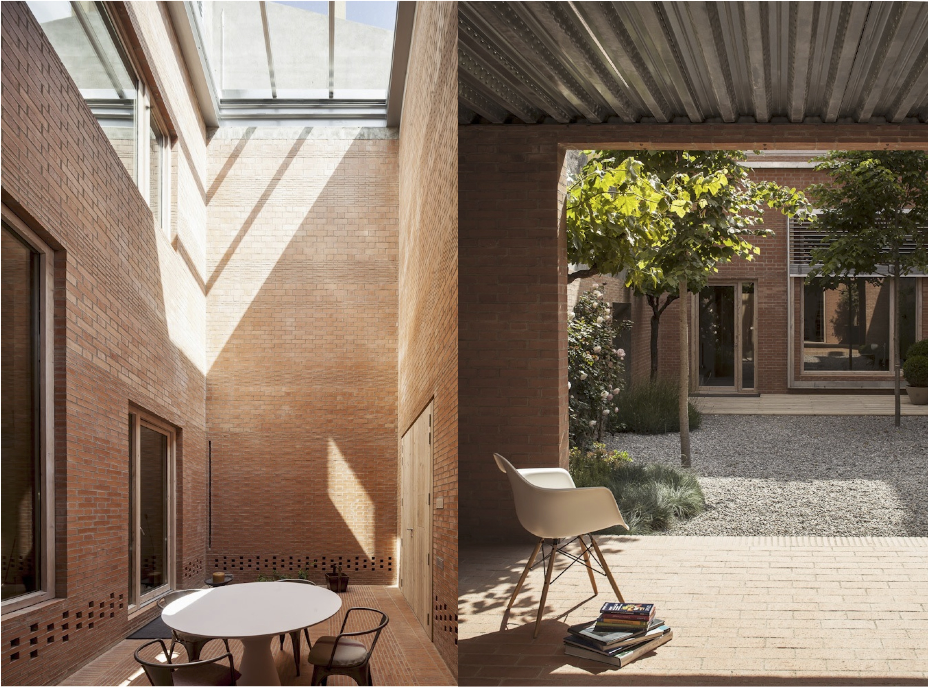
Located in an historical centre but lacking any character of its own, this house also faces the challenge of its narrowness, a 6.5m width. To resolve the problem of getting light in, a series of outdoor spaces create a transition between the rooms, thus becoming rooms themselves. Privacy, solar gain, ventilation and light are all addressed and resolved in one fell swoop. The sequence of spaces also creates a lovely ambiguity about what is an interior and what is an exterior space.
Because the colour and rhythm of the exterior masonry is visible from within, the interior walls are painted white, with just the window reveals left raw. There are simple, pale wood floorboards and an exposed (but beautifully detailed) metal ceiling. Sometimes, the materials are reversed, and the ceiling or walls are lined with wood. The zig zag line of the stair soffit plays against the pattern of the metal ribbed ceiling as it rises up, as well as the rhythm of the wood planks.

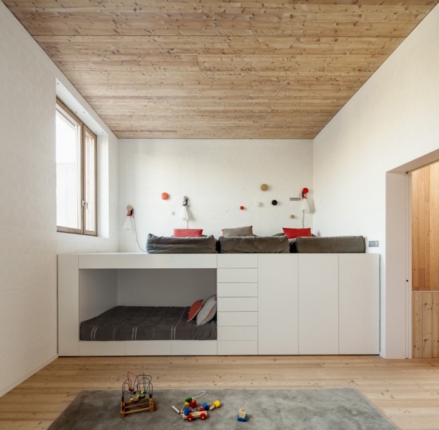
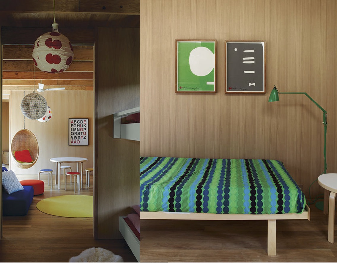
A kid’s room contains a single piece of furniture serving all necessary functions – sleeping, reading and storage.
Perfectly proportioned on the outside, simply and beautifully detailed within.
House 1014 by H Arquitectes, via Photographs: Adrià Goula