

Pantone have just announced their colour of the year for 2013 – emerald green. The colour, specifically Pantone 17-5641 Emerald, is described as ‘lively, radiant, lush.. vivid and verdant’.
Every year Pantone choose a colour, derived from various sources and influences; last year it was a vivid orange called Tangerine Tango. Green is in fact the most abundant hue in nature – the human eye sees more green than any other color in the spectrum.
Pantone is a standard language for colour communication between designer and manufacturer. Pantone’s founder created a system of identifying, matching and communicating colours to solve the problems associated with producing accurate colour matches in the graphic arts community. His insight – that the spectrum is seen and interpreted differently by each individual – led to the innovation of the Pantone matching system, a book of standardised colour in fan format. Different manufacturers in different locations could all refer to the same system to ensure colours matched without direct contact with one another. It is now used in all the industries, and its influence will be seen in fashion, packaging, graphics, interiors.
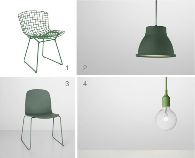
Emerald is certainly a bold choice for an interior. It works with basic black and white, and also with mid to dark-coloured woods. Pinterest is abuzz with emerald imagery, so here some chairs, a floor, a wall, and some fabulous emerald products…

Images clockwise: 1 / 2 / 3 / 4
What do you think of this year’s colour?

Reblogged this on Solely By Virtue.
I would say it is a ‘muted’ Emerald colour in my eyes … think maybe it will be popular in fashion ….
Like all the images clicking on Image No4
Emerald&Sapphire *Swoon* 😉
Yes the colour is a lovely one for fashion, I agree. The images aren’t of course all showing the colour as it should be due to the vagaries of colour reproduction. Glad you like the images, thanks for your comments! Jane
Love your examples,especially the Bertoia chair in green!
thank you so much, I adore that one too. thanks for stopping by. Jane
I like it.
i think i do too 🙂
Right now it’s not my favorite color, but I can say a different thing after seeing it here and there during the next year… maybe I’ll start to like it 🙂
Anu – I think I agree, I have mixed feelings about whether I would actually use emerald in a scheme or my own home.. but perhaps this provides a good challenge! Thanks for your comments. Jane