Tag Archives: Modernism

revisiting a modernist in berlin.

2216_03 001

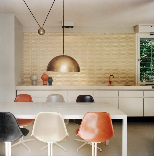
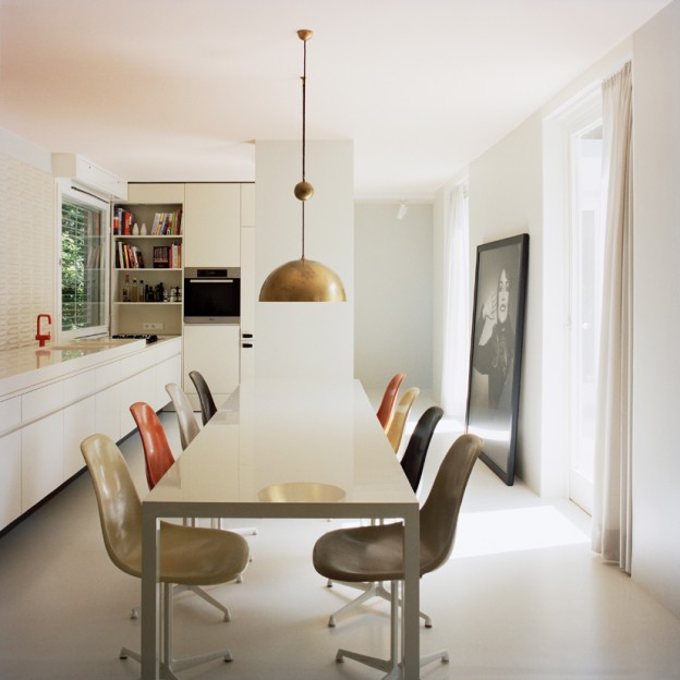
Revisiting this beautiful modernist – the use of texture, simple but sophisticated colour palette and clean lines is a look I revert to time and again.

Part of the 1957 building exhibition in Berlin’s Tiergarten park, this Modernist glass atrium house was designed by Eduard Ludwig, an architect who studied briefly at the Bauhaus, and whose passion lay in the design of bungalow-style houses. He studied under Mies van der Rohe and the influence of modernist masterpiece the Barcelona Pavillion is evident here.

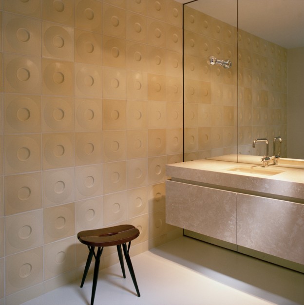
The simple lineality of the building is echoed internally with the floating linear kitchen cabinets, built-in, low-level storage lining the living area, and bathroom vanity in palest stone suspended against a full wall of mirror. Textured surfaces abound and are enhanced with splashes of intense colour in the palette of dark orange, black and off-white. Simple, classic furniture pieces like the shaker style chair (Hay do a simlar one, here) and brass domed kitchen pendant hold their own and yet perfectly compliment the space.
Atrium-House-in-Berlin-by-bfs-design-102214_03 0012214_12 0012215_11 0012215_02 001

Atrium-House-in-Berlin-by-bfs-design-1Beautifully restored by architectural firm bfs-design: Atrium House by Eduard Ludwig via Daily Icon.

Photos: Annette Kisling

a journey of delight : calder at tate modern.

calder-mobile_ohl.

‘There’s something totally joyous and unpretentious about the work which communicates to people,’ she added. ‘He’s one of the few artists who can sit in both camps: the public and the elite world.’ Farah Nayeri, NY Times

For those who have not lost their childish fascination with colours and shapes, movement and balance, Calder’s work remains a delight and inspiration. There is little darkness in his work, only a restless, fascinated mind, immersed in a journey of delight.

Calder plays it straight. Calder’s work is exactly what it appears to be. The strength of his work is this directness, without subtext; a refreshing lack of hidden meaning. We see Calder’s delicate mercury sculpture sitting with the vast canvas of Guernica in the background; Picasso’s dark genius and Calder’s lightness working brilliantly together. Picasso’s primary themes are those of humanity; Calder’s are of nature; he plays with lines, mass, force and momentum.

Calder emerged in an era when art was still catching up with the discoveries of 19th Century science and the technology of the 20th – not least the moving image. Calder’s work brings movement centre stage into art in a way that surpasses other artists often unsatisfactory attempts of that era to incorporate time (I’m thinking of cubism). Apart, of course, from the most successful new art form of the 20th Century, the movie itself.

Human visual aesthetics is derived from a highly developed appreciation of the body in both movement and poise. Calder’s unflinching preoccupation with mechanics; his exploration of the fine line between balance and movement, his testing of how far a rod or sinew can be stretched and still hold, resonates with what we naturally find beautiful and satisfying.

Calder does all this, and brings it into delicate and playful fusion with the rawness of his materials, the formal language of late Matisse and a touch of the surreality of Miro. I’m going back for more.

calder-horse_ohl.

calder-trapeze_ohl.

calder-balance_ohl.

You can read Farah Nayeri’s article, here:

Alexander Calder: Performing Sculpture, Tate Modern, until 3 April, 2016

Guest post by Jeremy Walker, architect and cardboard sculptor (HeathWalker Studio). Photos: owl’s house london using iPhone 6.

today’s image.

rcop_owlshouselondon.

The beautiful garden at Royal College of Physicians, Regents Park, for Modernist Monday.

Follow me on Instagram, here, and join in the #modernistmonday hashtag!

today’s image.

IMG_6569

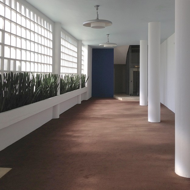
The elegant, lyrical foyer of Highpoint Two, the modernist delight designed by Berthold Lubetkin in 1937-38. Highpoint is open as part of London Open House next weekend; details, here:

Follow me on Instagram, here 

a very modern hotel.

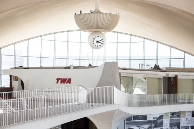
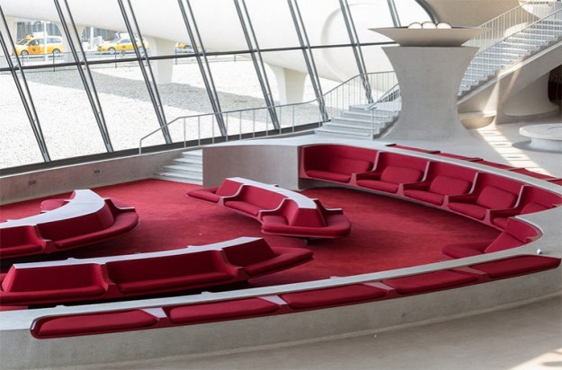
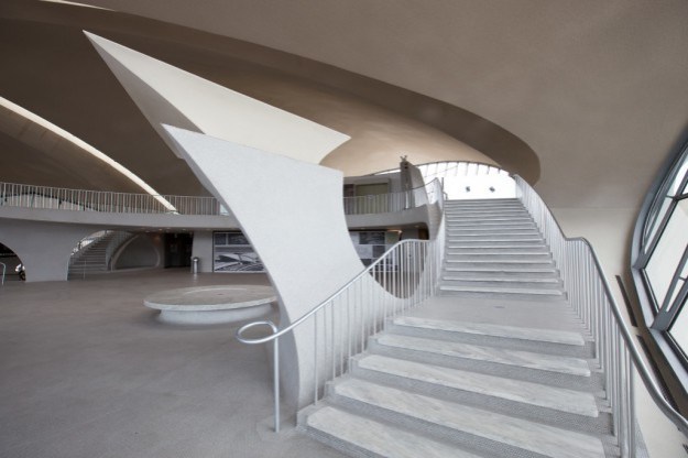
Futurist, modernist, dynamic: the gull-winged TWA terminal at JFK airport is the epitome of mid-century design. Evoking a bird in flight, it is also a force in concrete construction. It was certainly a major influence on me during my architectural studies, as I poured over the images of this and other iconic modernist imagery by architectural photographer Ezra Stoller.

The TWA terminal was the last project by Finnish born architect Eero Saarinen (completed in 1962), who said of it:

All the curves, all the spaces and elements right down to the shape of the signs, display boards, railings and check-in desks were to be of a matching nature. We wanted passengers passing through the building to experience a fully-designed environment, in which each part arises from another and everything belongs to the same formal world.

It is this all inclusive design that gives the building its streamlined, organic quality; everything is considered, everything belongs (I particularly adore the sunken, built-in seating). It is perhaps this that became the building’s downfall; it was unable to adapt and expand.

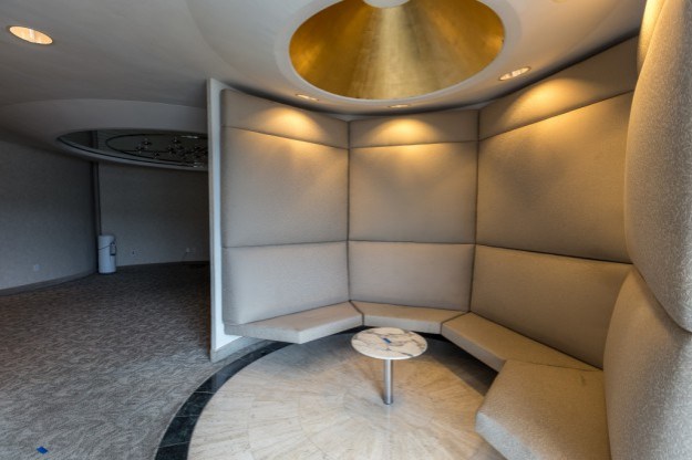
The terminal is about to undergo a complete refurbishment as a hotel and museum. The photographer Max Touhey was given access to document the building alongside a team of surveyors using 3-D laser scanners. Touhey made 700 photographs, a few hundred of which were bracketed (several exposures of each shot are used to ensure the light is correct), or used in a time lapse video.

twa terminal 03twa terminal 05twa terminal 10twa terminal 02twa terminal 01twa terminal 09twa terminal 07

TWA terminal, Eero Saarinen. Photographs by Max Touhey. Via wired.com; lattimes.com; somewhereiwouldliketolive.com

today’s image.

royalfestivalhall_ohl.

The mighty Royal Festival Hall, via owl’s house london instagram. Follow me, here.

today’s image.

isokon-penthouse_ohl.

View from the penthouse of the wonderful Isokon building, from a private tour at the weekend.

Follow owl’s house london Instagram, here.

today’s image.

modernist rhythms on owlshouselondon.

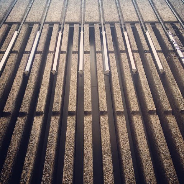
Modernist rhythms, Soho.

Follow my Instagram, here.

the bridge house.

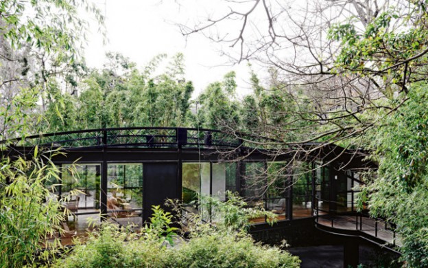
The Bridge House was another of the homes designed by modernist architect and writer Robin Boyd (see previous post, here), and it has just been extensively renovated. It is a little difficult to see what remains of the original home, designed in 1953, but the renovation is progressive and contemporary, rather than simply a pastiche. It is interesting to compare this home with the Walsh Street one, which remains unchanged since the ’50s.

The house’s unusual shape is a masterclass in designing according to context: two elliptical steel trusses straddle an old river bed, easement and dramatically sloping site. The resulting longitudinal window walls create a wedge-shaped plan and maximise internal views of the site’s established trees. A timber and steel bridge connect street level to the mid level entry point of the house.

boyd-bridge3_ohlboyd-bridge4_ohlboyd-bridge2_ohl.

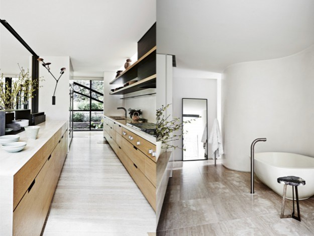
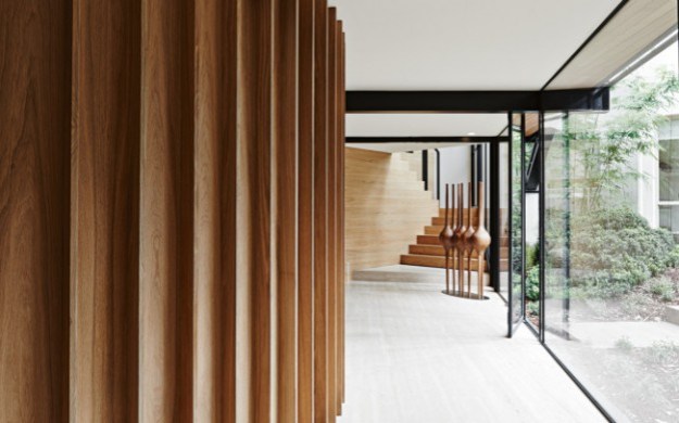
The interior is luxe and rich – floors are pale oak and travertine, a circular, ridged oak insertion holds a wine cellar. Walls are kept white, offsetting the black highlights and black metal windows that so beautifully frame the outdoor green.

Which do you prefer? I’d happily settle for either.

Bridge House, via. Photographs: Lisa Cohen

lessons in modernism.

If I could be anywhere this coming week it would be Palm Springs for Modernism week and the Palm Springs Art Fair. Palm Springs is of course a modernism enthusiasts’ delight, with its plentiful single and split level homes, all shifting planes and open plan layouts, with big glass sections and cantilevered floors.

Instead, I’m rediscovering the work of one of my favourite proponents of the style, the Melbourne architect and writer Robin Boyd. His work and in particular his writing were hugely influential on me growing up in the suburbs of Melbourne. His two key tomes – Australia’s Home and The Australian Ugliness – defined for me everything that was wrong with suburban living.

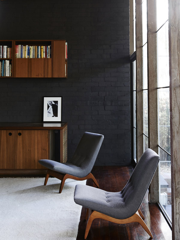
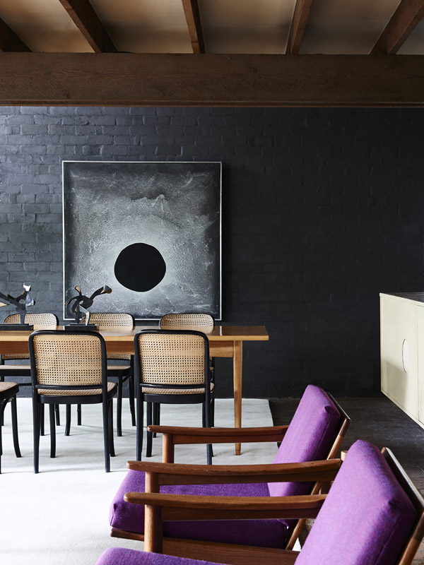
One of his best known works is Walsh Street house designed by Boyd for his family in 1957. It now houses the Robin Boyd Foundation and remains in its original condition.

Walshst-backroomWalshst-diningroomWalshst-mezzWalshst-balconyWalshst-kids2Walshst-bathroom

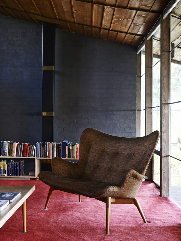
Furnished with pieces designed by Boyd’s contemporaries – Grant Featherston and Clement Meadmore (whom I once met, and visited his home in NY) amongst others – it demonstrates the design principles championed in his books, utilising an introspective layout, with the main house and a separate children’s pavilion facing inwards toward a central courtyard. (This was in direct contrast to the usual model of building a suburban house in the middle of the block).

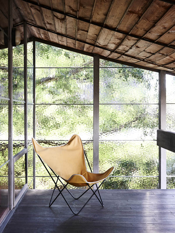
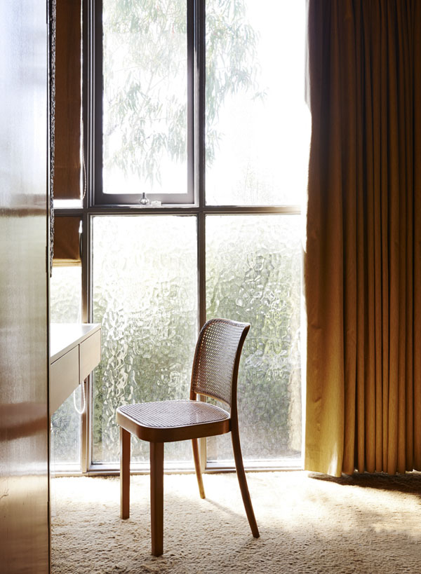
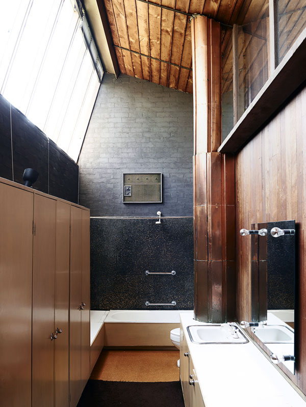
The finishes are bold and intense – deep, saturated colours and dark-painted brickwork walls; rich red woodwork, glimmering mosaic and even copper (how very contemporary..). Floor-to-ceiling plate glass, soaring ceilings and clerestory windows ensure light and nature are ever present.

An (almost) fitting substitute for a trip to Palm Springs…

Walsh Street House via Photographs, Eve Wilson