apartment of shadow and light.

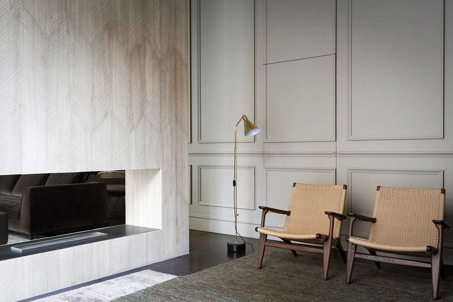
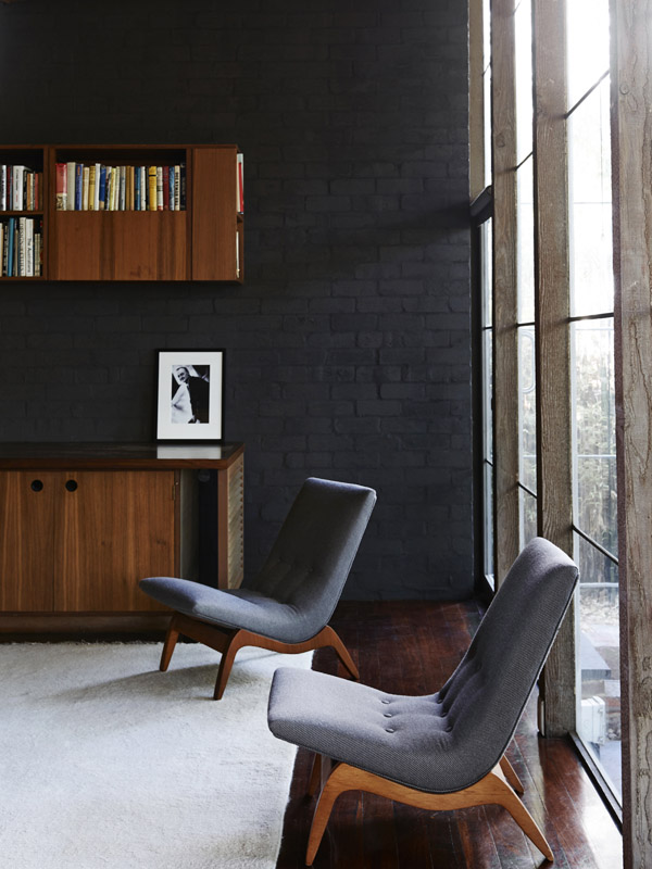
This apartment in Rome feels light and dark and shadowy, with its monochromatic palette and natural tones. The wonderfully sensual wall finish throughout is a mix of clay and aggregates – essentially refined earth – one of the beautiful, organic finishes of the Italian company Matteo Brioni.

villasciarra2villasciarra1villasciarra6villasciarra5villasciarra7

A dark grey terracotta floor, laid in herringbone pattern, adds a decorative element to the otherwise austere surfaces, as does the beamed ceiling. Raw materials are used to their best effect, the detailing bringing the refinement – a low, linear concrete ledge acts as fireplace and seat; fine metal shelves frame a library wall; a folded metal stair, with mesh panels forming the balustrade, serve their purpose without affectation.

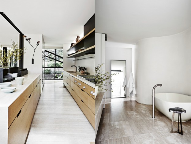
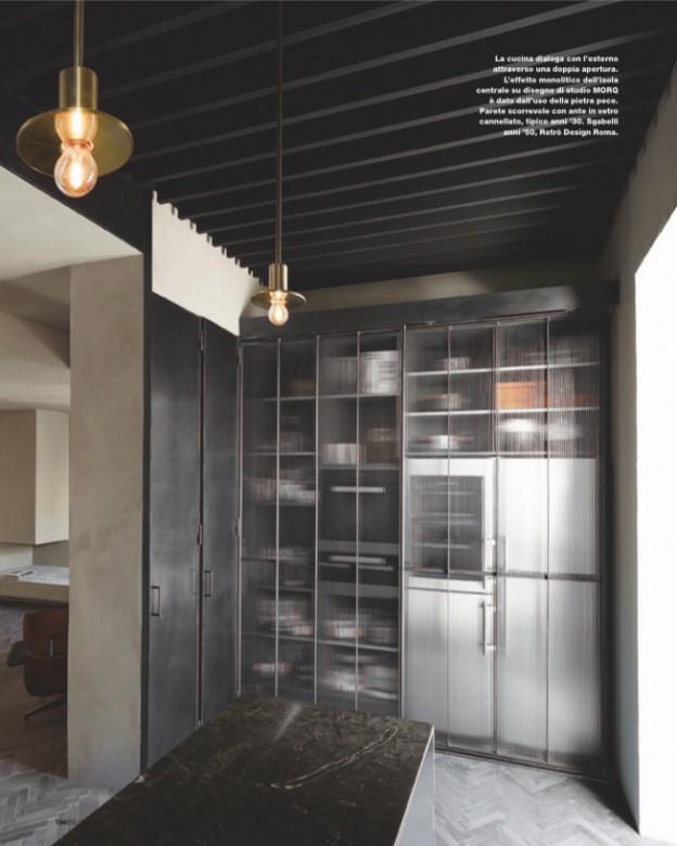
The kitchen combines dark stone, sleek, brushed stainless steel and beautiful, metal framed ribbed glass doors, which work to soften and blur the hard working utility zone. Copper pendant lights lift the monochrome palette.

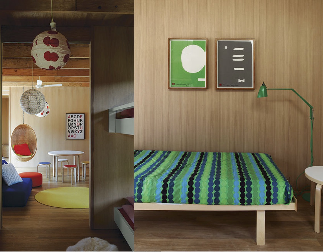
The choice of furnishings is simple – a mix of mid-century Alvar Aalto, Eames and others.

Villa Sciarra, Rome, by MORQ Architects, via Elle Decor Italia and Matteo Brioni. Photographs, Kasia Gatkowski. There are also some beautiful pictures of the apartment unfurnished, here

marvellous manet.

manet_ohl

Although there is only one Manet painting at the exhibition, it’s a beauty.

‘Portrait of Mademoiselle Claus’, 1868, is the polestar of the exhibition Homage to Manet, at the Norwich Castle Museum until Sunday April 19th. Read more, here.

More owl’s house london instagram, here.

milanese home couture.

Design store Spotti Milano’s current showroom interiors are a collaboration with multidisciplinary design studio (and fellow Milanese), Studiopepe. Called Home Couture, these interiors or ‘setups’ are rather beautifully curated vignettes. At first appearing distinctively Italian, they beautifully mix Italian luxe with Scandinavian simplicity and French classic contemporary.

Wall surfaces range from silks to chevron patterned stone to classical mouldings in modern hues. Textures are rich and luxurious, colours are warm and subdued. Sofas, a dining table and chaise by Maxalto share floor space with classic Saarinen pieces – Tulip tables and conference chairs – and Carl Hansen CH25 lounge chairs. Light fittings range from a Jonathan Adler brass chandelier to the classic Serge Mouille floor lamp. images_studiopepe-spotti_ohl05Home-Couture-by-Studiopepe-for-Spotti-Milano_ohl.Home-Couture-by-Studiopepe-for-Spotti-Milano_ohl02Home-Couture-by-Studiopepe-for-Spotti-Milano_ohl03

Next up for Spotti Milano will be a spring collaboration with Raf Simons and Kvadrat. Just another reason I should be heading to Milan, along with Salone del Mobile in April and Expo 2015 in May…

Home Couture by Spotti Milano and Studiopepe, via
Photos: Silvia Rivoltella

today’s image.

modernist rhythms on owlshouselondon.

Modernist rhythms, Soho.

Follow my Instagram, here.

happy weekend.

Fabulous and revealing: 100 Famous Artists and Their Studios (have you seen Francis Bacon’s?!)

Scanned image: Henri Matisse’s studio, from the recent Cut Outs exhibition at Tate Modern. My favourite.

house of tallowwood and scandinavian simplicity.

living-room_ohl.Situated in a very typical, coastal Victorian landscape of scrub and tea trees, this house is designed around a courtyard, blurring the lines between outside and in. Throughout, Japanese and Scandinavian influences are evident, from the simple, open plan layout to the beautiful detailing, influx of light, and restrained palette of textures and tones.

The L-shaped building surrounds the courtyard, with master bedroom at one end, and the children’s bedrooms at the other. Between, the open-plan living space leads out onto the terrace, partially sheltered by the overhanging roofline. In a separate pavilion, a studio and guest room is the ultimate garden room, with a fully openable window wall, wood burning stove and high-light windows.

All of the surfaces are lined with wood – a beautiful, pale, honey coloured indiginous eucalyptus called tallowwood. Exposed, laminated oregon beams form the roof structure, the lines continuing down to form a grid of shelving in the open plan living and kitchen spaces. The focal point of the living space is a free standing, dark-grey brick chimney, which contrasts beautifully with the wood; the only other contrast comes from simple white joinery and white mosaic tiled kitchen benchtop.

tallow-wood-kitchen_ohl.shiver_me_timbers-studio-wood-stoveofuro-tub-master-bath_ohl.beds_ohl

Everywhere, fully retractable windows open rooms up to the outside, with clerestory windows bringing even more light in. The simplicity of the design is underpinned by the simple lines of the Scandinavian furniture – Alvar Aalto daybed and stools, Hans Wegner Wishbone chairs, Nanna Ditzel hanging rattan chair and Marimekko textiles. The perfect weekender.

Pirates Bay House, O’Connor + Houle. Photographs, Richard Powers.
Via Interiors we Love, dwell.com

happy weekend.

HB3.tif

Koluma 01, architecture Peter Zumthor, 2007. Photograph, Hélène Binet, ammann // gallery

Tightly cropped and thick with atmosphere, Hélène Binet’s photographs capture the play of light on the structures of some of contemporary architecture’s leading figures, including Zaha Hadid, Daniel Libeskind and Peter Zumthor. Binet is this year’s recipient of the Julius Shulman Institute Excellence in Photography Award.

Hélène Binet: Fragments of Light, February 28 — March 29, 2015. Woodbury University Hollywood Gallery, 6518 Hollywood Boulevard, Los Angeles, CA 90028

the bridge house.

The Bridge House was another of the homes designed by modernist architect and writer Robin Boyd (see previous post, here), and it has just been extensively renovated. It is a little difficult to see what remains of the original home, designed in 1953, but the renovation is progressive and contemporary, rather than simply a pastiche. It is interesting to compare this home with the Walsh Street one, which remains unchanged since the ’50s.

The house’s unusual shape is a masterclass in designing according to context: two elliptical steel trusses straddle an old river bed, easement and dramatically sloping site. The resulting longitudinal window walls create a wedge-shaped plan and maximise internal views of the site’s established trees. A timber and steel bridge connect street level to the mid level entry point of the house.

boyd-bridge3_ohlboyd-bridge4_ohlboyd-bridge2_ohl.

The interior is luxe and rich – floors are pale oak and travertine, a circular, ridged oak insertion holds a wine cellar. Walls are kept white, offsetting the black highlights and black metal windows that so beautifully frame the outdoor green.

Which do you prefer? I’d happily settle for either.

Bridge House, via. Photographs: Lisa Cohen

lessons in modernism.

If I could be anywhere this coming week it would be Palm Springs for Modernism week and the Palm Springs Art Fair. Palm Springs is of course a modernism enthusiasts’ delight, with its plentiful single and split level homes, all shifting planes and open plan layouts, with big glass sections and cantilevered floors.

Instead, I’m rediscovering the work of one of my favourite proponents of the style, the Melbourne architect and writer Robin Boyd. His work and in particular his writing were hugely influential on me growing up in the suburbs of Melbourne. His two key tomes – Australia’s Home and The Australian Ugliness – defined for me everything that was wrong with suburban living.

One of his best known works is Walsh Street house designed by Boyd for his family in 1957. It now houses the Robin Boyd Foundation and remains in its original condition.

Walshst-backroomWalshst-diningroomWalshst-mezzWalshst-balconyWalshst-kids2Walshst-bathroom

Furnished with pieces designed by Boyd’s contemporaries – Grant Featherston and Clement Meadmore (whom I once met, and visited his home in NY) amongst others – it demonstrates the design principles championed in his books, utilising an introspective layout, with the main house and a separate children’s pavilion facing inwards toward a central courtyard. (This was in direct contrast to the usual model of building a suburban house in the middle of the block).

The finishes are bold and intense – deep, saturated colours and dark-painted brickwork walls; rich red woodwork, glimmering mosaic and even copper (how very contemporary..). Floor-to-ceiling plate glass, soaring ceilings and clerestory windows ensure light and nature are ever present.

An (almost) fitting substitute for a trip to Palm Springs…

Walsh Street House via Photographs, Eve Wilson