Category Archives: happenings.

the list: what to see in 2013.

A look forward to some exciting exhibitions and talks coming up in London in the first half of 2013:

jeurgen teller

1. Juergen Teller: Woo

23 January – 17 March 2013

A journey through his landmark fashion and commercial photography from the 90s, presenting classic images of celebrities such as Lily Cole, Kate Moss and Vivienne Westwood, as well as more recent landscapes. Juergen Teller is one of few photographers to operate in both the art world and at the centre of the commercial sphere, working with Marc Jacobs and Celine, among others.

Institute of Contemporary Arts

tim walker

2. Tim Walker: Story Teller

Until 27 January 2013

Extravagant in scale and ambition and instantly recognisable, Tim Walker’s photographs are full of life, colour and humour.

3. Valentino: Master of Couture

Until 3 March 2013

Celebrating the life and work of one of fashion’s most inspirational and influential designers. A lovely review on A Nomadic Abode, here

both, Somerset House 

steilineset memorial

4. Santiago Calatrava, RIBA lecture series, Tuesday 29 January, 7pm

5. Peter Zumthor, RIBA lecture series, Tuesday 05 February, 6:30pm

6. Emerging Architecture

Until 21 February 2013

The exhibition features award winning projects covering buildings, interiors, product design, engineering structures, urbanism and landscape – architecture’s emerging generation from 2012.

7

7. Mariko Mori: Rebirth

Until 17 February 2013

Japanese artist Mariko Mori’s first major exhibition in London for 14 years, including some of Mori’s most acclaimed works from the last 11 years, alongside new works created especially for the exhibition. Read the Guardian review, here

Royal Academy of Arts

whaam

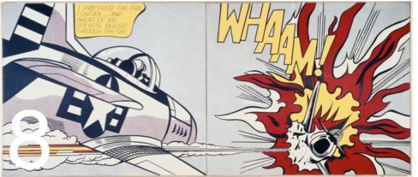
8. Lichtenstein: A Retrospective

21 February – 27 May 2013

The first full-scale retrospective of this artist in over twenty years.

Tate Modern

9. David Bowie Retrospective

23 March – 28 July 2013

Guardian review, here

Victoria & Albert Museum

10. Chromazone: Colour in Contemporary Architecture

Until 19 May 2013

Featuring key projects by major UK and international architects who use colour to create identity and define space in an attenpt to heighten the user experience of a building.

Victoria & Albert Museum

patrick caulfield

11. Patrick Caulfield and Gary Hume

5 June – 1 September 2013

A focused selection of work by Gary Hume (born 1962), in parallel with British painter Patrick Caulfield (1935–2005), illuminating the comparable work of these two artists from different generations.

Tate Britain

This is my pick of exhibitions and talks to look forward to; I’d love to know your thoughts!

colour of the year.

Pantone have just announced their colour of the year for 2013 – emerald green. The colour, specifically Pantone 17-5641 Emerald, is described as ‘lively, radiant, lush.. vivid and verdant’.

Every year Pantone choose a colour, derived from various sources and influences; last year it was a vivid orange called Tangerine Tango. Green is in fact the most abundant hue in nature – the human eye sees more green than any other color in the spectrum.

Pantone is a standard language for colour communication between designer and manufacturer. Pantone’s founder created a system of identifying, matching and communicating colours to solve the problems associated with producing accurate colour matches in the graphic arts community. His insight – that the spectrum is seen and interpreted differently by each individual – led to the innovation of the Pantone matching system, a book of standardised colour in fan format. Different manufacturers in different locations could all refer to the same system to ensure colours matched without direct contact with one another. It is now used in all the industries, and its influence will be seen in fashion, packaging, graphics, interiors.

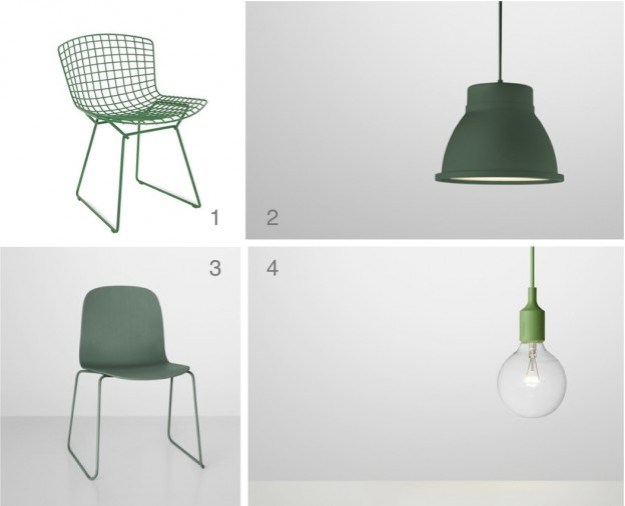
Emerald is certainly a bold choice for an interior. It works with basic black and white, and also with mid to dark-coloured woods. Pinterest is abuzz with emerald imagery, so here some chairs, a floor, a wall, and some fabulous emerald products…

emerald images 3

Images clockwise:  1  /  2  /  3  /  4

products

Products: 1  /  2  /  3  /  4

What do you think of this year’s colour?

bronze.

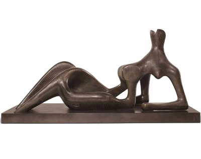
Bronze is the subject of the eponymous exhibition at the Royal Academy (deemed ‘utterly splendid’ by the marvellous Andrew Graham Dixon, read the review, here). It traces works in bronze from antiquity to now, from Rodin to Henry Moore, Ghiberti to Louise Bourgeois.

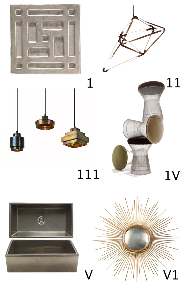
It is also something of a current trend in interiors, so this is my homage to the exhibition – the best of interior bronze. But first, the chemistry: it’s an alloy of copper, with tin, zinc and lead in lesser amounts. Inherently tough and resistant but much more malleable than its sculptural rivals, stone and wood, it has been used in household objects as well as sculpture for centuries. It ranges in colour from palest gold to darkest blue-brown, and can be matt finish or polished.

Enjoy the bronze edit!

1  tile   /   11 light (see my review, here)   /  111 light    /  1V  stool    /   V  trough    /   V1 mirror

Bronze is at the Royal Academy of Arts in London until December 9.

on the road.

‘Nothing behind me, everything ahead of me, as is ever so on the road.’
Jack Kerouac, On the Road

Here we go, the first post. Passion? Check! Inspiration? Check! Bucketfuls of ideas? Check!

Via