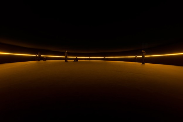
olafur eliasson, contact, 2014 image © iwan baan
I’m always deeply impressed by industrial designers who design products that function well and look good too, products that you can’t imagine being without (hello, toothbrush! hi, umbrella!). Here’s a chance to create something functional, beneficial, and hopefully, beautiful too. Natural Light is an international competition for design students to create a special edition solar lamp, with the intention of bringing sustainable light to areas in Africa where there is none. The original Little Sun lamp – a simple, vibrant-hued flower lamp – did just that. Thousands of Little Suns were distributed to nine African countries, replacing expensive and polluting alternatives such as kerosene lamps. 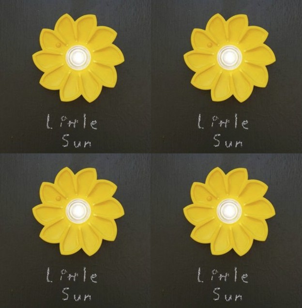
Little Sun is a social business who produce sustainable lighting solutions for off-grid African communities; the artist Olafur Eliasson is a co-founder. Eliasson is probably best known for The Weather Project, the dynamic and captivating sun installation that inhabited Tate Modern’s Turbine Hall in 2003-2004 (see his gorgeous current project at the Louis Vuitton Fondation, here) 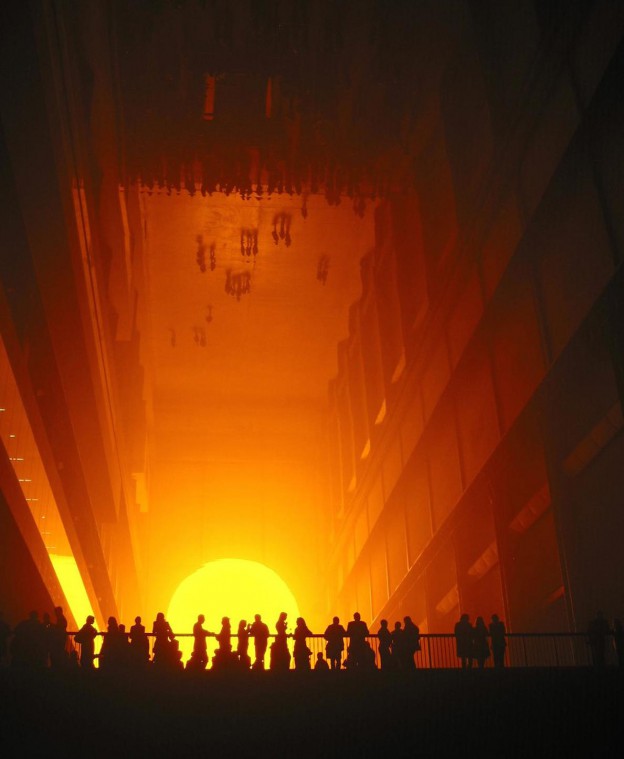
The Natural Light competition is a collaboration between Little Sun and Velux. Velux promote sustainable architecture and publish research into daylight, its effects on well-being and the environment. Their informative magazine contains useful information for designers on daylight and sustainable architecture, and of course they produce all manner of blinds.
Further details on the competition, Natural Light, here.