Author Archives: owls house london.

About owls house london.

architect, designer and general enthusiast of all good design.

lubetkin’s house.

If you’re the architect of one of the best examples of modernist architecture in this country, then chances are your own apartment – in the same building – is going to be fabulous.

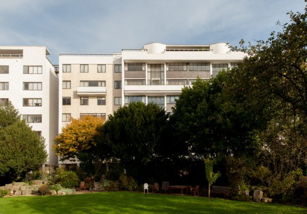
Berthold Lubetkin designed this penthouse as this own home, set atop Highpoint II (Highpoint I had been designed 3 years earlier in 1935) with its panoramic views across London and afar. I wrote about Highpoint I previously, here.

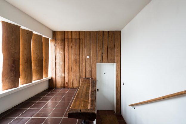
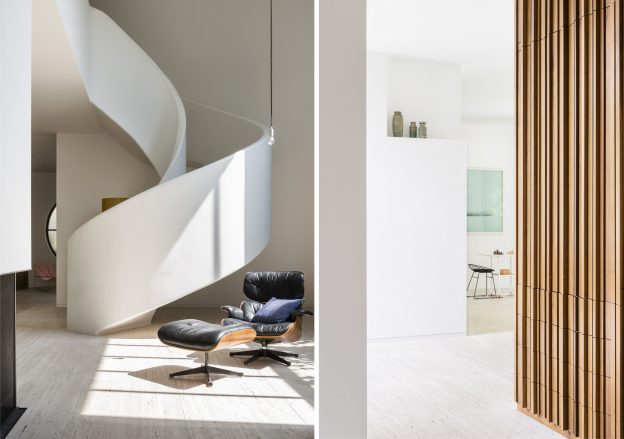
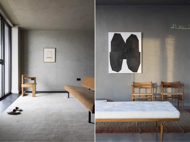
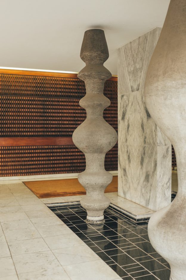
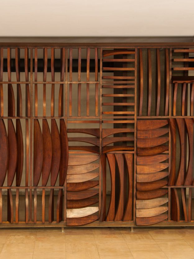
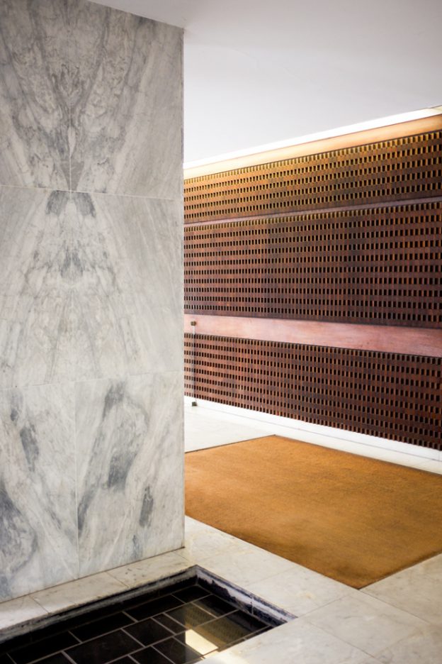
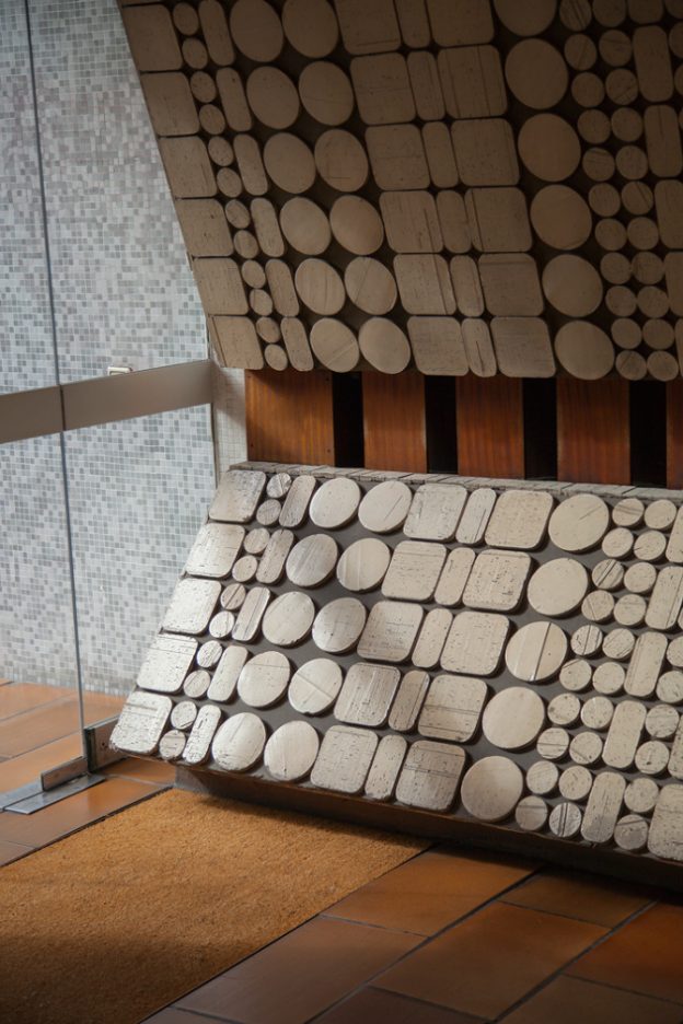
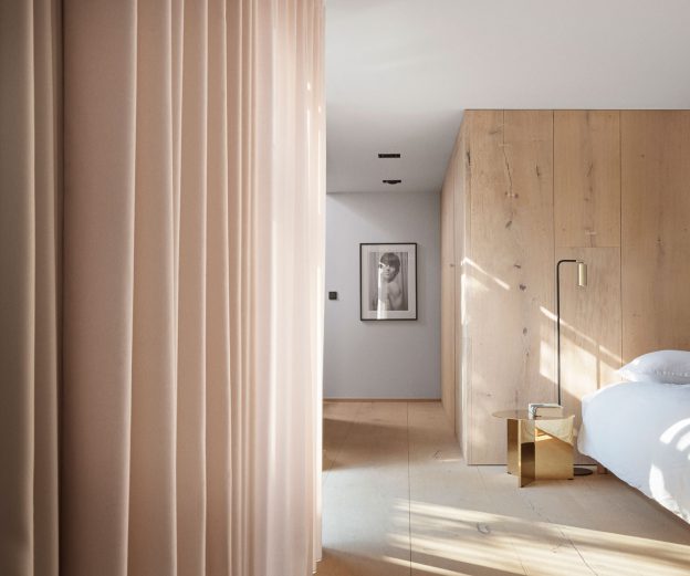
A striking entrance lobby sets the scene, with tiled floor, richly textured, timber-board cladding (a gib door leads to a cloakroom behind), and thick, vertical louvres of sand-blasted Norwegian pine. These striking finishes are bold, almost rustic, an unusual choice within the refined and elegant building. But they are contained, and as such are not allowed to dominate. The views beyond remain the scene-stealer.

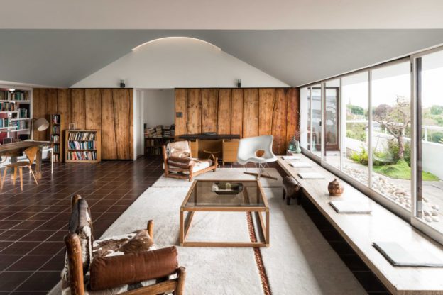
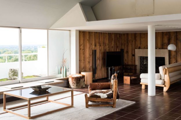
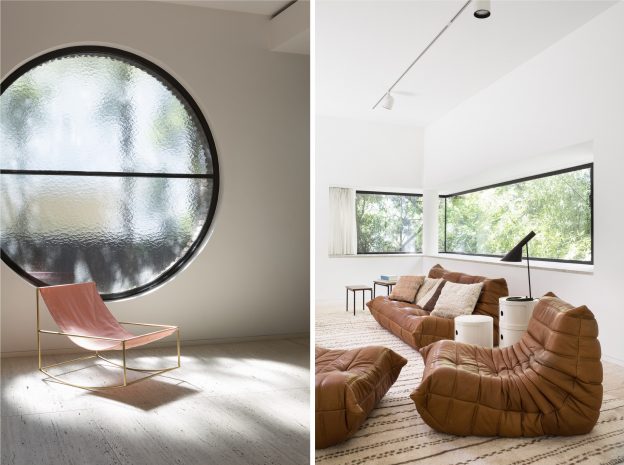
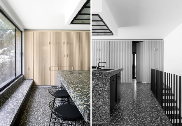
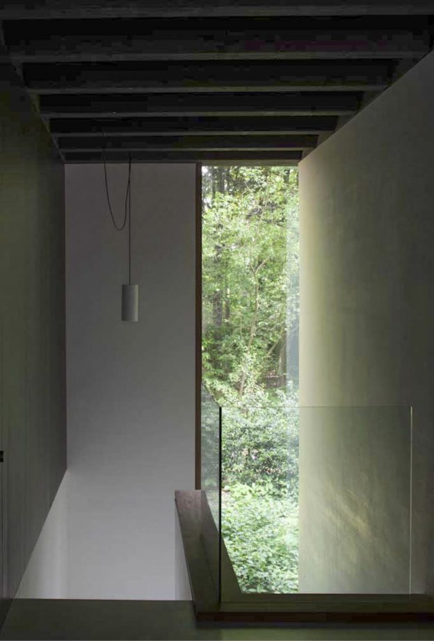
The main space is rectilinear, open plan and 12 metres long. A barrel vaulted ceiling forms the double-height space, with lengths of fully retractable glazing extending along both walls. The rich, dark tiled floor contrasts with the white walls and window surrounds; then, more rough-hewn, wide boards of timber clad the walls vertically in the low-ceilinged snug at one end. A slab of creamy travertine beneath the windows on one side forms a continuous seat, the terrace beckoning beyond.

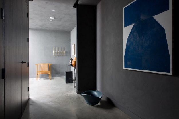
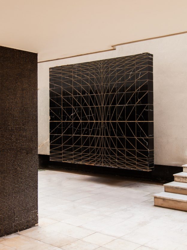
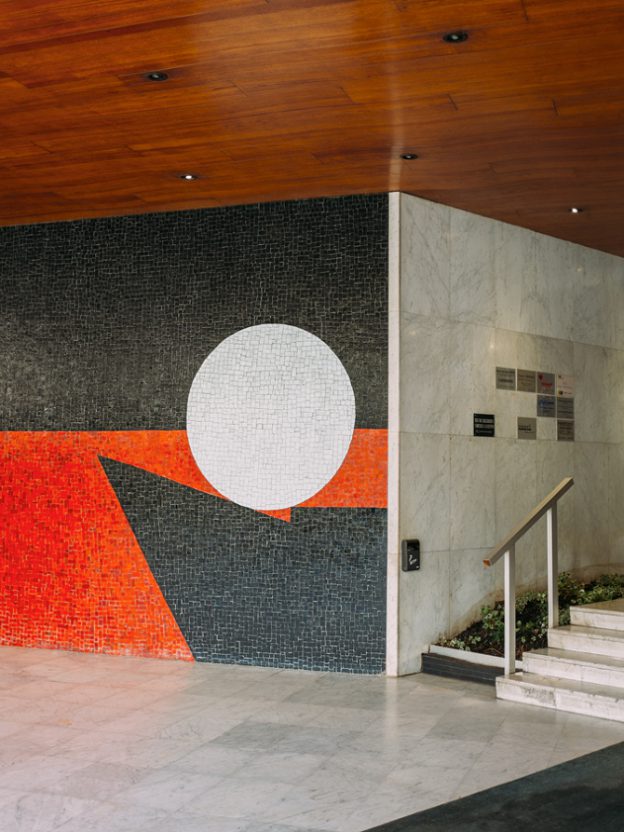
Elsewhere, walls are white and bare, and colour is used boldly but sparingly in tiles and feature walls.

The penthouse is for sale on The Modern house, here.

A Grade 1 listing means that the owner is unable to alter the apartment, but then, why would you want to?

The Lubetkin Penthouse, Highpoint II, London, N6. More, here.

a neapolitan modernist.

If our summer vacation involved a trip to the south of Italy, then this is where I would want to stay.

Built by Italian architect Michele Capobianco in 1964, the aptly named Villa Bianca is all geometric lines and elegance. Perfectly suited to the heat of its southern location, slim, double height columns elevate it high above its already lofty perch on the hills above Naples; the roof over-sailing the floors below, forming shady, travertine-lined terraces to sit and while. The garden too, is a sculptural, lush oasis of palms and grasses.

Inside, the entrance hall is a double volume, airy space, with artworks placed nonchalantly here and there. A stair to one side is flanked by a low wall which rises up to form a gallery at first floor level. All is white and cool. Dark wood adds warmth; tiled floors change pattern and tone depending on which room they inhabit. A secondary, circular stair spirals up, changing floor pattern as it arrives on each level. A beautiful fireplace niche, patterned with hand made brick, offers a place to sit and contemplate.

Simple, rectilinear furniture compliment the simple layout, the palette of dark wood and black leather bringing a sophistication to the mix.

Villa Bianca, Gulf of Naples, Italy, here.

I’ve also been seduced by this beautiful, contemporary farmhouse in Puglia. And I’m still looking forward to visiting this glamorous modernist in Portugal.


the wonderful world of peter d. cole.

Peter D. Cole is known for his wonderfully exuberant and playful works. I discovered him on Instagram, his works colour-bright set against their pure, white background.

His abstract, watercolour paintings and bold, minimal sculptures are firmly rooted in the landscape of his native Australia; a simple vocabulary of singular elements floating on a sea of colour. Forms are broken down to represent the most fundamental elements of sky, earth, sun and moon, picked out in primary reds, vivid yellows, intense blues and other clear, saturated hues.

Displaying the modernist language of his art school training in the mid 1960s, he cites Miro, Calder and González as influences, along with the Constructivists Moholy Nagy and El Lissitzky. Specific works too – Giacometti’s The Palace at 4am and Le Corbusier’s Ronchamp – have informed his sculptural pieces, styled out of powder-coated steel, aluminium, marble and brass.

Peter works from a purpose built studio adjoining his home in country Victoria, having designed both studio and house himself. Influenced by Japanese houses and the natural desire to capture the afternoon breeze, the main house sits on an elevated platform with a simple set of stairs leading to the entrance. The high ceilinged, white walled, light filled rooms offer perfect, gallery-style spaces in which to display his work.

The palette of materials is thus restrained, starting with floors of richly polished timber and walls of glass, creating an almost invisible boundary with the outdoors. Extraneous elements have been removed –  doors are recessed into wall thicknesses or simply framed in wood; junctions abut each other crisply. Elements of singular colour counterbalance the bold hues of Peter’s sculptures. Door handles and drawer pulls were designed and made by the artist, along with many of the light fittings. Furniture is a mix of antique and modern. Marc Newson’s idiosyncratic pieces are stand-outs, from the fabulous Wicker and Embryo chairs to the Super Guppy floor lamp, all of which sit comfortably amongst Peter’s bold, architectural forms.

More about the artist here, and his website, here

Photographs: Sean Fennessy via Peter D. Cole, with thanks.


a bauhaus vision in white.

Originally designed in 1934 by architect Nachman Kaplansky, Villa Kaplansky demonstrates the clean, geometric lines that were part of the Bauhaus movement’s influence. The exterior, with its linear, three bayed facade sitting on a raised plinth, uses the simple, functional language of the Modernists; the interior, recently remodelled, utilises these forms too, but with a contemporary take on ‘30s modern, adding an air of elegance.

Surfaces are kept pure and white, uninterrupted by skirtings or cornicing. Architraves align with wall planes. Thinly profiled jambs of black metal frame the outside through openings that are low and linear, or perfectly circular. The circle motif appears again and again, from deeply recessed skylights to the spiral stair wrapping itself ribbon-like through the double-height volume. Mirrors are round, as is a fabulous freestanding bathroom basin unit.

Contrast comes from the mid-brown timber joinery, in random width sections adding richness and texture, and mosaic tiles lining horizontal and vertical surfaces in wet areas. Beautiful marmoreal (or engineered marble here) forms the seamless kitchen island and floor surfaces, contrasted with the pale, creamy-pink fluted profile of the joinery units.

Loose furniture is bold with simple lines, from the ‘70s classic Ligne Roset Togo sofa in tan leather, to the Eames lounge chair and LCM dining chairs; to Muller van Severen’s modern classic recliner (more, here).

Beyond the main residence at the back of the garden is another building: a rectilinear, concrete pavilion with circular cutouts. It’s a beauty. (See more, here)

Villa Kaplansky, Antwerp, by B-architecten in collaboration with ByPerez.

Photographer: Frederik Vercruysse, with thanks.


abode.

These beautiful spaces belong to Abode, a waterside development in Greenwich, created by lifestyle magazine-of-the-moment, Cereal magazine.

Not your typical contemporary palette of white and wood, and not an Eames DSW chair in sight, this prototype offers a sophisticated alternative: contemporary and vintage furnishings sit against a backdrop of moody greys and dark-stained woods with granite, brass and poured concrete floors.

The soft, micro-fine wall surfaces have an ultra matt finish and seamless edges, flowing from floor to wall to ceiling, all in smudgy, earth tones. Polished concrete floors run through the open plan spaces, changing to ebony wood in the study. The black stained cupboards of the kitchen run along one wall, extending through the full-height glass and onto the terrace, a built-in BBQ at the far end. A pure white island unit prevents the overall palette from being too subdued, as does the lacquered brass splashback.

Classic pieces of furniture abound, including walnut Cherner dining chairs, Fritz Hansen marble-topped dining table, Charlotte Perriand stools, Bruno Mathsson daybed, and other vintage Scandinavian pieces. Marble plinths, Georg Jensen silverware and bold, modernist artwork complete the elegant, understated look. I’m moving in.

Abode by Cereal magazine and Conran and Partners, London SE10. More, here.


henrietta dubrey.

I first discovered the work of Henrietta Dubrey at the Affordable Art Fair in Hampstead last year, where one painting – an angular face with jet black hair and black-clad torso, set against a pale blue background – caught my attention. This year, I recognised her work immediately and determined to find out more.

Henrietta trained at the Wimbledon School of Art and then the Royal Academy Schools. Inspiration came from the Middle Generation St Ives painters who followed Barbara Hepworth and Ben Nicholson: Terry Frost, Roger Hilton, Peter Lanyon, Bryan Wynter and Patrick Heron, amongst others. Family holidays in St Ives as a child were a strong influence in this; as was the sea and surf and sandy beaches. She now lives in Cornwall.

Her body of work is both abstract and figurative, with a palette of subdued colour – earthy tones and sky blues. Her abstract paintings are at once calm and energetic, with the occasional jolt of bold colour. Figures are naive and deceptively simple, drawn wth a bold, confident hand and economy of line. I see so many influences, not only the St Ives painters, but international modernists too – Picasso, Miro and the Cubists. I love the simplicity, composition and strong forms.

Henrietta’s extensive body of work can be found on her website, here. She is represented by Edgar Modern, Bath and has an upcoming exhibition at Strover gallery, Cambridge. The Affordable Art Fair, Hampstead, finishes today.

Feature Image: Vocabulary 2017 58 x 156 cms

Early Afternoon 2017 130 x 105 cms
Go For It 2017 38 x 49 cms
Late Afternoon 2017 130 x 105 cms
Messenger 2017 45 x 33 cms
Abstract Woman 2017 79 x 65 cms
Chalky Down 2017 71 x 44 cms
Catalan Dream 2017 55 x 41 cms
Blow Me a Kiss 2017 25 x 13 cms

All images courtesy of the artist.

forest house.

Reminiscent of house of 150 trees, this beautiful forest house is situated in a rural region of Gent. Contemporary yet traditional, the Japanese aesthetic of wabi-sabi, which celebrates the imperfect, impermanent, and incomplete, is clearly evident here. Other influences include Frank Lloyd Wright, Carlo Scarpo and Andrea Branzi, who was a friend of the architect owners, Eddy Francois and Caroline de Wolf.

The house, as an extension of its environment, utilises natural, earthy materials. The vertical mullions of solid timber separating the floor to ceiling windows rise like tree trunks; the earth-toned, raw brick floor has the outdoor quality of a forest floor. Concrete soffits line some ceilings, others are wood with exposed beams continuing the line of the mullions. White plasterboard walls float beneath. Skinny brick walls with deeply recessed mortar joints to add texture, become the structure both inside and out.

housewoods05_ohleddy-francois09_ohleddy-francois14_ohlhousewoods03_ohleddy-francois13_ohleddy-francois07_ohleddy-francois10_ohl

Forest House, Gent, by Eddy Francois and Caroline de Wolf.

Photographs 2,3, 6,7,8: Jean-Luc Laloux; image 1,5: Sarah Blee; all others, unknown.

intimate spaces, defined.

Bold, modernist spaces in and around European cities dominate the site of French photographer Romain Laprade. He seeks out the intimate places often forgotten or deemed unimportant – foyers and entry halls – transition spaces that are too often seen as a luxury. It is these spaces that in reality allow a building to breathe, provide a place for occupants to pause, a space to contemplate or to stop and chat before passing through.

Romain started working as a graphic designer, working at French Vogue for 4 years. Now 28, his obsession is photography. The places he has found and photographed – the ones I like the most – are the foyers of modernist buildings from the ‘60s and ‘70s, most often in Paris. These wonderful interiors are rich in colour and texture – black granite cladding inlaid with bronze, or rows of mosaic tiles in bold hues of orange or red; bold concrete forms standing like voluptuous, oversized chess pieces, and floors of verde green marble. All surfaces have been considered – fine, dark bricks laid obliquely adjoin a ceiling of glossy black and red tiles; a vertical screen of rich brown wood opposes perfectly proportioned piers of tiny, matt black mosaic.

rl_paris15_ohl12rl_paris15_ohl13rl_paris15_ohl14rl_avpauldormer_ohl04

Images 1, 2 , 3,  Paris 15; image 4 and feature image, Av. Paul Doumer, 1960, Paris.
rl_2016_brusi_ohl18rl_leperiscope_ohl05rl_lemeridien_ohl15rl_lemeridien_ohl16
Image 5, Carrer de Brusi, Barcelona; image 6, Le persicope, 1972, Paris; images 7, 8, Le Meridien, 1964, Paris.rl_crimee_ohl02rl_creteil_ohl01rl_beaugrenelle_ohl06
 Image 9, Crimée, 1968, Paris; image 10, Créteil; image 11, Beaugrenelle.

See more Romain Laprade imagery, including beautiful fashion photographs for John Galliano and Tomasini Paris, here.

All images, courtesy Romain Laprade.

season’s greetings.

tree_ohl

Celebrating ‘life and all its myriad forms’, Antony Gormley’s Christmas Tree is a western red cedar with its trunk wrapped in a tapering column of light.

The Connaught Christmas Tree, Mount Street, London W1. Image by owl’s house london.

peter’s house.

petershouse_dining-ohl

I uncovered the beautiful interior of this converted garage whilst researching materials for the transformation of an agricultural building into a residence.

As with all good design, inspiration comes from the context and fabric of the original building, in this case raw brick and blackened steel. A narrow site and desire for natural light has prompted a glass walled atrium to be cut through the three floors. The clever placement of dark mirrors throughout has created a striking effect; not light and bright but spacious and theatrical.

The beautifully considered material palette includes concrete used on vertical as well as horizontal planes, clean, white and grey terrazzo forming the kitchen island and bathroom fittings and walls, and super-wide Dinesen oak floorboards used three ways – as a floor, as a wall, and as a ceiling lining. The blackened steel is used as both perforated panels flanking the stair, and as a wall lining in the double-height kitchen.

petershouse_kitchen-ohlpetershouse_living-ohlpeters-house-by-david-thulstrup-ohl02peters-house-by-david-thulstrup-ohl

Downstairs, furnishings and curtains are strong of form and bold of hue – deep purples, bright reds and vivid yellows show to great effect the form of such classic furniture as the Pierre Paulin Groovy chair and the Rietveld designed Utrecht armchair.

By contrast, the bedroom and study are softened with full height curtains, in a perfect shade of nude blush.

Peter’s House, Copenhagen by Studio David Thulstrup, via

Photographer: Peter Krasilnikoff